DevExpress UI controls/components, frameworks, and libraries now support .NET 8 RTM.
.NET 8 RTM support is available for the following product libraries/platforms.
Read About .NET 8 Support
End of .NET Standard 2 Support
With our next major update (v23.2, set for release in December 2023), our assemblies will not be built against this target.
Please review our Breaking Change notice for additional information.
With the release of v23.2, we have transitioned fully to the new DevExpress Drawing graphics library (powered by our cross-platform SkiaSharp engine):
Our Blazor Rich Text Editor now uses the DevExpress Drawing graphics library instead of System.Drawing.Common
We removed use of System.Drawing.Common
How to Deploy an ASP.NET Core Blazor Server Application to Azure App Service
How to Deploy an ASP.NET Core Blazor Server Application to Linux with Nginx
Documentation
DevExpress Drawing Library Goes RTM (v23.1)
DevExpress Cross-Platform Products — Getting Ready for .NET 7
#Report Designer for Visual Studio Code (CTP)
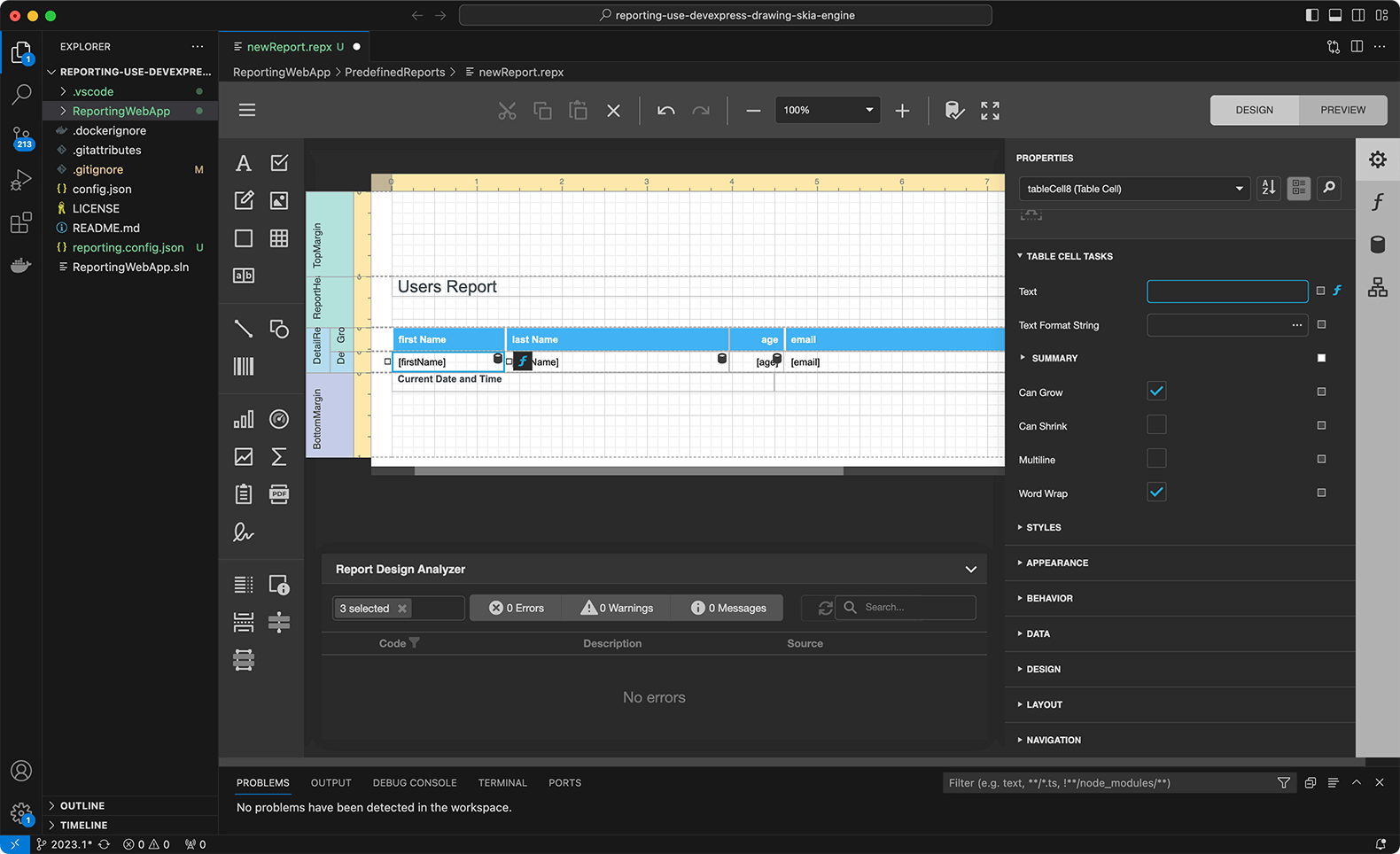
We are excited to announce the availability of our DevExpress VSCode Report Designer Extension as a Community Technology Preview (CTP). The extension allows you to create and edit reports/documents using our Visual Studio Code Report Designer for the following platforms: Windows, macOS, Linux.
Switch to Pre-Release to test extension capabilities with v23.2.
Read the blog post
#Linux and macOS Printing Support
DevExpress Reports now supports document printing through the Common UNIX Printing System (CUPS). This library is integrated with macOS. For Unix-based systems, you need to install the libcups2 package separately.
To print reports on printers accessible through CUPS, utilize the PrintToolBase class.
#Reporting — Enhanced Visual Studio Project Templates
We added Docker support in project templates. You can choose from Docker images for various Linux-based operating systems:
- Debian
- Alpine
- Ubuntu
- openSUSE
- Amazon Linux
A Dockerfile is automatically created and added to the project. The file contains all necessary settings.
The project template allows you to specify storage type used for caching documents generated by the report. Options include:
- File storage
- Database
- External cache service to implement a caching mechanism for distributed applications
- Azure Storage
- In-Memory Storage.
Note: these new options are also available when you generate a sample application using our .NET CLI templates on macOS and Unix-based operating systems.
Documentation:
Use Visual Studio Templates to Create an ASP.NET Core Application with a Document Viewer
Use .NET CLI Template to Create a Reporting App with Document Viewer
Use Visual Studio Templates to Create an ASP.NET Core Application with a Report Designer
Use .NET CLI Template to Create a Reporting App with Report Designer
New Localization API
With v23.2, we simplified the following localization-related tasks for all DevExpress .NET products that rely on standard RESX localization mechanisms:
- Identify localization strings used specifically in an application.
- Find untranslated strings based on application culture.
- Save modifications to a RESX file and use it as an additional source of localized strings.
You can now identify and localize non-translated strings in your DevExpress-powered .NET apps (WinForms, WPF, ASP.NET WebForms, MVC, Blazor, Reporting, BI Dashboards, and XAF UI).
Localization APIs include the following new events and properties in the XtraLocalizer class:
- QueryLocalizedStringContainerResource — Allows you to localize resources for data forms and dialogs that ship as part of DevExpress distributions. It was difficult to determine and alter all localization strings included in custom forms (as there were no separate localizers existed for these forms).
- QueryLocalizedStringNonTranslated — The event allows you to focus on resources that require translation in your application. Handle this event to collect non-localized resource strings for further translation. Our default translations are community-sourced, so they are not 100% covered (even for German, Spanish or French) and some may require corrections as well (again due to the community-sourced origin).
- QueryLocalizedString — The event allows you to localize resources for all DevExpress UI controls in your application. The event fires when the control requests a resource string and allows you to translate or modify it as needed (we extended this event with useful event arguments such as
IsTranslatedValueStringIDType - UserResourceManager — The property allows you to set a custom resource manager that can integrate custom RESX files into your applications for localization. This API offers a maximum level of control and is the topmost in the call hierarchy. As you would expect, you can pass this RESX to external translators much easier than when using our online Localization Service today (this is one of the challenges we hoped to address based on survey feedback).
UI Localization Client — Identification of Non-Translated Resources
We implemented a new UI Localization Client tool (a VSIX extension). This is a cross-platform utility that allows you to quickly identify non-translated strings of DevExpress UI controls and translate them. The utility automatically generates a RESX file(s) with translated resources and adds it to the project. You will be able to invoke this tool from Visual Studio, under the "Extensions > DevExpress > All Platforms" menu.
Documentation
NuGet v3 (nuget.devexpress.com) is now used by default. NuGet v3 is a faster and more secure way to access DevExpress NuGet packages from your IDE or CI/CD tools. NuGet v2 will continue to be supported.
Depending on authorization preferences, consider one of the following options:
Read the following help topics for additional information on how to configure CI/CD systems when using DevExpress NuGet server:
DevExpress NuGet Packages and Popular Continuous Integration Systems
Security, Licensing, and Reliability Considerations
#WinForms and WPF
We introduced a new Clipboard Access Policy that allows you to control (allow or disallow) clipboard-related operations initiated by users when using DevExpress UI controls in Windows Forms and WPF applications (including Reports and BI Dashboard).
Use the following methods at application startup to apply predefined restrictions:
You can also handle the following events to configure policies as needed:
The following example allows a user to paste data in ANSI text format into a DevExpress UI control from the clipboard. If the user pastes data in a different format, the paste-from-clipboard operation will be canceled:
          using System;
          using System.Windows.Forms;
          using DevExpress.Data.Utils;

          namespace DXApplication {
              internal static class Program {
                  /// <summary>
                  /// The main entry point for the application.
                  /// </summary>
                  [STAThread]
                  static void Main() {
                      Application.EnableVisualStyles();
                      Application.SetCompatibleTextRenderingDefault(false);
                      ClipboardAccessPolicy.SuppressCopyOperations();
                      ClipboardAccessPolicy.Pasting += ClipboardAccessPolicy_Pasting;
                      Application.Run(new Form1());
                  }
                  private static void ClipboardAccessPolicy_Pasting(object sender, ClipboardAccessPolicy.ClipboardOperationRequestEventArgs e) {
                      if (e.DataFormat == DataFormats.Text)
                          e.Cancel = false;
                  }
              }
          }
Documentation
Your feedback matters.
Please, review the description of WinForms-related features below and leave your feedback at the end of the section.
Go to the survey now.
Accessibility & UI Automation
We now support assistive tools and UI Automation patterns for the following WinForms controls:
- Chart
- Print Preview (Document Viewer)
- Diagram
- Spreadsheet
- Rich Text Editor
- Gantt
- Flyout Dialog
- Step Progress Bar
And yes, we also offer accessibility-related capabilities in our WinForms HTML & CSS implementation. These include:
- ARIA attributes (aria-label, aria-description, role)
- Roles (Button, Checkbox, Gridcell, Link, None, Menuitem, Menuitemcheckbox, Menuitemratio, Radio, Separator, Spinbutton)
-
Alt attributes on Image and Input elements
#Assistive Technologies (screen readers) Compatibility Enhancements
We enhanced the Accessibility Tree for the following UI controls to ensure that assistive technologies receive the necessary information to comply with accessibility guidelines outlined in WCAG:
- FilterControl
- Kanban
- RangeTrackBar
- BreadCrumbEdit
- CalendarControl
- ColorEdit and ColorPopupEdit
- Built-in End-User Forms (for example, Column Filter Popup, Summary Customization Form, etc.)
Assistive technologies, such as screen readers, are now notified of the following changes/modifications and can correctly pronounce them:
- Expand/Collapse State in a Card View / Combo Box
- ProgressBarControl Value
- AlertControl Message
- Selection in GridView
- Validation Errors in Data Editors
- Values in TimeSpanEdit, DateTimeOffsetEdit, and DateEdit (touch mode)
- Items in the Document Selector (DocumentManager)
- ImageComboBoxEdit Items
- Path Selection in BreadCrumbEdit
Assistive technologies (screen readers) can now access the following information:
- LayoutItem Label
- Node Nesting Level and Tree Info in TreeList and Accordion Control
- Gauge Value
- AccessibleName from LabelControl associated with a control
- AccessibleName from a tooltip associated with
ButtonBase
#Accessible Keyboard Navigation
Customization Window in Data Grid and TreeList
The Customization Window in our WinForms Data Grid and WinForms TreeList controls now fully supports keyboard navigation. Users can move through and interact with data fields and UI elements using arrow keys and shortcuts.
We added new APIs designed to display/hide the Customization Window in our CardView. New methods include:
Tab Navigation in Master-Detail Mode
We added smooth keyboard navigation support between tabs in a master-detail grid. Users can effortlessly switch between detail tabs by pressing CtrlNumKey
Ribbon, Backstage View, Recent Control
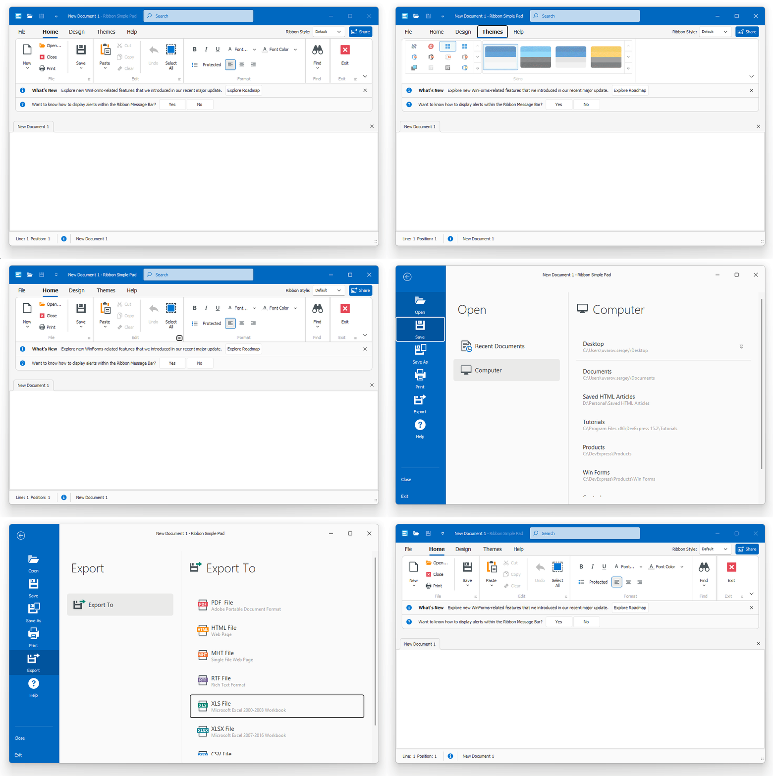
To help improve accessibility, we implemented keyboard navigation support (inspired by MS Office) in our WinForms Ribbon UI, Backstage View, and Recent Control. Improved keyboard navigation allows users with disabilities, vision impairments, and anyone who prefers keyboard shortcuts to navigate and interact with desktop applications more easily.
Use the Alt key to activate keyboard navigation. Use arrow keys to navigate. Use Enter and Esc keys to open/close the Backstage View, sub menus, and Ribbon galleries.
Range Trackbar
Keyboard users can now use navigation keys to interact with trackbar sliders:
- Up or Right arrow — Moves the slider to the right (top in the vertical orientation) by a small value.
- Down or Left arrow — Moves the slider to the left (bottom in the vertical orientation) by a small value.
- PageUp — Moves the slider to the right (top in the vertical orientation) by a large value.
- PageDown — Moves the slider to the left (bottom in the vertical orientation) by a large value.
- Home — Moves the slider to its minimum value.
- End — Moves the slider to its maximum value.
Filter Editor
You can now use the keyboard to interact with the filter editor tree (for example, navigate through items, select filter values, create filters/nodes, etc.).
Conditional Formatting Manager
We removed inaccessible areas and improved keyboard navigation in Master-Detail views.
CardView Column Customization Button
You can now focus the button that opens the Customization Form in our Card View.
Breadcrumb Editor
We improved keyboard navigation (inspired by File Explorer Bradcrumb) in our WinForms Breadcrumb editor. Keyboard users can now use navigation keys to interact with the editor:
- Left or Right arrow — Moves focus between path segments.
- Up or Down arrow — Opens a segment sub menu.
- Enter or Space — Activates the selected path segment.
- Shift + F10 — Opens the Breadcrumb editor's context menu.
Editor Popup Buttons
Users can now focus default buttons displayed within the editor's dropdown (popup).
Expression Editor
Users can now escape the "focus trap" in the expression editing area with the CtrlTab
Data Grid
#Multi-Level Filtering/Search in Master-Detail Mode
You can now enter a search expression within the Grid's Search Panel to instantly filter data and highlight results in master and expanded detail views.
Use the AllowFindInExpandedDetails property to enable the new search option.
gridView.OptionsFind.AllowFindInExpandedDetails = DefaultBoolean.True;
#Reorder Data Rows Using Drag & Drop in GridView
With drag & drop enabled, your users can move data rows to another Data Grid control or reorder rows (in the same Data Grid). With v23.2, reordering data rows is available out-of-the-box. You no longer need to handle drag-related events.
Users can select multiple data rows and move them to a different position, or move rows from one group to another. And yes, users can move data rows in a sorted GridView. The GridView automatically updates cell values for sorted columns.
New API
Use the GridView.OptionsDragDrop property to customize the following drag-drop settings:
AllowDataReorderingAllowSortedDataDragDrop
Specification
- Supported View:
GridView - Supported Data Source:
IListDataTableDataView
#Select Rows Based on a Specific Condition
Our WinForms Data Grid control now includes a new SelectionChanging event. Handle the event to prevent users from selecting data rows based on a specific condition.
#Save-Restore Layout Enhancements
We added new PropertySerializing and PropertyDeserializing events for granular control over layout save/restore operations.
Editors
#Rounded Progress Bars in WXI Skins
WinForms Progress Bar and Marquee Progress Bar controls display rounded corners when using WXI and WXI Compact skins (inspired by Windows 11).
#Display/Hide Auto-Complete Popups within Text Editors
Our WinForms Text Editors can display a popup with suggestions (to complete words). v23.2 includes new methods to display/hide the auto-complete popup when necessary. For example, you can display the popup with suggestions when a user presses a specific key or key combination.
New APIs include:
#Disable Shortcuts within Text Editors
You can now use the ShortcutsEnabled property to specify whether DevExpress TextEdit-based editors must accept standard keyboard shortcuts (Ctrl+C, Ctrl+X, etc.).
File Dialogs
#Wildcards
You can now use *?
Font Icon Images
Windows 10/11 contains hundreds of font icons (Segoe MDL2 Assets in Windows 10 and Segoe Fluent Icons in Windows 11 fonts). You can now use our Image Picker to assign font icon images to individual UI controls/elements or add them to our SvgImageCollection
If you run a DevExpress-powered application on Windows 11, it will use icons from the "Segoe Fluent Icons" font. If you run the same application on Windows 10, it will use icons from the "Segoe MDL2 Assets" font collection (automatically).
We also added a new WindowsFormsSettings.FontIconsStyle setting to specify default icon font:
            static void Main() {
                Application.EnableVisualStyles();
                Application.SetCompatibleTextRenderingDefault(false);
                WindowsFormsSettings.FontIconsStyle = FontIconsStyle.Win10;
                Application.Run(new Form1());
            }
Documentation
Gantt
#Middle-Button Auto-Scroll
Our WinForms Gantt control now supports auto-scrolling out of the box. With this option, your users can press the middle mouse button and then move the mouse to scroll content vertically or horizontally.
HTML & CSS Support
#Surrogate Pairs
We improved layout and content selection that includes emojis made up of two surrogates (when the emoji code is represented by two Unicode code points 🐼).
MVVM Framework
#Command Binding (Call Methods inside the UI)
We implemented the following APIs (for all WinForms components) for improved compatibility with Microsoft's new implementation (Using Command Binding in Windows Forms apps to go Cross-Platform):
CommandCommandParameterCommandChangedCommandCanExecuteChanged
We also augmented the UI generation mechanism in our Data Layout Control. You can now automatically generate buttons based on view model commands.
.NET 8 Data Annotation Attributes
We supported new data validation attributes (including new properties in RangeAttributeRequiredAttribute
What's new in .NET 8 - Data Validation
Ribbon
#Customize QAT Commands in Ribbon Customization Form
We extended runtime customization of the Ribbon UI. Your users can now customize Quick Access Toolbar (QAT) commands in the Ribbon Customization Window.
We added a new AllowToolbarCustomization option. When this option is enabled, users can select the “Quick Access Toolbar” item in the Ribbon Customization Window and add/remove/arrange QAT commands as needed.
            ribbonControl1.AllowCustomization = true;
            ribbonControl1.OptionsCustomizationForm.AllowToolbarCustomization = true;
Rich Text Editor
#Content Controls
The WinForms Rich Text Editor can now display, print, and export (PDF) documents that include the following content controls:
- Rich Text
- Plain Text
- ComboBox
- Drop-Down List
- Date Picker
- CheckBox
- Picture
- Repeating Section
We also added a new Document.ContentControls
Documentation
#Protected Sections
In "Fill-In Forms" protection mode, the WinForms Rich Text Editor locks the document and allows the user to complete only fillable forms (if any). In v23.2, we added a new Section.ProtectedForForms
You can also unlock specific sections in the Ribbon UI. Go to: Review > Protect Document.
Documentation
#SVG Support
The WinForms Rich Text Editor can now open, save, export (PDF), and edit documents with SVG graphics. You can also resize, move, and align SVG images within the document as needed.
Spreadsheet
#Form Controls
v23.2 ships with Excel-inspired Form Controls.
Our WinForms Spreadsheet control supports the following form controls:
- Button
- CheckBox
- ComboBox
- GroupBox
- Label
- ListBox
- Radio Button
- Spin Button
- Scrollbar
You can print and export (PDF) worksheets with the aforementioned form controls. We also added a new Worksheet.FormControls
Documentation
#Chart Enhancements
The WinForms Spreadsheet control can now display, print, and export (PDF) the following chart elements:
- Error Bars
- Rotated Axis Labels
- RTF Axis Titles
We also added new APIs to import and apply chart settings from Chart Template files (.CRTX). The AddFromTemplateLoadTemplate
Chart Enhancements - WinForms Spreadsheet
 Error Bars
 Rotated Axis Labels
 RTF Axis Titles
#Export Cell Content to HTML and RTF
You can now obtain cell content in RTF or HTML format. New APIs include:
GetRtfContentGetHtmlContent
Documentation
#SVG Support
The WinForms Spreadsheet control can now open, save, export (PDF), and edit worksheets/workbooks with SVG graphics. You can also move, align, and resize SVG images within the document as needed.
TreeList
#Select Nodes Based on a Specific Condition
Our WinForms TreeList control ships with a new TreeList.SelectionChanging event. Handle the event to prevent users from selecting nodes based on a specific condition.
#Save-Restore Layout Enhancements
The TreeList control includes the following new options:
- StoreAllColumnsOptions — Specifies whether to include all column settings in the layout when it is saved or restored.
- StoreColumnsLayout — Specifies whether to include column/band width and visibility information in the layout when it is saved or restored.
- StoreDataSettings — Specifies whether to include sorting, filtering, and summary information in the layout when it is saved or restored.
- StoreFormatRules — Specifies whether to include information about conditional formatting (if applied) in the layout when it is saved or restored.
- StoreVisualOptions — Specifies whether to include
TreeList.FindPanelVisibleTreeList.OptionsView
We also added new PropertySerializing and PropertyDeserializing events for granular control over layout save/restore operation. These events are also available in our WinForms Data Grid and Vertical Grid controls.
Documentation
#Middle-Button Auto-Scroll
The TreeList control ships with auto-scrolling. With this option, your users can press the middle mouse button and then move the mouse to scroll content vertically or horizontally.
#Collection Aggregate Functions
As you may know, our WinForms Data Grid allows you to create filters with the following collection aggregation functions: Count, Min, Max, Average, Sum, Exists. You can now specify the TreeListOptionsFilter.FilterEditorAggregateEditing property and use these functions to filter WinForms TreeList data based on collection properties.
treeList1.OptionsFilter.FilterEditorAggregateEditing = FilterControlAllowAggregateEditing.Aggregate;
Vertical Grid
#Advanced Customization Form
We improved the Row Customization Form in our WinForms Vertical Grid control. The Customization Form now displays all rows/categories, and allows users to display/hide these elements using check boxes. The form integrates a search box and a sort button.
Activate the UseAdvancedCustomizationForm option to use the Advanced Customization Form in your Windows Forms application.
#Save-Restore Layout Enhancements
We added new PropertySerializing and PropertyDeserializing events for granular control over layout save/restore operations.
Design-Time Enhancements
#Step Progress Bar — Select and Customize Items in .NET Designer
Step Progress Bar customization is now easier than ever. You can effortlessly choose an item directly on the design canvas, invoke its smart tag menu, and customize general settings as needed.
#BackstageView and RecentItemControl — Design-Time Customization Enhancements
You can now select an item in our WinForms BackstageView or RecentItemControl and press Escape to select its immediate parent until you reach the top parent (for example, a form or user control).
#The Bezier Skin Now Used in Design-Time
We refreshed our Visual Studio designers, wizards, and customization dialogs. These design-time elements now feature our lightweight vector skin ("The Bezier").
UI Templates
#Date Range Picker
We added the Date Range Picker to our WinFoms UI Templates. The template is based on our WinForms DateEdit control. As its name implies, the control allows users to select a date range.
#Your Feedback Matters!
Please
login to complete the survey.
Survey Completed
Thank you for taking the time to complete this survey. Your responses have now been posted. If you want to follow up with additional information, feel free to send us an email at clientservices@devexpress.com anytime.
You've Already Completed This Survey
Our records show that you have already completed this survey. If you want to follow up with additional information, send us an email at clientservices@devexpress.com.
This survey has expired
If you want to share your feedback or request new functionality, please submit a new support ticket via the DevExpress Support Center. We’ll be happy to follow up.
Your feedback matters.
Please, review the description of WPF-related features below and leave your feedback at the end of the section.
Go to the survey now.
Lightweight Themes
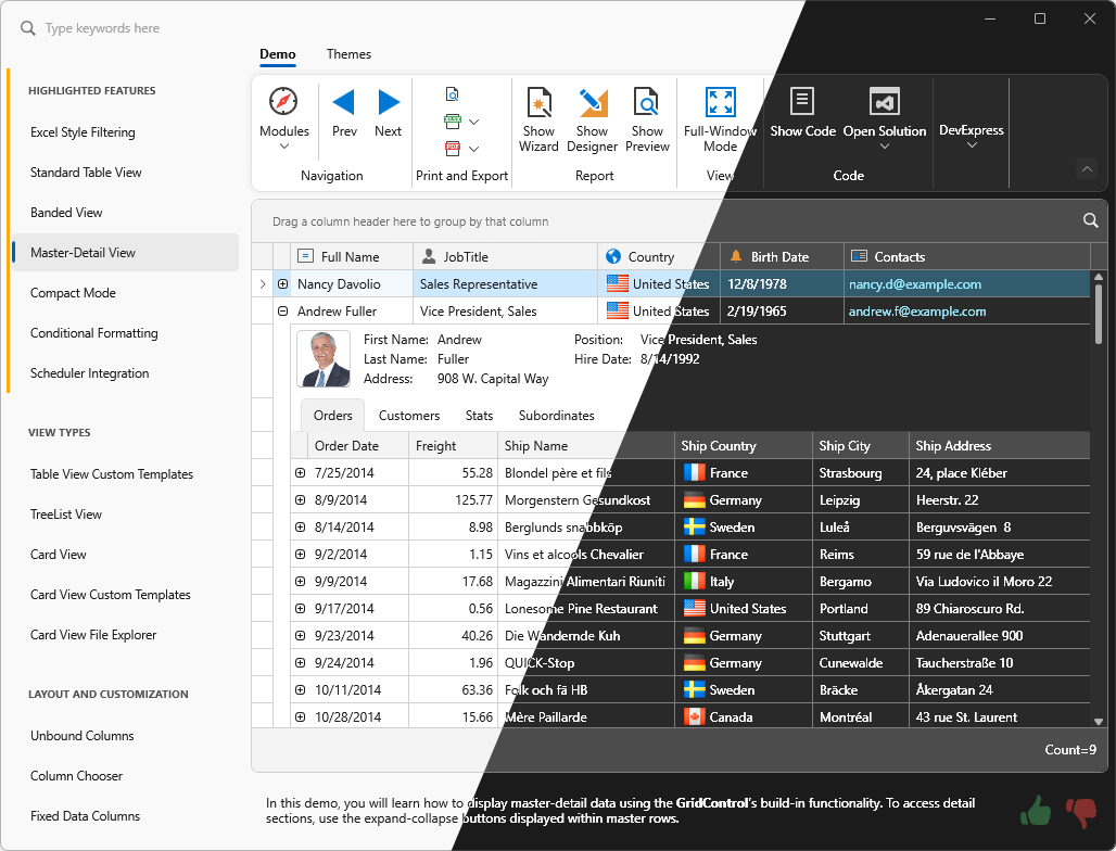
Lightweight themes were first introduced in June 2023 as a Community Technology Preview (CTP). This update marks their official release. Lightweight themes are optimized for better performance and lower memory consumption. Performance enhancements include (when compared to standard DevExpress themes):
- Improved Startup Performance (by 20-40%)
- Faster App View Switching (10-25% faster)
- Reduced Memory Footprint (by 40-50%).
Documentation
#New Windows 11 Lightweight Themes
v23.2 also introduces new lightweight versions of our Windows 11 themes: Light, Dark, System.
Lightweight themes shipped as part of our WPF Subscription include:
- Windows 11 (Light, Dark, System)
- Windows 10 (Light, Dark, System, System Colors)
- Office 2019 (Colorful, Black, High Contrast, System)
- Visual Studio 2019 (Blue, Light, Dark, System)
#Preload Theme Resources
When it comes to enterprise applications, the speed of switching views is as important as the speed of application startup. In v23.2, we improved the mechanism used to preload DevExpress theme resources at application startup.
The engine is now faster and supports both standard and lightweight WPF themes. With this enhancement, views start faster when users open them for the first time. Preloading themes also speeds up the first time you switch tabs, navigate the UI, open windows, and more.
Our flexible API allows you to load separate assemblies or a custom user control to better address specific usage scenarios:
            public partial class App : Application {
              static App() {
                ApplicationThemeHelper.Preload(PreloadCategories.Ribbon, PreloadCategories.Grid);
                // OR
                ApplicationThemeHelper.Preload<MyControl>();
              }
            }
Data Grid
#Web Style Selection in Master-Detail Mode
Web style selection is now availabe in master-detail mode. You can now display the Selector Column in master and detail views (this raised an exception in previous versions).
#Remove Rows on Delete Key
WPF Data Grid, Tree List, Tree View, and Gantt controls now include the DeleteKeyBehavior property. This property defines the action used when a user presses the Delete key. Available options include:
- Delete the focused row.
- Delete selected rows.
- Do nothing.
#Search Panel — Highlight Special Symbols
The Search Panel within our WPF Data Grid and Tree List controls now highlights results for search strings that include special symbols (+, -, %, :). To search data against these strings, specify them in quotation marks.
#Prevent Focusing on Specific Rows
We added a new FocusedRowHandleChanging event. Handle the event to prevent users from focusing rows based on a specific condition.
          void OnFocusedRowHandleChanging(object sender, FocusedRowHandleChangingEventArgs e) {
              if (e.NewRowHandle < 5)
                  e.NewRowHandle = e.OldRowHandle;
          }
#Multiple Cell Selection in Merged Mode
The WPF Data Grid now supports multiple cell selection in merged mode.
Data Editors
#Image Editor — Edit Loaded Image
You can now use our WPF ImageEdit control as a standalone image editor with the following image modification options:
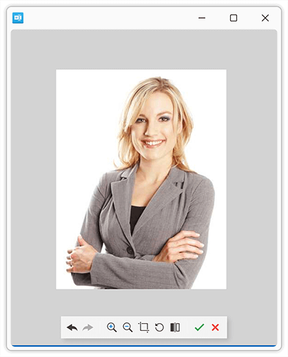
We implemented a new ImageEditToEditModeBehavior class. Attach the class to the ImageEdit
            <dxe:ImageEdit EditValue="{Binding Source, Mode=TwoWay}">
              <dxmvvm:Interaction.Behaviors>
                <dxe:ImageEditToEditModeBehavior/>
              </dxmvvm:Interaction.Behaviors>
            </dxe:ImageEdit>
Documentation
#Text Editors — Embedded Labels
WPF Data Editors can now display embedded (floating) labels in the edit box. This option allows you to eliminate field labels from all your data forms. An empty and unfocused editor displays its label in the middle. The label automatically moves upward when the editor is focused.
You can also add an access key shortcut to an editor. With the access key, the user can focus the editor by pressing the AltAccess Key
Use the Label property to specify the floating label (Documentation):
<dxe:TextEdit Label="_First Name"/>
#Date Edit — Default Value
You can now use the DateEdit.DefaultDateTime property to specify the editor's default date. The WPF Date Edit suggests an auto-complete option (in the edit box) or selects the default date (in the drop-down calendar) when a user interacts with an empty editor.
Scheduler
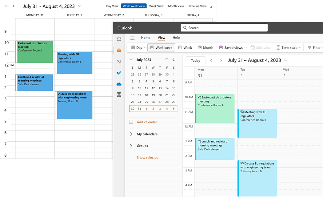
#Microsoft 365 Calendar Synchronization
Our WPF Scheduler control exposes new APIs and allows you to seamlessly synchronize user appointments with Microsoft 365 calendars (bi-directionally).
You can export appointments from the WPF Scheduler control to Microsoft 365 calendars, import Microsoft 365 (Outlook) events to the WPF Scheduler control, merge user appointments with Microsoft 365 calendars, and resolve merge conflicts.
Diagram
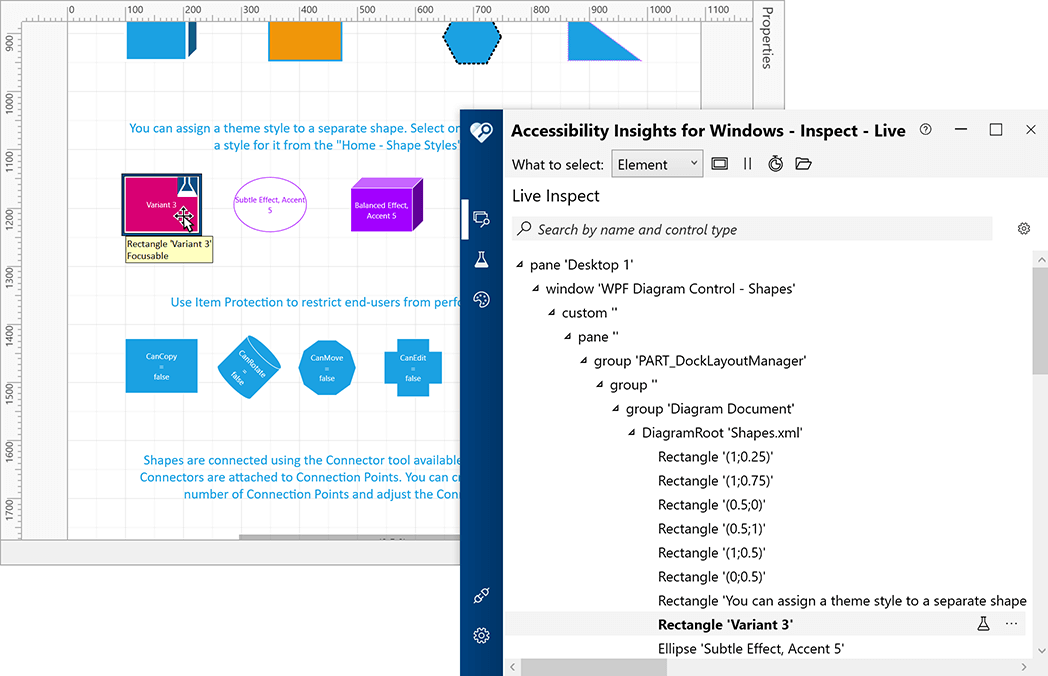
#UI Automation Support
To help you create accessible applications and create automation tests, we added support for assistive tools and implemented Automation UI patterns for shapes (items) used in our WPF Diagram control.
Rich Text Editor
#Content Controls
The WPF Rich Text Editor can now display, print, and export (PDF) documents that include the following content controls:
- Rich Text
- Plain Text
- ComboBox
- Drop-Down List
- Date Picker
- CheckBox
- Picture
- Repeating Section
We also added a new Document.ContentControls
Documentation
#Protected Sections
In "Fill-In Forms" protection mode, the WPF Rich Text Editor locks the document and allows the user to complete only fillable forms (if any). In v23.2, we added a new Section.ProtectedForForms
You can also unlock specific sections in the Ribbon UI. Go to: Review > Protect Document.
Documentation
#SVG Support
The WPF Rich Text Editor can now open, save, export (PDF), and edit documents with SVG graphics. You can also resize, move, and align SVG images within the document as needed.
Spreadsheet
#Form Controls
v23.2 ships with Excel-inspired Form Controls.
Our WPF Spreadsheet control supports the following form controls:
- Button
- CheckBox
- ComboBox
- GroupBox
- Label
- ListBox
- Radio Button
- Spin Button
- Scrollbar
You can print and export (PDF) worksheets with the aforementioned form controls. We also added a new Worksheet.FormControls
Documentation
#Chart Enhancements
The WPF Spreadsheet control can now display, print, and export (PDF) the following chart elements:
- Error bars
- Rotated Axis Labels
- RTF Axis Titles
We also added new APIs to import and apply chart settings from Chart Template files (.CRTX). The AddFromTemplateLoadTemplate
Chart Enhancements - WinForms Spreadsheet
 Error Bars
 Rotated Axis Labels
 RTF Axis Titles
#Export Cell Content to HTML and RTF
You can now obtain cell content in RTF or HTML format. New APIs include:
GetRtfContentGetHtmlContent
Documentation
#SVG Support
The WPF Spreadsheet control can now open, save, export to PDF, and edit worksheets/workbooks with SVG graphics. You can also move, align, and resize SVG images within the document as needed.
Themed Window
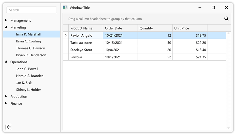
#Themed Window — Side Panel
Our WPF Themed Window now incorporates a side panel that is vertically aligned and overlaps the window title. You can use this new UI element to create a side navigation interface and deliver advanced navigation options or display custom content as needed.
Enable the ShowLeftPanel option to display the side panel. Use the following properties to specify panel content:
Documentation
#Your Feedback Matters!
Please
login to complete the survey.
Survey Completed
Thank you for taking the time to complete this survey. Your responses have now been posted. If you want to follow up with additional information, feel free to send us an email at clientservices@devexpress.com anytime.
You've Already Completed This Survey
Our records show that you have already completed this survey. If you want to follow up with additional information, send us an email at clientservices@devexpress.com.
This survey has expired
If you want to share your feedback or request new functionality, please submit a new support ticket via the DevExpress Support Center. We’ll be happy to follow up.
Your feedback matters.
Please, review the description of JavaScript-related features below and leave your feedback at the end of the section.
Go to the survey now.
Look & Feel
#New Fluent Theme
DevExtreme v23.2 ships with a new Microsoft Fluent inspired web theme.
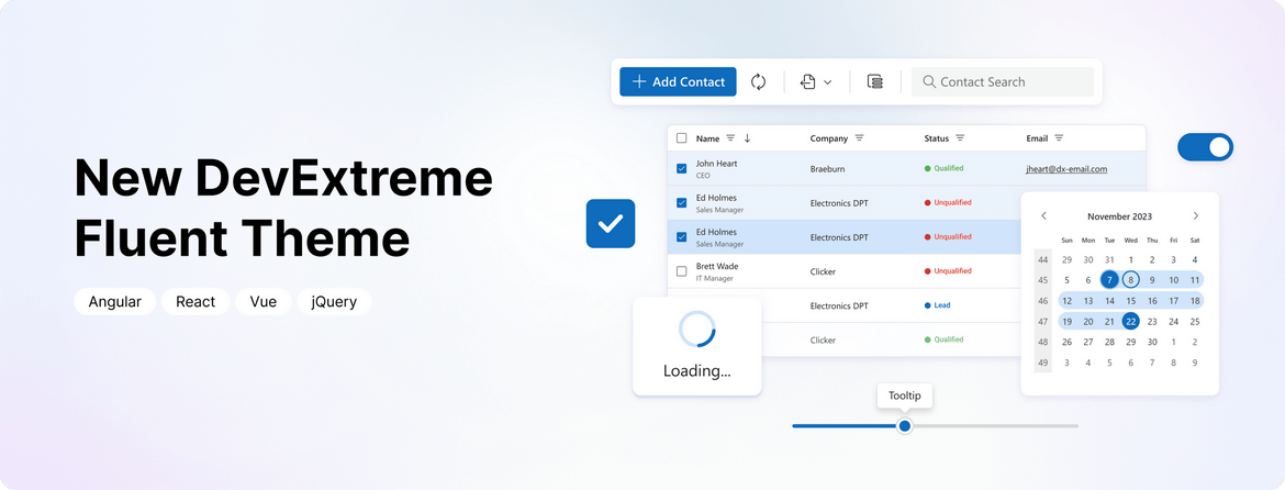
The theme includes the following capabilities:
- Accessible components with contrast color support.
- Two color schemes: Classic and SaaS.
- Two size modes: Standard and Compact.
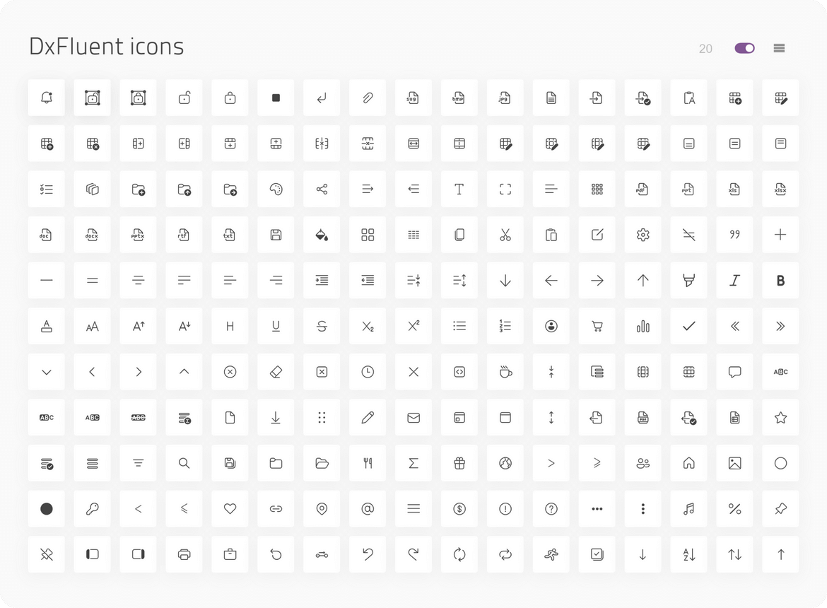
- New icon package.
#ThemeBuilder Enhancements
We introduced numerous enhancements to the DevExtreme ThemeBuilder tool. Enhancements include:
- Integration of the new Fluent theme.
- Advanced ThemeBuilder settings were expanded to incorporate all possible states of
ButtonButtonGroup - Added a new set of variables for editors.
ThemeBuilder Enhancements
#Material Theme Enhancements
This release includes the following changes to Material theme:
- To address accessibility-related issues, the disabled state for the Button component now includes a higher contrast color combination.
- We updated the appearance of our
ButtonGroup - Different text editor (type) boxes are now the same height. Thanks to higher contrast color combinations, the content of label and placeholder elements are also accessible.
- Multiple changes have been introduced within the DevExtreme Accordion component. The spin icon uses a higher contrast color combination. The component's overall style is more consistent with those outlined in Google's Material Design guidelines.
- To avoid help text overlapping with nearby items, the validation message now uses a contrasting background.
- Two icons were changed to make the overall icon set consistent.
- We changed the Slider's tooltip to make it more consistent with Material guidelines.
- The
List - Our
Form - Our
PivotFieldChooser
Scheduler
#Work Shift Support
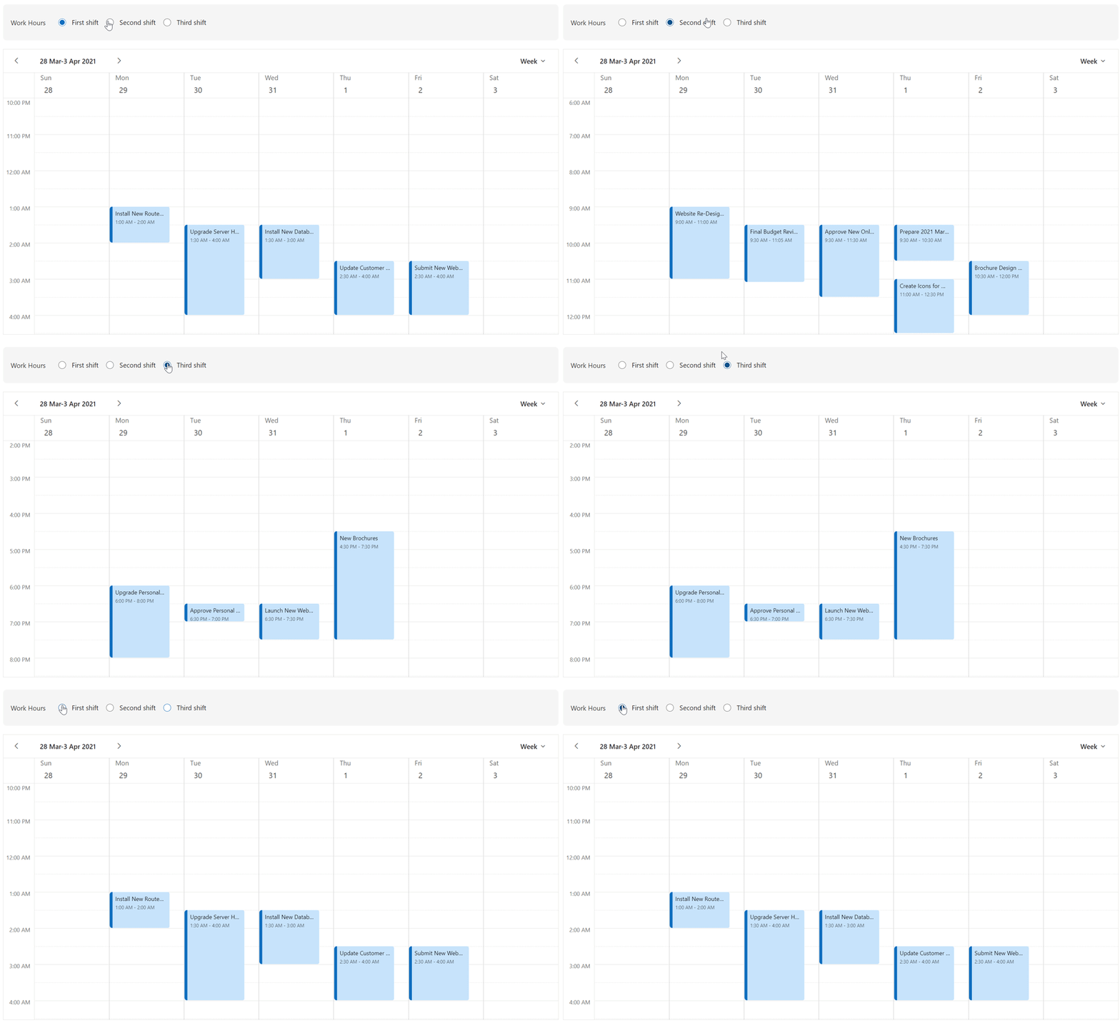
In v23.2, the DevExtreme Scheduler introduces an offset display option, allowing you to configure enterprise work day offsets and accommodate work shift variations, time zones, and other related usage scenarios.
Online Demo
Calendar
#Multi-Selection of Discrete Days
The new Calendar selectionMode option offers three modes: single, multiple, or range selection.
singlemultiplerange
You can set a single date or an array of dates as the initial value. You can also use the selectWeekOnClick option to allow selection of an entire week by clicking on associated week numbers.
Online Demo
Tabs & TabPanel
#Vertical Tabs Orientation
For Tabs, we added a new orientation option that allows you to arrange tabs either horizontally or vertically.
#Custom Tabs Position
For TabPanel, our new tabsPosition option allows you to locate tabs on the right, left, top, or bottom of the panel.
Tabs Position
 Tabs Position - Top
 Tabs Position Bottom
 Tabs Position - Left
 Tabs Position - Right
#Custom Icon Position
Both Tabs and TabPanel now include an iconPosition option, allowing you to define where icons are displayed within Tabs (start, end, top, or bottom position).
#Secondary Styling Mode
You can now specify a styling mode for the active tab. The following styling modes are available:
primarysecondary
TabPanel Online DemoTabs Online Demo
Form & Editors
#Change Detection (Dirty State)
v23.2 includes the following changes:
- Renamed the reset method to clear for uniformity and introduced a new reset method for editors to maintain reset functionality.
- Deprecated the Form's resetValues method, replacing it with clear, and introduced a new reset method for the entire Form.
- Added the isDirty flag for both editors and Form.
isDirty
Online Demo
#DateRangeBox Support
You can now use editorType: 'dxDateRangeBox'
#'Outside' Label Mode
v23.2 includes a new 'outside' label mode for editors.

#DropDownButton — New 'Type' Option
The DevExtreme DropDownButton includes a type option like its Button counterpart.
Examples
Angular | React | Vue | jQuery
Accessibility
The following accessibility-related enhancements have been introduced in this release cycle (WCAG and Section 508 standards):
Performance
#Vite Tree Shaking Support
We addressed Vite support restrictions that previously lead to a larger JS bundle size. You no longer need to disable Vite's Tree Shaking feature in your DevExtreme-based JS applications.
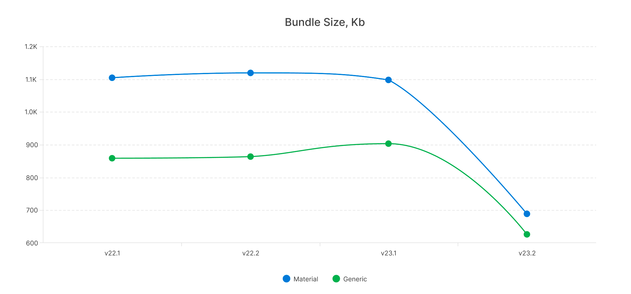
#Reduce CSS Size
The DevExtreme package includes all Generic and Material themes. We reduced theme set size as follows:
- 30% for Generic themes
- 37% for Material themes
- 34% overall
Demos & TypeScript
#React Demos — TypeScript and React Hooks
We migrated our React demo examples to TypeScript, providing you with two choices: JavaScript and TypeScript. Additionally, we made the switch from Class Components to Function Components.
#Vue Demos — TypeScript and Vue Composition API
We transferred all our Vue demo code to TypeScript. We also transitioned from Options API to Composition API.
#TypeScript Enhancements
Angular component properties now support literal union types. IntelliSense supplies hints to identify misuse of such types in code.

DevExtreme Angular allows you to specify generic type parameters to define instances of data-aware components like DataGrid.
                import { Component, ViewChild } from '@angular/core';
                import { DxDataGridComponent } from 'devextreme-angular/ui/data-grid';
                import { Employee } from './data';

                @Component({
                    selector: 'app-root',
                    templateUrl: './app.component.html',
                    styleUrls: ['./app.component.css']
                })

                export class AppComponent {
                    @ViewChild(DxDataGridComponent) dataGrid!: DxDataGridComponent<Employee, number>;

                    onButtonClick() {
                        const selectedRows: Employee[] = this.dataGrid.instance.getSelectedRowData();
                    }
                }
#Your Feedback Matters!
Please
login to complete the survey.
Survey Completed
Thank you for taking the time to complete this survey. Your responses have now been posted. If you want to follow up with additional information, feel free to send us an email at clientservices@devexpress.com anytime.
You've Already Completed This Survey
Our records show that you have already completed this survey. If you want to follow up with additional information, send us an email at clientservices@devexpress.com.
This survey has expired
If you want to share your feedback or request new functionality, please submit a new support ticket via the DevExpress Support Center. We’ll be happy to follow up.
Your feedback matters.
Please, review the description of Blazor-related features below and leave your feedback at the end of the section.
Go to the survey now.
.NET 8 Support
DevExpress Blazor components now offer full support for the latest .NET 8 release. If you're planning to upgrade existing Blazor apps from .NET 7 (or earlier) without modifications, your apps should continue to operate without issues.
For those looking to create new Blazor apps in .NET 8 or update existing apps to leverage render modes introduced in .NET 8, you'll need to enable interactivity for DevExpress components to unlock the capabilities of our Blazor UI libraries. DevExpress Blazor components support all three interactive render modes: Server, WebAssembly, and Auto.
Blazor Server-side Rendering (SSR) Support
The Static render mode (SSR) introduced in .NET 8 allows Blazor to render components and pages on the server without a socket connection or WebAssembly files. While the majority of DevExpress Blazor components are designed for interactive use, the following components now offer support for Static render mode:
- Grid and Pivot Grid (to display static data in a single page).
- Menu and TreeView (to display one level of hierarchy).
- Wait Indicator and Loading Panel (to indicate progress with streaming rendering).
- Form Layout (excluding tabs and collapsible groups).
- Grid Layout and Stack Layout.
New Project Templates
New DevExpress Blazor project templates are in sync with major changes to the project structure introduced in .NET 8. Our templates now provide:
- A new navigation menu optimized for .NET 8’s Static render mode.
- Support for configurable interactive render modes (Server, WebAssembly, Auto).
- Refreshed appearance for the side navigation menu and other visual enhancements.
In addition, our CLI templates now support parameters so you can specify framework version and render modes.
Bootstrap v5.3 and Dark Mode Support
DevExpress Blazor components now support Bootstrap v5.3. They also seamlessly integrate with the Color Mode feature introduced in this Bootstrap version.
To explore this capability, open our online Blazor demo and select "Default Dark" using the theme picker.
You can also select a default Bootstrap theme with dark mode enabled in our Project Wizard (when creating a new Blazor application).
New UI Kit for Figma
Our new Figma UI Kit for Blazor includes ready-to-use components engineered to promote/maintain UI consistency and simplify complex design processes. If UI consistency and design efficiency are important to you and your enterprise, you can start using our Figma UI Kit today.
Documentation
Adaptivity Enhancements
Our adaptivity engine has been extended. It now assesses various device and browser settings to determine when to display mobile-friendly user interfaces. This ensures a more effective user experience, preventing mobile interfaces from appearing on systems equipped with touch monitors and a mouse. These adaptivity-related enhancements extend to the following DevExpress Blazor components:
- Grid (Column Chooser window)
- Date Edit (the calendar)
- Popup
- Menu (the hamburger menu)
- Toolbar (submenus)
Accessibility Enhancements
We introduced a series of accessibility-focused enhancements for the following components:
- Grid
- Data Editors
- TreeView
- Toolbar
- Menu and Context Menu
These enhancements include:
- Alternative text descriptions for all elements.
- Adjusted element structure to ensure better compatibility with screen readers.
- New WAI-ARIA attributes and roles.
- Improved keyboard support.
Grid
#Cell Editing (CTP)
Our Blazor Grid now supports Cell Editing. In this new edit mode, you can activate cell editors and post changes without pressing the Grid’s Edit and Save buttons. Cell editing starts with a single cell click or Enter key press on a cell focused with the keyboard. You can navigate between cells with the keyboard and automatically post changes once focus leaves the edited row.
Or, if you prefer a more controlled approach, you can accumulate changes in memory and save them by clicking an external Save button.
Cell Editing supports validation and can seamlessly work with automatically generated editors, editors defined with EditSettingsCellEditTemplate
Documentation
Demo: Cell EditingDemo: Batch Editing
#Grouping and Caching Support for DevExtremeDataSource / CustomDataSource
You can now introduce data grouping support in our Blazor Grid when it is connected to remote data using DevExtremeDataSource or CustomDataSource. The Grid component requests information about groups from the server without loading all records and calculates group summaries (totals) on the server side.
In addition, both DevExtremeDataSource and CustomDataSource now ship with built-in record caching. Caching improves Grid usability and reduces the number of requests, especially for those using Virtual Scrolling mode.
Online Demo
#Hierarchical Filter Menu
Our Blazor Grid now features a hierarchical filter menu for DateTime columns. This feature allows you to group available dates by month and year and simplify record filtering within specific date ranges for your users.
Documentation
Online Demo
#Column Auto Fit
To help improve data presentation and information clarity, DevExpress Blazor Grid columns can now automatically modify width to fit actual content. You can trigger this functionality via the Grid's API (using the AutoFitColumnWidths method) or with a simple double-click on the column delimiter/separator.
Online Demo
#Toolbar
Our Blazor Grid now includes a new toolbar area positioned above its headers and the group panel. This area allows you to add any content within it. It works particularly well with our Blazor Toolbar, which automatically adapts its style to match the Grid.
Documentation
Online Demo
#Shortcuts and Keyboard Support Enhancements
We introduced the following enhancements to improve keyboard support in our Blazor Grid:
- Built-in popups and windows are now more accessible.
- The focus border now appears only when a user navigates through Grid elements with the keyboard and disappears after mouse navigation.
- We addressed a number of navigation-related issues.
Additionally, the Blazor Grid now includes more shortcuts so that users can quickly navigate through data:
- Home/End – Focuses the first/last cell of the current row.
- Ctrl + Home/Ctrl + End – Focuses the first/last cell on the current page.
- Page Up/Page Down – Moves focus one page up/down.
When the pager is focused, you can use the following shortcuts to navigate between Grid pages:
- Arrow Left/Arrow Right – Navigates to the previous/next page.
- Home/End – Navigates to the first/last page.
Documentation
#API Enhancements
Charts
#WASM Performance Enhancements
We improved Blazor Chart-related performance for WebAssembly applications. While beneficial for any WebAssembly app, WASM performance-related enhancements are of highest impact when working with large datasets. In such scenarios, DevExpress Blazor Charts will load up to 5 times faster.
#Live Update Enhancements
The DevExpress Blazor Chart now handles parameter and data source updates more efficiently. Instead of performing a full refresh, it only sends necessary changes to its engine. This results in significantly faster updates, and the Chart maintains its visual state, including zoom and scroll position, after an update.
#Palettes
Our Blazor Chart allows you to create your own custom palettes. Additionally, you can specify how the Chart extends colors when the number of series is greater than the number of colors in a palette using the PaletteExtensionMode property.
Online Demo
#Zoom Selected Area
The new AllowDragToZoom property allows users to zoom the Chart by selecting an area using a drag gesture. To pan the Chart in this instance, users must press the key specified by the PanKey property.
You can also use the new DxChartZoomAndPanDragBoxStyle component to configure color and opacity of the box that appears when a user selects a chart area.
Online Demo
#Financial Series – Reduction Colors
Our Blazor Chart can now automatically compare each point value in a financial series to the value of the previous point and highlight the points where values have decreased (using a specific color). This capability helps users monitor market-related changes.
Additionally, you can now customize the fill color for the body of a series point (one that represents a non-reduced value in a Candlestick Series) using the InnerColor property.
#Font Customization
You can customize font settings for DevExpress Blazor Chart elements, including Axis titles, Axis labels, Series labels, and Constant line labels. The new DxChartFont component offers settings such as color, font family, opacity, size, and weight.
Online Demo
#API Enhancements
Our Blazor Chart API has been extended and now offers more than 60 new members designed to customize Chart appearance and behavior.
New events:
- Rendered – Fires after the Chart has rendered and allows you to display/hide a custom loading indicator or perform other operations.
Common Chart settings:
- AdjustOnZoom - Specifies whether to adjust the visual range of the value axis when users zoom or pan the argument axis.
- DefaultPane - Specifies the pane that displays all series with unspecified Pane property.
- MaxBubbleSize - Specifies a coefficient that determines the diameter of the largest bubble.
- MinBubbleSize - Specifies the diameter of the smallest bubble.
- NegativeAsZeroes - Specifies whether the chart treats negative values as zeroes.
- RedrawOnResize - Specifies whether to redraw the chart when the container size changes.
- ResizePanesOnZoom - Specifies whether to resize chart panes after zooming or panning.
- StickyHovering - Specifies whether a point should remain in the hover state when the mouse pointer moves away.
Series settings:
- DxChartSeriesLabelBorder – A new component that allows you to display borders for series labels and offers customizable settings such as color, dash style, and width.
- Alignment - Specifies series label horizontal alignment (relative to the corresponding data point).
- HorizontalOffset - Specifies the horizontal offset of series labels.
- RotationAngle - Specifies the rotation angle of series labels.
- ShowForZeroValues - Specifies whether to show labels for points with zero values.
- VerticalOffset - Specifies series label vertical offset.
- BarOverlapGroupName - Specifies the name of a group that combines bar series to display them overlapped.
- CornerRadius - Specifies the corner radius for a bar or range series.
- MaxLabelCount - Specifies the maximum number of point labels that a series displays.
Axis settings:
- Overlap – Allows you to specify how the Chart displays overlapping axis labels.
- TextOverflow - Specifies how the chart displays overflowing axis labels.
- WordWrap - Specifies how the chart wraps overflowing axis labels.
- PlaceholderSize - Reserves an area for an axis and its labels.
- Alignment - Specifies series label horizontal alignment.
- DisplayMode – Specifies how the chart displays axis labels.
- IndentFromAxis – Specifies the indent between an axis and its labels.
- Position - Specifies axis label position.
Pane settings:
- DxChartPaneBorder – A new component that allows you to display pane borders and offers customizable settings such as color, dash style, opacity, and width.
- BackgroundColor - Specifies the pane’s background color.
Constant Line settings:
- PaddingLeftRight – Specifies the padding between the left/right side of a constant line and its label.
- PaddingTopBottom – Specifies the padding between the top/bottom side of a constant line and its label.
- Visible – Specifies whether the constant line label is visible.
Editors
#New List Box
The DevExpress Blazor List Box has been rewritten from the ground up. Although the public API remains unchanged, both visual and data layers are entirely new. This update introduces improved performance and stability while serving as a solid foundation for future enhancements. The new ListBox is already in use within our Grid’s Filter Menus, Scheduler, and RichEdit dialogs. It will also replace the current list implementation in the ComboBox and TagBox in future updates.
Documentation
#Calendar - Keyboard Support
The DevExpress Blazor Calendar allows users to access all its UI elements, select dates, and navigate between them using the keyboard.
Documentation
#API Enhancements
Navigation
#Toolbar, Menu & Context Menu — Focus & Keyboard Support
Our Blazor Toolbar, Menu, and Context Menu components are now fully accessible with the keyboard. They support keyboard navigation within items, menus, and sub-menus, and highlight the current (focused) item.
#Toolbar — New Adaptivity Engine
Our Blazor Toolbar features a new adaptivity engine. It works faster and ensures that items hide or minimize consistently, and the component smoothly responds to external size changes.
Reporting
#Web Report Designer — WebAssembly Support
You can now use DevExpress Web Report Designer in Blazor WebAssembly Apps and generate documents on the client-side. Leverage the Print Preview functionality to view changes made to the report in the designer immediately.
Rich Text Editor
#Non-Windows OS Support
We transitioned our Blazor Rich Text Editor's engine from System.Drawing.Common to the DevExpress Drawing graphics library. This upgrade allows Blazor Server, WebAssembly, and Hybrid apps to run on non-Windows platforms (Linux, Mac, Android, iOS, and other Unix-based systems) where the System.Drawing.Common library is not supported.
#Your Feedback Matters!
Please
login to complete the survey.
Survey Completed
Thank you for taking the time to complete this survey. Your responses have now been posted. If you want to follow up with additional information, feel free to send us an email at clientservices@devexpress.com anytime.
You've Already Completed This Survey
Our records show that you have already completed this survey. If you want to follow up with additional information, send us an email at clientservices@devexpress.com.
This survey has expired
If you want to share your feedback or request new functionality, please submit a new support ticket via the DevExpress Support Center. We’ll be happy to follow up.
Your feedback matters.
Please, review the description of ASP.NET Core-related features below and leave your feedback at the end of the section.
Go to the survey now.
Look & Feel
#New Fluent Theme
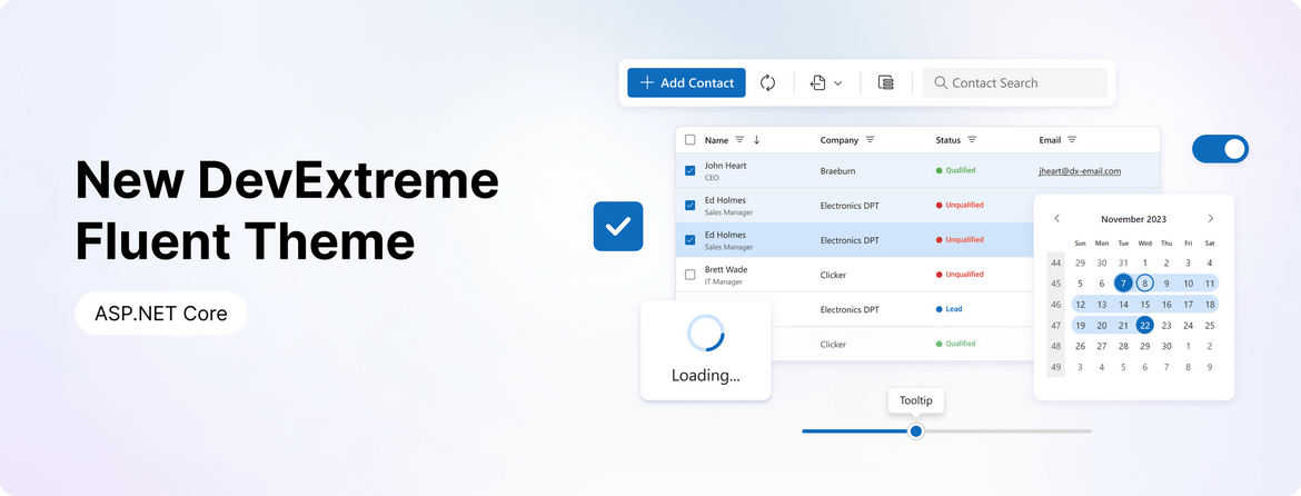
ASP.NET Core v23.2 ships with a new Microsoft Fluent inspired web theme.
The theme includes the following capabilities:
- Accessible components with contrast color support.
- Two color schemes: Classic and SaaS.
- Two size modes: Standard and Compact.
- New icon package.

#ThemeBuilder Enhancements
We introduced numerous enhancements to our ThemeBuilder tool. Enhancements include:
- Integration of the new Fluent theme.
- Advanced ThemeBuilder settings were expanded to incorporate all possible states of
ButtonButtonGroup - Added a new set of variables for editors.
ThemeBuilder Enhancements
#Material Theme Enhancements
This release includes the following changes to Material theme:
- To address accessibility-related issues, the disabled state for the Button component now includes a higher contrast color combination.
- We updated the appearance of our
ButtonGroup - Different text editor (type) boxes are now the same height. Thanks to higher contrast color combinations, the content of label and placeholder elements are also accessible.
- Multiple changes have been introduced within the DevExtreme Accordion component. The spin icon uses a higher contrast color combination. The component's overall style is more consistent with those outlined in Google's Material Design guidelines.
- To avoid help text overlapping with nearby items, the validation message now uses a contrasting background.
- Two icons were changed to make the overall icon set consistent.
- We changed the Slider's tooltip to make it more consistent with Material guidelines.
- The
List - Our
Form - Our
PivotFieldChooser
Scheduler
#Work Shift Support
In v23.2, the ASP.NET Core Scheduler introduces an Offset display option, allowing you to configure enterprise work day offsets and accommodate work shift variations, time zones, and other related usage scenarios.

Online Demo
Calendar
#Multi-Selection of Discrete Days
The new Calendar SelectionMode option offers three modes: single, multiple, or range selection.
singlemultiplerange
You can set a single date or an array of dates as the initial value. You can also use the SelectWeekOnClick option to allow selection of an entire week by clicking on associated week numbers.
Online Demo
Tabs & TabPanel
#Vertical Tabs Orientation
For Tabs, we added a new Orientation option that allows you to arrange tabs either horizontally or vertically.
#Custom Tabs Position
For TabPanel, our new TabsPosition option allows you to locate tabs on the right, left, top, or bottom of the panel.
Tabs Position
 Tabs Position - Top
 Tabs Position Bottom
 Tabs Position - Left
 Tabs Position - Right
#Custom Icon Position
Both Tabs and TabPanel now include an IconPosition option, allowing you to define where icons are displayed within Tabs (start, end, top, or bottom position).
#Secondary Styling Mode
You can now specify a styling mode for the active tab. The following styling modes are available:
primarysecondary
TabPanel DemoTabs Demo
Form & Editors
#Change Detection (Dirty State)
v23.2 includes the following changes:
- Renamed the reset method to
ClearReset - Deprecated the Form's
ResetValuesClearReset - Added the IsDirty property for both editors and Form.
IsDirty
Online Demo
#DateRangeBox Support
You can now use editorType: 'dxDateRangeBox'
#'Outside' Label Mode
v23.2 includes a new 'outside' label mode for editors.

#DropDownButton — New 'Type' Option
The ASP.NET Core DropDownButton includes the Type
Accessibility
The following accessibility-related enhancements have been introduced in this release cycle (WCAG and Section 508 standards):
Performance
#Vite Tree Shaking Support
We addressed Vite support restrictions that previously lead to a larger JS bundle size. You no longer need to disable Vite's Tree Shaking feature in your DevExtreme-based JS applications.
#Reduce CSS Size
The DevExtreme package includes all Generic and Material themes. We reduced theme set size as follows:
- 30% for Generic themes
- 37% for Material themes
- 34% overall

#Your Feedback Matters!
Please
login to complete the survey.
Survey Completed
Thank you for taking the time to complete this survey. Your responses have now been posted. If you want to follow up with additional information, feel free to send us an email at clientservices@devexpress.com anytime.
You've Already Completed This Survey
Our records show that you have already completed this survey. If you want to follow up with additional information, send us an email at clientservices@devexpress.com.
This survey has expired
If you want to share your feedback or request new functionality, please submit a new support ticket via the DevExpress Support Center. We’ll be happy to follow up.
Your feedback matters.
Please, review the description of DevExpress Reporting-related features below and leave your feedback at the end of the section.
Go to the survey now.
Reporting for Angular
#Angular Native Report Viewer
Our new Native Angular Report Viewer component can be seamlessly integrated into Angular applications. DevExpress reports for Angular includes all features/capability found in our Web Report Viewer, including:
- No Dependency on Knockout.js (KO)
- Native Platform Rendering: The Report Viewer utilizes native platform rendering for the highest possible performance.
- Simplified Property Tracking: Instead of dealing with KO-based observable properties, you can use our event mechanism to track changes to component properties.
- Native Angular Components as Templates: You can use native Angular components as templates for Angular Report Viewer elements, streamlining the development process.
The DevExpress Angular Native Report Viewer component is available in the devexpress-reporting-angular
Native Js Report Viewer mechanisms instead of working with knockout
Documentation
Reporting for Web
#Web Report Designer — Property Descriptions
Our Web Report Designer component now displays hints with property descriptions (when the user hovers over the information symbol (i) to the left of the property editor). This enhancement allows users to better understand the purpose of a given property.
And yes, you can translate property descriptions as needed. Use our Localization Service or our new Localization API and UI Localization Client utility.
#Web Report Designer — Smart Tags and Context Menus
The DevExpress Web Report Designer displays smart tags and context menus for report elements. With this change, popular actions/tasks associated with report elements are now one click away.
Context Menu Enhancements
We moved actions from the Properties Panel to the context menu so you can access actions more efficiently. Right-click a report element to open its context menu with available actions:
Context menus are also available for the Field List and Report Explorer.
Documentation
Smart Tag Enhancements
The gear icon associated with our report control now opens a popup for quick access to control properties:
#Report Designer for Visual Studio Code (CTP)
We are excited to announce the availability of our DevExpress VSCode Report Designer Extension as a Community Technology Preview (CTP). The extension allows you to create and edit reports/documents using our Visual Studio Code Report Designer for the following platforms: Windows, macOS, Linux.
Switch to Pre-Release to test extension capabilities with v23.2.
Read the blog post

#Reporting for Web Forms, MVC — Content Security Policy — Suppress Inline Styles and Scripts
We improved Content Security Policy (CSP) support for our Web Reporting components in ASP.NET MVC and Web Forms applications: you can now implement a nonce-based CSP. This change allows you to remove the unsafe-inlinestyle-srcscript-src
Documentation: ASP.NET Web Forms | Documentation: ASP.NET MVC
Reporting for Blazor
#Web Report Designer — WebAssembly Support
You can now use DevExpress Web Report Designer in Blazor WebAssembly Apps and generate documents on the client-side. Leverage the Print Preview functionality to view changes made to the report in the designer immediately.
Documentation
Reporting for ASP.NET Core
#Enhanced Visual Studio Project Templates
We added Docker support in project templates. You can choose from Docker images for various Linux-based operating systems:
- Debian
- Alpine
- Ubuntu
- openSUSE
- Amazon Linux
A Dockerfile is automatically created and added to the project. The file contains all necessary settings.
The project template allows you to specify storage type used for caching documents generated by the report. Options include:
- File storage
- Database
- External cache service to implement a caching mechanism for distributed applications
- Azure Storage
- In-Memory Storage.
Note: these new options are also available when you generate a sample application using our .NET CLI templates on macOS and Unix-based operating systems.
Documentation:
Use Visual Studio Templates to Create an ASP.NET Core Application with a Document Viewer
Use .NET CLI Template to Create a Reporting App with Document Viewer
Use Visual Studio Templates to Create an ASP.NET Core Application with a Report Designer
Use .NET CLI Template to Create a Reporting App with Report Designer
Reporting for All Platforms
#Enhanced Tagged (Accessible) PDF Export
You can now generate accessible PDFs with improved logical structure of associated elements. This new option allows screen readers to recognize the semantic tree of the document and improves PDF document navigation.
We added a new AccessibleRole property. Use the property to define the structure of report elements in the exported PDF document (compatible with the PDF/UA and PDF/A-1a, 2a or 3a specification) for the screen reader. Supported elements include:
- Heading
- Table
- Table Header Row
- Table Header Cell
You can specify a role for the following report controls:
#Drill-Through Reports
You can now create drill-through reports for all supported platforms. The drill-through feature allows you to click on a report element and navigate to a detail report within the same print preview window.
To create drill-through reports, use the ActionNavigateToReport
Documentation
#Linux and macOS Printing Support
DevExpress Reports now supports document printing through the Common UNIX Printing System (CUPS). This library is integrated with macOS. For Unix-based systems, you need to install the libcups2 package separately.
To print reports on printers accessible through CUPS, utilize the PrintToolBase class.
Documentation
#End-User Report Designer — Localizable Property Descriptions
With v23.2, you can translate property descriptions displayed in the Report Designer's property grid. Use our Localization Service or our new Localization API and UI Localization Client utility as needs dictate.
#Conditional Watermarks
You can now display text and picture watermarks on report pages based on a specific condition.
The XtraReport class includes a WatermarksXtraReport.WatermarkId
Iif([Arguments.PageIndex]=0,'Watermark_0',Iif([Arguments.PageIndex]%2=0,'Watermark_1','Watermark_2'))
Documentation
#Join Aggregate
You can now use a new Join()
The expression with the Join()
[Collection][Condition].Join(Expression)
[Collection][Condition].Join(Expression, Separator)
The following expression concatenates "CompanyName" field values within a report grouped by the "CategoryID" field into a single string separated by a semicolon:
[][[CategoryID] == [^.CategoryID]].Join([CompanyName], ';')Documentation
#EPC QR Code (SEPA Credit Transfer Scheme)
We extended barcode generation support. You can now create EPC QR Codes. EPC QR Code can generate a barcode that includes relevant data for a SEPA credit transfer.
The EPC QR Code also introduces built-in support for Austrian Payment Services.
Documentation
#QRCode with Frames
The QRCodeGenerator
- Padding
- Text
- TextAlignment
- TextPosition
- TextColor
- FrameWidth
- FrameColor
- CornerRadius
Visual Studio Report Designer for .NET
#Visual Studio Report Designer Enhancements
#Your Feedback Matters!
Please
login to complete the survey.
Survey Completed
Thank you for taking the time to complete this survey. Your responses have now been posted. If you want to follow up with additional information, feel free to send us an email at clientservices@devexpress.com anytime.
You've Already Completed This Survey
Our records show that you have already completed this survey. If you want to follow up with additional information, send us an email at clientservices@devexpress.com.
This survey has expired
If you want to share your feedback or request new functionality, please submit a new support ticket via the DevExpress Support Center. We’ll be happy to follow up.
Dashboard for Web Forms & MVC
#Content Security Policy — Suppress Inline Styles and Scripts
We improved Content Security Policy support for our BI Dashboard in ASP.NET MVC and Web Forms applications: you can now implement a nonce-based CSP. This allows you to remove unsafe-inlinestyle-srcscript-src
Documentation: ASP.NET Web Forms
Documentation: ASP.NET MVC
Your feedback matters.
Please, review the description of DevExpress Office File API-related features below and leave your feedback at the end of the section.
Go to the survey now.
SVG Support
DevExpress Office File API now supports SVG, natively. You can import, save, export (PDF), and edit Word, Excel, and PDF documents with SVG graphics. And yes, you can also resize, move, and align SVG images within the document as needed.
PDF Document API
#Digital Signature Validation API
New APIs allow you to validate PKCS #7 signatures within a PDF document (obtain the signer's identity, authenticity of the signature, time of signing, etc.):
          using(PdfDocumentSigner documentSigner = new PdfDocumentSigner(stream))
              foreach(var signature in documentSigner.GetSignatureInfo()) {
                  var pkcs7 = documentSigner.GetPdfPkcs7Signature(signature.FieldName);
                  var certificate = pkcs7.GetSignatureCertificate();

                  bool isValid = pkcs7.VerifySignature();
                  string issuerName = certificate.IssuerName.Name;
                  bool isCertificateValid = certificate.Verify();
                  var timeStamp = pkcs7.GetTimeStampDate();
                  bool isTimeStampValid = pkcs7.VerifyTimeStamp();
              }
Documentation
#Convert to PDF/A
We added a new PdfDocumentConverter
          var converter = new PdfDocumentConverter(filePath);
          converter.Convert(PdfСompatibility.PdfA2b);

          var status = converter.ConversionReport.ConversionStatus;
          var issues = converter.ConversionReport.Issues;
Documentation
#FreeText Annotations Font API
We extended the PdfFreeTextAnnotationFacade class with new properties designed to customize the following font settings for free text annotations:
- Bold
- Italic
- Font Color
- Font Name
- Font Size
Spreadsheet Document API
#Form Controls
We introduced Excel-inspired Form Controls to our Office File API. Form Controls represent objects you can insert into a worksheet. The DevExpress Spreadsheet Document API supports the following form controls:
- Button
- CheckBox
- ComboBox
- GroupBox
- Label
- ListBox
- Radio Button
- Spin Button
- Scrollbar
Documents with the aforementioned form controls can be printed and exported (PDF). Use the Worksheet.FormControls
Documentation
#Export Cell Content to HTML and RTF
You can now obtain cell content in RTF or HTML format. New APIs include:
GetRtfContentGetHtmlContent
Documentation
#Chart Enhancements
Spreadsheet Document API can now print and export (PDF) charts with the following UI elements:
We also added new APIs to import and apply chart settings from Chart Template files (.CRTX). The AddFromTemplate method creates a chart from a template. The LoadTemplate
Word Processing Document API
#Content Controls
Word Processing Document API now supports the following content controls:
- Rich Text
- Plain Text
- Combo Box
- Drop-Down List
- Date Picker
- Check Box
- Picture
- Repeating Section
Our Content Control API allows you to manage content controls in code. Use the Document.ContentControls
Documentation
#Protected Sections
In "Fill-In Forms" protection mode, you can protect the document and allow the user to complete only fillable forms (if any). In v23.2, we added a new Section.ProtectedForForms
Documentation
#Your Feedback Matters!
Please
login to complete the survey.
Survey Completed
Thank you for taking the time to complete this survey. Your responses have now been posted. If you want to follow up with additional information, feel free to send us an email at clientservices@devexpress.com anytime.
You've Already Completed This Survey
Our records show that you have already completed this survey. If you want to follow up with additional information, send us an email at clientservices@devexpress.com.
This survey has expired
If you want to share your feedback or request new functionality, please submit a new support ticket via the DevExpress Support Center. We’ll be happy to follow up.
Your feedback matters.
Please, review the description of .NET MAUI-related features below and leave your feedback at the end of the section.
Go to the survey now.
Material Design Color Themes
DevExpress .NET MAUI Controls ship with 10 built-in color themes (including dark and light options). DevExpress themes follow Material Design 3 guidelines. You can apply predefined themes or use our Theme class to create a custom color theme. Color themes automatically update their colors after each change to an accent color in Android.
Documentation
GitHub Example: Apply Themes to Standard Controls
Material Design Color Themes
 Green Material Design Color Theme
 Blue Material Design Color Theme
 Purple Material Design Color Theme
Download a free demo app from the Google Play Store, TestFlight, or GitHub, and see DevExpress MAUI UI controls in action now.


New PDF Viewer Control
Our high-performance PDF Viewer control allows you to display PDF files on mobile devices. The PDF Viewer can display PDFs from a file, stream, or uri.
Features include:
- Page Navigation (go to a page, previous page, next page, last page, first page)
- Bookmark and Cross-reference Navigation
- Document Page Layouts (single page, side-by-side, or mixed)
- Page Thumbnails
- Text Search
- Toolbar
- Zoom
Documentation
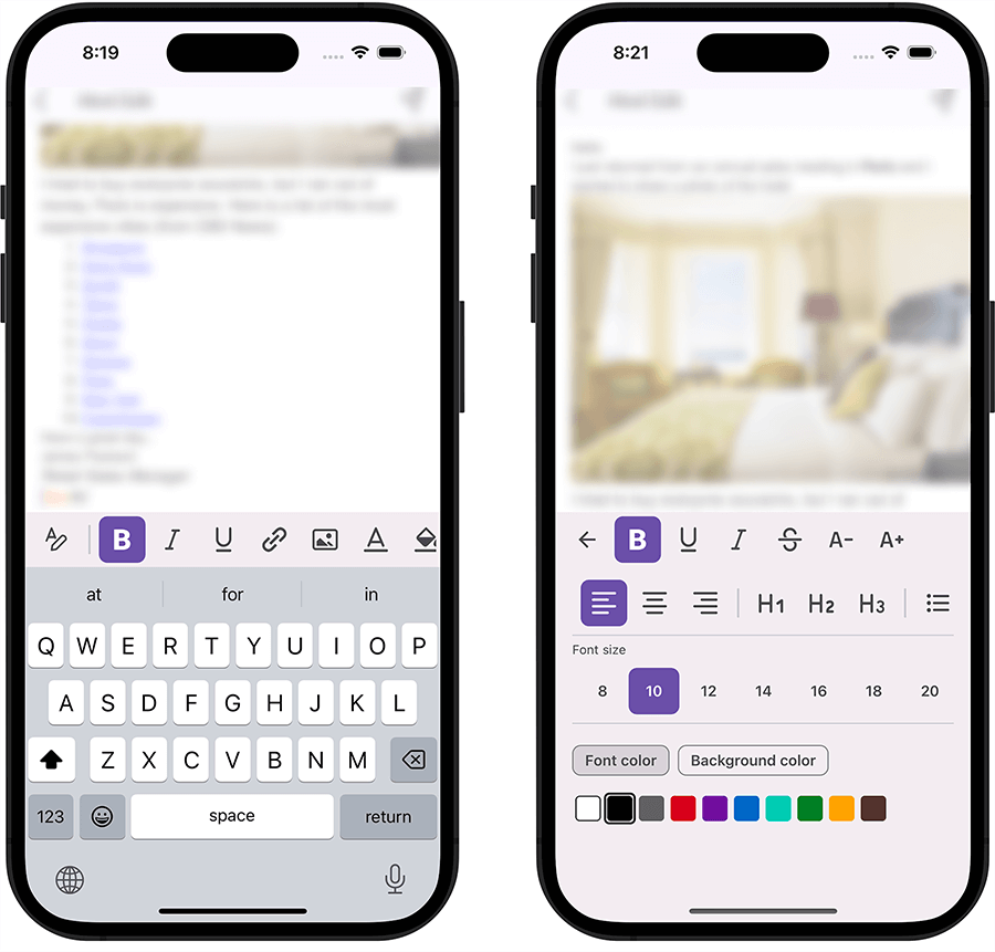
New HTML Edit Control
Our new HTML Editor allows you to display and edit formatted text. As its name implies, the control uses HTML as an internal data format. Features include:
- Text Formatting (font size, font attributes, color, background, etc.)
- Insert Images
- Lists
- Headers
- Hyperlinks
- Toolbar
- Comprehensive API
Documentation
GitHub Example: HTML Edit
New Circular Gauge Control
Our new Gauge control (RadialGauge
Documentation
New Image Edit Control
With our new Image Editor (ImageEdit
Documentation
New Toolbar Control
The .NET MAUI Toolbar (DXToolbar
- Button
- Navigation Button
- Toggle Button
- Color Picker
- Text
- Separator
- Custom Commands (Items)
Our Toolbar control follows Material Design guidelines so you can deliver the best possible UI/UX.
Documentation
New Radial Progress Bar
The Radial Progress Bar allows you to communicate application state and provide feedback for data intensive operations to your users. The control supports indeterminate state and ships with various customization options (including animations, appearance and layout settings).
Documentation
New Layout Panels
v23.2 includes three adaptive layout containers so you can quickly arrange UI controls in your mobile application.
Documentation
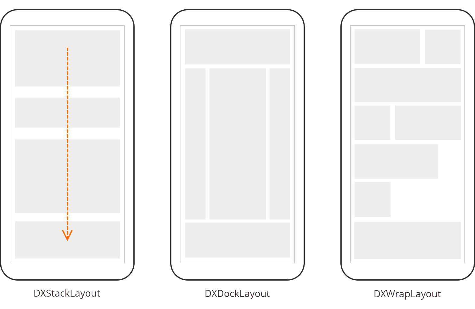
#Stack Layout
The Stack Layout panel (DXStackLayout
And yes, you can draw a border without incorporating a separate Border element to simplify the visual tree.
Documentation
#Dock Layout
The Dock Layout panel (DXDockLayout
Documentation
#Wrap Layout
The Wrap Layout panel (DXWrapLayout
Documentation
#Safe Keyboard Area View
The SafeKeyboardAreaView control automatically reduces content height when the device keyboard appears (preventing overlap issues). You can also display custom content in the device keyboard area, freeing up more space for UI elements.
Documentation
New Button Control
A completely new DXButtonSimpleButton
- New button states (accent, outlined, filled, text, and toolbutton)
- Support for custom themes (based our new theme engine)
- Customizable icon size
Documentation
New Toggle Button
Our new Toggle Button (DXToggleButton
And yes, you can arrange Toggle Buttons in a radio group.
Documentation
Border
The Border (DXBorderBorderThickness
Documentation
Content Presenter
The Content Presenter control allows you to reuse your DataTemplate
Documentation
Color Selector
As its name implies, the Color Selector control allows users to select a color from available options. The Color Selector displays 10 preset color options (by default). Color options are fully configurable and are not limited to 10. You can add your own colors or create a completely custom color palette.
We also implemented beautiful color selection animations to improve the user experience.
Documentation
Separator
The Separator control is designed to visually separate UI elements (vertically or horizontally). You can specify its length, thickness, and margins. And yes, the Separator control supports our color themes, so you can ensure a consistent look and feel across your mobile app.
Documentation
Source Code
Our Universal Subscription now includes the source code of our .NET MAUI components.
You can download the source code using our Download Manager (active Universal subscription/license is required).
Miscellaneous Enhancements
#DateEdit Popup — Customize Buttons
You can use the DateEdit.PickerButtonAreaTemplate property to define a custom DataTemplate with a custom layout:
            <dxe:DateEdit ...>
              <dxe:DateEdit.PickerButtonAreaTemplate>
                <DataTemplate>
                  <HorizontalStackLayout >
                    <Button Text="Custom OK" BackgroundColor="Green" TextColor="White" Command="{Binding ConfirmCommand}" />
                    <Button Text="Custom Cancel" BackgroundColor="Red" TextColor="White" Command="{Binding CancelCommand}" />
                  </HorizontalStackLayout>
                </DataTemplate>
              </dxe:DateEdit.PickerButtonAreaTemplate>
            </dxe:DateEdit>
Elements declared in DataTemplate contain DateEditPickerButtonAreaViewModel
You can use this object's ConfirmCommandCancelCommandDateEdit
#CollectionView — New Events
Our Collection View includes a new Scrolled event. Handle this event to hide the toolbar or fast access buttons (FAB) when users begin scrolling the Collection View. This allows you to use screen space more efficiently.
We also added a new SwipeItemShowing event. This event allows you to hide specific swipe items based on a condition, giving you more UX-related control.
#Chips — Content Template
Use the Chip.ContentTemplate property to customize the inner content of Chips. We also introduced this property in our filter elements.
#Input Chip Group — TextChanged Event
The InputChipGroup
#Your Feedback Matters!
Please
login to complete the survey.
Survey Completed
Thank you for taking the time to complete this survey. Your responses have now been posted. If you want to follow up with additional information, feel free to send us an email at clientservices@devexpress.com anytime.
You've Already Completed This Survey
Our records show that you have already completed this survey. If you want to follow up with additional information, send us an email at clientservices@devexpress.com.
This survey has expired
If you want to share your feedback or request new functionality, please submit a new support ticket via the DevExpress Support Center. We’ll be happy to follow up.
Your feedback matters.
Please, review the description of Cross-Platform .NET App UI (XAF)-related features below and leave your feedback at the end of the section.
Go to the survey now.
Common Enhancements
#.NET 8 Support
XAF Blazor/WinForms UI and DevExpress Web API Service now supports .NET 8.
#End of .NET Standard 2 Support
With our next major update (v23.2, set for release in December 2023), our assemblies will not be built against this target.
Read our Breaking Change notice for additional information.
#DevExpress Drawing Library Support for Straightforward non-Windows Development
We eliminated use of System.Drawing.Common
Breaking Change
#Multi-Tenancy Module for Blazor and WinForms — Official Release
The Multi-Tenancy Module was first introduced in June 2023 as a Community Technology Preview (CTP). This module helps developers create multi-tenant or SaaS-ready XAF Blazor and WinForms applications (.NET 6+) that target a single host database and one database per tenant. To incorporate this capability, you simply need to write a few declarative lines of code instead of writing hundreds of lines of code.
Our v23.2 major update marks the first official release of the DevExpress Multi-Tenancy Module. The first release supports straightforward CRUD usage scenarios and includes the following features:
- XPO ORM support (v23.1 supported only EF Core).
- Authentication: Log in with an email / OAuth2 account (like Microsoft Entra ID or Google), and a password (the domain automatically resolves the tenant and its storage).
- Tenant Isolation: Multi-tenant app with multiple databases (a database per tenant).
- Database Creation: The application automatically creates a tenant database and schema at runtime (if the database does not exist).
Documentation Example
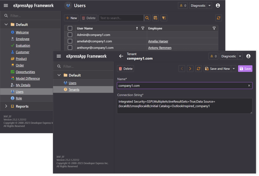
#Pre-Built Code & Project Error Diagnostics
We introduced XAF/XPO error diagnostics (shipped as part of the DevExpress.ExpressApp.CodeAnalysis NuGet package) in v23.2.2+ for new and existing XAF .NET Framework projects using the Project Converter (Breaking Change). This enhancement should save you time in Visual Studio or validate your build quality using your CI/CD workflows.
Documentation
#MARS Support for PostgreSQL and MySQL in EF Core
We now support Multiple Active Result Sets (MARS) for PostreSQL, MySql, and other database providers that do not support MARS natively. Our interceptor allows EF Core apps connected to these database providers to execute multiple query batches on a single database connection.
Blazor UI Enhancements
#Grid List Editor Enhancements
We now support the following features in our DxGridListEditor
- Context menu for grid headers and rows (just like WinForms/WebForms counterparts). For instance, Column Chooser, Hide Column, Group by Column, Show Auto Filter Row, Filter Editor, or Reset View Settings commands are available in the context menu for grid headers. Grid rows ship with New, Clone, Delete, Export To, and other menu items.
- Images for enumerations in Auto Filter Row.
- Add hyperlinks for reference/lookup properties in ListView (to open a detail form for a related record faster).
- In-place / Grid row-based actions. (Documentation)
- Double-click to open a DetailView from a ListView. (Documentation)
- Grid height is now set to 100%. This change removes external vertical scroll bar (you can now scroll vertically using native Grid capabilities).
Grid List Editor Enhancements - XAF for Blazor
 Context menu
 Images for enumerations in Auto Filter Row
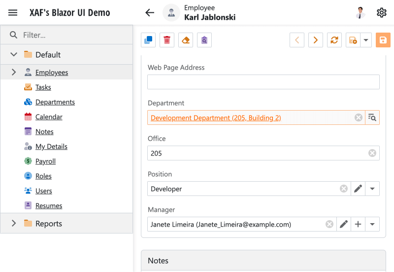 Hyperlink for reference/lookup properties
 In-place / Grid row-based actions
#Scheduler Module — Official Release
The Blazor Scheduler Module was first introduced in June 2023 as a Community Technology Preview (CTP). Our v23.2 update marks its official release and includes the following enhancements:
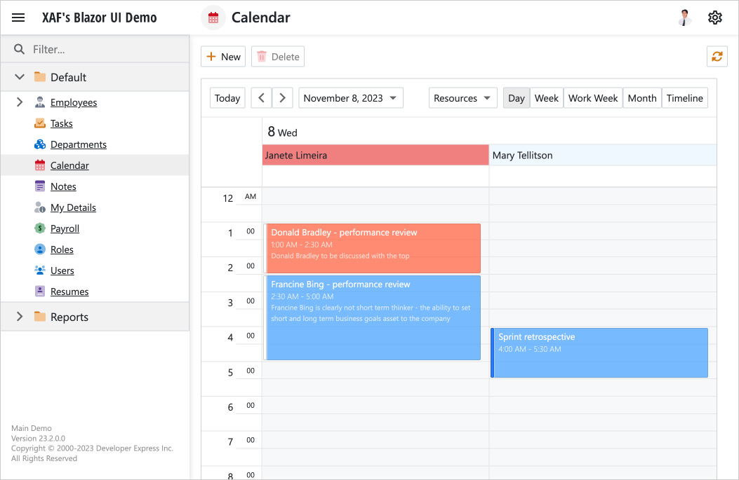
Examples:
#Lookup Property Editor Enhancements
We improved our Lookup Property Editor to better address the following usage scenarios:
- Quickly search data against a single (or multiple) field - just like XAF Web Forms. To deliver this functionality, our lookup editor includes a Search button, and this button displays a separate Find window with a standard data grid and search controls. This Find window also allows you to create new records using the standard New Action.
- Use all criteria language features for EF Core and XPO ORM without limitations. Unlike a simple combo box, the Find window hosts the standard data grid with all associated features, including server mode.
- Open a complete detail form for a related record (currently selected lookup value) using a hyperlink. This feature is helpful for those who do not want to view and edit related details in a separate window (currently provided by the Edit button).
- UX/UI of link dialogs. In
AutoLookupSmallCollectionItemCount
Documentation
#Splitter in Master-Detail Mode (List View)
The "split view" now displays a splitter. Users can use the splitter to resize side-by-side master and detail views (when IModelListView.MasterDetailMode
Splitter position is saved in the Application Model in the IModelListViewSplitLayout.ViewsOrder property (end-user settings are stored in the database by default when the Security System is enabled).
Documentation
#Popup Window Enhancements
Our popup DetailView supports the following features:
#Hot Reload Support
XAF Blazor apps now support Hot Reload, a feature of Visual Studio debugger. Popular scenarios include:
- modify markup or logic inside your custom Razor components;
- modify methods of your View Controllers/Actions, like the Execute event handlers.
Hot Reload reflects the changes in the application UI immediately. This saves time and improves productivity while debugging, because restart of your app is no longer needed.
NOTE: Hot Reload is not in effect when the entire application structure changes or XafApplication requires a setup/restart. This includes code changes in Startup.cs, Module.cs, BlazorApplication.cs, XAFML, JSON, and other configuration or resource files, add/delete/modify the structure of ORM business classes and XAF controllers. For more information, refer to the Microsoft documentation: Unsupported changes to code.
Documentation
#Miscellaneous Usability Enhancements
#Tutorials — Deploy XAF Apps to Azure, Windows, Linux
We prepared comprehensive step-by-step guides to help you host and publish ASP.NET Core Blazor Server XAF applications to Azure App Service and Internet Information Service (IIS):
Deployment Troubleshooting Guide
Security Enhancements
#OAuth2 Authentication Providers in WinForms UI
Our Security Module within XAF's WinForms UI now supports Windows and Azure Active Directory, Microsoft 365, Google, GitHub, and other OAuth2 authentication providers. The Login form automatically renders UI controls based on authentication settings.
Documentation
#XAF Web Forms UI — Content Security Policy (CSP) Support
XAF's ASP.NET Web Forms UI supports Content Security Policy (CSP). CSP helps developers automatically detect and mitigate specific security risks, including Cross-Site Scripting (XSS) and data injection attacks.
Documentation
Simplified Security Configuration for Reference Properties
We made it easier to protect FileDataMediaDataObjectResumePortfolioFileDataFileData
Documentation
#Enhanced Data Security for Audit Trail and Model Difference Modules
- XAF's Audit Trail and Model Difference modules with Middle Tier Security now operate on the application server side. Auditing data on the server instead of the client enhances data protection and overall security posture of XAF UI apps powered by XPO (EF Core-based apps already support this natively).
- XAF's Audit Trail and Model Difference modules with 2-Tier Security (Integrated Mode) no longer require wide type permissions for their service business types (AuditDataItemPersistent and ModelDifferenceXXX). You can simply add object permissions with the
UserId
            defaultRole.AddObjectPermission<ModelDifference>(SecurityOperations.ReadWriteAccess,
                "UserId = ToStr(CurrentUserId())", SecurityPermissionState.Allow);
            defaultRole.AddObjectPermissionFromLambda<AuditDataItemPersistent>(SecurityOperations.Read,
                "UserObject.Key = ToStr(CurrentUserId())", SecurityPermissionState.Allow);
- The Solution Wizard generates the updated permission code for audit events and model differences to protect against unauthorized data access (administrators have full access to all data).
Documentation
#"Brute Force" Attack Protection
XAF UI for Blazor and WinForms and Web API Service include built-in "Brute Force" attack protection. Your apps can prevent unauthorized attempts to log in and access data by guessing user passwords multiple times. You can implement the ISecurityUserLockout interface in your application user class, and configure the maximum number of failed login attempts in settings.
#Sensitive Data Is Removed from Log Files by Default
We modified the structure of records that we output to the audit log to exclude sensitive data. Please review our Breaking Change notice for additional information in this regard.
#Your Feedback Matters!
Please
login to complete the survey.
Survey Completed
Thank you for taking the time to complete this survey. Your responses have now been posted. If you want to follow up with additional information, feel free to send us an email at clientservices@devexpress.com anytime.
You've Already Completed This Survey
Our records show that you have already completed this survey. If you want to follow up with additional information, send us an email at clientservices@devexpress.com.
This survey has expired
If you want to share your feedback or request new functionality, please submit a new support ticket via the DevExpress Support Center. We’ll be happy to follow up.
Your feedback matters.
Please, review the description of DevExpress Web API Service features below and leave your feedback at the end of the section.
Go to the survey now.
Endpoints for Business Object Methods in Web API Service
Our Web API Service automatically generates endpoints for business object methods (decorated with the ActionAttribute). These endpoints can accept multiple parameters and are automatically displayed in the Swagger UI. This feature improves code sharing and saves time/code lines (since you do not need to create custom Web API controllers manually).
Documentation
#Your Feedback Matters!
Please
login to complete the survey.
Survey Completed
Thank you for taking the time to complete this survey. Your responses have now been posted. If you want to follow up with additional information, feel free to send us an email at clientservices@devexpress.com anytime.
You've Already Completed This Survey
Our records show that you have already completed this survey. If you want to follow up with additional information, send us an email at clientservices@devexpress.com.
This survey has expired
If you want to share your feedback or request new functionality, please submit a new support ticket via the DevExpress Support Center. We’ll be happy to follow up.
Navigation
#Quick Navigation
New navigation providers:
- Calls - finds all places where the active method (or active method call) is invoked, ignoring declarations and overrides
- Reads - finds all read references to the active variable or property
- Exports - finds all places where starting type is exported as a MEF contract
- Imports - navigates directly to the type declaration of the active variable or property, or to the declaration of the active method’s return type
#References Tool Window Enhancements
The References tool window results are now sorted, and the search origin is now highlighted in the results, showing where you were when you invoked the references search. This improves readability and makes it easier to find related references.
Templates
#Dynamic Numbers
CodeRush now supports dynamic numbers inside templates. This means a template can consist of letters and any number, and that number can be referenced in the code generated by that template.
This also impacts templates that work with primitives (e.g., "s" for Set and "r" for Return).
So for example, if you want to return 1 from a method, you can expand the "r1" template.
Or if you want set a variable that's on the clipboard to -3, you can expand the "s-3" template. For more information on the "s" template, see the "S" for SET video:
Refactorings and Code Clean Up
#Support for Nullable Reference Types
All refactorings and code cleanup rules now correctly support nullable reference types.
#Inline Method and Inline Lambda Enhancements
Inline Method and Inline Lambda refactorings now support additional scenarios, including inlining of local functions.
#Support for Concurrent .NET Types
We have added type shortcuts for a number of Concurrent .NET types:
- cq - ConcurrentQueue
- cs - ConcurrentStack
- cb - ConcurrentBag
- cd - ConcurrentDictionary
These type shortcuts work with all the templates expecting a type. So for example, if you want to declare a property that is a ConcurrentBag of strings, you could use "pcb.s". If you want to declare a method that returns a ConcurrentQueue of a class name that has been copied to the clipboard, use "mcq.". To learn more about CodeRush Templates, see the following videos:
#Better Support for Task and Task<T>
- The "t" mnemonic now represents the Task type (e.g., "mt" for a method returning Task, "tt" for a type reference to "Task", etc).
- The "t.?Type?" mnemonic is for generic Task<T> (e.g., "mt.s" for methods returning a Task<string>, "tt.b" for type reference to Task<bool>, etc.).
Refactorings and Code Clean Up
#Support for Nullable Reference Types
All refactorings and code cleanup rules now correctly support nullable reference types.
#Inline Method and Inline Lambda Enhancements
Inline Method and Inline Lambda refactorings now support additional scenarios, including inlining of local functions.
Build Output Highlighting
Timestamps are now colorized.
Download Your Copy Today
Once you're ready to upgrade, simply login to the DevExpress Client Center and download the appropriate installer to proceed.
Download Free TrialVCL Demos v23.2
Your feedback matters.
Please, review the description of VCL-related features below and leave your feedback at the end of the section.
Go to the survey now.
High DPI / SVG Support
#Windows 11 Skin (aka WXI) and Other High DPI Enhancements
In our v23.2 development cycle (from June to November), we have addressed more than 130 bugs in our show-case demos. A good portion of these bugs relates to our newest WXI skin/SVG/High DPI layouts. Our effort in this regard should improve the look and feel of apps powered by DevExpress VCL UI components. I hope you will notice these changes in our Mail Client, Grid, TreeList, Scheduler - and other demos.
This "bug smashing" release is in preparation for future support of WXI Compact and other modern vector skins in 2024.
See Resolved Issues
#Enhanced SVG Image Picker at Design Time
We revamped our image selector to support High DPI and SVG usage scenarios.
Improved Icon Organization
We added tabs for different icon collections (the Vector Icons tab is now the default).
Font Icon Images
Windows 10/11 contains hundreds font icons (Segoe MDL2 Assets in Windows 10 and Segoe Fluent Icons in Windows 11 fonts). You can now use our Image Picker to assign font icon images to individual UI controls/elements or add them to our image collections. And yes, you can color these icons using the command at the bottom right of the tab.
Easy Integration of Custom / User-Defined Icons
Our image selector now supports custom or user-defined icon collections (notice the new + and - buttons below). This is helpful when want to use Google Material, Font Awesome, or icons from your own designer.
NOTE: Custom/3rd-party icons may require pre-processing with our SVG Icon Builder tool to adapt these icons to DevExpress VCL skins/palettes. Our built-in tool adjusts icon size and color settings to match DevExpress guidelines.
#Modernized Skin and Palette Selectors for Bar and Ribbon Menu
With new vector skins like WXI, and SVG support, we retired our old skin and palette selector in favor of the one pictured below (inspired by our WinForms implementation).
The new selector allows you to exclude old raster skins and display color instead of just the palette name. The new selector is also configurable in code or at runtime (for instance, to only display certain groups of skins). You can test the capabilities of this new selector in nearly all VCL demos.
Chart Control
#Enhanced Label Overlapping for Values in XY Chart Diagrams
In our chart demos (bar and line), you can now find various settings under the "Label Overlapping" section at the right: Hide Overlapped, Justify Around Point, Justify All Around Point. This will match the behaviors found in our WinForms Chart Control.
Documentation
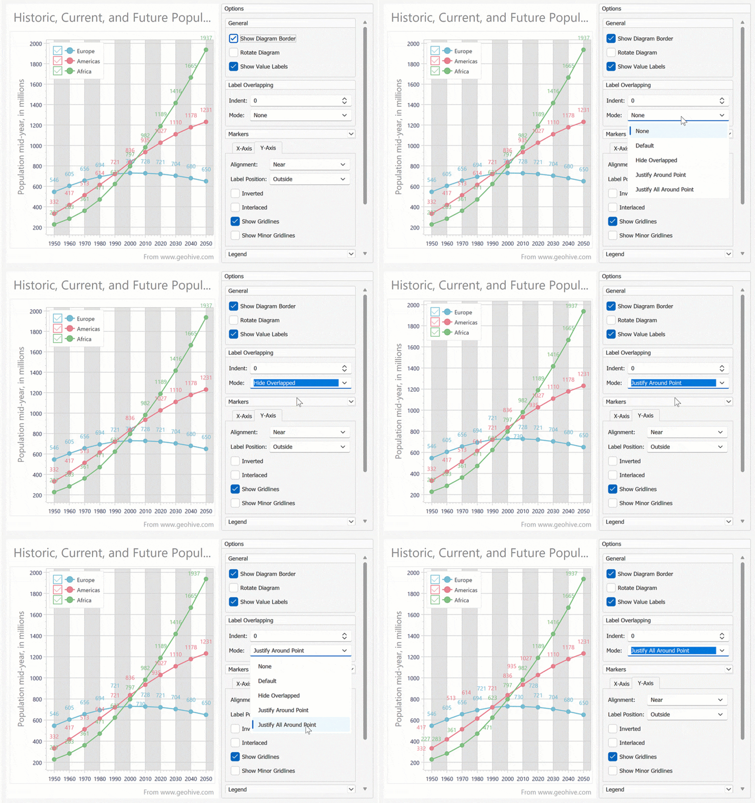
#Tooltips
As you may recall, in our v23.1 release cycle, we made it possible to manually incorporate chart tooltips via hit-testing events. In v23.2, we supported this popular requirement natively. Please review the following animation for more information or explore our chart demos live (bar, line, area, and pie).
Documentation
#Export Data
VCL charts can now export data using multiple file formats (export to SVG, PDF, Excel, Word, etc). You can also export charts programmatically using relevant API calls (ExportTo...
Documentation
#Print Data
Our VCL Chart control includes built-in Print Preview, Print, and Export to PDF commands. You can also print charts programmatically.
Documentation
#Crosshair Cursor
A crosshair cursor allows users to track series or indicator data point coordinates within the VCL Chart Control. It consists of argument and value lines, associated labels, and data point labels.
Documentation
Miscellaneous Enhancements
#RAD Studio 12.0 Athens Support
DevExpress VCL v23.2 officially supports Delphi 12 and C++Builder 12 (both 32-bit and 64-bit).
Breaking Change
#Enhanced Read-Only Style and Behavior for Data Editors
Over 55 data editors from our ExpressEditors Library ((TcxDBComboBox, TcxDBMaskEdit, TcxDBSpinEdit, etc.) now provide the StyleReadOnly property. This option allows VCL developers to customize style settings for the read-only editor state (without the need to modify sources or override internal portions of our editors).
We also added the AllowDropDownWhenReadOnly property to TcxComboBoxPropertiesTcxColorComboBoxPropertiesTcxFontNameComboBoxPropertiesTdxColorEditProperties
#Images for Bar and Ribbon Menu Designers
We added images for menu items and sorted them alphabetically so that it is easier for you to locate/distinguish different menu item types (much like in WinForms). Deprecated menu item types are moved to a separate group.
#Disable Hot Track for Editor Buttons
You can now style an editor button (TcxEditButton) so that it looks like an image without any hot-track or focus effects. For instance, this is helpful to implement a "Search" button in the dropdown editor.
#Style Support for Standalone Data Editors Using the WXI Skin
Standalone VCL editors placed on a form apply styles more effectively when our newest Windows 11 theme is used. For instance, a background color style is applied to the entire editor box region, including editor buttons (much like VCL Grid, Tree List, Ribbon and other container control counterparts).
#Your Feedback Matters!
Please
login to complete the survey.
Survey Completed
Thank you for taking the time to complete this survey. Your responses have now been posted. If you want to follow up with additional information, feel free to send us an email at clientservices@devexpress.com anytime.
You've Already Completed This Survey
Our records show that you have already completed this survey. If you want to follow up with additional information, send us an email at clientservices@devexpress.com.
This survey has expired
If you want to share your feedback or request new functionality, please submit a new support ticket via the DevExpress Support Center. We’ll be happy to follow up.