Accessibility Enhancements
Accessibility support remains a top engineering priority. Accordingly, we enhanced keyboard navigation/screen reader support, extended automation capabilities and other accessibility-related features to ensure better compliance with standards outlined in WCAG.
This release includes enhancements across most of our desktop and web component suites:
Support of New .NET DateOnly and TimeOnly Types Across UI Platforms
We now support DateOnly and TimeOnly types in data-aware UI controls (such as Data Grid, Tree List, Date and Time Editors) for the following UI platforms in .NET Core / .NET 6+ apps.
Thanks to changes at core levels (our DevExpress.Data and DevExtreme.AspNet.Data libraries), we now support these data types for our client/in-memory and server mode data sources (both of which are used by multiple UI controls listed above):
- EntityServerModeSource / EntityInstantFeedbackSource
- LinqServerModeSource / LinqInstantFeedbackSource
- GridDevExtremeDataSource (for ASP.NET Core / DevExtreme and Blazor-based controls)
You can sort, group, and filter data (and other capabilities) against DateOnly and TimeOnly values. We also extended our criteria language as follows:
You can use date/time-related functions (such as AddHours, GetDays, DateDiffDays, etc.) in filter expressions and unbound columns.
You can now wrap DateOnly/TimeOnly constants in '#' and '!' for string filter expressions:
[OrderDate] >= #!2018-03-22!# && [OrderTime] >= #!18:22:00!#
Due to the following Microsoft-related breaking change these new data types are of special importance to EF Core 8 developers: SQL Server date and time now scaffold to .NET DateOnly and TimeOnly. DevExpress customers will benefit from this new functionality even if NOT using EF Core 8 for data access – it is just important that the underlying database or IQueryable provider supports the new data types (like Microsoft SQL Server with EF Core 8). Here is a quote from Microsoft about the general value for .NET developers:
DateOnly and TimeOnly were introduced in .NET 6.0, and are a perfect match for mapping the database date and time types. DateTime notably contains a time component that goes unused and can cause confusion when mapping it to date, and TimeSpan represents a time interval - possibly including days - rather than a time of day at which an event occurs. Using the new types prevents bugs and confusion, and provides clarity of intent.
Note: Microsoft and third-party package vendors did not backport DateOnly and TimeOnly types on .NET Framework. Additionally, we do not officially support this feature for .NET Framework and OData/XPO data sources within both frameworks. We encourage you to migrate to .NET 6+ to benefit from the new data types. Technically, we share parts of our codebase between .NET Framework and .NET, so do not be confused that our DevExpress.Data library for .NET Framework includes our own "shim" DateOnly and TimeOnly types. If you experience any conflicts with third-party compatibility packages (like one or two for unofficial support), we recommend that you remove these packages.
.NET and .NET Framework — Migration from Newtonsoft.Json to System.Text.Json
In our v24.1 release cycle, the following DevExpress products will use Microsoft’s System.Text.Json instead of Newtonsoft.Json for JSON serialization-related tasks in runtime code:
Data Access Library: BI Dashboards (DashboardJsonDataSource) and Reporting (JsonDataSource) for .NET 6+ WinForms, WPF, Blazor, ASP.NET Core apps (.NET Framework apps will continue to use the Newtonsoft.Json library. We expect to switch to System.Text.Json in our v24.2 release cycle).
Breaking Change
Data Access Library for .NET 6+ and .NET Framework DevExtreme, Blazor and ASP.NET Core apps (a System.Text.Json-compatible version of DevExtreme.AspNet.Data v4.0.0+ is now available).
Breaking Change
Backend Web API Service for .NET 6+ non-XAF apps (DevExtreme, Blazor, .NET MAUI, etc.) and XAF apps.
Breaking Change
Maps in .NET 6+ WinForms in WPF, Blazor, ASP.NET Core apps (.NET Framework apps will continue to use the Newtonsoft.Json library. We expect to switch to System.Text.Json in our v24.2 release cycle).
Breaking Change
- Blazor Rich Text Editor (no Breaking Changes).
Our design-time code (wizards, designers and tools) may still continue to use Newtonsoft.Json, because of dependencies within Visual Studio (some design-time services still rely on Newtonsoft.Json, but we believe this will change in the future). Remaining .NET Framework products that currently rely on the Newtonsoft.Json library, will likely switch to System.Text.Json in the future. Here we rely on the minimally supported .NET Framework version for DevExpress products, which will likely change from 4.5.2 to 4.6.2 in v24.2.
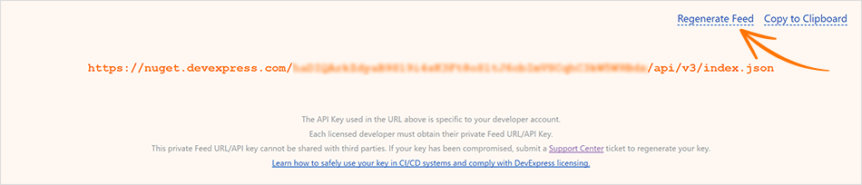
Regenerate Your NuGet API Key (Feed)
To regenerate the NuGet API key, navigate to https://nuget.devexpress.com/ and click the Regenerate Feed link.
Your NuGet API key is sensitive information, and you should protect it from unauthorized use by untrusted third parties. If you have leaked your NuGet API key, you need to regenerate it as soon as possible. Cases or reasons to regenerate a NuGet API key may include, but are not limited to, the following:
- You included your NuGet API key in a public forum post, GitHub repository, log files, or other authorized place by mistake.
- Members of your team who previously had access to your NuGet Feed have left the company.
- You know or suspect that your NuGet API key has been stolen or compromised.
DevExpress NuGet Server - Enhanced Documentation
We updated our online documentation to address popular usage scenarios based on user feedback. We clarified which DevExpress NuGet feed (offline or online) to use for Windows, Mac OS, Linux:
Your feedback matters.
Please, review the description of WinForms-related features below and leave your feedback at the end of the section.
Go to the survey now.
DateOnly & TimeOnly Type Support
DevExpress WinForms data-aware UI controls (such as our Data Grid and TreeList) and the Date Editor now support DateOnly and TimeOnly data types (in .NET applications). These data types offer the following advantages (versus the traditional DateTime type): usage clarity, improved database compatibility, less space during serialization, and the ability to mitigate potential errors/inconsistencies related to different time zones.
Built-in DateOnly/TimeOnly support extends to:
- UI Elements Related to Data Filtering (Column Filter Popup, Filter Editor, Expression Editor, Automatic Filter Row)
- Conditional Formatting Rules
- Data Summaries
- Data Grouping
- Unbound Columns
- Masks
- Search
-
Criteria Operators
gridView.ActiveFilterString = "[Date]=#!2022-02-01!#";
We also added DateOnly/TimeOnly type support within our server-based data sources:
- EntityServerModeSource / EntityInstantFeedbackSource
- LinqServerModeSource / LinqInstantFeedbackSource
You can sort, group, and filter data in server mode sources against DateOnly and TimeOnly values. And yes, you can use date/time-related functions (such as AddHours(), GetDays(), DateDiffDays()) in filter expressions and unbound columns.
Data Grid
#Merged Cell Editing
As its name implies, users can now simultaneously edit all cells in a merged range or modify separate cells (in GridView and BandedGridView) as needs dictate. Use the new MergedCellEditMode property to activate this feature and specify how users edit merged cell data.
Options include:
VisibleCells – Edits data cells in a merged range.
FocusedCell – Edits data cells in a merged range for the focused row.
Disabled
using DevExpress.XtraGrid.Views.Grid;

// Allows users to edit data cells in a merged range.
gridView1.OptionsView.MergedCellEditMode = MergedCellEditMode.VisibleCells;
#Display Custom UI Elements in the Find Panel
v24.1 includes new APIs to display predefined and/or custom UI controls in the Find Panel. With this new option, you can build fully customizable/personalized interfaces when using the DevExpress Find Panel.
Use view.FilterPanelItems to introduce custom Find Panel UI elements in your WinForms app:
// This code snippet comes from the Find Panel module in our WinForms Data Grid demo (v24.1).
CheckButton showCustomButton = null;
void ceShowCustomButton_CheckedChanged(object sender, EventArgs e) {
    CheckEdit customButton = sender as CheckEdit;
    if(customButton.Checked) {
        showCustomButton = view.FindPanelItems.AddCheckButton(customButtonName, null, view.OptionsFind.Behavior != FindPanelBehavior.Search,
            (button, args) => {
                CheckButton checkButton = button as CheckButton;
                view.OptionsFind.Behavior = checkButton.Checked ? FindPanelBehavior.Filter : FindPanelBehavior.Search;
                checkButton.ToolTip = "Find Panel Mode";
                icbFindPanelBehavior.EditValue = view.OptionsFind.Behavior;
            });
        showCustomButton.ImageOptions.ImageUri.Uri = "Filter;Size16x16;Svg";
    }
    else {
        showCustomButton = null;
        view.FindPanelItems.RemoveItem(customButtonName);
    }
    icbFindPanelBehavior.Enabled = showCustomButton == null;
}
#Hide Specific Filters from Excel-inspired Filter Dropdown
The WinForms Data Grid control exposes a ShowFilterPopupExcel event and allows you to hide specific filter options from "Filters" and "Values" tabs of our Excel-style Filter Dropdown. v24.1 adds a e.HideFilter(filterType) method to event arguments for advanced customization of the filter menu. Use this method to hide unnecessary filter operators from the "Filters" tab.
We also introduced this feature in our WinForms TreeList control.
void gridView1_ShowFilterPopupExcel(object sender, DevExpress.XtraGrid.Views.Grid.FilterPopupExcelEventArgs e) {
    if (e.Column.FieldName == "UnitPrice") {
        e.HideFilter(DevExpress.Utils.Filtering.Internal.CustomUIFilterType.BelowAverage);
        e.HideFilter(DevExpress.Utils.Filtering.Internal.CustomUIFilterType.Between);
        e.HideFilter(DevExpress.Utils.Filtering.Internal.CustomUIFilterType.BottomN);
        // ...
    }
}
#Display a Custom DevExpress Popup Menu
We've made it easier to display the DevExpress PopupMenu for individual Data Grid UI elements.
In previous versions, you had to customize the built-in menu (add/remove menu items) within the control's PopupMenuShowing event. With v24.1, you can display a custom menu (created and customized at design time or runtime) using the new e.ShowCustomMenu method:
void gridView1_PopupMenuShowing(object sender, PopupMenuShowingEventArgs e) {
  if (e.MenuType == GridMenuType.Column) {
      popupMenu_Column.Tag = e.HitInfo;
      popupMenu_Column.MenuCaption = $"{e.HitInfo.Column}";

      e.ShowCustomMenu(popupMenu_Column);
  }
}
API enhancements extend to: DevExpress TreeList, Vertical Grid (Property Grid), and Pivot Grid.
How to: Implement a Custom Menu in the DevExpress WinForms Data Grid
#Export Cell Images to Excel
The WinForms Data Grid control now exports images (raster and SVG) displayed within cells of bound and unbound columns to XLSX in data-aware export mode. Cell images are exported as a Byte[] array. To activate this feature, set the AllowCellImages property to DefaultBoolean.True.
void btnExport_Click(object sender, EventArgs e) {
    DevExpress.XtraPrinting.XlsxExportOptionsEx options = new DevExpress.XtraPrinting.XlsxExportOptionsEx();
    options.AllowCellImages = DevExpress.Utils.DefaultBoolean.True;
    advBandedGridView1.ExportToXlsx("grid_export.xlsx", options);
}
You can customize cell images or replace values with images (based on export conditions) before the Grid Control generates the output document. Handle the CustomizeCell event as follows:
void Options_CustomizeCell(DevExpress.Export.CustomizeCellEventArgs e) {
    if(e.ColumnFieldName == "Photo" && e.Value == null) {
        e.Value = XtraEditors.Controls.ByteImageConverter.ToByteArray(imageCollection1.Images["car"]);
        e.Handled = true;
    }
}
#Calculate the Best Size
Designed to address common layout-related dev tasks, the new CalcBestSize(maxSize, checkScrollInfo) method calculates the maximum allowable size of the Grid Control (to display as many data rows and columns as possible).
#Custom Tile Painting for the DevExpress TileView (Kanban)
You can now customize tile appearance by handling the new TileView.CustomDrawTile event. With its comprehensive event arguments (APIs), you can easily change border shape and color or draw custom UI elements to address specific design requirements/user preferences.
And yes, you can render HTML and CSS templates inside tiles as needs dictate:
#Display Tooltips for Trimmed Conditional Formatting Rules
If formatting rule name is larger than the width of the cell, the rule will appear in a tooltip when you hover over the cell:
#Annotate Conditional Formatting Rules
With this option, you and your end-users can include descriptive text for conditional formatting rules, offering insights into the purpose and logic behind each rule. Implementing text descriptions for conditional formatting rules is simple and intuitive. Users can add explanations directly in the Formatting Rule Editor, ensuring that context is available each time they view or change rules.
To enable this feature, set the OptionsView.AllowFormatRuleDescription property to true.
Note: we also introduced this feature in our WinForms TreeList, VerticalGrid, and PivotGrid controls.
TreeList
#Expand Nodes on Search
With this new feature, users can effortlessly locate specific TreeList nodes, even if they are collapsed within a complex hierarchy. When users initiate a search within the DevExpress TreeList, the TreeList automatically expands relevant nodes to display search results (in previous versions, you could only search through expanded nodes).
Use the TreeList's OptionsFind.ExpandNodesOnSearch setting to enable/disable the "Expand Nodes on Search" feature.
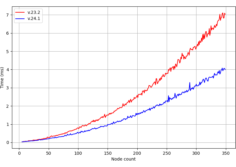
#Improved Performance for Large Data Sources
We improved WinFroms TreeList performance to better address usage scenarios when large data updates are made to the underlying data source.
The following internal test results illustrate performance improvements:
#Auto-Filter Row Focus Retention
This addition to our WinForms TreeList control ensures that user focus remains unaffected when using the Auto-Filter Row, even during data updates.
In previous versions, the TreeList automatically closed the active editor in the Auto-Filter Row when updating data. In v24.1, the editor remains active (users can edit filter criteria during data updates).
Accordion
#Display Item Captions in a Minimized State
We added a new CaptionShowMode property to control how the item caption is displayed when the Accordion control is minimized/collapsed.
Options include:
- Below Image
- Above Image
- None
The new CaptionImageIndent property specifies the indent between the image and caption.
#Configurable Item Indents
With this new option, you can introduce fully personalized side navigation logic. We added the ChildIndentStartLevel property. This property specifies the hierarchy level that starts the indentation of child elements.
We also implemented a new QueryElementIndent event that allows you to adjust the indent for specific accordion items based on design preferences/requirements.
Ribbon & Bars
#Page Key Tips
We added a new ShowPageKeyTipsMode property. Use this property to configure the display of page key tips within the Ribbon UI. This enhancement allows users - who prefer to use keyboard shortcuts instead of mouse input - to quickly navigate through different Ribbon sections and access specific commands (without unnecessary keystrokes).
Options include:
Hide - Hides key tips for all Ribbon pages.ShowOnMultiplePages - Displays key tips only if the Ribbon UI displays multiple pages.Show (Default) - Displays key tips for all visible Ribbon pages and for the selected page (even if the selected page is hidden).
#BarCheckItem – Checked-state Image
You can now specify different images (bitmap or SVG) for checked and unchecked states of checkbox items (BarCheckItem).
New APIs include:
#Press Enter to Execute a Command
We extended available user interactions within the command search box. Users can execute commands without the need for additional clicks or interactions. Handle the new SearchMenuEnterPressed event to execute a command based on freely written text or the first found command instantly when the user performs a search and presses the Enter key.
#Manage and Display Relevant Commands within the Search Menu Popup
Our Ribbon Control exposes a CustomizeSearchMenu event. This event allows you to implement custom logic to determine which commands must appear in search results. v24.1 extends the event's arguments to simplify customization.
New APIs include:
e.AddHeader(string caption) – Displays the header with a specific caption.e.AddItem(BarItem item) – Displays the specified command in search results.e.ShowNoMatchesItem – Specifies whether to display “No matches found” when a search query does not return results.
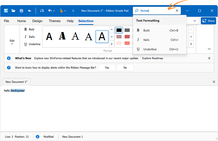
void ribbonControl1_CustomizeSearchMenu(object sender, RibbonSearchMenuEventArgs e) {
    if(e.SearchString.ToLower() == "format") {
        e.AddHeader("Text Formatting");
        e.AddItem(ribbonControl1.Items["iBold"]);
        e.AddItem(ribbonControl1.Items["iItalic"]);
        e.AddItem(ribbonControl1.Items["iUnderline"]);
        e.ShowNoMatchesItem = false;
    }
}
We introduced the UseCustomRibbonSearch property for those who prefer to generate search results from scratch. When set to true, our Ribbon Control does not auto-populate search results (e.Menu.ItemLinks). You won't need to clear pre-built search results before adding your own commands.
Use the RibbonControl.OptionsSearchMenu property to access search-related settings. These include:
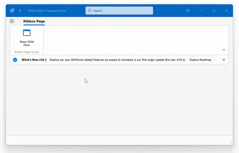
#Merge Ribbon Messages (MDI)
The Ribbon control of a parent Form displays messages (Office-inspired flyout notifications and alerts) of Ribbon controls displayed on child MDI Forms when merged:
Use the RibbonControl.MergedMessages property to access and manage merged messages.
Data Editors
#DateEdit – DateOnly Type Support
Our WinForms DateEdit control now supports the DateOnly data type. The following properties accept DateOnly values:
public DateOnly DateOnly { get; set; }public object MinDate { get; set; }public object MaxDate { get; set; }
#Simple Button – Custom Painting
We implemented a new CustomDraw event. Handle this event to paint our WinForms Simple Button manually.
void simpleButton1_CustomDraw(object sender, DevExpress.XtraEditors.ButtonCustomDrawEventArgs e) {
    if(e.Info.State == DevExpress.Utils.Drawing.ObjectState.Hot) {
        e.Cache.FillRectangle(Brushes.Orange, e.Bounds);
        e.DefaultDrawImage();
        e.DefaultDrawText();
        e.Handled = true;
    }
}
#Unified Padding Settings for Textbox-based Editors
v24.1 ships with consistent padding settings across all DevExpress Textbox-based data editor types (such as TextEdit, SpinEdit, DateEdit, MemoEdit, etc.). These settings allow you to maintain visual consistency without having to specify different padding options for different editor types.
Use Properties.TextPadding and Properties.Padding properties to specify text and content paddings within the text box.
#MemoEdit – Enhanced WXI Skin Visualization
We enhanced the visualization of MemoEdit borders and added scrollbar colorization within our WXI Skin. Accordingly, the DevExpress WinForms MemoEdit now supports DevExpress Skin colors.
memoEdit1.Properties.Appearance.BackColor = DevExpress.LookAndFeel.DXSkinColors.FillColors.Question;
#Distinguish User vs. Code Modifications to the Editor's Value
You can now distinguish between modifications made by a user and those made programmatically (in code) to the editor's value. We added a e.ModifiedByUser parameter to arguments for the EditValueChanging event:
void textEdit1_EditValueChanging(object sender, DevExpress.XtraEditors.Controls.ChangingEventArgs e) {
    if(e.ModifiedByUser) {
        // ...
    }
}
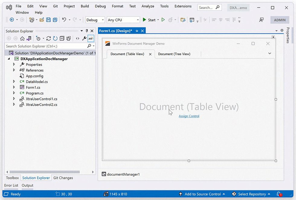
Document Manager
#Adding Content at Design-Time
Our Document Manager supports deferred loading. To leverage this capability, document content must be generated at runtime in the QueryControl event handler. While this technique offers flexibility and performance benefits, it may be complicated for simple usage scenarios (where all documents are known at design-time).
In v24.1, you can add User Controls and Forms to documents at design time (in Visual Studio).
Docking Library
#Layout Restore Validation
You can now ensure the integrity and consistency of docking layouts during deserialization. Inconsistency or corruption of deserialized layout data can result in unexpected behavior, visual artifacts, or application crashes. The RestoreLayoutError event allows you to prevent loading of broken layouts or to handle/fix layout-related issues as needed:
using DevExpress.Utils.Serializing;

void dockManager1_RestoreLayoutError(object sender, RestoreLayoutErrorEventArgs e) {
    foreach (var exception in e.Exceptions) {
        if (exception is TabContainerActiveChildNotSetException activeChildException)
            activeChildException.Panel.ActiveChild = activeChildException.Panels[1];
    }
    e.Throw = false;
}
Note: we also added layout restore validation in our WinForms Document Manager (RestoreLayoutError).
HTML & CSS Support
#Pre-Written Code Snippets for HTML/CSS
v24.1 includes 40 pre-written HTML & CSS code snippets in our HTML Template Designer for Visual Studio. These are optimized code snippets that address common HTML-related tasks.
Code snippets include:
- Basic Elements (border, picture, link, tooltip, list, table)
- Text & Font Snippets
- Layout Snippets
- Colors & Visual Elements
- Binding Snippets
#Align Editor Text
You can now use standard CSS properties to align DevExpress editor content (horizontally or vertically) used within HTML templates.
PDF Viewer
#Signature Info Panel
With our new Signature Info panel, you can display detailed information for each signature in the loaded document and verify signature validity.
When you open a document, the PDF Viewer verifies signatures and displays associated status in the Signature panel (valid, invalid, or unknown).
In addition, the new panel displays the following signature-related information:
- Location of the signature in the document
- Signer's information
- Reasons the signature was created
- Date and time when the document was singed and modified once it was signed
- Certificate information.
Documentation
#Layers
PDF document layers allow you to selectively view or hide specific content sections. The main purpose of layers is to control the visibility of graphics objects rendered in a PDF document across different states (when you view or print a PDF document).
We added a Layers panel to display all layers contained in a document. This new capability allows you to change layer visibility via the UI. Click the check box next to the layer's name in the new Layers panel to display/hide a given document layer. Visible layers are highlighted using an “eye” icon; layers that cannot be hidden because of a document configuration do not have a check box next to their name.
With the power of the PDF Facade API, you can also access and manage layer visibility at runtime when you preview or print your PDF documents. Call the PdfViewerExtensions.GetDocumentFacade extension method to obtain the PdfDocumentFacade class object (it allows you to change the PDF document without access to its inner structure) and use the PdfDocumentFacade.OptionalContentVisibility collection to change the visibility state for the required document layers in code.
pdfViewer.LoadDocument("layers.pdf");
PdfDocumentFacade documentFacade = pdfViewer.GetDocumentFacade();

// Set visibility for each Layer
documentFacade.OptionalContentVisibility.Groups[0].Visible = false;
documentFacade.OptionalContentVisibility.Groups[1].Visible = false;
documentFacade.OptionalContentVisibility.Groups[2].Visible = true;
Documentation
Rich Text Editor
#Accessibility - Screen Readers Support
v24.1 adds support for key accessibility-related requirements, including the ability for assistive technologies (such as screen readers) to read text in the body of a document, alternative text and names for images, text box content, headers, and footers.
#Export to Accessible PDF
We extended accessibility-related support to the following elements when exporting Word documents to accessible PDF files:
- Table of Contents tagging
- Metadata fields
- Alt text handling
- Tables
- Floating objects.
Adobe Acrobat Pro and PDF Accessibility Checker 2024 were used for quality control. Our test documents successfully passed validation for PDF/UA compatibility and WCAG 2.1 compliance.
Accessibility-related export enhancements are available out-of-the-box when you specify the PdfUACompatibility option:
using System.IO;
using DevExpress.XtraRichEdit;

//...
using(FileStream stream =
    new FileStream(resultFilePath, FileMode.Create, FileAccess.Write, FileShare.Read)) {
    PdfExportOptions exportOptions = new PdfExportOptions();
    exportOptions.PdfUACompatibility = PdfUACompatibility.PdfUA1;

    richEditControl.ExportToPdf(stream, exportOptions);
}
#Decorative Shapes
We added a Decorative property for the Shape class to mark document graphics (pictures, shapes, and charts) as decorative. Decorative shapes add visual interest, but they are not informative. Thus, you do not need to specify Alt Text (meaningful description) for decorative objects when you generate an accessible document.
#Math Equations
Our Rich Text Editor now preserves Math Equations when saving a document. You can import your Word documents with Math Equations in our WinForms Rich Text Editor and save them to the RTF and OpenXml (.docx/.docm) formats without content loss.
Note: Math Equations will be printed or exported to PDF only if the source document contains a fallback image for a Math Equation. To suppress Math Equation import, set the DocumentCapabilities.MathEquations property to DocumentCapability.Disabled.
#Gutter and Mirrored Margins
The DevExpress WinForms Rich Text Editor v24.1 allows you to specify gutter margins - extra space that ensures binding will not obscure text on printed pages. You can specify gutter position (top, left, and right) and margin size. Use the Document.GutterAtTop, SectionMargins.GutterPosition, and SectionMargins.Gutter properties to address specific usage requirements.
The following code snippet adds a left gutter to the first document section:
using DevExpress.XtraRichEdit;
using DevExpress.XtraRichEdit.API.Native;
using DevExpress.Office.Utils;
//...

richEditControl.LoadDocument(@"Documents//Alice.docx");

Document document = richEditControl.Document;
Section firstSection = wordProcessor.Document.Sections[0];

var pageMargins = firstSection.Margins;
pageMargins.GutterPosition = GutterPosition.Left;
pageMargins.Gutter = Units.InchesToDocumentsF(1);

richEditControl.SaveDocument("Alice_formatted.docx", DocumentFormat.OpenXml);
Our new Document.MarginType property allows you to define a regular or mirrored margin type. Enable mirrored margins if you print on both sides of the paper and want to bind the printout.
The following code snippet enables mirrored margins and specifies an additional space value:
using DevExpress.XtraRichEdit;
using DevExpress.XtraRichEdit.API.Native;
using DevExpress.Office.Utils;
//...
richEditControl.LoadDocument(@"Documents//Alice.docx");
Document document = richEditControl.Document;

// Enable mirrored margins
document.MarginsType = MarginsType.Mirrored;

foreach (Section section in richEditControl.Document.Sections) {
    var pageMargins = section.Margins;

    // Set the value for mirrored margins
    pageMargins.Gutter = Units.InchesToDocumentsF(0.5f);
}

richEditControl.SaveDocument("Alice_formatted.docx", DocumentFormat.OpenXml);
New UI elements are also available.
Documentation
#Image Export API
v24.1 includes new cross-platform APIs to export Word document pages to an image. This new capability allows you to generate document previews. With our new APIs, you can convert document pages to raster and vector images (PNG, JPEG, BMP, multi-page Tiff, emf), save them as physical files on the disk or obtain a list of image streams for further processing in code. You can also set image background color, modify output image resolution, or generate thumbnail images with a specified size.
The new API is available via the RichEditDocumentServerExtensions.ExportToImage extension method of the Document object.
Please note that the RichEditDocumentServerExtensions class is defined in the DevExpress.Docs.v24.1.dll assembly. Add this assembly to your project or install the "DevExpress.Document.Processor" NuGet Package to use the RichEditDocumentServerExtensions members. You need a license for the DevExpress Office File API Subscription or DevExpress Universal Subscription to use this class in production code.
The following code snippet exports the first document page to an image with a specified size and JPEG format:
using DevExpress.XtraRichEdit;
using DevExpress.XtraRichEdit.Export.Image;
using DevExpress.Drawing;

richEditControl.LoadDocument(@"C:\Documents\Alice.docx");
//...
RichEditImageExportOptions options = new RichEditImageExportOptions();
options.Format = DXImageFormat.Jpeg;
options.PageRange = "1";
options.LargestEdgeLength = 1080;

richEditControl.Document.ExportToImage(@"C:\Documents\Image.jpeg", options);
#Export Document Pages to SVG
Our new Image Export APIs allow you to export document pages to SVG. Use the RichEditImageExportOptions.Format option to set SVG as a target image format.
RichEditImageExportOptions options = new RichEditImageExportOptions();
options.Format = DXImageFormat.Svg;
options.PageRange = "1";

richEditControl.Document.ExportToImage(@"C:\Documents\Image.svg", options);
SVG Export is also available from the user interface - open the Print Preview dialog, click the Export to Image button, choose the SVG format in the Image Options dialog and complete document export.
SVG Scroll Cursor
WinForms data-aware controls with scrollable content now ship with DPI-independent scroll cursor (the cursor that appears when the user presses the middle mouse button), providing smooth and precise navigation regardless of screen resolution.
Spreadsheet
#Accessibility Enhancements - Decorative Shapes
We added a Decorative property for the Shape class to mark document graphics (pictures, shapes and charts) as decorative. Decorative shapes add visual interest, but they are not informative. Thus, you do not need to specify Alt Text (meaningful description) for decorative objects when you generate an accessible document.
#Justify & Distributed Text Alignment
v24.1 adds support for Justify and Distributed horizontal alignment types within Spreadsheet cells. Excel files using these alignment options can be printed and exported to PDF.
You can use the Cell.Alignment.Horizontal property to specify horizontal alignment in code.
The following code snippet specifies alignment in code:
var workbook = new Workbook();
var worksheet = workbook.Worksheets[0];

Cell cellA1 = worksheet.Cells["A1"];
cellA1.Value = "Justified and top";
cellA1.Alignment.Horizontal = SpreadsheetHorizontalAlignment.Justify;
cellA1.Alignment.Vertical = SpreadsheetVerticalAlignment.Top;
workbook.ExportToPdf("Result.pdf");
#Sort and Filter by Color
The DevExpress WinForms Spreadsheet ships with enhanced filter and sort-related capabilities. We added new APIs that can sort and filter workbook data by background and font color. Cell ranges filtered/sorted by cell color can also be printed and exported to PDF.
Our Sorting APIs include new Worksheet.Sort method overloads designed to sort a specified range by font color or fill setting (background color and pattern).
The following code snippet sorts cell values across two cell ranges - the first is sorted by a red font color and the second is sorted by fill settings specified for the first cell in the range:
spreadsheetControl.LoadDocument("sort-filter.xlsx");
Worksheet worksheet = spreadsheetControl.ActiveWorksheet;

// Sort cell range by font color
worksheet.Sort(worksheet["B2:B10"], Color.Red);
// Sort cell range by fill color
worksheet.Sort(worksheet["D2:D10"], worksheet["D2"].Fill);
To filter cells by font or background color, you need to apply an auto-filter to the required cell range or table. Once complete, you need to obtain the required column from the AutoFilter.Columns collection and call one of the following methods:
The following code snippet uses these methods for both cell range and table:
spreadsheetControl.LoadDocument("sort-filter.xlsx");
Worksheet worksheet = spreadsheetControl.ActiveWorksheet;

// Apply an auto-filter to a cell range and filter the first column by font color
worksheet.AutoFilter.Apply(worksheet["B1:B10"]);
worksheet.AutoFilter.Columns[0].ApplyFontColorFilter(Color.Red);

// Create a table, apply an auto-filter and filter the first column by fill color
Table table = worksheet.Tables.Add(worksheet["B12:B21"], true);
table.AutoFilter.Apply();
table.AutoFilter.Columns[0].ApplyFillColorFilter(Color.Red);
In addition, our new APIs allow you to sort data across a filtered range (when auto-filter is enabled) and sort cells by their values/colors simultaneously (using sorting conditions).
DocumentationWatch Video
#Export Cell Range to SVG
In this release, we enhanced our CellRangeExtensions.ExportToImage method and added support for the SVG image format.
The CellRangeExtensions class is defined in the DevExpress.Docs.v24.1.dll assembly. Add this assembly to your project or install the DevExpress.Document.Processor NuGet Package to use CellRangeExtensions members. To use this class in production code, you will need an active DevExpress Office File API or DevExpress Universal Subscription.
spreadsheetControl.LoadDocument("InvestmentPortfolio.xlsx", DocumentFormat.Xlsx);
Worksheet worksheet = spreadsheetControl.ActiveWorksheet;

worksheet.Range["B18:I30"].ExportToImage("cell_range_image.svg", ImageFileFormat.Svg);
SVG Export is also available from the user interface - open the Print Preview dialog, click the Export to Image button, choose the SVG format in the Image Options dialog and complete document export.
Accessibility and UI Automation
#Accessible Keyboard Navigation
TabPane & NavigationPane
We added keyboard navigation support to our WinForms TabPane and Navigation Pane controls (much like that of the XtraTabControl). Keyboard focus is now managed as follows:
Right/Left Arrow — Activates the Next/Previous page.Ctrl+Tab / Ctrl+Shift+Tab — Activates the Next/Previous page and focuses the tab header or UI control displayed on the page.Home — Activates the first page.End — Activates the last page.
Additional API includes:
AllowNavigationThroughPages — Activate this option to focus the tab header (rather than the UI control displayed on the page) when the user navigates using the Tab key. This option is disabled by default.ShowHeaderFocus — Displays/hides the focus rectangle.
TextBox-based Data Editors in BarEditItems
We improved keyboard navigation within our Ribbon UI and Toolbars. Keyboard focus is now appropriately managed to mimic behaviors found in Microsoft Word. Specifically, when the BarEditItem has focus and the user presses an arrow key, the BarEditItem retains focus, allowing navigation within the editor.
v24.1 exposes new properties that allow you to suppress a keyboard key (Alt or Control) for bar items with embedded editors (BarEditItem):
The following example activates MS Word-inspired behavior for a bar item with a combo box. Instead of using the Alt+DownArrow combination to open the dropdown, the user simply needs to press DownArrow:
public Form1() {
    InitializeComponent();
    barItemCombobox.SuppressModifierKey = DevExpress.XtraEditors.SuppressKeys.Alt;
}
ButtonEdit-based Editors
We've optimized the keyboard focus within our ButtonEdit-related controls to ensure that it follows a logical and intuitive sequence. Users can easily tab from the edit box to buttons, navigate through buttons using Left/Right keys, press buttons (Enter/Space), and tab back to the edit box (Escape or Shift+Tab).
Use the WindowsFormsSettings.KeyboardNavigationExtension property to enable this behavior for DevExpress TabPane, NavigationPane, and all ButtonEdit controls within the application.
public Form1() {
    InitializeComponent();
    DevExpress.XtraEditors.WindowsFormsSettings.KeyboardNavigationExtensions = DevExpress.XtraEditors.KeyboardNavigationExtensions.All;
}
Use the AllowButtonNavigation property to enable keyboard navigation for a specific ButtonEdit control.
Additional options include:
- In-place Mode Support
- Right to Left Mode Support
- Advanced Mode Support
WinForms TileView (Kanban)
End-users can now focus tile group header/footer buttons with the keyboard and use arrow keys for left/right navigation.
WinForms Diagram Control
We improved keyboard navigation in the DevExpress WinForms Diagram control. Users can now use the following keyboard keys:
Ctrl++ – Zooms in on the canvas.Ctrl+- – Zooms out the canvas.Ctrl+Space – Expands/collapses the focused container.F4 – Opens the Properties window.
Column Filter Popup
When a user opens an Excel Filter Popup, the popup window automatically receives focus. Users can navigate between popup window UI elements using the keyboard.
#Screen Reader Related Enhancements
v24.1 ships with improved accessibility across our WinForms UI control library. Screen readers (such as Narrator and NVDA) can now pronounce the following user actions and properties:
- Checking an item in the Data Grid Column Customization Menu.
- Expanding/collapsing an item in the DevExpress Accordion Control.
- Specifying criteria within the DevExpress Grid Auto Filter Row.
- Focusing tokens in the Token Editor (a Screen reader pronounces tokes).
- Focusing a group in the DevExpress WinExplorer View.
- Focusing a cell in the DevExpress Grid New Item Row.
- Navigating through card fields in the DevExpress CardView.
- TextEdit.Properties.AdvancedModeOptions.Label
- TextEdit.Properties.NullValuePrompt
Additional enhancements:
When a user enters an incorrect expression in the Expression Editor, the screen reader pronounces the error message.
When a user uses the integrated Find Panel to search for specific information, the screen reader pronounces the number of search results.
#AccessKey and AcceleratorKey Support in Ribbon UI and Toolbars
Ribbon UI elements (Bar items, Ribbon pages, BackStageView, Group Caption button, and Application button) now expose the following accessibility-related properties:
AccessKey in MSAA and UI AutomationAcceleratorKey in UI Automation.
Note: We set these properties based on values of properties such as ItemShortcut.
Miscellaneous Enhancements
#Assign Images by Key/Name
Image options include a new ImageKey string setting. Use it to specify an image by its "name". Unlike ImageIndex, where adding or removing images can change the position of existing images in the collection (requiring the ImageIndex property to be updated), the ImageKey property identifies an image regardless of its position in the collection (search in the collection is done by the image name).
Note: ImageKey takes priority over ImageIndex (if both properties are specified).
Performance Improvements
#Improved Windows Forms Out-of-Process Designer
We were in close collaboration with the Microsoft dev team over the last few months, and Microsoft has recently released a Visual Studio 2022 update, which improves form load performance across a number of .NET Core / .NET usage scenarios.
These performance enhancements are not tied to any DevExpress version because they are implemented at the Visual Studio core level (based on our feedback associated with problematic internal routines). From Microsoft release notes:
Through a fruitful collaboration with a key partner, we are thrilled to announce substantial enhancements to the WinForms server process TypeResolutionService. These enhancements have yielded remarkable design time performance improvements, ranging from 30% to an impressive 50% in typical line of business applications. Notably, these enhancements particularly shine during scenarios that trigger server process restart and designer reload, such as project rebuilds or adjustments in project references.
At the heart of these performance improvements lies a new mechanism implemented by our team, prioritizing assemblies crucial for designer load. We encourage you to explore the updated designer and share your invaluable feedback through VS Feedback channel so that we can continue improving WinForms designer performance.
You can cut an additional 1-2 seconds from designer startup (if you do not need all DevExpress WinForms components simultaneously on your forms) by using the following smaller packages (like DevExpress.Win.Grid, DevExpress.Win.TreeList, DevExpress.Win.Charts, etc.) instead of the large DevExpress.Win.Design package.
Read the Blog Post
Survey - WinForms
Your Feedback Matters!
Please
login to complete the survey.
Survey Completed
Thank you for taking the time to complete this survey. Your responses have now been posted. If you want to follow up with additional information, feel free to send us an email at clientservices@devexpress.com anytime.
You've Already Completed This Survey
Our records show that you have already completed this survey. If you want to follow up with additional information, send us an email at clientservices@devexpress.com.
This survey has expired
If you want to share your feedback or request new functionality, please submit a new support ticket via the DevExpress Support Center. We’ll be happy to follow up.
Your feedback matters.
Please, review the description of WPF-related features below and leave your feedback at the end of the section.
Go to the survey now.
Accessibility and UI Automation
#Assistive Technologies (Screen Readers) – Compatibility Enhancements
We enhanced our WPF Accessibility Tree for the following UI controls (assistive technologies obtain the necessary information to help address WCAG accessibility guidelines):
- Layout Control
- Tab Control
- Ribbon Gallery
- Built-in Dialogs and Forms (such as Column Filter Popup, Bars Customization Window).
Screen readers (such as Narrator and NVDA) can now pronounce the following actions:
- The user selects a row/node with the keyboard in the DevExpress WPF Grid or WPF TreeList control.
- The user expands/collapses a node.
- The user checks/unchecks a node.
- The user moves focus to a WPF Ribbon Bar item.
- The WPF Grid’s cell value is modified in code.
Screen readers can now access the following information:
- Column/band name for the focused WPF Grid cell.
- Focused WPF Grid row cell values in multi row selection mode.
- The position of the focused cell among visible rows/columns.
- The name of the New Item Row in DevExpress WPF Grid and TreeList controls.
- Active cell editor type in the DevExpress WPF Grid.
- DevExpress WPF ThemedMessageBox text.
- DevExpress WPF Step Progress Bar items.
#Accessible Keyboard Navigation
WPF Diagram Control
We improved keyboard navigation in the DevExpress WPF Diagram control. Users can now use the following keyboard keys:
Ctrl++ – Zooms in on the canvas.Ctrl+- – Zooms out the canvas.Ctrl+Space – Expands/collapses the focused container.F4 – Opens the Properties window.
WPF Ribbon Control
We improved keyboard navigation within our WPF Ribbon control. Users can move focus to the "Expand/Collapse Ribbon" button using the Tab or Arrow key (Space and Enter keys expand/collapse the Ribbon).
v24.1 ships with improved keyboard navigation within BarSplitButtonItem:
Enter – Executes the main action.Alt + DownArrow – Invokes the drop-down window.
Row Context Menus in the WPF Grid Control
Pressing the Context Menu Button invokes a context menu for the focused row.
WPF Office Navigation Bar
Users can now press Space or Enter to invoke an action associated with the focused item.
WPF Accordion Control
Pressing the Shift+Tab shortcut focuses the "Expand/Collapse" button.
WPF Track Bar Editor
Users can now focus each thumb of the range track bar editor with the keyboard.
DateOnly & TimeOnly Type Support
DevExpress WPF Data Grid now supports DateOnly and TimeOnly data types (in .NET applications). These data types offer the following advantages (versus the traditional DateTime type): usage clarity, improved database compatibility, less space during serialization, and the ability to mitigate potential errors/inconsistencies related to different time zones.
Built-in DateOnly/TimeOnly support extends to:
- UI Elements Related to Data Filtering (Column Filter Popup, Filter Editor, Expression Editor, Automatic Filter Row)
- Conditional Formatting Rules
- Data Summaries
- Data Grouping
- Unbound Columns
- Criteria Operators
- Masks
- Search
Data Grid
#Export Cell Images to Excel
The WPF Data Grid now exports images (raster and SVG) displayed within cells of bound and unbound columns to XLSX format in data-aware export mode. Cell images are exported as a Byte[] array. To activate this feature, set the AllowCellImages property to DefaultBoolean.True.
XlsxExportOptionsEx options = new XlsxExportOptionsEx();
options.AllowCellImages = DevExpress.Utils.DefaultBoolean.True;
view.ExportToXlsx("grid_export.xlsx", options);
Handle the CustomizeCell event to customize cell images or replace values with images (based on export conditions) before the Grid Control generates the output document.
Documentation
#Filter by Color and Icon Set
We extended the user experience when using the WPF Grid Control (in TableView and TreeListView). Users can quickly filter data based on visual criteria (Icon Set and Color Scale format conditions). This functionality is available to users via the column header's context menu if conditional formatting is applied:
New APIs include:
- TableView.AllowFormatConditionFiltersMenu – Displays/hides the “Format Condition Filters” submenu in context menus associated with all columns in a TableView (if conditional formatting is applied).
- TreeListView.AllowFormatConditionFiltersMenu – Displays/hides the “Format Condition Filters” submenu in context menus associated with all columns in a TreeListView (if conditional formatting is applied).
- AllowFormatConditionFiltersMenu – Displays/hides the “Format Condition Filters” submenu in the context menu associated with a specific column (if conditional formatting is applied).
#Aggregate Filters
We added aggregate filter support to our WPF Data Grid. The Data Grid exposes a new AllowFilterEditorAggregateOperands property that allows users to filter data by items in bound collection data fields (for example, master-detail data). When enabled, the grid Filter Editor displays aggregated operands for collection properties/fields (SUM, COUNT, MIN, MAX, AVG, EXISTS).
You can also customize the operand list (for example, hide unnecessary operands) for specific data columns using the AllowedAggregateFilters property.
<dxg:GridColumn FieldName="Genres" AllowedAggregateFilters="Exists, Count"/>
Font Icon Images
Support for Font Icon Images was first introduced in our WinForms product line (Dec 2023). v24.1 extends this feature to our WPF UI library.
Use the DevExpress WPF Image Picker (integrated within Visual Studio) to assign font icon images to individual UI controls/elements or use our FontIconSource extension to do the same in code.
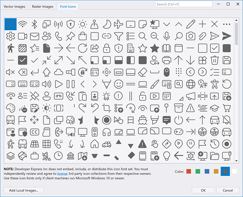
If you execute a DevExpress-powered WPF application, it will display icons from the most recent icon font available in the system. For example, the "Segoe Fluent Icons" font is used as the default font if both "Segoe Fluent Icons" and "Segoe MDL2 Assets" fonts are installed.
Use the FontIconSourceExtension.FontFamily property to specify icon font:
<dxb:BarButtonItem Glyph="{dx:FontIconSource Glyph=0xf0b4, FontFamily=SegoeMDL2Assets}"/>
You can also select an icon color from predefined values (Red, Green, Blue, Yellow, Black, and White). These colors are auto modified to match the applied DevExpress Theme:
<dxb:BarButtonItem Glyph="{dx:FontIconSource Glyph=59246, ColorName=Yellow}"/>
And yes, you can use WpfSvgPalette to colorize icons to address design preferences:
<dxb:BarButtonItem Glyph="{dx:FontIconSource Glyph=59246}">
    <dx:WpfSvgPalette.Palette>
        <dx:WpfSvgPalette>
            <SolidColorBrush x:Key="Black" Color="Aqua"/>
        </dx:WpfSvgPalette>
    </dx:WpfSvgPalette.Palette>
</dxb:BarButtonItem>
Documentation: Font Icon Images
Ribbon & Bars
#Search Box
A Ribbon-based UI can include dozens of commands across multiple pages. Without prior experience with a given app, users can struggle to locate appropriate actions/commands. To minimize usage friction/learning curve, v24.1 ships with a new WPF Ribbon Search Box.
Specify the SearchItemDisplayMode property to activate the search box in your WPF app. Our WPF Ribbon compares the search string to command content (BarButtonItem.Content) to generate search results.
You can enable an item's HideFromSearch option to exclude it from search. For more granular control, use the following events:
- ItemsRequested – Fires when the searchable items list is generated. The event allows you to modify search results before applying the search criteria (for example, to add additional items based on a condition).
- ItemFiltering – Fires for each item before it is displayed in search results. The event allows you to hide the item from search results.
- ItemsFiltered – Notifies when a search is complete.
Additional settings include:
- SearchDelay – Specifies the delay in milliseconds between the last text change and the text search.
- SearchItemFocusShortcut – Specifies the keyboard shortcut used to focus the search box (the default shortcut is "Ctrl+F").
- ShowDescriptionInSearchResults - Specifies whether to display the path to items within the DevExpress WPF Ribbon UI (Category > Page > Group).
PDF Viewer
#Signature Info Panel
With our new Signature Info panel, you can display detailed information for each signature in the loaded document and verify signature validity.
When you open a document, the PDF Viewer verifies signatures and displays associated status in the Signature panel (valid, invalid, or unknown).
In addition, the new panel displays the following signature-related information:
- Location of the signature in the document
- Signer's information
- Reasons the signature was created
- Date and time when the document was singed and modified once it was signed
- Certificate information.
Documentation
#Layers
PDF document layers allow you to selectively view or hide specific content sections. The main purpose of layers is to control the visibility of graphics objects rendered in a PDF document across different states (when you view or print a PDF document).
We added a Layers panel to display all layers contained in a document. This new capability allows you to change layer visibility via the UI. Click the check box next to the layer's name in the new Layers panel to display/hide a given document layer. Visible layers are highlighted using an “eye” icon; layers that cannot be hidden because of a document configuration do not have a check box next to their name.
With the power of the PDF Facade API, you can also access and manage layer visibility at runtime when you preview or print your PDF documents. Call the PdfViewerExtensions.GetDocumentFacade extension method to obtain the PdfDocumentFacade class object (it allows you to change the PDF document without access to its inner structure) and use the PdfDocumentFacade.OptionalContentVisibility collection to change the visibility state for the required document layers in code.
pdfViewer.LoadDocument("layers.pdf");
PdfDocumentFacade documentFacade = pdfViewer.GetDocumentFacade();

// Set visibility for each Layer
documentFacade.OptionalContentVisibility.Groups[0].Visible = false;
documentFacade.OptionalContentVisibility.Groups[1].Visible = false;
documentFacade.OptionalContentVisibility.Groups[2].Visible = true;
Documentation
Rich Text Editor
#Export to Accessible PDF
We extended accessibility-related support to the following elements when exporting Word documents to accessible PDF files:
- Table of Contents tagging
- Metadata fields
- Alt text handling
- Tables
- Floating objects.
Adobe Acrobat Pro and PDF Accessibility Checker 2024 were used for quality control. Our test documents successfully passed validation for PDF/UA compatibility and WCAG 2.1 compliance.
Accessibility-related export enhancements are available out-of-the-box when you specify the PdfUACompatibility option:
using System.IO;
using DevExpress.XtraRichEdit;

//...
using(FileStream stream =
    new FileStream(resultFilePath, FileMode.Create, FileAccess.Write, FileShare.Read)) {
    PdfExportOptions exportOptions = new PdfExportOptions();
    exportOptions.PdfUACompatibility = PdfUACompatibility.PdfUA1;

    richEditControl.ExportToPdf(stream, exportOptions);
}
#Decorative Shapes
We added a Decorative property for the Shape class to mark document graphics (pictures, shapes, and charts) as decorative. Decorative shapes add visual interest, but they are not informative. Thus, you do not need to specify Alt Text (meaningful description) for decorative objects when you generate an accessible document.
#Math Equations
Our Rich Text Editor now preserves Math Equations when saving a document. You can import your Word documents with Math Equations in our WinForms Rich Text Editor and save them to the RTF and OpenXml (.docx/.docm) formats without content loss.
Note: Math Equations will be printed or exported to PDF only if the source document contains a fallback image for a Math Equation. To suppress Math Equation import, set the DocumentCapabilities.MathEquations property to DocumentCapability.Disabled.
#Gutter and Mirrored Margins
The DevExpress WPF Rich Text Editor v24.1 allows you to specify gutter margins - extra space that ensures binding will not obscure text on printed pages. You can specify gutter position (top, left, and right) and margin size. Use the Document.GutterAtTop, SectionMargins.GutterPosition, and SectionMargins.Gutter properties to address specific usage requirements.
The following code snippet adds a left gutter to the first document section:
using DevExpress.XtraRichEdit;
using DevExpress.XtraRichEdit.API.Native;
using DevExpress.Office.Utils;
//...

richEditControl.LoadDocument(@"Documents//Alice.docx");

Document document = richEditControl.Document;
Section firstSection = wordProcessor.Document.Sections[0];

var pageMargins = firstSection.Margins;
pageMargins.GutterPosition = GutterPosition.Left;
pageMargins.Gutter = Units.InchesToDocumentsF(1);

richEditControl.SaveDocument("Alice_formatted.docx", DocumentFormat.OpenXml);
Our new Document.MarginType property allows you to define a regular or mirrored margin type. Enable mirrored margins if you print on both sides of the paper and want to bind the printout.
The following code snippet enables mirrored margins and specifies an additional space value:
using DevExpress.XtraRichEdit;
using DevExpress.XtraRichEdit.API.Native;
using DevExpress.Office.Utils;
//...
richEditControl.LoadDocument(@"Documents//Alice.docx");
Document document = richEditControl.Document;

// Enable mirrored margins
document.MarginsType = MarginsType.Mirrored;

foreach (Section section in richEditControl.Document.Sections) {
    var pageMargins = section.Margins;

    // Set the value for mirrored margins
    pageMargins.Gutter = Units.InchesToDocumentsF(0.5f);
}

richEditControl.SaveDocument("Alice_formatted.docx", DocumentFormat.OpenXml);
New UI elements are also available.
Documentation
#Image Export API
v24.1 includes new cross-platform APIs to export Word document pages to an image. This new capability allows you to generate document previews. With our new APIs, you can convert document pages to raster and vector images (PNG, JPEG, BMP, multi-page Tiff, emf), save them as physical files on the disk or obtain a list of image streams for further processing in code. You can also set image background color, modify output image resolution, or generate thumbnail images with a specified size.
The new API is available via the RichEditDocumentServerExtensions.ExportToImage extension method of the Document object.
Please note that the RichEditDocumentServerExtensions class is defined in the DevExpress.Docs.v24.1.dll assembly. Add this assembly to your project or install the "DevExpress.Document.Processor" NuGet Package to use the RichEditDocumentServerExtensions members. You need a license for the DevExpress Office File API Subscription or DevExpress Universal Subscription to use this class in production code.
The following code snippet exports the first document page to an image with a specified size and JPEG format:
using DevExpress.XtraRichEdit;
using DevExpress.XtraRichEdit.Export.Image;
using DevExpress.Drawing;

richEditControl.LoadDocument(@"C:\Documents\Alice.docx");
//...
RichEditImageExportOptions options = new RichEditImageExportOptions();
options.Format = DXImageFormat.Jpeg;
options.PageRange = "1";
options.LargestEdgeLength = 1080;

richEditControl.Document.ExportToImage(@"C:\Documents\Image.jpeg", options);
#Export Document Pages to SVG
Our new Image Export APIs allow you to export document pages to SVG. Use the RichEditImageExportOptions.Format option to set SVG as a target image format.
RichEditImageExportOptions options = new RichEditImageExportOptions();
options.Format = DXImageFormat.Svg;
options.PageRange = "1";

richEditControl.Document.ExportToImage(@"C:\Documents\Image.svg", options);
SVG Export is also available from the user interface - open the Print Preview dialog, click the Export to Image button, choose the SVG format in the Image Options dialog and complete document export.
Property Grid
#Customize Row Appearance
We added a PropertyGridControl.RowStyle property. Use this property to customize row appearance/style settings.
As you would expect from a DevExpress WPF grid-based control, you have full control over row appearance. You can apply row styles based on a condition (use the WPF PropertyGrid's RowStyleSelector property or standard WPF trigger-based techniques), or you can use the new AlternationCount property to alternate row styles.
<dxprg:PropertyGridControl ...
                AlternationCount="3">
    <dxprg:PropertyGridControl.RowStyle>
        <Style TargetType="dxprg:RowControl">
            <Style.Triggers>
                <Trigger Property="ItemsControl.AlternationIndex" Value="1">
                    <Setter Property="Background" Value="#122C2C2C"/>
                </Trigger>
                <Trigger Property="ItemsControl.AlternationIndex" Value="2">
                    <Setter Property="Background" Value="LightGray"/>
                </Trigger>
            </Style.Triggers>
        </Style>
    </dxprg:PropertyGridControl.RowStyle>
</dxprg:PropertyGridControl>
Spreadsheet
#Accessibility Enhancements - Decorative Shapes
We added a Decorative property for the Shape class to mark document graphics (pictures, shapes and charts) as decorative. Decorative shapes add visual interest, but they are not informative. Thus, you do not need to specify Alt Text (meaningful description) for decorative objects when you generate an accessible document.
#Justify & Distributed Text Alignment
v24.1 adds support for Justify and Distributed horizontal alignment types within Spreadsheet cells. Excel files using these alignment options can be printed and exported to PDF.
You can use the Cell.Alignment.Horizontal property to specify horizontal alignment in code.
The following code snippet specifies alignment in code:
var workbook = new Workbook();
var worksheet = workbook.Worksheets[0];

Cell cellA1 = worksheet.Cells["A1"];
cellA1.Value = "Justified and top";
cellA1.Alignment.Horizontal = SpreadsheetHorizontalAlignment.Justify;
cellA1.Alignment.Vertical = SpreadsheetVerticalAlignment.Top;
workbook.ExportToPdf("Result.pdf");
#Sort and Filter by Color
The DevExpress WPF Spreadsheet ships with enhanced filter and sort-related capabilities. We added new APIs that can sort and filter workbook data by background and font color. Cell ranges filtered/sorted by cell color can also be printed and exported to PDF.
Our Sorting APIs include new Worksheet.Sort method overloads designed to sort a specified range by font color or fill setting (background color and pattern).
The following code snippet sorts cell values across two cell ranges - the first is sorted by a red font color and the second is sorted by fill settings specified for the first cell in the range:
spreadsheetControl.LoadDocument("sort-filter.xlsx");
Worksheet worksheet = spreadsheetControl.ActiveWorksheet;

// Sort cell range by font color
worksheet.Sort(worksheet["B2:B10"], Color.Red);
// Sort cell range by fill color
worksheet.Sort(worksheet["D2:D10"], worksheet["D2"].Fill);
To filter cells by font or background color, you need to apply an auto-filter to the required cell range or table. Once complete, you need to obtain the required column from the AutoFilter.Columns collection and call one of the following methods:
The following code snippet uses these methods for both cell range and table:
spreadsheetControl.LoadDocument("sort-filter.xlsx");
Worksheet worksheet = spreadsheetControl.ActiveWorksheet;

// Apply an auto-filter to a cell range and filter the first column by font color
worksheet.AutoFilter.Apply(worksheet["B1:B10"]);
worksheet.AutoFilter.Columns[0].ApplyFontColorFilter(Color.Red);

// Create a table, apply an auto-filter and filter the first column by fill color
Table table = worksheet.Tables.Add(worksheet["B12:B21"], true);
table.AutoFilter.Apply();
table.AutoFilter.Columns[0].ApplyFillColorFilter(Color.Red);
In addition, our new APIs allow you to sort data across a filtered range (when auto-filter is enabled) and sort cells by their values/colors simultaneously (using sorting conditions).
Documentation: Sort Cell Range by Color
#Export Cell Range to SVG
In this release, we enhanced our CellRangeExtensions.ExportToImage method and added support for the SVG image format.
The CellRangeExtensions class is defined in the DevExpress.Docs.v24.1.dll assembly. Add this assembly to your project or install the DevExpress.Document.Processor NuGet Package to use CellRangeExtensions members. To use this class in production code, you will need an active DevExpress Office File API or DevExpress Universal Subscription.
spreadsheetControl.LoadDocument("InvestmentPortfolio.xlsx", DocumentFormat.Xlsx);
Worksheet worksheet = spreadsheetControl.ActiveWorksheet;

worksheet.Range["B18:I30"].ExportToImage("cell_range_image.svg", ImageFileFormat.Svg);
SVG Export is also available from the user interface - open the Print Preview dialog, click the Export to Image button, choose the SVG format in the Image Options dialog and complete document export.
Lightweight Themes
#Obtain Lightweight Theme Palette Color
With v24.1, you can effortlessly access color information from existing palettes that ship as part of our Lightweight themes. This functionality extends to custom color palettes, allowing you to use colors that reflect the unique identity of your WPF application.
Documentation
Survey - WPF
Your Feedback Matters!
Please
login to complete the survey.
Survey Completed
Thank you for taking the time to complete this survey. Your responses have now been posted. If you want to follow up with additional information, feel free to send us an email at clientservices@devexpress.com anytime.
You've Already Completed This Survey
Our records show that you have already completed this survey. If you want to follow up with additional information, send us an email at clientservices@devexpress.com.
This survey has expired
If you want to share your feedback or request new functionality, please submit a new support ticket via the DevExpress Support Center. We’ll be happy to follow up.
Your feedback matters.
Please, review the description of JavaScript and ASP.NET Core related features below and leave your feedback at the end of the section.
Go to the survey now.
New Splitter Component
Our new Splitter component allows you to divide a page or section into multiple adjustable panes.
These panes can be:
- resizable - A handle with a drag icon allows users to modify size.
- collapsible - A handle with an arrow icon allows users to collapse the pane.
If you enable both these properties, the handle displays both icons and users can both resize/collapse a given pane as desired. If both properties are false, the handle remains hidden.
The Splitter component can be oriented either vertically or horizontally. Orientation affects the following pane-related properties (can be specified in pixels or percents)
- size - Specifies initial width (horizontal orientation) or height (vertical) of the pane.
- maxSize, minSize - Defines resizing limits for the pane.
- collapsedSize - Specifies the size of a collapsible pane when collapsed.
<dx-splitter orientation="vertical">
    <dxi-item
          [collapsible]="true"
          size="50%"
          minSize="20px"
          сollapsedSize="30px"
      >
      </dxi-item>
</dx-splitter>
const App = () => (
    <Splitter orientation="vertical">
        <Item
            collapsible={true}
            size="50%"
            minSize="20px"
            сollapsedSize="30px"
        />
    </Splitter>
);
export default App;
<template>
    <DxSplitter orientation="vertical">
        <DxItem
            :collapsible="true"
            size="50%"
            min-size="20px"
            collapsed-size="30px"
        />
    </DxSplitter>
</template>
$('#splitter').dxSplitter({
    orientation: 'vertical',
    items: [
      {
        collapsible: true,
        size: '50%',
        minSize: '20px',
        collapsedSize: '30px',
      },
    ],
});
Splitter panes can contain multiple content types, ranging from simple HTML to complex components. You can place HTML markup inside the item tag or use the following properties to populate panes with content:
- itemTemplate - Defines a custom template for all panes.
- template - Sets a custom template for each specific pane.
To customize Splitter appearance, specify the separatorSize property to modify the size of the handle's shorter side. You can also alter color and icons through CSS.
Enable allowKeyboardNavigation in the Splitter component to control Splitter actions through shortcut keys, mirroring mouse functions. To see the full list of shortcuts, refer to the following help topic: Accessibility.
For complex layouts, nest Splitters as illustrated in our demo (which also highlights use of templates for content insertion).
Select one of the following supported dev frameworks to explore the capabilities of this new feature:
Angular | React | Vue | jQuery | ASP.NET Core | ASP.NET MVC
UI/UX and API Enhancements
#DropDownButton - Custom Button Template
With v24.1, you can replace the base button in DropDownButton with custom content (such as an avatar or multiline text).

<dx-drop-down-button icon="spindown" template="button-template">
    <div *dxTemplate="let data of 'button-template'">
        <div class="text-container">
            <div class="name"> {{ currentEmployee.FirstName }} {{ currentEmployee.LastName }} </div>
            <div class="position"> {{ currentEmployee.Position }} </div>
        </div>
        <span class="dx-icon-{{ data.icon }} dx-icon"></span>
    </div>
</dx-drop-down-button>
const renderButton = (data) => {
    return (
        <React.Fragment>
            <div className="text-container">
                <div class="name"> {currentEmployee.FirstName} {currentEmployee.LastName} </div>
                <div class="position"> {currentEmployee.Position} </div>
            </div>
            <span className={"dx-icon-" + data.icon + " dx-icon"}></span>
        </React.Fragment>
    );
};
export default function App() {
    return (
        <DropDownButton
            icon="spindown"
            render={renderButton}
        />
    );
}
<template>
    <DxDropDownButton
        icon="spindown"
        template="button-template"
    >
        <template #button-template="{ data }">
            <div class="text-container">
                <div class="name"> {{ currentEmployee.FirstName }} {{ currentEmployee.LastName }} </div>
                <div class="position"> {{ currentEmployee.Position }} </div>
            </div>
            <span :class="'dx-icon-' + data.icon + ' dx-icon'"></span>
        </template>
    </DxDropDownButton>
</template>
$("#myDropDownButton").dxDropDownButton({
    icon: 'spindown',
    template: (data, $element) => {
        const $textContainer = $('<div class="text-container">').appendTo($element);
        $(`<div class='name'>${currentEmployee.FirstName} {currentEmployee.LastName}</div>`).appendTo($textContainer);
        $(`<div class='position'> ${currentEmployee.Position} </div>`).appendTo($textContainer);
        $(`<span class="dx-icon-${data.icon} dx-icon"></span>`).appendTo($element);
    },
});
Select one of the following supported dev frameworks to explore the capabilities of this new feature:
Angular | React | Vue | jQuery | ASP.NET Core | ASP.NET MVC
#Menu/ContextMenu — Item Scrolling
Submenus that exceed page size (in Menu or ContextMenu) can now be scrolled.
You can use CSS stylesheets to customize submenus as needs dictate. For instance, the following code snippet restricts submenu height in ContextMenu:
.dx-context-menu .dx-menu-items-container {
    max-height: 200px;
}
In the Menu component, use the onSubmenuShowing function to configure scroll-related settings. For instance, you can restrict the size of the submenu when item count surpasses a specified limit:
onSubmenuShowing({ submenuContainer, itemData } {
    if (itemData.items.length > 5) {
        submenuContainer.style.maxHeight = this.limitSubmenuHeight ? `200px` : '';
    }
}
const onSubmenuShowing = useCallback(({ submenuContainer, itemData }) => {
    if (itemData.items.length > 5) {
        submenuContainer.style.maxHeight = limitSubmenuHeight ? `200px` : '';
    }
}, []);
function onSubmenuShowing({ submenuContainer, itemData } {
    if (itemData.items.length > 5) {
        submenuContainer.style.maxHeight = limitSubmenuHeight.value ? '200px' : '';
    }
}
onSubmenuShowing: ({ submenuContainer, itemData }) => {
      if (itemData.items.length > 5) {
        $(submenuContainer).css('maxHeight', 200 || '');
      }
}
Select one of the following supported dev frameworks to explore the capabilities of this new feature:
Menu: Angular | React | Vue | jQuery | ASP.NET Core | ASP.NET MVC
ContextMenu: Angular | React | Vue | jQuery | ASP.NET Core | ASP.NET MVC
#Form — Group Caption Custom Content
Our new Form groupItem.captionTemplate option enables custom content replacement for group captions.
Select one of the following supported dev frameworks to explore the capabilities of this new feature:
Angular | React | Vue | jQuery | ASP.NET Core | ASP.NET MVC
#HTML Editor — Spellcheck and CSP Support
The DevExtreme HTML Editor now uses spellcheck functionality across all supported browsers. As you would expect, this addition enhances text editing capabilities through real-time spelling correction/suggestion support.
Previous versions required Content Security Policy (CSP) directives when passing markup with inline styles to our HTML Editor. The DevExtreme HTML Editor v24.1 fully supports CSP.
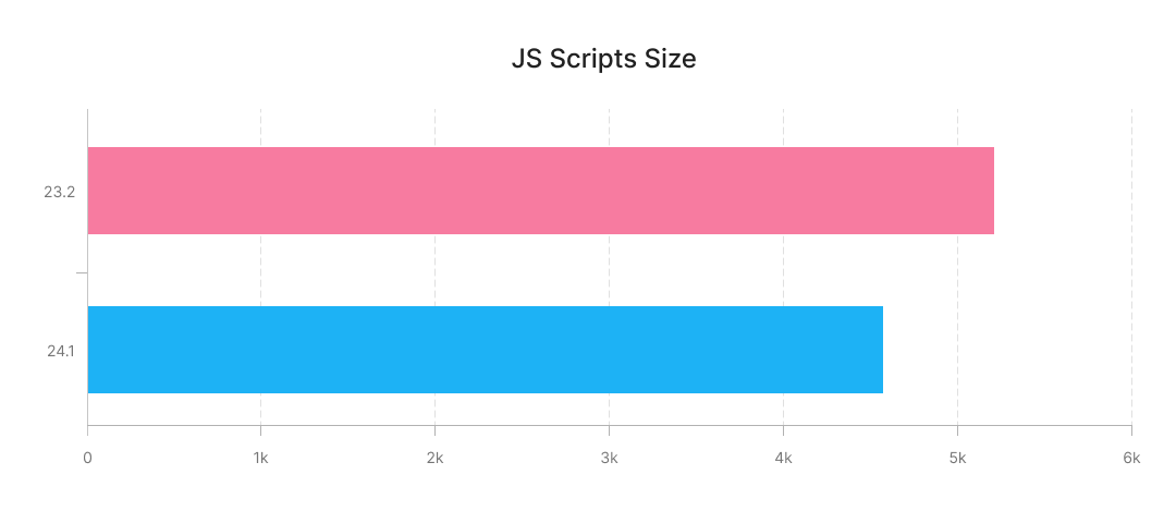
JS Script Size
In our last major release cycle (v23.2), we reduced CSS size for built-in themes. In this release cycle, we reduced DevExtreme JS scripts size as follows:
- We updated the ECMAScript compilation target for DevExtreme JS code. This eliminated the need for complicated syntactic constructions (due to transpiling) for operations supported by all modern browsers.
- We ceased storage of time zone data. We switched to an internal browser time zone engine for time zone related operations.
These modifications reduced bundle size by approximately 12%.
Angular 18 Support
DevExtreme v24.1 supports Angular 18. Earlier versions (such as DevExtreme v23.2) are not compatible with Angular 18.
Refer to the Angular Update Guide and our Migrate to the New Version help topic to update your application.
New DxHttpModule for Angular
#Simplified Request Interception
Angular HttpClientModule is a module that simplifies HTTP requests. It supports request and response interceptors, which allows you to introduce capabilities such as authentication tokens or logging across all HTTP requests.
Previously, our DataSource, FileUploader, and Map components depended on non-native Angular Ajax requests for server communication.
With v24.1, we transitioned these components from Ajax to the HttpClientModule. Simply import our DxHttpModule to activate this new functionality.
In the following example, DataSource utilizes DxHttpModule for request interception.
Online Demo
Shadow DOM Support (CTP)
Shadow DOM represents one of three Web Components specifications, complemented by HTML templates and Custom Elements.
Shadow DOM allows the attachment of a hidden, separate Document Object Model (DOM) to an element, termed the 'Shadow Host'. This hidden DOM, called the 'Shadow DOM', can contain additional nested Shadow Hosts, forming a structure known as a Shadow Tree.
It's a direct method to create components with isolated CSS and JavaScript. Many everyday web interfaces use Shadow DOM (a feature available in all major browsers).
This release cycle introduces Shadow DOM support in Angular, React, and Vue as a Community Technology Preview (CTP). Accordingly, you can now use DevExtreme components inside the Shadow DOM of custom HTML elements (Web Components).
Note: CTPs includes limitations. Refer to our documentation for additional information: Angular | React | Vue
Select one of the following supported dev frameworks to explore the capabilities of this new feature:
Angular | React | Vue
Online Example
Accessibility
v24.1 accessibility-related enhancements include NVDA support for improved keyboard navigation and pronunciation support across the following components:
- Tabs
- TabPanel
- TagBox
- List
- DropDownButton
- Calendar
- DataGrid with Master-Detail
Additionally, DataGrid and TreeList now meet the Status Messages criterion.
You can now access accessibility compliance (using the AXE® web accessibility evaluation tool) in many DevExtreme demos including the following:
Sample AXE accessibility report:
ASP.NET Core - DateOnly/TimeOnly Type Support
DevExtreme ASP.NET Core DataGrid now supports DateOnly and TimeOnly data types. DateOnly and TimeOnly data types offer the following benefits when compared to the traditional DateTime data type:
- Usage clarity.
- Improved database compatibility.
- Less space during serialization.
- Ability to mitigate potential errors/inconsistencies related to different time zones.
The following DataGrid features support DateOnly and TimeOnly data types:
- Filtering-related UI elements (filter row, filter panel, search panel, header filter)
- Grouping (group interval data operations, both outside and inside a header filter)
- Summary (min/max, count)
<div id="grid"></div>
<script>
    $(function() {
        $("#grid").dxDataGrid({
            columns: [
                {
                    dataField: "orderDateOnly",
                    dataType: "date",
                    headerFilter: {
                        groupInterval: "quarter"
                    }
                },
                {
                    dataField: "orderTimeOnly",
                    dataType: "time",
                },]
          });
    });
</script>
ASP.NET Core - Data Validation
#Standalone Editor Validation
With this release, you can use Razor syntax (in addition to Model-based method) to add validation rules directly to DevExtreme Editors.
This method can be used in the following situations:
- Modifying validation rules when model changes are impossible, such as when models are shared across views.
- Adding extra editors to a view and defining associated validation rules independent of a model.
@(
    Html.DevExtreme().TextBoxFor(m => m.StringProperty).ValidationRules(tvr => {
        tvr.AddRequired();
    })
)
#Remote Attribute — AdditionalFields Property Support
In ASP.NET Core, the Remote attribute facilitates client-side validation. Its AdditionalFields property enables server-based validation of field combinations.
This release introduces support for the AdditionalFields option in the DevExtreme DataGrid and TreeList.
The following code snippet validates email addresses in a DataGrid column. When a user enters an email that exists in the database, it determines whether to create a new profile or edit an existing record (refer to RemoteValidation Controller). To enable this validation, pass the ID field to AdditionalFields:
- View
- Model
- Remote Validation Controller
@(Html.DevExtreme().DataGrid<EmployeeValidation>()
    .Editing(editing => {
          editing.AllowUpdating(true);
          editing.AllowAdding(true);
    })
    .Columns(columns => {
        columns.AddFor(m => m.ID);
        columns.AddFor(m => m.Email);
    })
)
using System.ComponentModel.DataAnnotations;

public class EmployeeValidation {
    public int ID { get; set; }

    [Remote("CheckUniqueEmailAddress", "RemoteValidation", AdditionalFields = nameof(ID))]
    public string Email { get; set; }
}
[HttpPost]
public JsonResult CheckUniqueEmailAddress(EmployeeValidation model) {
    var isValid = !db.Employees.Any(emp => {
        var equals = string.Equals(emp.Email, model.Email, StringComparison.OrdinalIgnoreCase);
        return model.ID != emp.ID && equals;
    });
    return Json(isValid);
}
ASP.NET Core - Rich Text Editor
#New Table API

With v24.1, the DevExpress Rich Text Editor for ASP.NET Core allows you to modify table layout, decoration, and structure at runtime.
const columnCount = 5;
const rowCount = 5;
const table = richEdit.document.tables.create(0, columnCount, rowCount);

table.autoFit = false;
table.styleName = "Grid Table 5 Dark Accent 1";
table.width = { type: TableWidthType.Twips, value: 9000 };
table.tableStyleOptions = {
    ...table.tableStyleOptions,
    totalRow: true,
    headerRow: true,
}

for (let i = 0; i < table.rows.count; i++) {
    const cells = table.rows.getByIndex(i)!.cells;

    for (let j = 0; j < cells.count; j++) {
        const cell = cells.getByIndex(j)!;
        richEdit.document.insertText(cell.interval.start, `Row ${i} Cell ${j}`);
    }
}
#HTML Export/Import
The Rich Text Editor now supports the import and export of documents in HTML format. You can add HTML markup to the main sub-document (insertHtml method overloads), obtain HTML text and markup of the main sub-document (getHtml method overloads), and download document content to a file in HTML format.
Survey - JavaScript & ASP.NET Core
Your Feedback Matters!
Please
login to complete the survey.
Survey Completed
Thank you for taking the time to complete this survey. Your responses have now been posted. If you want to follow up with additional information, feel free to send us an email at clientservices@devexpress.com anytime.
You've Already Completed This Survey
Our records show that you have already completed this survey. If you want to follow up with additional information, send us an email at clientservices@devexpress.com.
This survey has expired
If you want to share your feedback or request new functionality, please submit a new support ticket via the DevExpress Support Center. We’ll be happy to follow up.
Your feedback matters.
Please, review the description of Blazor-related features below and leave your feedback at the end of the section.
Go to the survey now.
New TreeList (CTP)
Our new Blazor TreeList allows you to organize, display, and navigate hierarchical data with absolute ease. The component ships with the following integrated capabilities:
- Data Sorting
- Filter Row with Auto-Generated Editors
- Total Summaries
- Single and Multiple Node Selection
- Focused Row
- Header Bands
- Paging and Scrolling
- Virtual Scrolling
- Toolbar
- Keyboard Support
Online Demo
You will notice that the DevExpress Blazor TreeList and Grid UI components look and behave in a similar manner. This is not a coincidence. Our Blazor TreeList and Grid use the same rendering engine and rely upon common logic/algorithms. Thanks to commonalities between the components, we are in position to add new functionality to both of components simultaneously in future release cycles.
#Bind to Flat Data
Our Blazor TreeList component can be bound to any traditional data source. Since the TreeList is designed to display information using a tree structure, its data source must meet specific requirements. If a data source contains flat data, two additional fields are necessary to build the appropriate tree structure:
- A field that contains a node’s unique identifier. Assign this field to the KeyFieldName property.
- A field that contains the unique identifier of a node’s parent. Assign this field to the ParentKeyFieldName property.
The following example binds the Blazor TreeList component to a flat data source:
@inject IEmployeeTaskDataProvider EmployeeTaskDataProvider
<DxTreeList Data="@TreeListData"
            KeyFieldName="Id"
            ParentKeyFieldName="ParentId">
    <Columns>
        <DxTreeListDataColumn FieldName="Name" />
        <DxTreeListDataColumn FieldName="EmployeeName"/>
        <DxTreeListDataColumn FieldName="StartDate" />
        <DxTreeListDataColumn FieldName="DueDate" />
    </Columns>
</DxTreeList>

@code {
    List<EmployeeTask> TreeListData { get; set; }
    protected override void OnInitialized () {
        TreeListData = EmployeeTaskDataProvider.GenerateData();
    }
}
#Bind to Server-Side Data
You can also bind the DevExpress Blazor TreeList component to our DevExtremeDataSource. This data source allows you to improve TreeList performance when binding large data sets for the following reasons:
- The TreeList loads child nodes on demand (when user expands a node).
- DevExtremeDataSource performs data filtering operations on the server.
To bind the component to DevExtremeDataSource, you must:
#Bind to Hierarchical Data
If each node in your data source includes a field with a list of child nodes, assign the field’s name to the ChildrenFieldName property and bind the Data property to the data source:
@inject ISpaceObjectDataProvider SpaceObjectDataProvider
<DxTreeList Data="@TreeListData"
            ChildrenFieldName="Satellites">
    <Columns>
        <DxTreeListDataColumn FieldName="Name"/>
        <DxTreeListDataColumn FieldName="TypeOfObject" Caption="Type"/>
        <DxTreeListDataColumn FieldName="Mass" Caption="Mass, kg"/>
        <DxTreeListDataColumn FieldName="MeanRadius" Caption="Radius, km"/>
    </Columns>
</DxTreeList>

@code {
    List<SpaceObject> TreeListData { get; set; }
    protected override void OnInitialized () {
        TreeListData = SpaceObjectDataProvider.GenerateData();
    }
}
Alternatively, you can assign a collection of root nodes to the Data property and handle the ChildrenLoading event to populate nodes with children. In the event handler, use the Parent argument to determine the processed node and assign this node’s children to the Children property.
#Load Data on Demand
The DevExpress Blazor TreeList allows you to initially load only root nodes and retrieve node children when a node is expanded for the first time. To switch the component to on demand mode, follow the steps below:
The following example loads TreeList data on demand:
@inject FileSystemDataProvider FileSystemDataProvider
<DxTreeList Data="TreeListData"
            HasChildrenFieldName="HasChildren"
            ChildrenLoadingOnDemand="TreeList_ChildrenLoadingOnDemand">
    <Columns>
        <DxTreeListDataColumn FieldName="Name" />
        <DxTreeListDataColumn FieldName="Type" />
        <DxTreeListDataColumn FieldName="DateModified" />
        <DxTreeListDataColumn FieldName="Size" />
    </Columns>
</DxTreeList>

@code {
    object TreeListData { get; set; }
    protected override async Task OnInitializedAsync() {
        Data = await FileSystemDataProvider.GetRootItemsAsync();
    }
    Task TreeList_ChildrenLoadingOnDemand(TreeListChildrenLoadingOnDemandEventArgs e) {
        var item = e.Parent as FileSystemDataItem;
        e.Children = item.Children;
        return Task.CompletedTask;
    }
}
New HTML Editor
Our Blazor HTML Editor allows you to format/display text and visual content and store it as HTML or Markdown. Users can apply inline formatting and modify font, size, and color as needs dictate. Additionally, the DevExpress Blazor HTML Editor offers the following integrated features:
- Block formatting, including headings, text alignment, lists (bullet and numbered), code blocks, and quotes.
- Variables support (for example, {{companyName}}): Among other use cases, this capability can be used to generate dynamic email content.
- Toolbar with adaptive layout support.
- Built-in toolbar customization.
- Image Insert: You can upload an image from the local file system or specify a URL.
- Table support.
- Mentions support.
Online Demo
New PDF Viewer (CTP)
The new DevExpress Blazor PDF Viewer component can display PDF file content directly in your DevExpress-powered Blazor app. The component allows you to navigate through the document, set zoom level, print, and download the document. Additionally, the CTP version of the Blazor PDF Viewer includes a single-page preview and toolbar customization option (such as rearranging, grouping, hiding, and adding items)
Online Demo
New Map
The DevExpress Blazor Map component can display geo maps with markers and route info within your DevExpress-powered Blazor web app. The component retrieves relevant data from a GIS service (Bing, Google, or GoogleStatic - requires application authentication with an appropriate API key) and ships with the following capabilities:
- Marker/route configuration and customization options.
- Built-in map navigation and type controls.
- Manual map adjustment (set Zoom and MapCenter).
- Map and marker "click" support.
Online Demo
New Polar Chart
The DevExpress Polar Chart for Blazor allows you to visualize data within a polar coordinate system - where each point on a plane is determined by the distance from the center and the angle from a fixed direction. The DevExpress Blazor Polar Chart component ships with the following capabilities:
- Multiple series types: line, area, bar, stacked bar, and scatter.
- Continuous, discrete, and logarithmic axis value support.
- Spider web mode.
- Chart element customization: labels, tooltips, legend, and many more.
Online Demo
New Date Range Picker
The DevExpress Date Range Picker for Blazor allows you to select a range of dates within a single calendar dropdown. The component ships with the following integrated capabilities:
- Minimum and maximum dates
- Special date highlighting
- Selected date formatting API
- Input validation
- Clear button
- Nullable date support and placeholder
- Automatic support for browser time zone and localization
Online Demo
New DropDown Box
The DevExpress Blazor DropDown Box is a customizable editor - designed to display/use a variety of UI elements within its drop-down window: from simple lists and trees, to grids, or any combination therein. You can assign an editor value programmatically based on page interactions.
The following code snippet adds the DevExpress Blazor Grid to the DropDown Box popup.
<DxDropDownBox Value="Value" QueryDisplayText="QueryText">
    <DropDownBodyTemplate>
        <DxGrid Data="@GridData" ShowSearchBox="true" SelectedDataItem="@Value"
            SelectedDataItemChanged="item => GridSelectedDataItemChanged(item, context.DropDownBox)" .../>
    </DropDownBodyTemplate>
</DxDropDownBox>

@code {
    Customer Value { get; set; }
    IEnumerable<object> GridData { get; set; }

    string QueryText(DropDownBoxQueryDisplayTextContext arg) {
        if(arg.Value is Customer value)
            return value.ContactName;
        return string.Empty;
    }
    void GridSelectedDataItemChanged(object item, IDropDownBox dropDownBox) {
        Value = item as Customer;
        dropDownBox.HideDropDown();
    }
}
The DropDown Box' value is not limited to a single object. It can be a collection of objects (for those looking to implement a multi-selection editor):
Or even a composite data item generated based on user selection made within the popup:
Online Demo
New File Input
Our new Blazor File Input component allows you to introduce file upload functionality to your Blazor app without creating a separate Web API project with an upload controller.
Our Blazor File Input control supports multiple upload modes (Instant and OnButtonClick), can upload multiple files simultaneously, and allows you to validate file size and extension both on the client and server.
Handle the FilesUploading event to upload selected files. For each file, the event supplies a Stream you can open to read file content. Once the read operation is complete, you can send the file to another destination, save it to the file system, or display the file content on a web page.
The following code snippet configures FileInput to upload files to a specified folder:
<DxFileInput FilesUploading="OnFilesUploading" />

@code {
    async Task OnFilesUploading(FilesUploadingEventArgs args) {
        foreach (var file in args.Files) {
            Stream? stream = default;
            var filePath = "full path to the uploaded file";
            FileStream fs = new(filePath, FileMode.Create);
            try {
                if(IsValidFile(file)) {
                    stream = file.OpenReadStream(int.MaxValue);
                    await stream.CopyToAsync(fs);
                }
            }
            catch (Exception ex) {
                if (file.CancellationTokenSource.IsCancellationRequested)
                    // Handle the cancel action here
            }
            finally {
                await fs.FlushAsync();
                fs.Close();
                if (stream != null)
                    stream.Close();
            }
        }
    }
}
Note: Before adding file upload capabilities to your Blazor app, make certain to institute necessary security-related processes (to avoid risks and control unauthorized file operations).
Online Demo
New Drawer
Our new Blazor Drawer component allows you to add a "dismissible" navigation side panel to your web application. The control includes the following features:
- Left-side and right-side position.
- Overlap and shrink display modes.
- The minimized drawer state.
- Header, body, and footer templates.
Online Demo
New Toast
Our new Blazor Toast component allows you to notify users about processes and events. Notification messages can remain visible until a user clicks the close button or closed automatically after a predetermined amount of time. The DevExpress Blazor Toast component supports four theme modes (Dark, Light, Pastel, and Saturated) and the following notification styles:
- Danger
- Info
- Primary
- Success
- Warning
You can place a DxToast component in markup and call the Show method to display it.
<DxToastProvider Name="ToastContainer" />
<DxToast @ref=toast Text="The process has been completed." ProviderName="ToastContainer" />

@code {
    DxToast toast;

    protected override void OnAfterRender(bool firstRender) {
        toast.Show();
    }
}
          </lang>
        </code2>

        <para>
          Alternatively, use the notification service to create toasts at runtime.
        </para>

        <code2>
          <lang brush="razor" name="Razor">
<DxToastProvider Name="ToastContainer" />

@code {
    [Inject] IToastNotificationService ToastService { get; set; }

    protected override void OnAfterRender(bool firstRender) {
        ToastService.ShowToast(new ToastOptions {
            ProviderName = "ToastContainer",
            Text = "The process has been completed."
        });
    }
}
In both instances, you must add the DxToastProvider component to a page. This component serves as a toast container and should be declared where toasts will be displayed.
Online Demo
New Progress Bar
The new DevExpress Blazor Progress Bar component allows you to communicate the status of ongoing processes with end-users. When progress cannot be estimated, the component can display an infinite moving bar. The control includes the following integrated features:
- Horizontal, vertical, and circular layout
- Four statuses to indicate process state: InProgress, Warning, Error, and Success
- Indeterminate state
- Element customization: icon, label, and bar thickness
Online Demo
New Bar Gauge
The Bar Gauge for Blazor allows you to display data as circular bars where each bar indicates a single value. The component ships with the following capabilities:
- Geometry and layout configuration
- Palette customization
- Export and printing support
- Real-time data updates
- Gauge element customization: labels, tooltips, legend, and many more.
Online Demo
New Sparkline
Our new Blazor Sparkline component allows you to display value trends using a compact UI metaphor. You can use the DevExpress Blazor Sparkline as a standalone component or embed it into other UI controls. Sparkline allows you to configure all series and point settings at the root component level. Sparkline applies corresponding settings based on the Type property value (which defines series type). In addition to series and point settings, you can configure tooltips and customize the component's container.
Sparkline includes built-in export and print capabilities. You can call the ExportToAsync method to export data to a file (PNG, PDF, JPEG, or SVG) or call the GetSvgMarkup method to obtain the component's SVG markup.
Online Demo
New Rendering Engine
The following DevExpress Blazor components now use our optimized rendering engine (instead of Bootstrap):
Keyboard Support
To address accessibility standards and improve user experiences for those with disabilities, v24.1 adds keyboard navigation support for the following Blazor UI components:
Project Templates
#.NET 8 Authentication and Authorization
Our Blazor project templates for .NET 8 include an option to add ASP.NET Core Identity and Token-based Authentication to your projects. In addition to the necessary infrastructure, our templates generate an authentication interface powered by DevExpress Blazor components.
Grid
#Header Bands
The DevExpress Blazor Grid can now arrange its columns into logical groups called bands. Each band contains its own header displayed above column headers. Columns without a band span the entire band region. The Grid also supports multi-level bands wherein a band can display other bands within it.
Documentation
While end-users can reorder columns within bands or move them to the Group Panel, column movement between bands is restricted.
The Grid’s Column Chooser has also been updated to support Header Bands. It displays bands and columns hierarchically and allows end-users to toggle the visibility of entire groups, not just individual columns.
Online Demo
#Export Server-Side Data
v24.1 introduces Blazor Grid data export functionality for any supported server-side data/Server Mode sources (GridDevExtremeDataSource, or CustomDataSource). Remote data can be exported to XLS, XLSX, and CSV formats.
The DevExpress Blazor Grid can now fetch records from a remote data source to/from the exported document. While fetching records, the Grid displays a loading indicator. To avoid flickering, the indicator is displayed only during estimated fetch time. For more information on this feature, refer to the following help topic: Data Export.
Online Demo
#New Cell Editor Appearance
In-place editors in the filter row, edit row, and edit cells of the DevExpress Blazor Grid ship with a new improved look/feel - and automatically display validation icons, when required. The appearance of grid cells is now consistent in both display and edit modes.
Online Demo
#Cell Editing Enhancements
Our Blazor Grid's Edit Cell mode feature is now official and includes Virtual Scrolling support. It now ships with the following enhancements:
- Users can now change a check box value with a single click.
- The Grid automatically selects cell text when the cell switches to edit mode.
- The Grid now automatically updates the focused row when switching to edit mode.
- The Grid’s new GetEditContext method allows you to obtain edit context at any time.
- Column text alignment affects editors displayed inside the column.
#Keyboard Navigation Enhancements and New Tab Navigation
In v24.1, our Blazor Grid ships with enhanced keyboard navigation and virtual scrolling support. The Grid component now automatically activates keyboard navigation and built-in shortcuts (Note: You may want to remove the KeyboardNavigationEnabled property from your project as it's now obsolete).
The Tab key navigates between all Grid cells regardless of a cell editor's active state. Users can also leave the table area by pressing Ctrl + Up or Ctrl + Down (Alt + Up or Alt + Down on Mac).
In addition, we improved the RowClick event. With v24.1, this event allows you to implement custom actions in response to mouse clicks and after a user presses Enter when a data row has focus.
#Built-in Value Posting
We added the following new method to EditModelSaving event arguments: CopyChangesToDataItem. This method allows you to copy all changes made to the edit model during editing. Complex field values can be copied as well.
The following v23.2 code snippet...
async Task OnEditModelSaving(GridEditModelSavingEventArgs e) {
  var editModel = (EmployeeEditModel)e.EditModel;
  if (dataItem != null) {
      dataItem.FirstName = editModel.FirstName;
      dataItem.LastName = editModel.LastName;
      dataItem.Title = editModel.Title;
      dataItem.HireDate = editModel.HireDate;
  }
}
... can now be replaced with a shorter version:
async Task OnEditModelSaving(GridEditModelSavingEventArgs e) {
    var editModel = (EmployeeEditModel)e.EditModel;
    if (dataItem != null) {
        e.CopyChangesToDataItem();
    }
}
#DateOnly and TimeOnly Support
With v24.1, our Blazor Grid component supports DateOnly and TimeOnly types for the following:
- Sorting
- Filtering
- Hierarchical Filter Menu for DateOnly values
- Grouping
- Summaries
- Auto-generated cell editors
- Interval grouping for DateOnly values
- Value formatting using DisplayFormat
- Excel Export
#Enable/Disable Skeletons
The DevExpress Blazor Grid no longer displays skeletons by default when Virtual Scrolling is used with local data. Since rows in a local data source are usually rendered quickly, this new behavior produces a more fluid experience, with fewer visual updates.
Skeletons are still enabled by default for remote data sources (for record loading from a server or database). You can now use the SkeletonRowsEnabled property to control skeleton behavior - enable it for local sources or disable it for remote sources if server response time is acceptable.
#Highlight Rows on Hover
To highlight Blazor Grid rows when hovering rows, simply enable our new HighlightRowOnHover property (highlight color is based on the theme used within your DevExpress-powered Blazor app).
Charts
#Annotations
The new Blazor DxChartAnnotation object allows you to create chart annotations — comments that contain information about chart content. You can populate annotations with image or text content. You can also anchor annotations to chart elements (series points or axes) or position annotations based on pixel coordinates. DevExpress Blazor Chart components also allow you to customize annotations as needed — you can configure annotation borders and shadows, image and text settings.
Online Demo
#Strips
Our new Blazor DxChartAxisStrip object allows you to create and configure axis strips. You can use a strip to highlight a range between two axis values or an area above/below a value. These highlighted areas help users determine whether a point falls in or out of a predefined range. You can also add a DxChartAxisStripLabel object to strip markup to display and configure strip labels.
Online Demo
#Error Bars
The new DxChartSeriesValueErrorBar object allows you to configure error bars (indicate measurement precision or uncertainty). They display a possible value range next to a series point. Error bars can display fixed values or percentages, statistical function values, or error values obtained from data source fields.
Online Demo
#Tooltip Enhancements
v24.1 introduces extended tooltip functionality for DevExpress Blazor Chart components. You can now change tooltip visibility for individual series points in code. To display a tooltip for a particular series point, call component-specific ShowTooltip method overloads (DxChart.ShowTooltip, DxPieChart.ShowTooltip, or DxPolarChart.ShowTooltip). To hide the tooltip, call the HideTooltip method.
With v24.1, you can also handle the TooltipShowing event to obtain information about a tooltip before it appears (or cancel the tooltip as needed).
#Label Customization Enhancements
We expanded the list of available label customization settings. You can now set individual text for each point label using the Texts property. Moreover, you can modify the following properties for point labels:
#Live Update Enhancements
We extended our Blazor Chart’s live update capabilities and introduced Length and VisualRangeUpdateMode properties. These enhancements allow the chart to retain its visual state (zoom and scroll position) when Chart data changes.
Online Demo
#API Enhancements
PieChart settings:
- SegmentDirection - Specifies the direction in which the chart arranges series slices.
- StartAngle - Specifies the angle at which the chart positions the first series slice.
Axis settings:
- WorkdaysOnly - Specifies whether the chart displays only workdays on the axis.
- WorkWeek - Specifies weekdays DxChart treats as workdays.
- WorkDates - Specifies dates DxChart treats as workdays.
- Holidays - Specifies dates DxChart marks as holidays.
Axis Range settings:
New ComboBox and TagBox
We've rebuilt the DevExpress Blazor ComboBox and TagBox components, maintaining their existing API while revamping visual and data layers for improved stability, visuals, and performance. These changes form the basis for upcoming features and enhancements, with many already available in v24.1.
Online Demo: ComboBoxOnline Demo: TagBox
#Performance Enhancements
Overall ComboBox and TagBox performance has been improved significantly. Tasks like opening the dropdown, searching, or navigating through items are now more responsive. In addition, startup times for ComboBox/TagBox have been reduced by up to three times. This boosts overall performance for forms that contain these editors and any components utilizing ComboBox/TagBox internally, such as our Blazor Grid, Rich Text Editor, Scheduler, and Toolbar.
#Search Across Multiple Columns
Based on customer feedback, our ComboBox and TagBox can now search for text in any defined column, even columns whose values are not displayed in the edit box.
Use the new SearchEnabled property to exclude specific columns from search when necessary.
#New Search API
In addition to `Contains` and `StartsWith`, ComboBox and TagBox include an `Equals` condition for searching within collections of similarly named items. The new SearchTextParseMode property also defines how editors interpret search strings divided by spaces:
GroupWordsByAnd – search words are treated as individual conditions grouped by the AND logical operator; only items that match all of the words are displayed.GroupWordsByOr – search words are treated as individual conditions grouped by the OR logical operator; items that match at least one of these words are displayed.ExactMatch – search words are not treated separately; only items that match search text (exact match) are displayed.
#New Templates
We've introduced new templates for ComboBox and TagBox to simplify popular customization usage scenarios:
- ColumnCellDisplayTemplate – allows you to implement custom formatting for values in a multi-column ComboBox/TagBox.
- ItemDisplayTemplate/TagDisplayTemplate – these templates are similar to
ItemTemplate/TagTemplate (available previously), but offer information about the underlying data item, value, and displayed text in context. - EmptyDataAreaTemplate – allows you to customize the area displayed when the ComboBox/TagBox popup displays no items.
#Keyboard Navigation Enhancements
Both ComboBox and TagBox now use a client-side keyboard navigation engine in their dropdowns. This makes keyboard navigation more responsive in Blazor Server apps since each keystroke doesn’t need to be sent to the server. In addition, keyboard navigation is now more stable when used in combination with Virtual Scrolling.
List Box
#New Search and Filter API
The DevExpress Blazor List Box introduces new API that allows you to connect it to external search/filter UI elements:
Documentation
Online Demo
#New Scroll API
The following new APIs allow you to scroll to a specific ListBox item:
Date Edit & Time Edit
#DateOnly and TimeOnly Support
DevExpress Blazor Date Edit and Time Edit components now support DateOnly and TimeOnly values, respectively. All editor features - including masks, formatting API, and validation - now function properly with these new data types.
File Management
#New Upload Appearance
Our Blazor Upload component's file list ships with a revamped look and feel. To make the list more understandable and visually compact, we removed the common progress bar, resized and rearranged UI elements, updated icons, and added text to certain action buttons.
Online Demo
Form Layout
#Item Caption Template
The new DxFormLayoutItem.CaptionTemplate property allows you to set icons, buttons, links, or other elements near each LayoutItem caption.
<DxFormLayoutItem>
    <CaptionTemplate>
        <div class="email-caption">
            <label for="contactEmail">Email</label>
            <DxButton CssClass="info-icon-btn"
                      IconCssClass="info-icon text-info"
                      RenderStyle="@ButtonRenderStyle.None"
                      Click="() => IsInfoOpen = !IsInfoOpen" />
            <DxFlyout @bind-IsOpen=@IsInfoOpen
                      PositionTarget=".info-icon-btn"
                      PreventCloseOnPositionTargetClick="true"
                      Width="240">
                Email must contain the company's domain name.
            </DxFlyout>
        </div>
    </CaptionTemplate>
    <Template>
        <DxTextBox @bind-Text="@Email" InputId="contactEmail"/>
    </Template>
</DxFormLayoutItem>
Online Demo
Rich Text Editor
#New Table API
With v24.1, the DevExpress Rich Text Editor for Blazor allows you to modify table layout, decoration, and structure at runtime.
Documentation
<DxRichEdit @ref="@richEdit" />
@code {
    DxRichEdit richEdit { get; set; }
    @* ... *@
        try {
        @* ... *@
            var columnCount = 4;
            var rowCount = 5;
            richEdit.DocumentAPI.BeginUpdate();
            await richEdit.DocumentAPI.Tables.CreateAsync(0, columnCount, rowCount);
            for (int i = 0; i < rowCount; i++)
                for (int j = 0; j < columnCount; j++) {
                    var myTable = await richEdit.DocumentAPI.Tables.GetAsync(0);
                    var cellPosition = myTable.Rows[i].Cells[j].Interval.Start;
                    await richEdit.DocumentAPI.AddTextAsync(cellPosition, "Row=" + (i + 1) + ",Column=" + (j + 1));
                }
            richEdit.DocumentAPI.EndUpdate();
            @* ... *@
        }
        catch (OperationCanceledException e) {
            @* ... *@
        }
}
#HTML Export/Import
The DevExpress Rich Text Editor for Blazor now supports document import/export in HTML format. You can add HTML markup to the main sub-document (AddHtmlAsync method overloads), obtain HTML text and markup of the main sub-document (GetHtmlAsync method overloads), and download document content to a file in HTML format.
Online Demo
#Context Menu Customization
v24.1 introduces extended UI customization options for the DevExpress Blazor Rich Text Editor. You can now customize the component's context menu and associated sub-menus. Handle the CustomizeContextMenu event to:
- Add or remove built-in menu items
- Add custom menu items
- Customize item appearance/behavior.
With v24.1, you can also control context menu visibility using the ContextMenuEnabled property.
<DxRichEdit CustomizeContextMenu=OnCustomizeContextMenu />

@code {
    void OnCustomizeContextMenu(IContextMenuItemCollection items) {
        if (selection.Intervals[0].Length > 0) {
            var span = await selection.ActiveSubDocument.GetTextSpanAsync(selection.Intervals[0]);
            textToSearch = span.Text.Trim();
        }
        else
            textToSearch = null;
        var searchItem = items.AddCustomItem(0, "Google Search...", async () => {
            var url = String.Format("https://www.google.com/search?q={0}", HttpUtility.UrlEncode(textToSearch));
            await JSRuntime.InvokeVoidAsync("open", url, "_blank");
        });
        searchItem.Enabled = !string.IsNullOrEmpty(textToSearch);
        searchItem.IconCssClass = "search-icon";
        items.Remove(RichEditContextMenuItemNames.CutSelection);
        items.Remove(RichEditContextMenuItemNames.CopySelection);
        items.Remove(RichEditContextMenuItemNames.Paste);
        var clipboardItem = items.AddCustomItem(1, "Clipboard");
        clipboardItem.BeginGroup = true;
        clipboardItem.Items.Add(RichEditContextMenuItemNames.CutSelection);
        clipboardItem.Items.Add(RichEditContextMenuItemNames.CopySelection);
        clipboardItem.Items.Add(RichEditContextMenuItemNames.Paste);
    }
}
Scheduler
#Multiple Resources
Our Blazor Scheduler allows users to assign multiple resources to an appointment. With v24,1, users can create meetings with multiple participants, group events, or services that require coordination among multiple resources. To enable this functionality, use the EnableMultipleResources property. Once enabled, appointment forms will allow multiple selection in the Resource field:
All selected resources will be displayed in the appointment tooltip:
If the Scheduler is grouped by resources, multi-resource appointments will appear under all selected resources.
Online Demo
#Built-in Scroll Bars
The DevExpress Blazor Scheduler component now automatically displays a scroll bar when cells don't fit within control boundaries/size. To specify Scheduler boundaries/size, modify width/height parameters using CSS:
<style>
    .my-scheduler {
        height: 600px;
    }
</style>

<DxScheduler ... CssClass="my-scheduler"/>
#Scroll API
v24.1 ships with a new ScrollTo() method. This method scrolls the view area to a specified date or appointment. When used, ScrollTo() can help you focus user attention on the most important time/appointment/event within the currently displayed view (for example, the beginning of a work day).
<DxScheduler ... @ref="Scheduler" />

@code {
DxScheduler Scheduler { get; set; }
DesiredDate = new DateTime(2024, 05, 14)
// ...
protected override void OnAfterRender(bool firstRender) {
  base.OnAfterRender(firstRender);
        if (firstRender) {
              Scheduler.ScrollTo(DesiredDate);
        }
    }
}
#Recurrence Form Customization
We enhanced the Scheduler's AppointmentFormShowing event. It now allows you to customize recurrence options for both Appointment and Recurrence forms. For instance, you can modify the list of items available in the Appointment form’s Repeat section as needs dictate:
...Or modify the list of repeat end items and weekday list in the Recurrence form:
The following code snippet customizes the Scheduler's recurrence options:
<DxScheduler ...  AppointmentFormShowing="OnAppointmentFormShowing"/>

void OnAppointmentFormShowing(SchedulerAppointmentFormEventArgs args) {
        args.FormInfo.RepeatItems = new List<SchedulerRecurrenceType>() {
            SchedulerRecurrenceType.Yearly,
            SchedulerRecurrenceType.Weekly,
            SchedulerRecurrenceType.Never
        };
        args.FormInfo.RecurrenceFormInfo.RepeatEndItems = new List<SchedulerRecurrenceRange>() {
            SchedulerRecurrenceRange.OccurrenceCount,
            SchedulerRecurrenceRange.EndByDate
        };
        args.FormInfo.RecurrenceFormInfo.WeekDayItems.Remove(SchedulerWeekDays.WeekendDays);
    }
}
#Day, Week, WorkWeek Views – Minimum Cell Width
You can now specify the minimum width of a day cell in day, week, and work week views. Pass the integer value to the CellMinWidth property to set this width in pixels.
Window and Popup
#Drag And Drop Using Multiple Window Elements
Disable the new DxPopup.AllowDragByHeaderOnly / DxWindow.AllowDragByHeaderOnly option to allow users to drag and drop a window by its header, body, or footer.
Online Demo: WindowOnline Demo: Popup
Survey - Blazor
Your Feedback Matters!
Please
login to complete the survey.
Survey Completed
Thank you for taking the time to complete this survey. Your responses have now been posted. If you want to follow up with additional information, feel free to send us an email at clientservices@devexpress.com anytime.
You've Already Completed This Survey
Our records show that you have already completed this survey. If you want to follow up with additional information, send us an email at clientservices@devexpress.com.
This survey has expired
If you want to share your feedback or request new functionality, please submit a new support ticket via the DevExpress Support Center. We’ll be happy to follow up.
Your feedback matters.
Please, review the description of DevExpress Reporting-related features below and leave your feedback at the end of the section.
Go to the survey now.
Reporting for Web
#Native React Report Viewer Component
Our native React Report Viewer component leverages the internal architecture of the DevExpress Angular Report Viewer and associated assistive technologies. Our implementation delivers superior user experiences and improved performance when compared to solutions based on JavaScript wrappers. Our new React Report Viewer ships with the following built-in customization capabilities:
Toolbar Customization
'use client';
import React from 'react';
import ReportViewer, { Callbacks, RequestSettings } from 'devexpress-reporting-react/dx-report-viewer';
import { TemplateEngine } from 'devexpress-reporting-react/dx-report-viewer/core/template-engine';
import { ActionId } from 'devexpress-reporting/viewer/constants';
import { CustomAction } from 'devexpress-reporting/dx-webdocumentviewer';

import "devextreme/dist/css/dx.light.css";
import "@devexpress/analytics-core/dist/css/dx-analytics.common.css";
import "@devexpress/analytics-core/dist/css/dx-analytics.light.css";
import "devexpress-reporting/dist/css/dx-webdocumentviewer.css";
import styles from "./page.module.css";

export default function Home() {
  const templateEngine = new TemplateEngine();
  templateEngine.setTemplate('slideshow', () => (
    <svg version="1.1" xmlns="http://www.w3.org/2000/svg" x="0px" y="0px" viewBox="0 0 24 24">
      <polygon className="dxd-icon-fill" points="4,2 4,22 22,12 " />
    </svg>
  ));

  const handleCustomizeMenuActions = ({ sender, args }: { sender: any, args: any }) => {
    let interval: any;
    const action = new CustomAction({
      text: "Run Slide Show",
      imageTemplateName: "slideshow",
      visible: true,
      disabled: false,
      selected: false,
      clickAction: function () {
        if (this.selected) {
            clearInterval(interval);
            this.selected = false;
            return;
        }
        var model = sender.GetPreviewModel();
        if (model) {
            this.selected = true;
            interval = setInterval(function () {
                var pageIndex = model.GetCurrentPageIndex();
                model.GoToPage(pageIndex + 1);
            }, 2000);
        }
      }
    });
    args.Actions.push(action);

    var highlightEditingFieldsAction = args.GetById(ActionId.HighlightEditingFields);
    if (highlightEditingFieldsAction)
        highlightEditingFieldsAction.visible = false;
  };

  return (
    <main className={styles.main}>
      <ReportViewer reportUrl="Report" templateEngine={templateEngine}>
        <RequestSettings invokeAction="/DXXRDV" host="http://localhost:5065" />
        <Callbacks CustomizeMenuActions={React.useCallback(handleCustomizeMenuActions,[])} />
      </ReportViewer>
    </main>
  );
}
Example: Reporting for React - Customize Viewer Toolbar
Parameters Customization
The following sample code declares a custom template for the Parameter Editor and applies validation rules to the NumberBox component (used to edit the "Age" report parameter value):
const CustomizeParameterEditor = ({data}: {data: IEditorViewModel}) => (
    <NumberBox showSpinButtons={true} value={data.value} disabled={data.disabled}>
        <Validator validationRules={data.validationRules}>
        </Validator>
    </NumberBox>
);

export default function Home() {
    const templateEngine = new TemplateEngine();
    templateEngine.setTemplate('custom-parameter-editor', CustomizeParameterEditor);

    const handleCustomizeParameterEditors = React.useCallback((event: any): void => {
      const parameter = event.args.parameter;
      const info = event.args.info;
      const curYear = new Date().getFullYear();
      if (parameter.type === 'CustomParameterType') {
          info.validationRules = info.validationRules || [];
          info.validationRules.push({
              type: 'range',
              min: 1900,
              max: curYear,
              message: `The Birth Year parameter value should be in a range from 1900 to ${curYear}.`
          });
          info.editor.header = "custom-parameter-editor";
      }
    }, []);

    return (
        <main className={styles.main}>
            <ReportViewer reportUrl="CustomParameterReport" templateEngine={templateEngine}>
                <RequestSettings invokeAction="/DXXRDV" host="http://localhost:2119/" />
                <Callbacks CustomizeParameterEditors={handleCustomizeParameterEditors} />
            </ReportViewer>
        </main>
    );
}
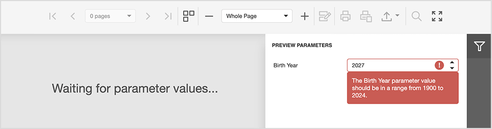
Documentation: Create a React Application with Web Document Viewer (Next.js)
#Native Angular Report Viewer
Toolbar Customization API
With this release, our Angular Report Viewer allows you to customize its built-in toolbar as requirements dictate. The following code snippet hides a toolbar item using the CustomizeMenuActions event handler:
CustomizeMenuActions(event) {
    var actionSearch = event.args.GetById(ActionId.Search);
    if (actionSearch)
        actionSearch.visible = false;
    }

    var highlightEditingFieldsAction = e.GetById(DevExpress.Reporting.Viewer.ActionId.HighlightEditingFields);
    if (highlightEditingFieldsAction)
        highlightEditingFieldsAction.visible = false;
}
The following code snippet adds a custom export option to the toolbar using the same event handler:
function CustomizeMenuActions(event) {
    const actionExportTo = event.args.GetById(ActionId.ExportTo);
    const newFormat = { format: 'NewFormat', text: 'New Format' };
    if (actionExportTo) {
        actionExportTo.events.on('propertyChanged', (args) => {
            const formats = actionExportTo.items[0].items;
            if (args.propertyName === 'items' && formats.indexOf(newFormat) === -1) {
                formats.push(newFormat);
            }
        });
    }
}
OnPush Change Detection Strategy Support
v24.1 also adds support for OnPush Change Detection Strategy. Angular's OnPush change detection strategy improves performance by reducing unnecessary rendering cycles and only triggering change detection when input references change. With this update, you can change the detection strategy from default to ChangeDetectionStrategy.OnPush by adding the changeDetection property in the @Component decorator as follows:
import { Component, ViewEncapsulation } from '@angular/core';
import { CommonModule } from '@angular/common';
import { RouterOutlet } from '@angular/router';
import { DxReportViewerModule } from 'devexpress-reporting-angular';

@Component ({
  selector: 'app-root',
  changeDetection: ChangeDetectionStrategy.OnPush,
  encapsulation: ViewEncapsulation.None,
  standalone: true,
  imports: [
      CommonModule,
      RouterOutlet,
      DxReportViewerModule
],
templateUrl: './app.component.html',
styleUrls: [...]
})

export class AppComponent {
  title = 'DXReportViewerSample';
  reportUrl: string = 'TestReport';
  hostUrl: string = 'https://localhost:5001/';
  invokeAction: string = '/DXXRDV';
}
#New Standalone Parameters Panel Component for ASP.NET Core, Blazor, Angular
Our new Standalone Report Parameters Panel automatically generates a layout for report parameter editors (including associated grouping) based on a backend supplied report instance.
In previous versions, you could only modify report parameter values within the Report Designer Print Preview and/or Document Viewer (parameters were modified directly within the control’s UI). Since our new Standalone Report Parameters Panel is a separate control, it can be placed anywhere in your application.
The Report Parameters Panel ships with the following capabilities/benefits:
- Reduced memory usage: By eliminating the need to generate report images in the background and send them to the client, the Report Parameters Panel reduces overall memory footprint. You don’t even have to use the Document Viewer to export or print reports with parameters.
- Same API members: Component implementation is based on the DevExpress Document Viewer’s Parameters Panel. As such, you have access to the same set of public report parameter properties/events.
- Custom buttons and handlers: The panel allows you to create custom submit buttons and manage associated click events (allowing you to serialize input parameter values, send them to the backend application, and apply them to an instance of the XtraReport class before printing or export operations).
A key consideration when developing our new Parameters Panel was the ability to use the panel independently, without displaying a report in the Document Viewer. Because the Parameters Panel operates independently, you can create custom layouts and behaviors to meet a variety of business requirements, including:
- Programmatically generate a report and export it without displaying a preview (use the Parameters Panel externally, without displaying a report in the Document Viewer).
- Create a custom user interface to send reports by Email - change a few of parameters in the UI to generate and send a new report based on new parameter values.
- Manage parameter values when generating very large reports. For instance, use CachedReportSource to avoid memory consumption-related issues when you display, print, or export large documents. Or use PdfStreamingExporter to export reports to PDF in either streaming or multi-threaded streaming export modes.
Here’s a sample component definition for the Angular platform:
<dx-report-parameters-panel class="parametersPanel" [reportUrl]="yourReportName" height="560px" width="400px">
    <dxrpp-request-options [invokeAction]="invokeAction" host="http://yourhostname:port/"></dxrpp-request-options>
    <dxrpp-callbacks (BeforeRender)="onBeforeRender($event)"></dxrpp-callbacks>
</dx-report-parameters-panel>
You serialize parameter values on the client and send them to the backend app. You can then apply them to an instance of the XtraReport class before printing or export operations:
onBeforeRender(event) {
    this.sender = event.sender;
    const panel = this.sender.GetParametersModel();
    panel.buttons.push({
        text: 'Export',
        onClick: async () => {
            const data = this.sender.SerializeParametersState();
            const formData = new FormData();
            formData.append('serializedParameters', data);
            formData.append('reportUrl', this.reportUrl);
            const result = await fetch(`${this.host}/ExportWithParameters`, {
                method: 'POST',
                body: formData
            }).then(response => response.json());
            alert(result.message);
        }
    }, {
        text: 'Send Email',
        onClick: () => {
            alert('Email sent');
        }
    });
    panel.showButtons = true;
}
The following code snippet applies parameter values on the backend:
public async Task<IActionResult> ExportWithParameters(
    [FromServices]IReportParametersSerializer reportParametersSerializer,
    [FromForm]string serializedParameters,
    [FromForm]string reportUrl)	{
        var report = await reportParametersSerializer.ApplyParametersStateAsync(reportUrl, serializedParameters);
        report.ExportToPdf("yourFilePath");
        return Ok(new { Message = "A report has been successfully exported" });
}
ExampleDocumentation
#Web Report Designer - Hide/Restrict Parameter Editing
We introduced a new set of APIs to help customize edit settings for parameters, parameter groups, and parameter separators. This API will be of value when creating a set of "canned" or predefined reports with mandatory/hidden parameters.
The new ParameterEditingSettings class contains the following settings that affect the Properties Panel, Field List and Parameter Editor:
The following code snippet turns parameters, parameter groups and separators to read-only for an ASP.NET Core application (users can't add/delete parameters/groups/separators, edit/reorder associated properties):
@{
  var designerRender = Html.DevExpress().ReportDesigner("reportDesigner")
      .ParameterEditingSettings( configure => {
          configure.AllowEditParameterCollection = false;
          configure.AllowEditParameterSeparators = false;
          configure.AllowEditParameterGroups = false;
          configure.AllowEditProperties = false;
          configure.AllowReorderParameters = false })
      .Height("100%")
      .Bind("TestReport");
  @designerRender.RenderHtml()
  }
We also introduced a new CustomizeParameterProperties event that allows you to customize a specific parameter or disable/hide specific properties editors at the web Report Designer level.
For instance, the following code snippet hides the Allow Null Value property editor for all parameters (both in the Properties Panel and Parameter Editor) and hides the delete button for parameter groups:
function customizeParameterProperties(s, e) {
    if (e.parameter) {
        let allowNullInfo = e.getEditor('allowNull');
        if (allowNullInfo) {
            allowNullInfo.visible = false;
        }
    }
    if (e.parameterPanelLayoutItem.layoutItemType === 'Group') {
        e.editOptions.allowDelete = false;
  }
}
Documentation
Reporting for Blazor
#Report Viewer - Send an Email
We created an example that uses the Mailkit library to send an email from our Native Blazor Report Viewer.
The "Send Email" button in the Viewer's toolbar opens a DxPopup. In the "Send Email" window, you can specify a recipient list, subject, attachment, and body. Click the "Send" button to send the report with the specified settings.
Example
All Platforms
#SVG Export
v24.1 ships with a new SVG export option. When enabled, it allows users to save reports as a collection of scalable vector graphics (SVG) images. This new export format will produce high-quality vector report page images without loss of text content quality. SVG export will be of value for those who wish to modify/share report images or embed report thumbnails on web pages (since the SVG format is fully compatible with modern browsers).
Open SVG file (Export Result)
#New Expression Functions
We added the following new expression functions to criteria language syntax used in DevExpress Reports:
PrevRowColumnValue(string columnName) — Allows users to retrieve the value of the previous column/row. The function call returns the same record if it is the first record in the data source.NextRowColumnValue(string columnName) — Allows users to retrieve the value of the next column/row. The function call returns the same record if it is the latest record in the data source.GroupIndex(int level) — Allows users to retrieve the current group index.CurrentRowIndexInGroup() — Allows users to retrieve the current row index within a group.
Functions are applicable to report control properties whose values can be set via expression binding. They are especially useful when you need to hide first or last records within a group, or highlight these records (i.e., modify appearance properties like Font, BackColor, etc.). Obtaining the group index or the row index within a group is helpful when you need to display group numbering in the group header or record numbering within the group itself. The introduction of PrevRowColumnValue and NextRowColumnValue functions also simplifies migration from Microsoft SSRS and Crystal Reports, where their counterparts exist.
The following example generates a report with a multi-level numbered list. To achieve this report layout, report controls use GroupIndex and CurrentRowIndexInGroup functions within data binding expressions (to return group and row indexes).
The following image illustrates output for a report designed to group information by product category and discontinued state (Review the following help topic for more information: Group Numbering by Index.):
Documentation
#Parameters Localization Enhancements
With our built-in DevExpress Reports localization engine, individuals using our Report Designer can now localize the titles of parameter groups displayed within the Parameters Panel across all supported platforms.
Descriptions for lookup parameter static values are also localizable.
Cloud Deployment
#Skia-Based Graphics Engine (non-Windows Environment) - Performance Enhancements
We refactored the implementation of our cross-platform drawing engine: we added caching for font internals and optimized dynamic memory allocation. Our internal tests indicate the following improvements when generating a 1500-page text-based report (average of 25 iterations):
- Time taken to create a report document has decreased by approximately 20% (9 sec vs. 11 sec).
- Time taken to export the report to PDF has decreased by approximately 16% (7.25 sec vs. 8.7 sec).
- Time taken to export the report to an image has decreased by approximately 10% (5.2 sec vs. 5.7 sec).
We also discovered that the overall CPU usage decreased by approximately 8-10%.
Note: Performance enhancements are most pronounced for large report documents with lots of text.
#Microsoft Azure and Amazon Web Services App Deployment Tutorials
We created and published a set of help topics designed to simplify the deployment of DevExpress Reports-powered web apps to Microsoft Azure and AWS. Tutorials include:
Microsoft Azure
- The deployment of an ASP.NET Core Reporting app via Visual Studio to Azure App Service (Linux)
- The deployment of a dockerized ASP.NET Core Reporting app via Visual Studio/CLI to Azure App Service (Linux)
- The deployment of an Azure Functions App (Linux-based) with the Reporting capabilities
- The usage of the Azure Storage Cache to store report documents
Amazon Web Services (AWS):
- The deployment of a dockerized ASP.NET Core Reporting app (Linux-based) to AWS Elastic Container Service using the AWS Fargate
- The deployment of an AWS Lambda function app
- The creation and deployment of a REST API application with Reporting capabilities to AWS Lambda
We encourage you to review these new topics: DevExpress Reporting — Cloud Integration.
#Reporting for Microsoft Azure — Updated References
We have refactored our internal implementation of services responsible for communicating with the Azure Service Bus and Azure Storage. These services are designed to host multi-instance ASP.NET Web Forms, MVC, and ASP.NET Core web apps with DevExpress Reports on Microsoft Azure. They also allow you to cache report documents in Azure Table and Azure Blob storage. Our implementation now uses the most recent versions of the following NuGet packages.
Documentation: Microsoft Azure Reporting - Implement Custom Storages
NuGet Packages: ASP.NET Web Forms & MVC | ASP.NET Core
Accessibility
We now support assistive tools for the following controls:
- Native Blazor Report Viewer
- JS Report Viewer
- WinForms Report Viewer*
- WPF Report Viewer*
We have enhanced the accessibility tree to ensure that assistive technologies receive the information they require from user interface elements in accordance with accessibility guidelines outlined in WCAG.
Assistive technologies (screen readers) can now access document content in all the controls listed above.
The following controls now fully supports keyboard navigation:
- Native Blazor Report Viewer
- HTML5/JS Report Viewer
Users can move through user interface elements and navigate through document content using tab, arrow and special keys.
Documentation
Data Sources
#SqlDataSource Wizard — Trust Level Certificate and Encryption Options
Please note that the changes described below are already available in the latest update of our current major version: v23.2.5.
We enhanced the user experience in our Data Source Wizard while binding a report to an instance of the MS SQL Server. The data source connection screen now features two new options marked on the screenshot:
These new options/changes allow you to avoid the "The certificate chain was issued by an authority that is not trusted" error while binding a report to MS SQL Server database if you cannot set up MS SQL Server differently. Learn more about this error and its cause in the following Microsoft topic: The certificate chain was issued by an authority that isn't trusted - SQL Server (Microsoft Learn).
New API Members in Documentation | Reporting — Tutorial
#SqlDataSource — Postgres Data Driver v7.0 Support
Initially, we hoped to introduce Postgres Stored Procedure support, but discovered that they are mostly useful for update and delete database operations (the SqlDataSource component operates in read-only mode).
Instead, we modified our Postgres Database connection and now allow you to bind DevExpress Reports and BI Dashboards to Postgres Functions while using the newest v7.0 database driver.
#JsonDataSource — The Use of The System.Text.Json NuGet Package
With v24.1, DevExpress Reports and BI Dashboard will utilize functionality from the System.Text.Json assembly/NuGet package (by default). This change was influenced by security considerations and the improved performance offered by Microsoft's built-in library. This package is part of .NET, and this change only pertains to the .NET product line; .NET Framework-based products remain untouched and will continue to use functionality from the Newtonsoft.Json package.
If, for any reason, you are unable to utilize System.Text.Json functionality in your .NET-based application, you can set the DevExpress.DataAccess.Native.Json.JsonLoaderHelper.JsonProcessingLibrary* property to NewtonsoftJson and continue using the Newtonsoft.Json library.
Breaking Change Description: System.Text.Json is used to process the JsonDataSource (DashboardJsonDataSource) component instead of the Newtonsoft.Json library
Survey - Reporting
Your Feedback Matters!
Please
login to complete the survey.
Survey Completed
Thank you for taking the time to complete this survey. Your responses have now been posted. If you want to follow up with additional information, feel free to send us an email at clientservices@devexpress.com anytime.
You've Already Completed This Survey
Our records show that you have already completed this survey. If you want to follow up with additional information, send us an email at clientservices@devexpress.com.
This survey has expired
If you want to share your feedback or request new functionality, please submit a new support ticket via the DevExpress Support Center. We’ll be happy to follow up.
Cascading Parameters
You can now set up cascading parameters to filter the data source or items in a dashboard. The list of values of a dependent parameter now refreshes automatically when you change the value of the parent parameter. When using two parameters, the parent parameter is used to filter the data source for the dependent parameter with dynamic list settings. The following image illustrates cascading parameters where Products parameter values are filtered by the selected Category:
Documentation (WinForms) | Documentation (Web)
Web Dashboard Enhancements
#Cache Management API
This update allows you to tailor our built-in BI Dashboard caching engine. Customers encountered several scenarios where our built-in cache needed to be disabled, prompting us to introduce the following API.
You can now use the ASPxDashboard.DataSourceCacheEnabled property for Web Forms (or the DashboardConfigurator.DataSourceCacheEnabled property for other web platforms) to disable caching entirely. This forces the DevExpress Dashboard to load the most relevant data whenever a user accesses and views a dashboard.
By default, whenever a dashboard parameter value changes, a new data source instance is created and stored in the cache. This impacts memory usage, especially when a parameter doesn't affect data source filtering. As such, we added the ASPxDashboard.DataSourceCacheKeyCreated/ DashboardConfigurator.DataSourceCacheKeyCreated event to prevent the creation of new cache records based on parameter values/available event arguments. For instance, consider the following:
DashboardConfigurator.Default.DataSourceCacheKeyCreated += (s, e) => {
  if(e.Key.DashboardId == "MyDashboard")
    e.Key.Parameters.Clear();
};
In this scenario, altering a parameter value updates dashboard item data, while reusing the existing data source from the cache without additional fill requests.
Furthermore, you can utilize this event to update a specific data source when any interaction with the dashboard takes place:
DashboardConfigurator.Default.DataSourceCacheKeyCreated += (s, e) => {
  if(e.Key.DataSourceId == "dsSales")
    e.InvalidateCacheRecord();
};
Another use case involves increasing cache key granularity by including groups of users or the users themselves in the cache key. You can utilize the new IDataSourceCacheKey.CustomData property for this purpose. The primary advantage of this strategy is that the key is solely used for creating/retrieving records from the cache and is never exposed on the client side, thus maintaining the security aspect of the implementation:
DashboardConfigurator.Default.DataSourceCacheKeyCreated += (s, e) => {
  e.Key.CustomData.Add("UserId", CurrentUser.UserId);
};
#Accessibility — Keyboard Navigation
Keyboard navigation is fully supported for groups and dashboard items. Users can move through user interface elements using tab, arrow and special keys.
Data Sources
#SqlDataSource Wizard — Trust Level Certificate and Encryption Options
Please note that the changes described below are already available in the latest update of our current major version: v23.2.5.
We enhanced the user experience in our Data Source Wizard while binding a report to an instance of the MS SQL Server. The data source connection screen now features two new options marked on the screenshot:
These new options/changes allow you to avoid the "The certificate chain was issued by an authority that is not trusted" error while binding a report to MS SQL Server database if you cannot set up MS SQL Server differently. Learn more about this error and its cause in the following Microsoft topic: The certificate chain was issued by an authority that isn't trusted - SQL Server (Microsoft Learn).
New API Members in Documentation | BI Dashboard — Tutorial
#SqlDataSource — Postgres Data Driver v7.0 Support
Initially, we hoped to introduce Postgres Stored Procedure support, but discovered that they are mostly useful for update and delete database operations (the SqlDataSource
Instead, we modified our Postgres Database connection and now allow you to bind DevExpress Reports and BI Dashboards to Postgres Functions while using the newest v7.0 database driver.
#JsonDataSource — The Use of The System.Text.Json NuGet Package
With v24.1, DevExpress Reports and BI Dashboard will utilize functionality from the System.Text.JsonNewtonsoft.Json
If, for any reason, you are unable to utilize System.Text.Json functionality in your .NET-based application, you can set the DevExpress.DataAccess.Native.Json.JsonLoaderHelper.JsonProcessingLibraryNewtonsoftJson
Breaking Change Description: System.Text.Json is used to process the JsonDataSource (DashboardJsonDataSource) component instead of the Newtonsoft.Json library
Your feedback matters.
Please, review the description of DevExpress Office File API-related features below and leave your feedback at the end of the section.
Go to the survey now.
Accessibility Enhancements
We extended accessibility-related support to the following elements when exporting Word documents to accessible PDF files:
- Table of Contents tagging
- Metadata fields
- Alt text handling
- Tables
- Floating objects
Adobe Acrobat Pro and PDF Accessibility Checker 2024 were used for quality control. Our test documents successfully passed validation for PDF/UA compatibility and WCAG 2.1 compliance.
Accessibility-related export enhancements are available out-of-the-box when you specify the PdfUACompatibility
using System.IO;
using DevExpress.XtraRichEdit;
// ...
RichEditDocumentServer wordProcessor = new RichEditDocumentServer();
//...
using(FileStream stream =
    new FileStream(resultFilePath, FileMode.Create, FileAccess.Write, FileShare.Read)) {
    PdfExportOptions exportOptions = new PdfExportOptions();
    exportOptions.PdfUACompatibility = PdfUACompatibility.PdfUA1;

    wordProcessor.ExportToPdf(stream, exportOptions);
}
In addition, we added a Decorative
Printing on Unix-based Systems
In this release (v24.1), we added printing support for .NET-based Office File API powered applications running on Unix-based systems. You can now print barcodes, and Word, Excel, and PDF documents in non-Windows environments.
We created a new set of APIs that work with the DXPrinterSettings options available in our DevExpress.Drawing library.
Use the following new methods to print your documents and barcodes on Unix-based systems:
// DevExpress.XtraRichEdit.RichEditDocumentServer:
public void Print(DXPrinterSettings printerSettings, string printDocumentName);
public void Print(DXPrinterSettings printerSettings);

//DevExpress.Spreadsheet.Workbook:
public void Print(DXPrinterSettings printerSettings);
public void Print(DXPrinterSettings printerSettings, params string[] sheetNames);
public void Print(DXPrinterSettings printerSettings, IEnumerable<string> sheetNames);

//DevExpress.BarCodes.BarCode:
public void Print(DXPrinterSettings printerSettings);
For the DevExpress.Pdf.PdfDocumentProcessorPrint(PdfPrinterSettings printerSettings)PdfPrinterSettings.DXPrinterSettings
using DevExpress.Drawing.Printing;
using DevExpress.Pdf;

// Load a PDF file
PdfDocumentProcessor documentProcessor = new PdfDocumentProcessor();
documentProcessor.LoadDocument(@"..\..\Demo.pdf");

// Declare printer settings
PdfPrinterSettings pdfPrinterSettings = new PdfPrinterSettings();

// Specify CUPS printer settings
DXPrinterSettings dxPrinterSettings = pdfPrinterSettings.DXSettings;
dxPrinterSettings.Duplex = DXDuplexMode.DuplexLongEdge;
dxPrinterSettings.Copies = 3;

// Print the document
documentProcessor.Print(pdfPrinterSettings);
Note: For Unix-based systems, you need to install the libcups2
Export Documents to SVG
We extended our image export engine and now support SVG images within our Barcode Generation API, Word Processing Document API, and Spreadsheet Document API libraries. With v24.1, you can generate SVG images from your Barcodes, Word document pages and Excel worksheets/cell ranges in both Windows and non-Windows environments.
To generate an SVG image from a barcode, create a BarCode class instance, modify settings as necessary and call the BarCode.Save method with DXImageFormat.Svg
using (BarCode barCode = new BarCode()) {
    barCode.Symbology = Symbology.QRCode;
    barCode.BackColor = Color.White;
    barCode.ForeColor = Color.Black;
    barCode.RotationAngle = 0;
    barCode.CodeBinaryData = Encoding.Default.GetBytes("https://www.devexpress.com/");
    barCode.Options.QRCode.CompactionMode = QRCodeCompactionMode.Byte;
    barCode.Options.QRCode.ErrorLevel = QRCodeErrorLevel.Q;
    barCode.Options.QRCode.ShowCodeText = false;
    barCode.DpiX = 72;
    barCode.DpiY = 72;
    barCode.Module = 2f;

    barCode.Save("barcode.svg", DXImageFormat.Svg);
}
For Word documents, use our new Image Export API - create an RichEditImageExportOptionsRichEditImageExportOptions.Format
using (var wordProcessor = new RichEditDocumentServer()) {
    wordProcessor.LoadDocument(@"C:\Documents\Alice.docx");
    RichEditImageExportOptions options = new RichEditImageExportOptions();
    options.Format = DXImageFormat.Svg;
    options.PageRange = "1";

    wordProcessor.Document.ExportToImage("first_page_image.svg", options);
}
To export a cell range in an Excel worksheet to an SVG image, call the CellRangeExtensions.ExportToImage method with ImageFileFormat.Svg
using (Workbook workbook = new Workbook()) {
    workbook.LoadDocument("InvestmentPortfolio.xlsx", DevExpress.Spreadsheet.DocumentFormat.Xlsx);
    Worksheet worksheet = workbook.Worksheets.ActiveWorksheet;

    worksheet.Range["B18:I30"].ExportToImage("cell_range_image.svg", ImageFileFormat.Svg);
}
Spreadsheet Document API
#Justify & Distributed Text Alignment
v24.1 adds support for Justify and Distributed horizontal alignment types within Spreadsheet cells. Excel files using these alignment options can be printed and exported to PDF.
You can use the Cell.Alignment.Horizontal property to specify horizontal alignment in code.
The following code snippet specifies alignment in code:
var workbook = new Workbook();
var worksheet = workbook.Worksheets[0];

Cell cellA1 = worksheet.Cells["A1"];
cellA1.Value = "Justified and top";
cellA1.Alignment.Horizontal = SpreadsheetHorizontalAlignment.Justify;
cellA1.Alignment.Vertical = SpreadsheetVerticalAlignment.Top;
workbook.ExportToPdf("Result.pdf");
#Sort and Filter by Color
The DevExpress Spreadsheet Document API ships with enhanced filter and sort-related capabilities. We added new APIs that can sort and filter workbook data by background and font color. Cell ranges filtered/sorted by cell color can be also printed and exported to PDF.
Our Sorting APIs include new Worksheet.Sort method overloads designed to sort a specified range by font color or fill setting (background color and pattern).
The following code snippet sorts cell values across two cell ranges - the first is sorted by a red font color and the second is sorted by fill settings specified for the first cell in the range:
workbook.LoadDocument("sort-filter.xlsx");
Worksheet worksheet = workbook.Worksheets.ActiveWorksheet;

// Sort cell range by font color
worksheet.Sort(worksheet["B2:B10"], Color.Red);
// Sort cell range by fill color
worksheet.Sort(worksheet["D2:D10"], worksheet["D2"].Fill);
To filter cells by font or background color, you need to apply an auto-filter to the required cell range or table. Once complete, you need to obtain the required column from the AutoFilter.Columns
The following code snippet uses these methods for both cell range and table:
workbook.LoadDocument("sort-filter.xlsx");
Worksheet worksheet = workbook.Worksheets.ActiveWorksheet;

// Apply an auto-filter to a cell range and filter the first column by font color
worksheet.AutoFilter.Apply(worksheet["B1:B10"]);
worksheet.AutoFilter.Columns[0].ApplyFontColorFilter(Color.Red);

// Create a table, apply an auto-filter and filter the first column by fill color
Table table = worksheet.Tables.Add(worksheet["B12:B21"], true);
table.AutoFilter.Apply();
table.AutoFilter.Columns[0].ApplyFillColorFilter(Color.Red);
In addition, our new APIs allow you to sort data across a filtered range (when auto-filter is enabled) and sort cells by their values/colors simultaneously (using sorting conditions).
Documentation: Sort Cell Range by Color
PDF Document API
#Layers API
v24.1 includes an enhanced PDF Facade API and new APIs designed to manage Optional Content (Layers) visibility in code.
Note: A PDF document only stores a default Optional Content configuration. This means that Layer visibility is not preserved when you save the document. Visibility settings are only applicable when you preview the document in the PDF Viewer component or print the document/export it to an image.
The new API is available via the PdfDocumentFacade.OptionalContentVisibility property. Access Optional Content groups using the PdfOptionalContentVisibility.Groups
The following code snippet changes visibility for Optional Content groups stored in the document and generates print/image output (to preview results):
PdfDocumentProcessor processor = new PdfDocumentProcessor();
processor.LoadDocument("layers.pdf");

// Set visibility for each Layer
processor.DocumentFacade.OptionalContentVisibility.Groups[0].Visible = false;
processor.DocumentFacade.OptionalContentVisibility.Groups[1].Visible = false;
processor.DocumentFacade.OptionalContentVisibility.Groups[2].Visible = true;

// Print document or export its page to an image to check the result
DXBitmap bitmap = processor.CreateDXBitmap(1, 1000);
processor.Print();
Documentation: Manage Visibility of Layers (Optional Content Groups)
#PDF-A Converter Enhancements
With this release (v24.1), our PdfDocumentConverter can convert your documents to PDF/A-1b. To create PDF/A-1b documents, pass the PdfCompatibility.PdfA1b
using DevExpress.Pdf;
// ...
var filePath = "PdfAConversionDemo.pdf";
var converter = new PdfDocumentConverter(filePath);

// Convert the file to the Pdf/A1-b format.
converter.Convert(PdfCompatibility.PdfA1b);
converter.SaveDocument("Result.pdf");
We also added PdfDocumentConverter.PdfACompatibility and PdfDocumentConverter.PdfUACompatibility properties to help obtain the current PDF/A and PDF/UA versions of the document loaded to the converter.
Word Processing Document API
#Math Equations
Our Word Processing tools now preserve Math Equations when saving a document. You can import your Word documents with Math Equations in our Word Processing Document API library and save them to the RTF and OpenXml (.docx/.docm) formats without content loss. Note: Math Equations will be printed or exported to PDF only if the source document contains a fallback image for a Math Equation. To suppress Math Equation import, set the DocumentCapabilities.MathEquations property to DocumentCapability.Disabled
#Cross-Platform Image Export API
v24.1 includes new cross-platform APIs to export Word document pages to an image. This new capability allows you to generate document previews in both Windows and non-Windows environments. With our new APIs, you can convert document pages to raster and vector images (PNG, JPEG, BMP, multi-page Tiff, emf), save them as physical files on the disk or obtain a list of image streams for further processing in code. You can also set image background color, modify output image resolution, or generate thumbnail images with a specified size.
The new API is available via the RichEditDocumentServerExtensions.ExportToImage extension method of the Document
Please note that the RichEditDocumentServerExtensionsRichEditDocumentServerExtensions
The following code snippet exports the first document page to an image with a specified size and JPEG format:
using DevExpress.XtraRichEdit;
using DevExpress.XtraRichEdit.Export.Image;
using DevExpress.Drawing;


using (var wordProcessor = new RichEditDocumentServer()) {
    wordProcessor.LoadDocument(@"C:\Documents\Alice.docx");

    RichEditImageExportOptions options = new RichEditImageExportOptions();
    options.Format = DXImageFormat.Jpeg;
    options.PageRange = "1";
    options.LargestEdgeLength = 1080;

    wordProcessor.Document.ExportToImage(@"C:\Documents\Image.jpeg", options);
}
#Gutter and Mirrored Margins
The DevExpress Word Processing Document API v24.1 allows you to specify gutter margins - extra space that ensures binding will not obscure text on printed pages. You can specify gutter position (top, left, and right) and margin size. Use the Document.GutterAtTop, SectionMargins.GutterPosition, and SectionMargins.Gutter properties to address specific usage requirements.
The following code snippet adds a left gutter to the first document section:
using DevExpress.XtraRichEdit;
using DevExpress.XtraRichEdit.API.Native;
using DevExpress.Office.Utils;

using (var wordProcessor = new RichEditDocumentServer()) {
    wordProcessor.LoadDocument(@"Documents//Alice.docx");

    Document document = wordProcessor.Document;

    Section firstSection = wordProcessor.Document.Sections[0];

    var pageMargins = firstSection.Margins;
    pageMargins.GutterPosition = GutterPosition.Left;
    pageMargins.Gutter = Units.InchesToDocumentsF(1);

    wordProcessor.SaveDocument("Alice_formatted.docx", DocumentFormat.OpenXml);
}
Our new Document.MarginType property allows you to define a regular or mirrored margin type. Enable mirrored margins if you print on both sides of the paper and want to bind the printout.
The following code snippet enables mirrored margins and specifies an additional space value:
using DevExpress.XtraRichEdit;
using DevExpress.XtraRichEdit.API.Native;
using DevExpress.Office.Utils;

using (var wordProcessor = new RichEditDocumentServer()) {
    wordProcessor.LoadDocument(@"Documents//Alice.docx");
    Document document = wordProcessor.Document;

    // Enable mirrored margins
    document.MarginsType = MarginsType.Mirrored;

    foreach (Section section in wordProcessor.Document.Sections) {
        var pageMargins = section.Margins;
        // Set the value for mirrored margins
        pageMargins.Gutter = Units.InchesToDocumentsF(0.5f);
    }

    wordProcessor.SaveDocument("Alice_formatted.docx", DocumentFormat.OpenXml);
}
Documentation
Survey - Office File API
Your Feedback Matters!
Please
login to complete the survey.
Survey Completed
Thank you for taking the time to complete this survey. Your responses have now been posted. If you want to follow up with additional information, feel free to send us an email at clientservices@devexpress.com anytime.
You've Already Completed This Survey
Our records show that you have already completed this survey. If you want to follow up with additional information, send us an email at clientservices@devexpress.com.
This survey has expired
If you want to share your feedback or request new functionality, please submit a new support ticket via the DevExpress Support Center. We’ll be happy to follow up.
Your feedback matters.
Please, review the description of .NET MAUI-related features below and leave your feedback at the end of the section.
Go to the survey now.
New TreeView Control
v24.1 includes a new .NET MAUI TreeView control. Designed to present hierarchical data, our .NET MAUI TreeView allows you to create intuitive and visually appealing user interfaces with ease. With our new .NET MAUI TreeView (DXTreeView), you can quickly visualize files structures, organization linked relationships, hierarchical data sets, navigation menus, and more.
Our .NET MAUI TreeView ships with the following built-in capabilities:
- Hierarchical and self-referential data support
- Independent and recursive check box support
- Filtering
- Sorting
- Selection
- Swipe items
- Item template support
Documentation
New Slide View Control
v24.1 ships with a new SlideView component - designed to leverage swipe gestures (right/left or up/down) for view navigation. Our .NET MAUI SlideView component can help you create a variety of user interface solutions including application galleries or user tutorial screens.
The DevExpress .NET MAUI SlideView includes:
- MVVM support (ItemsSource, ItemTemplate, ShowNext/ShowPrevious commands)
- Item caching for improved app performance
- Horizontal/vertical orientation
- Looped and animated navigation
Documentation
New Expander Control
This release includes a .NET MAUI Expander (DXExpander) container component to help organize screen content into collapsible/expandable groups. DXExpander supports horizontal and vertical orientation and ships with fluid collapse/expand animation effects.
Documentation
New Scroll View Control
v24.1 includes a new .NET MAUI ScrollView container component designed to help you generate scroll-centric mobile interfaces. With our .NET MAUI ScrollView, users can scroll content across both vertical and horizontal directions.
Documentation
New Slider Controls
We added two slider controls to our .NET MAUI component suite:
- DXSlider — allows users to select a numeric value.
- DXRangeSlider — allows users to select a range of numeric values.
Features include:
- Configurable scale step
- Minimum and maximum values
- Customizable thumbs, tickmarks, and track
- Thumb tooltips
Documentation
Scheduler
#Agenda View
Our new .NET MAUI AgendaView component allows you to display schedules, events, and appointments as a single day.
Features include:
- Ability to hide empty time slots to save screen space
- Appointment and header appearance customization options
- Built-in button to create a new appointment
Documentation
PDF Viewer
#Document Signatures
With v24.1, users can sign PDF documents via our intuitive user interface (users can draw a signature at a given location or select a predefined signature). Signatures can be selected, moved and resized. Users can also specify ink color and line width.
Note: To use our .NET MAUI PDF Viewer, you must purchase a separate license (the PDF Viewer is not part of the DevExpress free .NET MAUI offer).
To respond to user sign actions, our .NET MAUI PDF Viewer includes the following events:
SignatureCreating / SignatureCreatedSignatureChangedSignatureDeleting / SignatureDeletedSignatureSelectionChanged
Documentation
#Text Selection
Users are now able to select PDF document text and highlight or copy it to the clipboard as requirements dictate. To help facilitate selection, we added a selection context menu that appears when text is selected (the menu includes copy and highlight commands).
You can also interact with selected content via new API methods and events.
Documentation
#Text Formatting Annotations
v24.1 allows you to highlight selected text with different markup text annotations. The following text decorations can be added via the interface or API:
- Highlight
- Underline
- Strikethrough
- Underline with a wavy line
Documentation
#Graphic Annotations
Users can now add annotations to a PDF document, and then comment/collaborate with one another. Our .NET MAUI PDF viewer supports the following annotations:
- Sticky notes
- Free text
- Ellipses (Circle annotations)
- Rectangles (Square annotations)
- Free-hand drawing
Documentation
#Acro Fields
AcroForms are interactive fields within a PDF document. They allow users to easily fill out forms and can help you gather data.
The following AcroForms are included:
- Text fields with following attributes supported: input character limit, read-only, multi-line, password.
- Check boxes
- Radio buttons
- List boxes with single and multiple selection support
- Combo boxes with single selection support
You can also import/export AcroForm data in CSV, XML and FDF formats.
Documentation
Filtering UI
#Predefined Filters
v24.1 will ship with a new PredefinedFilterCheckedChipGroupItem component. You can leverage this new UI element to add quick chip filters. Each filter chip allows you to set display text and filter criterion. Common usage scenarios for our optimized .NET MAUI Filter UI/Filter Item include creating favorite user filters or filtering based on a predefined value range.
<ContentPage ...
  xmlns:dxe="clr-namespace:DevExpress.Maui.Editors;assembly=DevExpress.Maui.Editors">
<!--...-->
<dxe:PredefinedFilterCheckedChipGroupItem Text="Price" FieldName="Price" ShowValueCounts="true">
<dx:PredefinedFilter Text="$0 - $500" FilterExpression="?p < 500"/>
<dx:PredefinedFilter Text="$500 - $2000" FilterExpression="?p >= 500 AND ?p < 2000"/>
<dx:PredefinedFilter Text="$2000+" FilterExpression="?p >= 2000"/>
</dxe:PredefinedFilterCheckedChipGroupItem>
<!--...-->
</ContentPage>
Documentation
#Multi-Column Layout
The DevExxpress .NET MAUI CollectionView now supports multiple items within any row/column. Our multi-span layout can simplify design if/when collection view items are displayed as cards (allowing you to display more items on screen).
For more information, please refer to the following API members:
#Ripple Effect
Our .NET MAUI CollectionView now supports ripple effects for tapped items. Ripple animations can help you create more intuitive user experiences. To activate ripple effects, enable the UseRippleEffect property.
#Item and Group Separators
Separators are common elements and are used in most collections. With our most recent update, you no longer need to add a separator to your item template. This enhancement simplifies XAML code and template arrangement logic. The following APIs will help you add separators to our .NET MAUI CollectionView:
HTML Editor
#Tables
Users can now add and edit tables within our .NET MAUI HTML Editor. Like other DevExpress .NET MAUI controls, user interface elements are designed to maximize ease-of-use on mobile devices/form factors.
Documentation
Button
#Ripple Effect
We added ripple effect support to our .NET MAUI Button component. Use the UseRippleEffect property to activate ripple animations for individual buttons.

Orientation-Based Settings
With our new OnOrientation markup extension, it's much easier to implement a responsive UI based on device orientation. There is no need to write C# code and handle orientation changes: you can specify orientation-based settings in XAML.
Documentation
<ContentPage ... xmlns:dx="clr-namespace:DevExpress.Maui.Core;assembly=DevExpress.Maui.Core">
    <!--...-->
    <dx:DXButton Content="Click" Padding="{dx:OnOrientation Portrait='10,6', Landscape='12,8'}"/>
    <!--...-->
</ContentPage>
Target Plain .NET
As you may know, the XUnit testing library requires standard .NET 8 (not .NET 8.0 Android/iOS) to be referenced as a target framework within project settings. In previous versions, you could not use our controls in a standard .NET 8 project and therefore you could not use XUnit. With v23.2.5, you can target standard .NET 8 in projects when using DevExpress .NET MAUI component libraries.
Documentation
<Project Sdk="Microsoft.NET.Sdk">
    <PropertyGroup>
        <TargetFrameworks>
            net8.0;net8.0-android;net8.0-ios
        </TargetFrameworks>
        <OutputType Condition="'$(TargetFramework)' != 'net8.0'">
            Exe
        </OutputType>
        <!-- ... -->
    </PropertyGroup>
    <!-- ... -->
</Project>
Optimized Memory Consumption
With this update, DevExpress .NET MAUI components allow you to ship mobile apps with a significantly lower memory footprint (prevents memory-related issues and improves overall performance).
Build Settings
The DevExpress.Maui.Core NuGet package now includes ".props" and ".targets" files for default build settings. These settings allow you to maximize performance and minimize application size across a variety of usage scenarios. Additionally, they allow you to use Emit as needed (to generate Entity Framework Core classes dynamically).
Documentation
Common XAML Namespace
You can now reference all DevExpress .NET MAUI Controls with a single "xmlns:dx="http://schemas.devexpress.com/maui" XAML namespace. To update app XAML, simply use our XamlTool.
<ContentPage ...
      xmlns:dx="http://schemas.devexpress.com/maui"
<ContentPage ...
      xmlns:dx="clr-namespace:DevExpress.Maui.Core;assembly=DevExpress.Maui.Core"
      xmlns:dxcv="clr-namespace:DevExpress.Maui.CollectionView;assembly=DevExpress.Maui.CollectionView"
      xmlns:dxg="clr-namespace:DevExpress.Maui.DataGrid;assembly=DevExpress.Maui.DataGrid"
      xmlns:dxco="clr-namespace:DevExpress.Maui.Controls;assembly=DevExpress.Maui.Controls"
DevExpress CRM Demo
Our new real-life application demonstrates the following features/capabilities:
- Mobile-friendly CRUD flow (using an SQLite database).
- Basic and advanced .NET MAUI filtering UI elements.
- Master-detail view that leverages the DevExpress .NET MAUI BottomSheet control to display selected item info.
- Export .NET MAUI DataGrid data to Excel and PDF.
- Import Excel file data and display it within the DevExpress .NET MAUI DataGrid.
- Document processing using the DevExpress Office File API library.
- Report generation powered by DevExpress Reports.
- Material Design 3 theme support.
- Data visualization using charts and circular gauge.
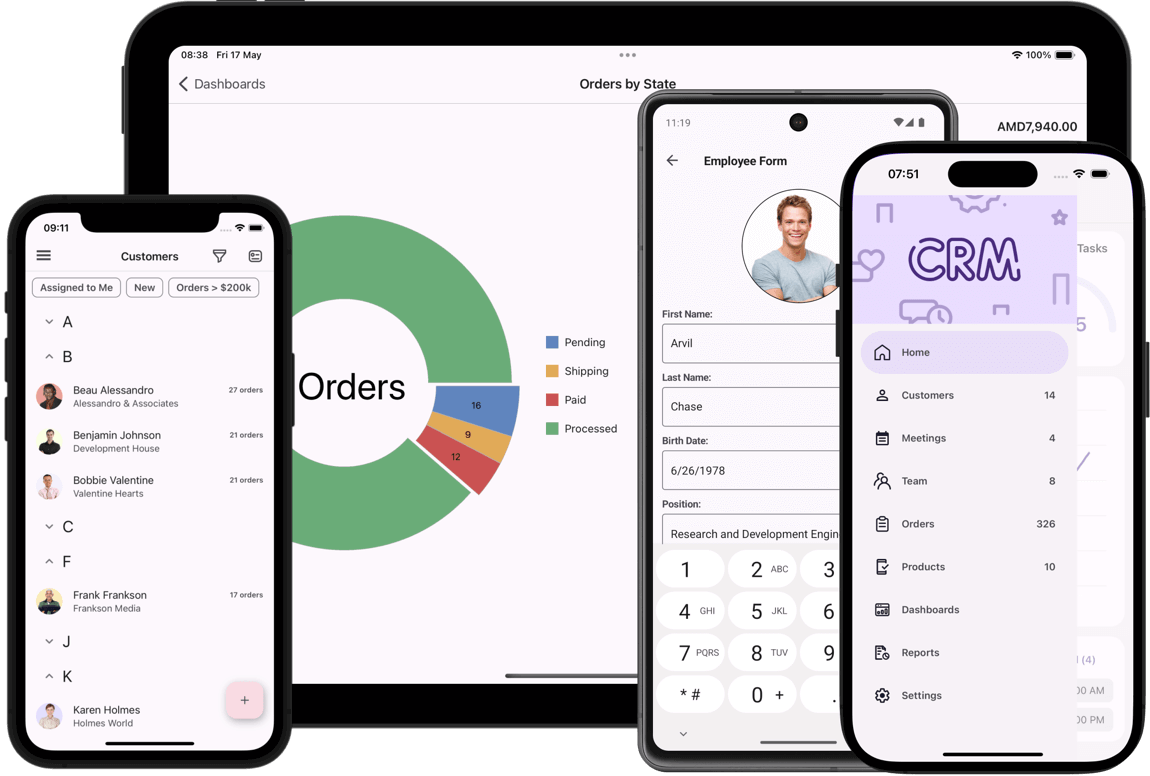
Download our free demo app from the Google Play Store, TestFlight, or GitHub, and see DevExpress MAUI UI controls in action.


Source Code for Demo App (iOS and Android)
Survey - .NET MAUI
Your Feedback Matters!
Please
login to complete the survey.
Survey Completed
Thank you for taking the time to complete this survey. Your responses have now been posted. If you want to follow up with additional information, feel free to send us an email at clientservices@devexpress.com anytime.
You've Already Completed This Survey
Our records show that you have already completed this survey. If you want to follow up with additional information, send us an email at clientservices@devexpress.com.
This survey has expired
If you want to share your feedback or request new functionality, please submit a new support ticket via the DevExpress Support Center. We’ll be happy to follow up.
Your feedback matters.
Please, review the description of Cross-Platform .NET App UI (XAF) and Web API Service related features below and leave your feedback at the end of the section.
Go to the survey now.
Blazor – CRUD
#Batch / Cell Edit in Grid List Editor
Batch Edit support officially ships in XAF Blazor v24.1 via a single option (InlineEditMode = Batch) - much like its XAF WebForms counterpart.
Roman Shelomanov
We have been testing this since 24.1 EAP and now in 24.1.2 Beta and it works fantastic. Thank you so much for getting it done, it's one extra step to get Blazor to feature parity with WinForms that lots of us have used and loved over the years.
#Export Data from Grid List Editor to Excel when DataAccessMode = Server
Our Blazor Components and XAF v24.1 support Excel export functionality for grids bound to server-side data (for both EF Core and XPO ORM). To export data to Excel, the DevExpress Blazor Grid will display a loading indicator and download all records from a data source.
#Add New Fields into the Customization Form of the Grid and Layout Controls at Runtime
XAF WinForms apps include an Object Model dialog. With it, end-users can search, tick or untick data model fields (including sub-fields and collections), which are not yet displayed in the grid or layout control (as part of the Column Chooser or Customization Form).
Much like Microsoft Office apps, this capability allows users to fully customize list and detail forms (based on the structure of a data model). Again, this is helpful when developers need to address changes to business requirements without redeployment. For more information, refer to Runtime Layout Customization in ASP.NET Core Blazor Applications.
XAF Blazor v24.1 provides a similar experience for both ListView (Column Chooser) and DetailView (Customization Form). This feature removes the need for many UI customizations in the design-time Model Editor (inside Visual Studio) - something many of you love in XAF WinForms UI. Of course, you can also disable these runtime capabilities for end-users.
Blazor – Usability
Philippe Petrussa
As mentioned in one of your posts, DevExpress has strongly reduced the boilerplate code to integrate Blazor editors in XAF Blazor. Great Job!
#Tabbed MDI Support
Tabbed MDI is a multiple document interface (MDI) UI metaphor found in many modern applications (including your favorite Web browser or Microsoft Outlook Web). It is a robust interface that maximizes document screen real estate, especially when working with multiple documents, email messages, etc.
Tabbed MDI is enabled in XAF WinForms apps by default, and XAF Blazor provides a similar user experience in v24.1. You can also customize Tabbed MDI in the Model Editor as follows:
-
Restore previously opened tabs between application runs (
RestoreTabbedMdiLayout = True by default).
-
Refresh View data source on tab focus (
RefreshViewOnTabFocus = False by default)
-
Display or hide tab images (
ShowTabImage = True by default)
In addition, you can access the underlying tab control in code and configure it as needed using a Controller (in the "SolutionName.Blazor" project). For instance, you can load tabs on demand or simultaneously:
protected override void OnFrameAssigned() {
    base.OnFrameAssigned();
    Frame.TemplateChanged += Frame_TemplateChanged;
}
void Frame_TemplateChanged(object sender, EventArgs e) {
    if(Frame.Template is ITabbedMdiMainFormTemplate template) {
        template.TabsModel.RenderMode = DevExpress.Blazor.TabsRenderMode.AllTabs;
    }
}
#Simplified Creation of Custom Blazor Property and List Editors
In v24.1, we reduced boilerplate code for many popular UI customization scenarios:
- Create custom Property and List Editors.
- List/Property Editors access control options in code without adapters.
Previously, XAF Blazor developers had to create intermediate Component Adapter, Renderer and other boilerplate classes, which were cumbersome or noisy.
With this release, the amount of required code is much less (like its XAF WinForms counterpart). Our built-in ComponentModel classes now handle component ValueChanged events (TextChanged, DateChanged, TimeChanged, etc.) and automatically read and write component values (text, date, time, etc.). The minimal implementation of a Blazor property editor based on DxTextBoxModel component model is as follows in v24.1:
[PropertyEditor(typeof(string), false)]
public class CustomStringPropertyEditor : BlazorPropertyEditorBase {
    public CustomStringPropertyEditor(Type objectType, IModelMemberViewItem model) : base(objectType, model) { }
    public override DxTextBoxModel ComponentModel => (DxTextBoxModel)base.ComponentModel;
    protected override IComponentModel CreateComponentModel() => new DxTextBoxModel();
}
Controller code used to customize a List View or DetailView Property Editor control is also simpler in v24.1 (since no adapter is required):
public class CustomizeDateEditorController : ViewController<DetailView> {
    protected override void OnActivated() {
        base.OnActivated();
        View.CustomizeViewItemControl<DateTimePropertyEditor>(this, CustomizeDateTimeEditor);
    }
    void CustomizeDateTimeEditor(DateTimePropertyEditor propertyEditor) {
        // v23.2
        //if(propertyEditor.Control is DxDateEditAdapter adapter) {
        //    adapter.ComponentModel.TimeSectionVisible = true;
        //}
        // v24.1+
        propertyEditor.ComponentModel.TimeSectionVisible = true;
    }
}
Our newest Outlook Inspired Demo app contains many custom Property and List Editors. It’s a great source for UX validation/comparison between v23.2 and v24.1.
Breaking Change
Martin Praxmarer
I really love it – I have integrated the new Blazor Progress Bar in nearly 5 minutes – without creating an adapter – nor an razor component! Thank you Guys – simply wonderful!
#Accessibility Enhancements and Keyboard Support
Currently, XAF (UI for ASP.NET Core Blazor, WinForms, and ASP.NET WebForms) ships with partial accessibility support mirroring those found in corresponding DevExpress UI controls across respective UI platforms:
XAF Blazor also ships with its own set of UI components/elements (like property editors and action containers). In v24.1, we extended accessibility support and improved keyboard support for all XAF Blazor UI elements (~20% of scenarios). XAF accessibility support will also level up automatically as soon as we enhance accessibility in DevExpress Blazor UI components throughout 2024.
Our Blazor Grid's keyboard navigation option also officially ships and is enabled by default in XAF Blazor.
Documentation
Blazor – Extra Modules
Steve Mitchell
Our main Windows XAF app has been in production for many years and is used by Venues, corporations, museums, exhibition spaces, etc. We have been providing it as a SAAS offering for that past few years via Citrix on a private cloud in the US and also on Azure in Canada and Australia - separate cloud locations due to data privacy laws of each region :)
We are getting close to being able to switch our cloud offering to the XAF Blazor application which will allow us to move away from Citrix which is costly due to the infrastructure requirements and per user licensing of MS RDP and Citrix. I have been testing the XAF blazor (and associated pure Blazor support apps) on our Canadian Azure cloud publishing directly as App Services and have been very pleased so far.
#Scheduler Module - Shared/Multiple Resources
The underlying Blazor scheduler component (DxScheduler) supports multiple resources for a scheduler appointment/event in v24.1. XAF Blazor Scheduler module now allows you to use shared resources as well. Previously, only a single resource was allowed in DxScheduler, and XAF displayed a validation error message when you attempted to link multiple resources to an appointment.
Documentation
#Notifications Module Support
XAF Blazor v24.1 supports our Notifications Module. The module allows you to display reminders for scheduler appointments or any custom objects (such as tasks). The detail form for a scheduler appointment/event also allows you to configure reminders like those available in Microsoft Outlook.
With the help of the Notifications Module, your app can display a popup window before appointment/event start times.
Note: our Notifications module does not have to be bound to the Scheduler module: it can display notifications that originate from anywhere. In the latter instance, your goal as a developer is to provide the notifications service with notification items and the service will process them as required.
#Migration to the Native Blazor Report Viewer
In v24.1, XAF's Blazor Reporting Module uses the native Report Viewer for Blazor Server apps (DxReportViewer) instead of a JavaScript-based Report Viewer (DxDocumentViewer).
The native report viewer has a number of benefits for XAF Blazor developers:
- Support of Size Modes and all Blazor themes
- Easier customization without JS using pure C#
- Improved performance: Native implementation reduces load time and increases page navigation speed when compared to JavaScript wrapper based reporting tools.
Breaking Change
Documentation
Entity Framework
#EF Core 8 ORM Support
EF Core 8 support officially ships in v24.1 for XAF and associated Backend Web API Service. EF Core 8 is the latest production-ready version of Entity Framework.
While EF Core 8 offers numerous advantages over its predecessor (performance and customization included), it also introduced a series of breaking changes that we needed to address (for instance, DateOnly and TimeOnly support).
For more information about recent EF Core updates, refer to the following Microsoft documents:
#Cascade Deletion for Aggregated One-to-Many Collections in EF Core
With v24.1, XAF's Solution Wizard includes modelBuilder.SetOneToManyAssociationDeleteBehavior(DeleteBehavior.SetNull, DeleteBehavior.Cascade); in the OnModelCreating method of EF Core-based apps. This code will configure "DeleteBehavior.SetNull" for non-aggregated One-to-Many associations and "DeleteBehavior.Cascade" for aggregated One-to-Many associations respectively. Previously, XAF's Aggregated attribute was not considered by EF Core as it was for XPO ORM (and there might be exceptions in certain ListView scenarios).
Documentation
#Noteworthy EF Core-related Bug Fixes
In addition to new features, we also addressed the following issues in our v24.1 release cycle:
- T1217729 - Core – Scheduler Event notifications do not work in EF Core applications
- T1230436 - Core - Properties of base classes not included in EF Core's DbContext are missing from the Application Model
- T1219872 - Core - Root ListView in the InstantFeedback mode doesn't update modified object data with EF Core
- T1204704 - WinForms - Column Header Filters are empty for reference properties with EF Core
Security System
#Single Sign-On Support
In v24.1, XAF Blazor and WinForms .NET 6+ apps support Single Sign-On (SSO) natively. Today, modern business apps are integrated with many external systems within organizations. For instance, if an organization uses Microsoft 365, XAF apps are often available at https://myapps.microsoft.com/ among many other apps within this organization. Since XAF Blazor and WinForms .NET 6+ apps (both XPO and EF Core-based) support Microsoft Entra ID and other OAuth2 providers, organizations want/prefer XAF apps to share the same login details or authentication cookies with existing systems/services such as Microsoft Entra SSO.
Said differently, organizations require the following: when a user is already authenticated within the organization (for instance, using Microsoft 365), XAF apps must seamlessly work with SSO. Previously, XAF developers had to implement custom solutions to modify XAF’s login form and authentication behavior to support SSO.
Important SSO scenarios include, but are not limited to the following:
If a user is NOT logged in within the organization, then XAF apps display a standard OAuth2/SSO provider logon form (just like Teams, Word or Outlook normally does for Microsoft 365). If a user was forced to sign out by administrators, then XAF apps should display the standard logon form as well.
If a user is logged in within the organization (it can be another non-XAF app), then no XAF login form is displayed for the user and focus moves directly to the XAF app UI (by a link from an organization's `Apps dashboard` or via other methods). The logon procedure in an XAF app proceeds automatically behind the scenes (via API calls). XAF users should NOT be forced to explicitly press the “Login with Microsoft” in this instance, because SSO will "just work" as expected.
Documentation
#Bypass Security Permission Checks for Internal Business Logic
In addition, it is now possible to call the new SetPropertyValueWithSecurityBypass method from within your BaseObject descendants to bypass security checks for certain protected properties in your internal application logic (custom base classes are also supported).
This capability is especially valuable to XAF developers when you wish to set service properties like CreatedBy, ModifiedBy, CreatedOn, UpdatedOn, etc. - our Audit Trail and Model Difference modules operate using a similar mechanism. The SetPropertyValueWithBypassSecurity method can freely set protected properties on behalf of a restricted/regular user in code much like an application administrator - without having to know admin credentials (like impersonation for service tasks).
ApplicationUser GetCurrentUser() {
    return ObjectSpace.GetObjectByKey<ApplicationUser>(
        ObjectSpace.ServiceProvider.GetRequiredService<ISecurityStrategyBase>().UserId);
}

public override void OnSaving() {
    base.OnSaving();
    if (ObjectSpace.IsNewObject(this)) {
        SetPropertyValueWithSecurityBypass(nameof(CreatedBy), GetCurrentUser());
    }
    else {
        SetPropertyValueWithSecurityBypass(nameof(UpdatedBy), GetCurrentUser());
        SetPropertyValueWithSecurityBypass(nameof(UpdatedOn), DateTime.Now);
    }
}
As you probably know, this is a long-requested option for many XAFers - an option that prevented full migration from Integrated Mode to Middle Tier Security (because CreateNonsecuredObjectSpace and other workarounds were inconvenient).
The SetPropertyValueWithBypassSecurity also includes certain limitations like calling this method is only supported from inside BaseObject.OnSaving (for the best security) or the bypassed property cannot update other protected properties internally. We are of the opinion that this new option will cover 80% of popular use-cases.
Breaking Change
#Enhanced Performance for Middle Tier Security for WinForms Apps
XAF WinForms with Middle Tier Security execute much faster in v24.1. We boosted performance for both EF Core 8 and XPO ORM, as compared to v23.2 (XPO ORM results are even better - a 2.5x improvement). The graphs below show the current duration of batch of performance tests and also individual tests in 24.1 vs v23.2 for EF Core 8.
Breaking Change
Multi-Tenancy
#Extend the Built-in Tenant Class with Custom Fields
You can now extend the standard Tenant class to associate additional data (for instance, module and feature license info) with tenants stored in the application’s Host Database. Of course, you can also access custom Tenant fields in code later (from a Controller or Application Builders). We also supported this for both EF Core and XPO ORM.
// MySolution.Module\BusinessObjects\CustomTenant.cs
// EF Core
using DevExpress.Persistent.BaseImpl.EF.MultiTenancy;

public class CustomTenant : Tenant {
    public virtual string CustomField { get; set; }
}
// MySolution.Blazor.Server/Startup.cs (MySolution.Win/Startup.cs)
builder.AddMultiTenancy()
    .WithCustomTenantType<CustomTenant>()
    //...
#Middle Tier Security for WinForms Apps: Multi-Tenancy and OAuth2 Support
In v24.1, XAF WinForms apps (.NET 6+) with Middle Tier Security natively supports Multi-Tenancy and OAuth2 providers (for example, Microsoft Entra ID or Google). Our Outlook Inspired Demo now also uses Middle Tier Security with the Multi-Tenancy module.
As we described in our Security Considerations help topic, Windows desktop apps can better meet enterprise security standards with our Middle Tier application server. With our solution, EF Core or XPO developers can retain their standard DbContext or Session and initiate remote connections to a data store from any .NET client (like XAF WinForms or non-XAF apps). This capability is critical within certain environments/business apps (those that cannot maintain direct database connections because of security considerations).
Non-XAF EF Core or XPO developers can benefit from our Middle Tier application server and preserve DbContext or Session with their entity data model (learn more). This is especially critical for many desktop .NET developers (WinForms, WPF, WinUI, etc.), who are now required to meet higher security standards. In a nutshell, these developers need to either retrofit/modernize their "fat clients" for Windows (#1) or redo everything from scratch using modern Web technologies and Cloud services (#2). Our Middle Tier Security allows you to choose the "easier" and potentially more reliable route (#1), and to "replace" direct database connections with middleware. Review the following code snippet for more information in this regard:
var httpRemoteRepository = new HttpRemoteRepository(httpClient, typeof(EFCoreDbContext).FullName);
var optionsBuilder = new DbContextOptionsBuilder<EFCoreDbContext>();
optionsBuilder.UseMiddleTier(opt =>
    opt.UseRemoteRepository(httpRemoteRepository));
optionsBuilder.UseChangeTrackingProxies();
optionsBuilder.UseLazyLoadingProxies();
var dbContextOptions = optionsBuilder.Options;
var dbContext = new EFCoreDbContext(dbContextOptions);
var users = dbContext.Employees.ToList();
#Web API Service for XAF & Non-XAF UI Clients (Powered by EF Core & XPO ORM)
In v24.1, our Backend Web API Service supports Multi-Tenancy for both EF Core and XPO ORM.
Our Web API Service has both FREE (basic CRUD) and paid features (such as reporting, audit trail, validation, file attachments, localization, etc). We also distribute many demo applications illustrating the use of free and paid APIs with .NET MAUI, Blazor WebAssembly, JavaScript and even more (for paid features, you must own a DevExpress Universal Subscription license).
To learn more about our Web API Service and determine whether it can be of value within your organization, please review the following blog post: Common Questions about the New DevExpress Web API Service (powered by Entity Framework and XPO ORM).
Cross-Platform Enhancements
#Migration from Newtonsoft.Json to System.Text.Json
"System.Text.Json" library is now used to deserialize input parameters for Backend Web API Service endpoints.
For more information, refer to the following blog post: .NET and .NET Framework — Migration from Newtonsoft.Json to System.Text.Json (v24.1).
Breaking Change
#Support of New .NET DateOnly and TimeOnly Types for EF Core 8 and Blazor/WinForms UI
As you probably read in the EF Core 8 breaking changes above, SQL Server date and time now scaffold to .NET DateOnly and TimeOnly, Grid List Editor and associated Date/Time Property Editors in XAF Blazor and WinForms apps for .NET 6+ now support the new .NET types accordingly.
The underlying Blazor and WinForms grid components support operations with DateOnly/TimeOnly (sorting, grouping, filtering, including Filter Editors auto filter rows, column header filters) - as will Criteria Language, Server Mode, and other underlying data access components for EF Core.
#Command Line Interface (CLI) Solution Wizard Templates
XAF v24.1 allows you to use the .NET command line interface (CLI) or the `dotnet` tool to quickly create XAF Blazor and WinForms apps from the console (without using XAF's Solution Wizard). This is similar to the DevExpress Reports implementation: Use .NET CLI Templates.
This capability is valuable for XAF developers using Microsoft Visual Studio Code (VS Code) or JetBrains Rider in both Windows and non-Windows development environments (like Linux or MacOS). Previously, these users had to first create XAF projects in Visual Studio for Windows using the Solution Wizard.
dotnet new install DevExpress.XAF.ProjectTemplates::24.1.3
dotnet new dx.xaf -p blazor win -e2e -api Standalone -s MiddleTier -n MyCoolApp
cd MyCoolApp
dotnet run
Documentation
#XPO ORM Data Model Wizard — Trust Level Certificate and Encryption Options
Please note that the changes described below are already available in the latest update of our current major version: v23.2.5.
We enhanced the user experience in our Data Source Wizard while binding a report to an instance of the MS SQL Server. The data source connection screen now features two new options marked on the screenshot:
These new options/changes allow you to avoid the "The certificate chain was issued by an authority that is not trusted" error while binding a report to MS SQL Server database if you cannot set up MS SQL Server differently. Learn more about this error and its cause in the following Microsoft topic: The certificate chain was issued by an authority that isn't trusted - SQL Server (Microsoft Learn).
Survey - XAF & Web API Service
Your Feedback Matters!
Please
login to complete the survey.
Survey Completed
Thank you for taking the time to complete this survey. Your responses have now been posted. If you want to follow up with additional information, feel free to send us an email at clientservices@devexpress.com anytime.
You've Already Completed This Survey
Our records show that you have already completed this survey. If you want to follow up with additional information, send us an email at clientservices@devexpress.com.
This survey has expired
If you want to share your feedback or request new functionality, please submit a new support ticket via the DevExpress Support Center. We’ll be happy to follow up.
Voice Support
After you specify Azure Speech Recognition and OpenAI API keys in Voice Setup, you can enable voice features in Visual Studio 2022 and up.
Voice setup instructions
#Voice Commands
Hold left Ctrl key and speak to trigger voice commands. Examples of things you can say and what they do:
- "open foo" - finds and opens Foo.cs file in editor
- "class bar" - navigates to classes named "bar"
- "bookmark storage" - creates a new bookmark named "storage"
- "goto storage" - jumps to a bookmark named "storage"
- "show me solution explorer" - shows the Solution Explorer
- "line one hundred" - jumps to line 100 in current file
Voice commands can use inferred intent, so you don't have to be precise when invoking them. Also, if you're working in large solutions (e.g., with 10,000+ files) the Voice Command for opening files is a huge productivity boost.
#Voice to Code
Hold right Ctrl and speak to dictate strings, comments, and expressions, and to name identifiers. Examples of what you can create with voice:
- A new PascalCase or camelCase identifier name when Visual Studio's Rename refactoring is active.
- Dictated strings (including expressions in interpolated strings).
- Dictated comments (including indentifier references in comments and paramref and seealso tags in XML Doc comments)
Expressions and statements:
- Simple expressions, like method and property calls, numbers and binary expressions.
- More advanced expressions, like await expressions, null, true and false literals, discards, method calls with out and ref arguments, and assignment statements.
#Voice for Copilot
Hold left Ctrl and speak "Hey Copilot!" followed by your query to interact with the GitHub Copilot Chat tool window using your voice. You can use words like "this method" or "this class" to automatically include relevant code in your query. If the Copilot tool window is already active and its chat prompt has focus, you can hold the right Ctrl key down to directly dictate your query into the prompt control (there's no need to start your prompt with "Hey Copilot").
Navigation
New quick navigation providers:
- MEF Imports - find where the active type is imported.
- MEF Exports - find where the active type is exported.
- Type - go directly to the type of active variable or property.
Your feedback matters.
Please, review the description of VCL-related features below and leave your feedback at the end of the section.
Go to the survey now.
RAD Studio 12.1 Support
DevExpress VCL v24.1 and v23.2.6+ officially support Delphi 12.1 and C++ Builder 12.1 (for both 32-bit and 64-bit). If you installed RAD Studio 12.1 previously, please apply its Patch 1, because it addresses the RSS-536 incompatibility issue for the Delphi 64-bit compiler (Blog Post). Also, beware a known performance issue in our Rich Text Editor due to the System.Generics.Defaults unit changes.
High DPI Support
#Enhanced High DPI Resolution and Vector Skin/Image Support
In addition to new features, we also focus on bug fixes, especially for High DPI-related issues, vector skins, and performance bottlenecks. Ultimately, we want our VCL UI components to be polished, modern, and stand out among all competitors in these aspects (UI matters and this affects almost every VCL customer).
Many "fixes" are technically "features". We've recently started to publish more bug reports (for instance, from our internal/private testing) and also include more information into all bug reports such as screenshots before/after and samples - everybody can review this info and analyze the complexity of the work involved.
#New Vector Theme - Windows 11 (WXI) Compact
We now ship our WXI Compact Skin - a clone of the WXI skin with smaller paddings and margins, which many of you were used to from traditional DevExpress VCL skins such as Bezier, Office, etc.
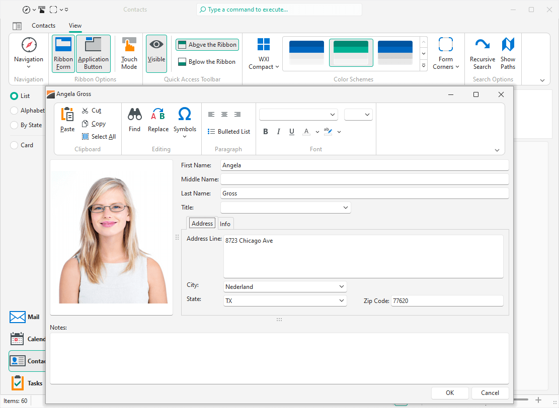
To enable the new WXI Compact Skin, assign WXICompact to the TdxSkinController component's SkinName property.
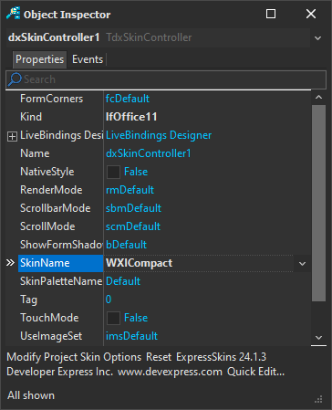
#Easier SVG Assignment for Image Lists at Design-Time
In v24.1, the DevExpress VCL Ribbon (and other UI controls) allow you to use a single image list for large and small SVG icons. With this capability you can simply specify a small SVG icon and we will scale it up automatically (for instance, in places where the control needs a large icon in the Ribbon). This will improve overall usability and should reduce time spent/maintenance in half.
Based on our roadmap survey votes, we made it possible for customers to use both old and new icon assignment strategies using UseRegularAsLarge, LargeSize and related SVG image options. Existing apps and usage habits will remain unaffected.
#Layout and Image Modifications in Design-Time Wizards and Dialogs
VCL v24.1 includes dozens of layout and `raster to vector` image adjustments in key design-time areas (wizards, designers, and dialogs). High DPI support is crucial and we want to set the highest standards in this regard (in terms of developer usability and speed).
Data-Aware Controls and Menu
#Accessibility Enhancements and Keyboard Support
Previous versions of the DevExpress ExpressBars and ExpressNavBar Suite included partial accessibility support (powered by Microsoft Active Accessibility or MSAA). We initially hoped to use MSAA to support remaining VCL controls, but research showed that it is not technically feasible. It turned out that this COM-based technology is outdated for modern accessibility requirements and highly interactive UI controls like ours.
Accordingly, we built a new engine for ongoing accessibility-related enhancements (it is powered by Microsoft UI Automation or UIA - used in DevExpress WinForms and WPF products). UIA gave us much more flexibility and allowed to introduce the following accessibility-related v24.1 features:
- UIA-powered controls now include Automation options like Name, Description, etc.
- UIA-powered controls now include specialized events to customize Automation options at runtime.
- UIA-powered controls currently include Button, Check Box, Radio Button, Group Box, Panel, Text Editor, Button Editor, and Label.
Our effort in this regard work will continue throughout 2024-2025, and will include enhancements for key unsupported components:
- Data grid (key navigation and "read-only" scenarios, likely without data editing and other complex interactions in the first release)
- Form layout manager (including layout groups, tabs, etc.)
- Navigation and menu (key scenarios in both Ribbon and standard toolbars)
- TreeList, Scheduler, Pivot Grid, and other popular data editors (key scenarios in both in-place and standalone editors)
#Accent-Insensitive Operation Support for Data-Aware Controls
With v24.1, you can configure how various diacritic glyphs in letters (umlauts, grave, acute, and other accents) are treated. For instance, if you type "Joao" in a search box, Data Grid filtering results will include data records with both "João" and "Joao". For more information, read the following quote from Wikipedia:
A diacritic (also diacritical mark, diacritical point, diacritical sign, or accent) is a glyph added to a letter or to a basic glyph. The term derives from the Ancient Greek διακριτικός (diakritikós, "distinguishing"), from διακρίνω (diakrī́nō, "to distinguish"). The word diacritic is a noun, though it is sometimes used in an attributive sense, whereas diacritical is only an adjective. Some diacritics, such as the acute ⟨á⟩, grave ⟨à⟩, and circumflex ⟨â⟩ (all shown above an 'a'), are often called accents. Diacritics may appear above or below a letter or in some other position such as within the letter or between two letters.
You can enable or configure accent-insensitive operations globally using the TdxDiacriticStringOptions class:
- ComparisonMode: allows you to switch between comparison modes (Auto, Sensitive, Insensitive). By default (Sensitive), we do not ignore accents. Insensitive mode can be of value for global organizations with users from different countries/data (for instance, names of employees or goods can be in different languages).
- NormalizationMode: specifies the string normalization algorithm (Fast, System) used for string comparison in diacritic-insensitive mode. The default algorithm (Fast) works up to 3 times faster compared to the operating system-dependent algorithm (System).
Note: TdxDiacriticStringOptions does not work in Server Mode – use database collation options instead.
Impacted text-comparison operations and control features include:
- Sorting
- Grouping
- Incremental search
- Auto-filter row
- Find panel, etc.
This behavior expands to the following controls:
- Navigation control
- Ribbon and standard toolbars
- Lookup editors
- Data grid
- Pivot grid
- Tree list
- Other data-bound controls (powered by our Data Controller).
#Editing Operations (Rotate, Crop, Flip, etc.) in Image Controls
You can now invoke the Image Editor dialog for TcxImage and TcxDBImage components using the Edit context menu command. Our design-time Image Picker dialog includes the new Edit command as well. The Edit command unlocks basic image editing operations:
- Crop and straighten
- Adjust brightness, contrast and saturation
- Mirror
- Rotate, etc.
The Image Editor maintains operation history and offers both undo and redo functionality. Once the editor is closed and changes are saved, modifications cannot be undone.
VCL ImageEdit with Integrated Image Editor
#EXIF Metadata Support in Image Controls
In v24.1, our image controls (TcxImage and TcxDbImage) read and interpret EXIF metadata from images and modify the image display accordingly. For instance, our image controls automatically rotate the image based on orientation metadata (unlike the standard TImage control and certain image viewers).
Impacted image-based scenarios (where rotation will take place) include:
- Data Grid cells
- TreeList cells
- Vertical and Property Grid cells
Previously, this required a complex custom solution with a manual call of the Rotate method. Customers who implemented custom solutions on their own (for instance, image rotation in the grid or standalone image editors), can disable this default behavior using a static feature toggle. The TdxGPImage.DefaultImageExifAutoRotation class property value defines if the image editor rotates an image based on EXIF metadata.
#Field Name-Based Expressions for Data-Aware Controls
With v24.1, you can use {FieldName} in formula expressions in conditional formatting rules to refer to a field by underlying name instead of a display name. Previously, you could only use a display name/caption or an index. This capability will help you create formulas for conditional formatting rules.
This is helpful in VCL apps that support multiple languages or other scenarios where you cannot rely on a field caption (due to its dynamic nature such as translation to another language).
Review expression syntax examples for conditional formatting expressions in our Online Documentation.
Ribbon Control
#Office 365 Style for VCL Ribbon Control
Our VCL Ribbon Control ships with a new Office 365 rendering style. When our new Office 365 style is used, the Ribbon control displays a Search box at the top of the Ribbon form and Show Ribbon options on the bottom right of the Ribbon UI.
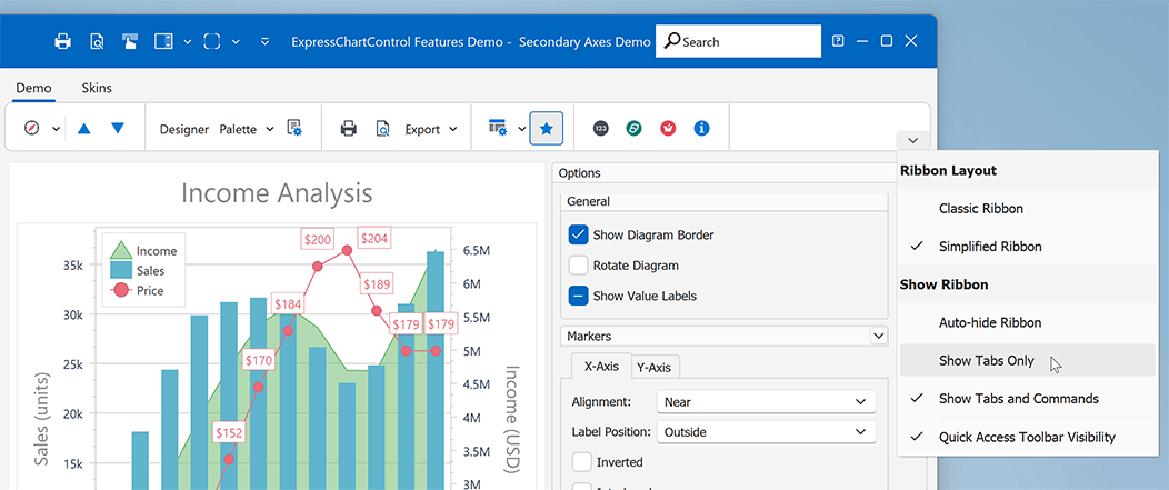
Chart Control
#Secondary Axes
Secondary axes can be of value if you need to display multiple scales with different measurement units. You can now use SecondaryAxes.AxesX and SecondaryAxes.AxesY properties to add and configure supplemental axes for the main axis of arguments (X-axis) and main axis of values (Y-axis).
The following code snippet creates a secondary axis of values and associates it with the first series in an XY diagram. Refer to the TdxChartSecondaryAxes class description for detailed information on available options.
var
  ADiagram: TdxChartXYDiagram;
  AAxisY: TdxChartSecondaryAxisYCollectionItem;
  AXYSeries: TdxChartXYSeries;
begin
  if dxChartControl1.DiagramCount = 0 then Exit;
  ADiagram := dxChartControl1.Diagrams[0] as TdxChartXYDiagram;
  if ADiagram.SeriesCount = 0 then Exit;
  ASeries := ADiagram.Series[0];
  AAxisY := ADiagram.SecondaryAxes.AxesY.Add;
  ASeries.View.AxisY := AAxisY.Axis;
  AAxisY.Title.Text := 'Income (USD)';
  AAxisY.Title.Alignment := TdxAlignment.Center;
  AAxisY.Appearance.Color := TdxAlphaColors.Gray;
end;
#Logarithmic Scales
A logarithmic scale can be of value when you need to display a value range that differs by large orders of magnitude. You can now set the Logarithmic property to True or False to switch between logarithmic and standard numeric scales for the axis (TdxChartCustomAxis). The LogarithmicBase property helps you specify the base of the logarithm (for the logarithmic scale of the axis - default is 10).
#Point and Segment Color Customization via Events
You can handle OnGetSeriesPointDrawParameters and OnGetValueLabelDrawParameters events to customize individual series points and associated value labels based on specific conditions.
Example #1: Generate unique fill colors for all point markers in the series (Europe's population).
procedure TFeaturesDemoMainForm.cdLineGetSeriesPointDrawParameters(
  Sender: TdxChartCustomDiagram;
  AArgs: TdxChartGetSeriesPointDrawParametersEventArgs);
var
  ALineDrawParameters: TdxChartLineSeriesPointDrawParameters;
  APalette: TdxChartPalette;
  APaletteItem: TdxChartPaletteItem;
begin
  APalette := TdxChartStandardPaletteRepository.FindPalette('Slipstream');
  if AArgs.SeriesPoint.Series.Caption = 'Europe' then
  begin
    if AArgs.DrawParameters.ClassType <> TdxChartLineSeriesPointDrawParameters then Exit;
    ALineDrawParameters := AArgs.DrawParameters as TdxChartLineSeriesPointDrawParameters;
    APaletteItem := APalette.GetColorsForIndex(AArgs.SeriesPoint.Index);
    ALineDrawParameters.MarkerAppearance.FillOptions.Color := APaletteItem.Color;
  end;
end;
Example #2: Display different measurement units for value labels (millions or thousands of $).
procedure TMyForm.cdAreaGetValueLabelDrawParameters(Sender: TdxChartCustomDiagram;
  AArgs: TdxChartGetValueLabelDrawParametersEventArgs);
begin
  if AArgs.SeriesPoint.Value >= 1000 * 1000 then // Millions
    AArgs.Text := Format('%.1fM', [AArgs.SeriesPoint.Value / (1000 * 1000)])
  else if AArgs.SeriesPoint.Value >= 1000 then // Thousands
    AArgs.Text := Format('%.0fk', [AArgs.SeriesPoint.Value / 1000])
  else
    AArgs.Text := Format('%0f', [AArgs.SeriesPoint.Value]);
end;
Review more code examples for Area, Line, Bar, Pie chart views in our Online Documentation.
#Palettes
You can now use the Palette property to switch between color palettes whose color sets are applied to individual simple series values and XY series. The following code snippet applies a predefined palette ("Nature Colors") to the chart control:
dxChartControl1.Palette := TdxChartStandardPaletteRepository.FindPalette('Nature Colors');
You can also add a TdxChartPaletteRepository component to create and manage custom palettes. The following code snippet creates a user palette with three colors and applies the palette to the chart control:
var
  AChartPalette: TdxChartUserPalette;
begin
  AChartPalette := dxChartPaletteRepository1.CreateItem;
  AChartPalette.Name := 'My Palette 1'; // Assigns a unique palette name
  AChartPalette.Count := 3;  // Sets the size of the palette item array
  AChartPalette.Items[0] := TdxChartPaletteItem.Create(TdxAlphaColors.Red);
  AChartPalette.Items[1] := TdxChartPaletteItem.Create(TdxAlphaColors.Green);
  AChartPalette.Items[2] := TdxChartPaletteItem.Create(TdxAlphaColors.Blue);
  dxChartControl1.Palette := AChartPalette;
end;
You can also switch between color palettes at runtime, if necessary.
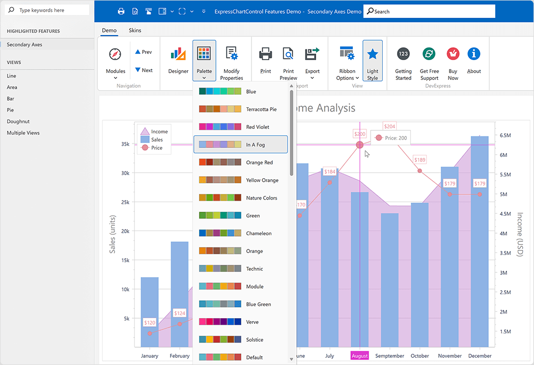
You can find more information on predefined and custom palettes in our Online Documentation
Survey - VCL
Your Feedback Matters!
Please
login to complete the survey.
Survey Completed
Thank you for taking the time to complete this survey. Your responses have now been posted. If you want to follow up with additional information, feel free to send us an email at clientservices@devexpress.com anytime.
You've Already Completed This Survey
Our records show that you have already completed this survey. If you want to follow up with additional information, send us an email at clientservices@devexpress.com.
This survey has expired
If you want to share your feedback or request new functionality, please submit a new support ticket via the DevExpress Support Center. We’ll be happy to follow up.