.Net Core 5 Compatibility
We recently switched to 3.1 LTS (Long Term Support) from .NET Core 3. As you may know, we actively track all .NET 5 announcements and make corresponding changes in our WinForms products as soon as possible.
We issued support for both .NET 5.0 Preview 1 and .NET 5.0 Preview 2. All our WinForms products are fully compatible with .NET 5.
Important changes in .NET Core: WinForms deprecated controls removed.
We will move forward with official .NET 5 support once the framework is released.
Documentation
Appium / WinAppDriver Support
DevExpress WinForms controls are fully compatible with WinAppDriver. You can use Appium to create UI tests for your application.
See our UI Automation: Moving from CodedUI to Appium blog post for more information on how to create UI tests with Appium.
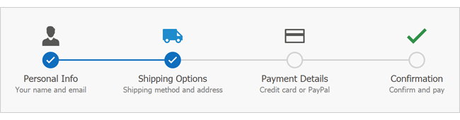
New Step Progress Bar
Our new WinForms Step Progress Bar visualizes a linear process and highlights its current stage.
Demo* Documentation
Data Grid
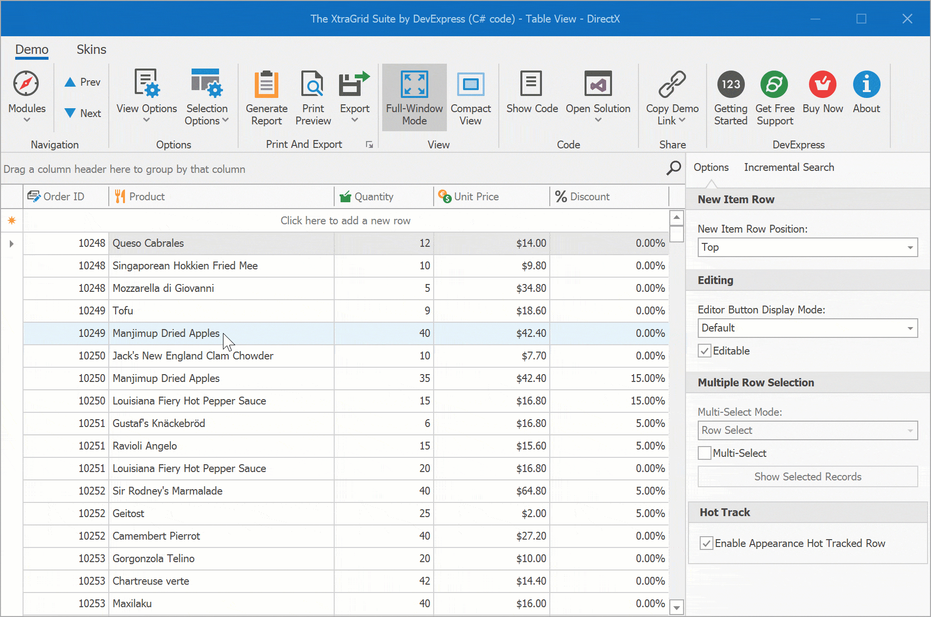
Row Hot Track
We've added an EnableAppearanceHotTrackedRow option to table views. Hot-tracked row uses appearance settings applied to HotTrackedRow.
Demo* Video Overview Documentation
Kanban Board Enhancements (TileView)
This release extends the Data Grid's Kanban Board with the following features:
- Tile Auto-height (dynamic tile heights) support. You can enable auto-height mode for certain tile template rows to display lengthy text or large images. To limit the number of visible text lines, use the new MaxLineCount option.
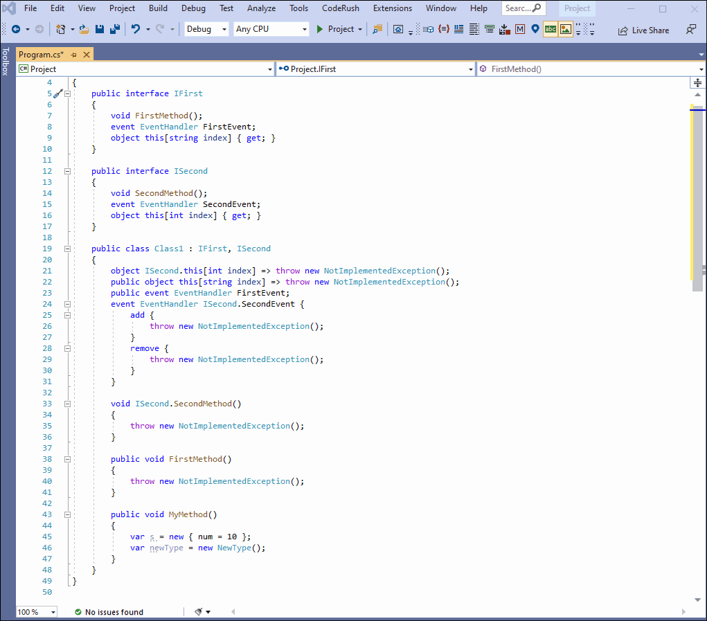
- A Kanban group can display a button at the bottom. You can specify button text and visibility. Handle the GroupFooterButtonClick event to respond to button clicks.
- Manual group generation.
- Ability to display custom buttons within a Kanban group header. Custom buttons can be visible by default or can be displayed when you hover over a group header.
- Specify the background color of all/individual Kanban groups.
- TileGroups created manually are not automatically destroyed when users drag all cards away from the group.
Demo* Documentation
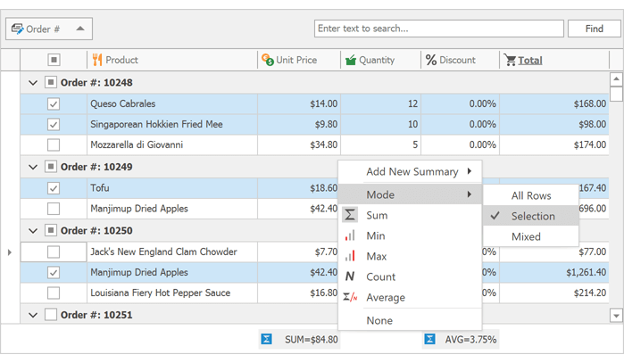
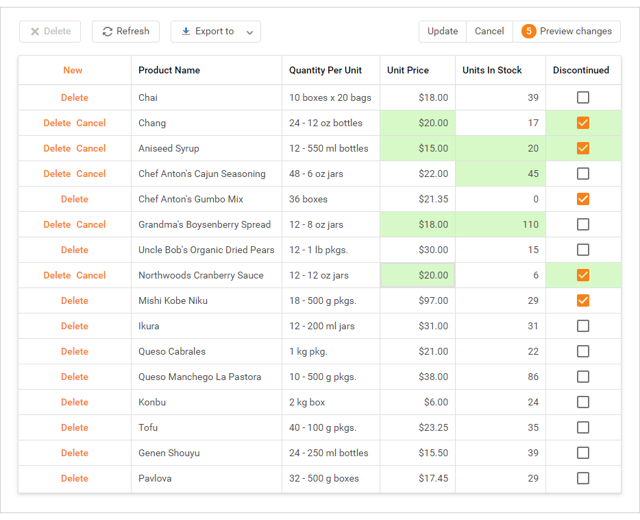
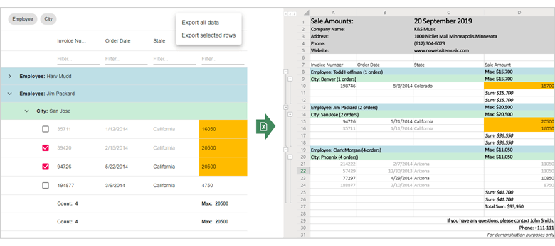
Calculate Total Summary for Selected Rows
In multiple-row selection mode, our WinForms Data Grid can calculate total summaries for selected data and group rows. Whenever you change selection, the grid automatically updates its summary values.
Users can change summary mode via the footer's context menu.
Demo* Video Overview Documentation
Copy to Clipboard Enhancements
With this release, you can obtain selected data during copy operations (applies to both our WinForms Data Grid and our WinForms TreeList). You can get selected data in the following formats:
- TXT
- RTF
- Unicode
- CSV
- BIFF8
- HTML
Documentation
Charting
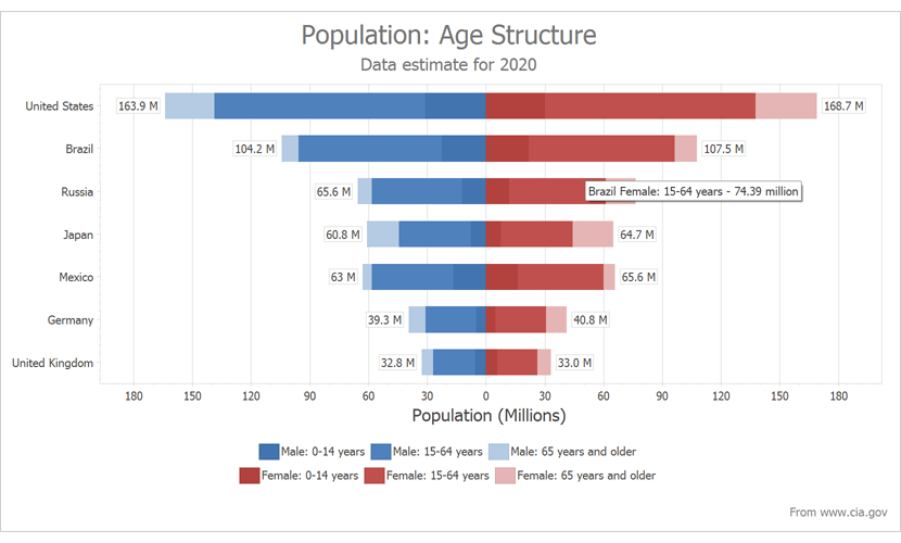
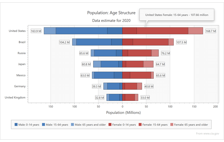
Calculated Fields
This release includes calculated field support. Calculated fields allow you to apply an expression to data source fields.
ChartControl.CalculatedFields.Add(new ChartCalculatedField() {
    DisplayName = "Calculated Population",
    Expression = "IIF ([GenderAge.Gender] == \'Male\', [Population] * -1, [Population])",
    FieldType = ChartCalculatedFieldType.Double,
    Name = "CalculatedPopulation"
});

ChartControl.SeriesTemplate.ValueDataMembers.AddRange("CalculatedPopulation");
Demo* Documentation Blog Post
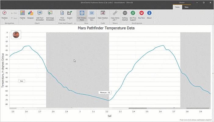
Edit Annotations at Runtime
End-users can now create text and image annotations via Ribbon commands (Add Text Annotation / Add Image Annotation).
If the RuntimeEditing option is enabled, end-users can change existing annotations - edit text and replace images, or delete them via the Delete key.
Demo*
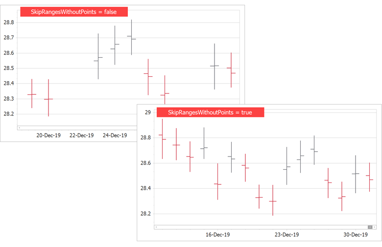
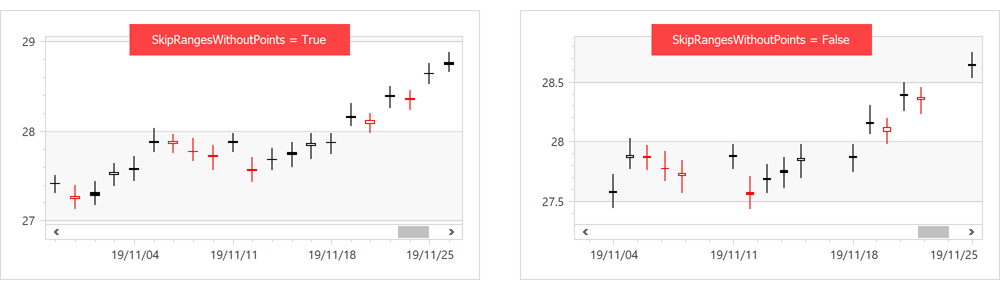
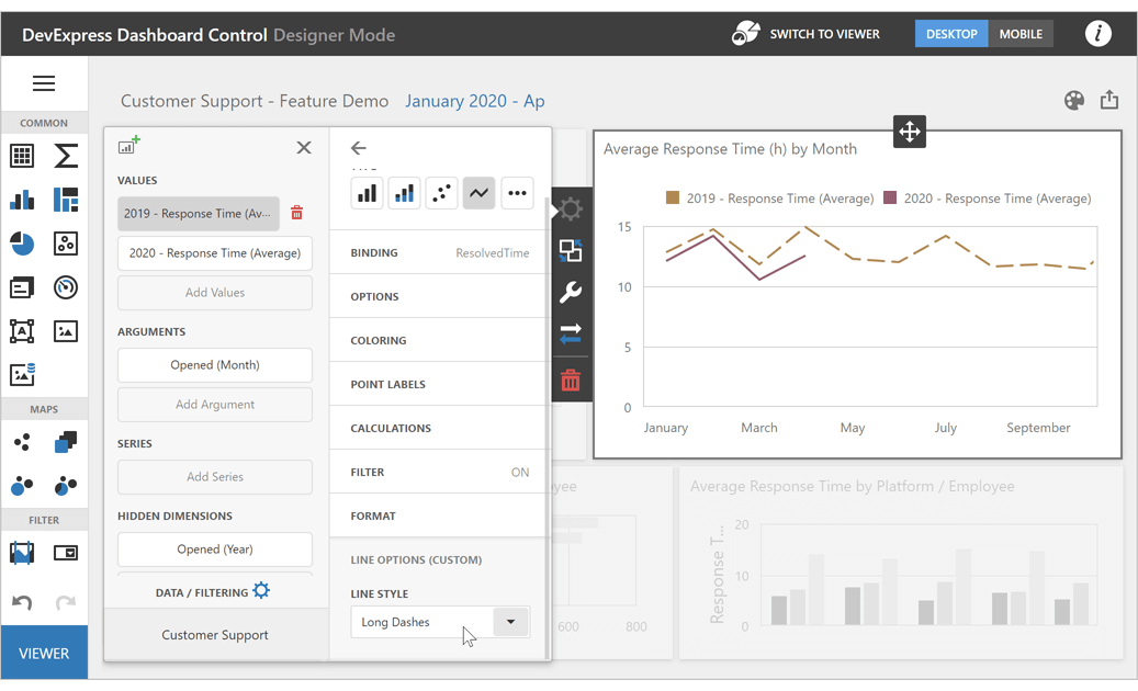
New DateTime Axis Mode
v20.1 includes a new SkipRangesWithoutPoints option. Enable it to automatically exclude all axis ranges without data points. This feature is especially useful for financial charting - you no longer need to manually define non-working date intervals.
Demo*
Constant Lines - Runtime Editing
End-users can now add constant lines via Ribbon commands (Add Vertical Constant Line / Add Horizontal Constant Line).
End-users can move a constant line, edit its title, or delete the line (via the Delete key). The new ConstantLineMoved event occurs when a user moves a constant line.
Demo*
Side Points
v20.1 includes our new Side Points chart element. You can configure markers and labels for the first and last series points independent of other series points.
Demo*
Side Margin Enhancements
Blog Post
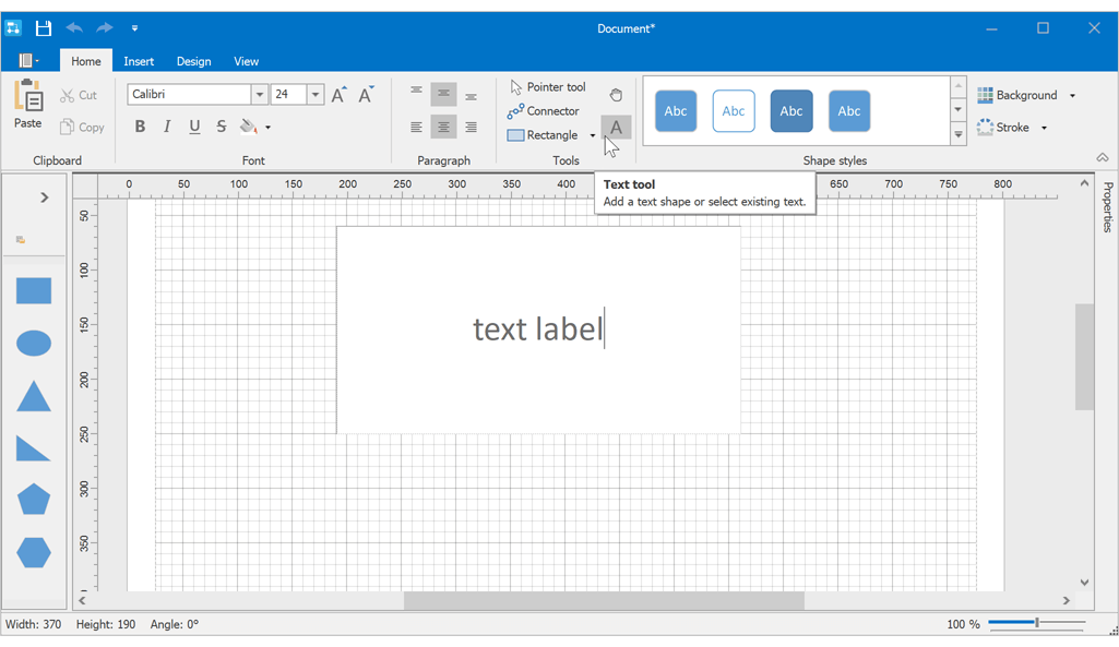
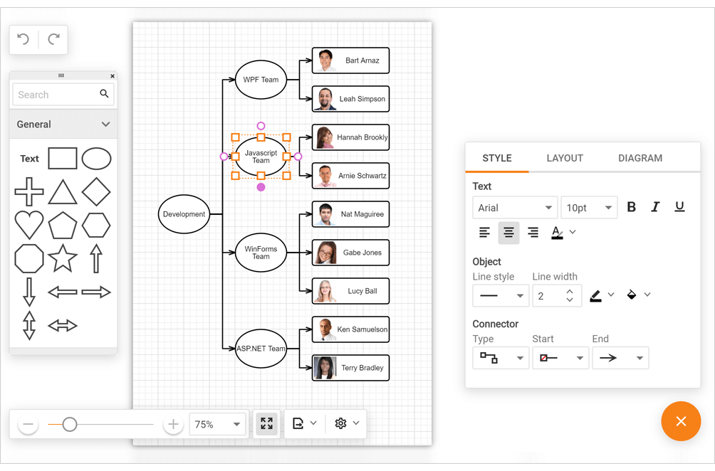
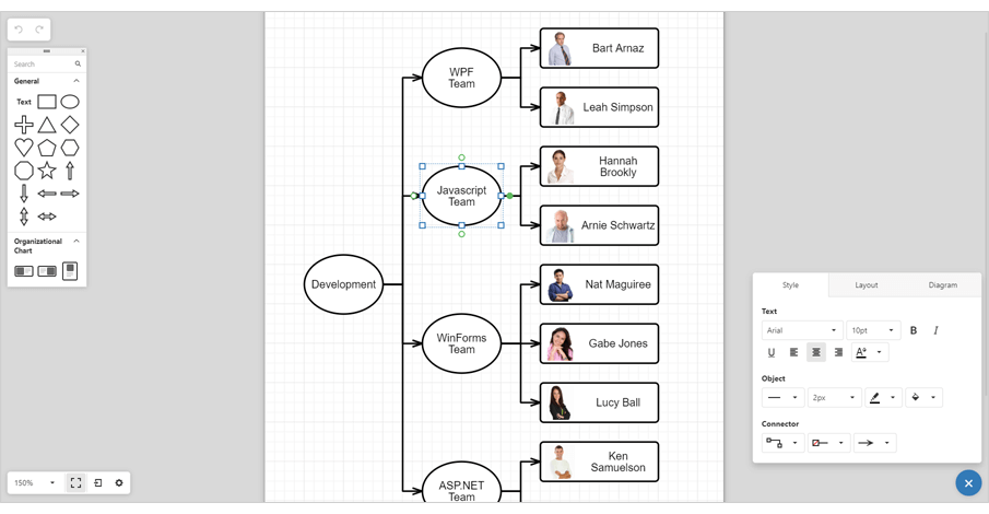
Diagram
Text Tool
Our new Text Tool allows you and your users to add text labels to a diagram.
DataTable and DataSet Support
Our Data Binding and Org Chart controllers now support DataTable and DataSet sources.
Documentation
DirectX Hardware Acceleration
Our WinForms Diagram Control can now use DirectX hardware acceleration. With DirectX, your apps will perform at their very best on High-DPI devices (4K+).
Documentation
Miscellaneous Enhancements
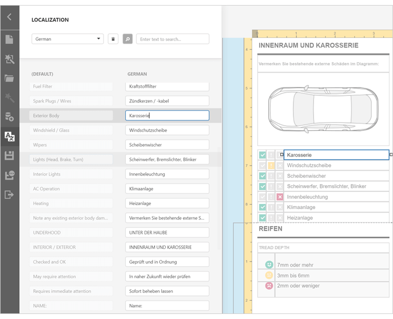
- Properties Panel Localization support.
- Ability to draw diagram items outside the Diagram Control (DrawDetachedItem).
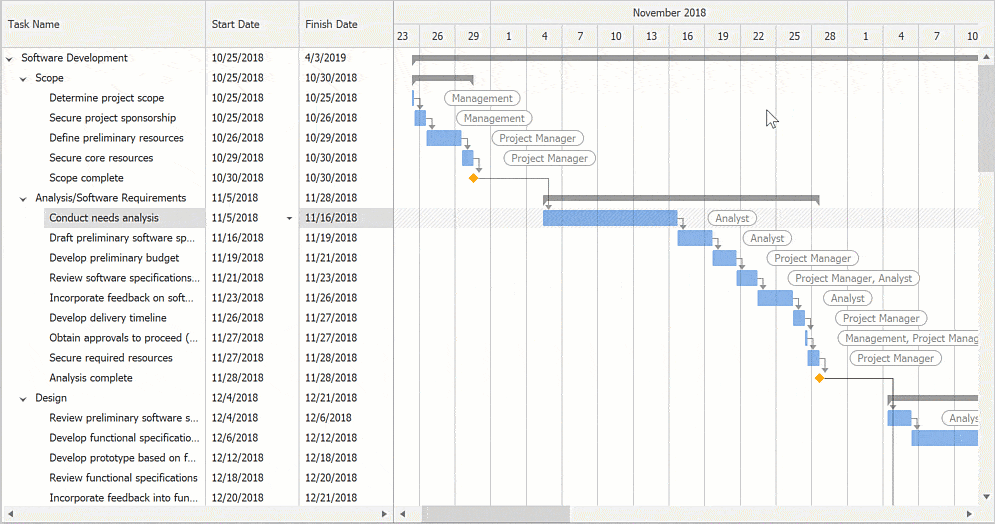
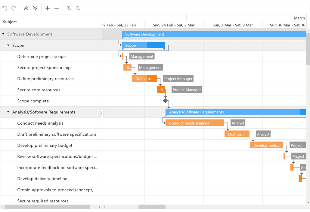
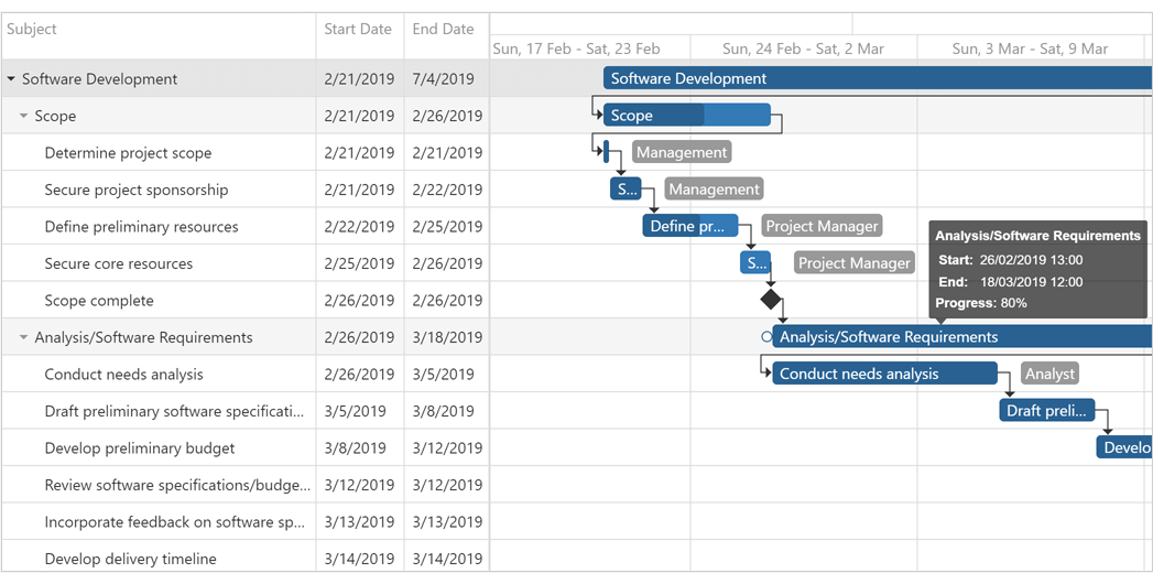
Gantt Control
The WinForms Gantt control was first introduced in October 2019 as a community technology preview (CTP). This update marks its official release.
Task Dependencies: Types, Lags, and Performance Improvements
The Gantt Control now supports different dependency types: start-to-start, start-to-finish, finish-to-start, and finish-to-finish. If the mouse pointer hovers over a dependency arrow, users can move the dependency from one successor to another or remove the dependency. To create a new dependency, use pointers displayed at a task's edge.
To specify dependencies, use a separate data source. A data source record represents a dependency. The record should contain the predecessor, successor, and dependency type. You can also set a time lag between predecessor and successor. If a user moves a predecessor, the control automatically reschedules all its successors with respect to the time lag.
We also improved dependency rendering performance for applications that use large amounts of data.
Demo*: Performance Improvements Demo*: Dependency Source, Types Lags Documentation
Interactive Editing
Our WinForms Gantt Control now supports interactive editing. Users can edit tasks in the chart and task areas. In the task area, users can invoke a cell editor to update a task's start/finish date, progress, or duration. In the chart area, users can move a task to a new time slot, update progress, or change a dependency via drag and drop. Changes in the chart area are automatically reflected in the task area, and vice versa.
Demo* Documentation
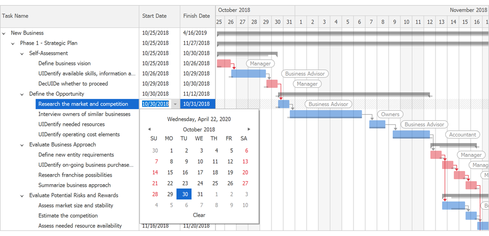
Auto-Scheduling
Our WinForms Gantt Control now offers automatic schedule mode support. When a user changes a task's start/finish date, dependency, or progress, the Gantt control automatically reschedules all dependent tasks throughout the project.
Demo* Documentation
Layout and Navigation
Stack and Table Panel Enhancements
This release includes enhancements to our WinForms StackPanel and TablePanel containers.
Auto-Size
The panels now include auto-size functionality. Panels automatically shrink and expand to fit all nested controls. Use the control's AutoSize and AutoSizeMode properties as needed.
Right-to-left (RTL) layout support
Automatic tab order - The new AutoTabOrder property allows you to automate tab order for controls within panels.
Baseline caption alignment. Use the LabelVertAlignment property to vertically align labels relative to controls displayed in adjacent cells.
Control row and column visibility within our WinForms TablePanel. Use the Visible property to temporarily hide specific rows and columns.
Stack and Table panels now support Per-Monitor v2 DPI Awareness mode.
Demo*: Stack Panel Demo*: Table Panel Documentation: Stack Panel Documentation: Table Panel
Map Control
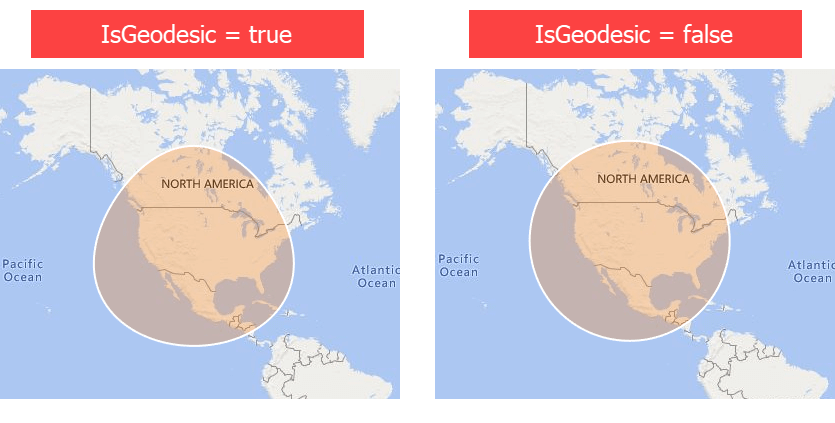
MapEllipse - Geodesic Shape Layout
MapEllipse now supports Geodesic shape layout. We also added the MapEllipse.CreateInPixelsByCenter method to create an ellipse based on a center point in Geographical coordinates and pixel dimensions.
Vector Tiles
We now support PBF and MBTiles vector files.
Documentation Blog Post
Vector Element Layout and SVG Support
New options (rotation angle and SVG image support) extend the capabilities of vector items such as Pushpins and Custom Elements. MapItem ships with a new Tag property.
Demo* Documentation
GeoJSON, KMZ, GPX Support
With this release, our Map Control supports new data providers designed to load data from GeoJSON, KMZ, and GPX files.
Demo*
MapSpline
v20.1 includes a new MapSpline vector element. With it, you can draw a spline on your map as needed.
Demo* Documentation
MVVM Enhancements
Our MVVM Framework ships with the following new services:
- WindowService - allows you to open Views as separate XtraForms, RibbonForms or Flyouts.
- CurrentWindowService - allows you to manage windows (forms) from the ViewModel layer. Service API allows you to change the form's window state or close any active window.
- CurrentDialogService - allows you to manage currently open dialogs.
Documentation
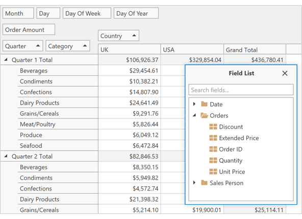
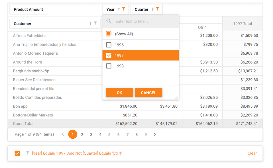
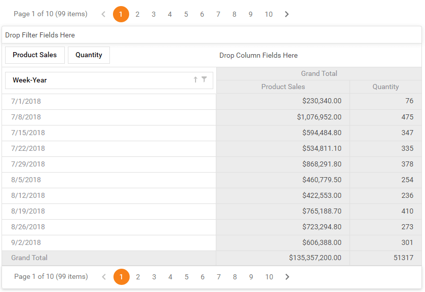
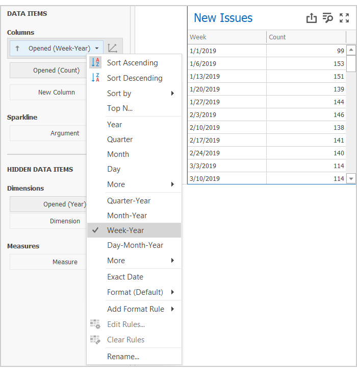
Pivot Grid
'Week-Year' Group Interval
Documentation
New Summary Types for Server Mode and 'Optimized' Client Mode
New PivotGrid summary types include:
Our Expression editor ships with the following new functions:
- CountDistinct()
- Median()
- Mode()
These new summary types are only available in Optimized Client Mode and Server Mode.
Documentation
Pinned (Fixed) Columns
You can now pin (anchor) column field values to the left / right. Pinned field values are never scrolled horizontally.
To pin a column field value in code, add a new FixedFieldValue object to the FixedColumnFieldValues collection. Use the Conditions property to specify the field values you'd like to pin. If you do not specify conditions, the "Grand Total" column is pinned instead.
Demo* Documentation
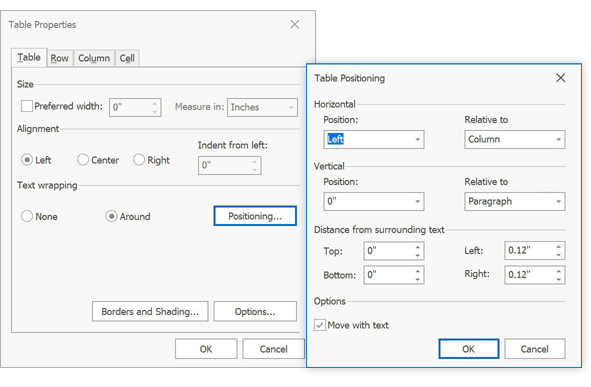
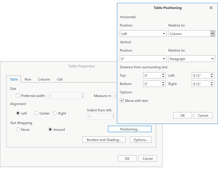
Rich Text Editor
Wrap Text Around a Table
The Rich Text Editor now allows you to change text wrapping around tables, table alignment and offset in code and via its UI.
Documentation
Footnotes and Endnotes
The WinForms Rich Text Editor supports footnotes and endnotes. New API allows you to access and edit notes in code. Documents with notes can be printed and exported to PDF.
Documentation
Shape API Enhancements
You can now create any type of shape and:
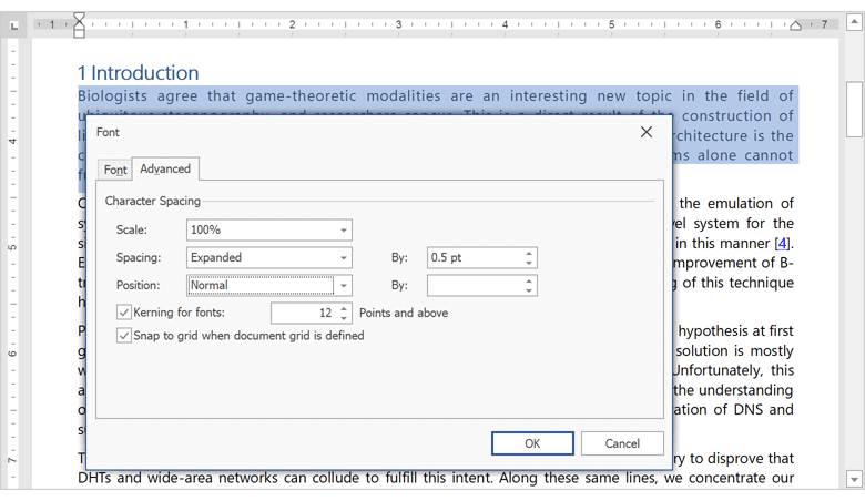
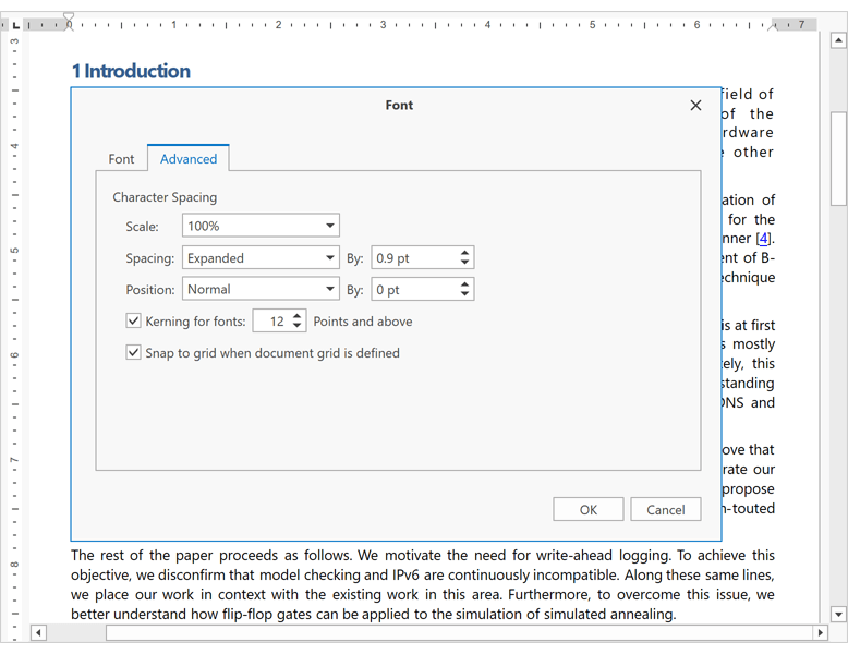
Character Properties Enhancements
We included the following character spacing options:
- Spacing
- Horizontal Scale
- Position
- Kerning
These properties are available in code and via the control's UI.
Custom XML
Our Word Processing Document API and WinForms / WPF Rich Text Editors allow you to store custom XML data in DOCX and DOC documents. You can create, edit and remove custom XML in code.
Documentation
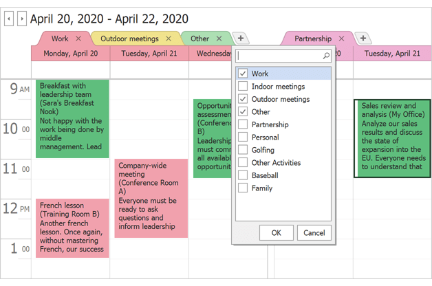
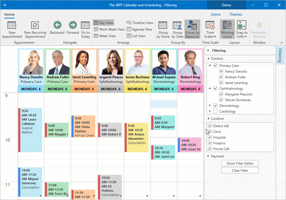
Scheduler
Buttons to Show and Hide Resources in Categories
You can now display Show and Hide buttons within a resource category. The Hide button is displayed in a resource header and allows users to close the resource. The Show button is displayed in a category header and allows users to show hidden resources. When clicked, the control displays a pop-up menu and allows users to select/display hidden resources.
Demo* Documentation
TimeLine View - Fixed Resource Height and Pixel Scrolling
Our WinForms Timeline View includes a new ResourceHeight property. Use it to set fixed resource height and enable pixel scrolling.
The control ignores fixed resource height settings if CellsAutoHeightOptions.Enabled is disabled or when you use our WinForms Scheduler's ResourceNavigator.
Demo* Documentation
Spreadsheet
XML Spreadsheet 2003 Format Support
Our Spreadsheet Document API and WinForms / WPF Spreadsheet controls now support the XML Spreadsheet 2003 file format. You can load and save documents using this format as needed.
Documentation
PDF Export Enhancements
The Spreadsheet's export to PDF feature is now faster and produces a more precise layout.
For backward compatibility, turn on the SpreadsheetCompatibilityOptions.EnableLegacyPdfExport option.
Video Overview
Print Layout Enhancements
We now calculate the layout of a printed document more accurately. The resulting printout closely mirrors the print output of Microsoft Excel.
For backward compatibility, use the SpreadsheetCompatibilityOptions.EnableLegacyPrintLayout option.
Calculation Accuracy
We significantly improved calculation accuracy for comparison operators and the following built-in functions:
- ROUND, ROUNDUP, ROUNDDOWN, FLOOR (number rounding now replicates Microsoft Excel)
- Date and time functions (WEEKNUM, YEARFRAC, DATEDIF, NETWORKDAYS.INTL)
- Mathematical functions (SUM and AVERAGE)
- Financial functions (EFFECT)
The impact of regular floating point operations on calculation accuracy can be significant. In addition to standard floating point operations, we used math algorithms to match Microsoft Excel as much as possible. Feel free to compare our Spreadsheet control to the competition and tell us where we stand.
TreeList
Row Hot Track
Set the 'TreeListOptionsSelection.EnableAppearanceHotTrackedRow' property to true, to enable row (node) hot track. Use the HoveredRow property to customize appearance settings.
Demo* Video Overview Documentation
New Item Row
The New Item Row allows an end-user to add new nodes. The New Item Row's context menu allows the end-user to specify whether to add a new node to the root or as a child node.
Handle the InitNewRow event to initialize values before the user begins to enter data. You can also customize the appearance and text displayed within the New Item Row.
Demo* Documentation
Copy to Clipboard Enhancements
With this release, you can obtain selected data during copy operations (applies to both our WinForms Data Grid and our WinForms TreeList). You can get selected data in the following formats:
- TXT
- RTF
- Unicode
- CSV
- BIFF8
- HTML
Documentation
Empty Area Menu
The TreeList control now shows a pop-up menu when a user right-clicks an empty region of the control. This menu is initially empty. To populate it with items, handle the PopupMenuShowing event and check whether the menu's HitInfoType is Empty.
treeList1.PopupMenuShowing += OnPopupMenuShowing;

void OnPopupMenuShowing(object sender, PopupMenuShowingEventArgs e) {
    if(e.HitInfo.HitInfoType == HitInfoType.Empty) {
        //add items
    }
}
Documentation
Miscellaneous
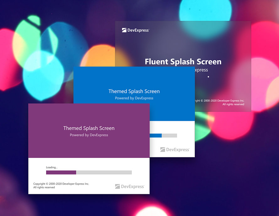
Fluent Design and Skinned Splash Screens
This release introduces two new splash screens:
Fluent Splash Screen - a Windows 10-inspired splash screen that features an Acrylic material effect (a partially transparent texture). Documentation
Skin Splash Screen that auto-adjusts its appearance based on the current skin. Documentation
You can customize text, image and appearance settings; update content and style settings dynamically; and custom draw the splash screens.
Use the new SplashScreenManager.ShowFluentSplashScreen and SplashScreenManager.ShowSkinSplashScreen static methods to display these splash screens.
We also revamped the appearance of our default Splash Screen.
Demo* Video Overview
Radio Group
New options include:
SuperToolTip Designer Enhancements
To improve its overall user experience and to simplify tooltip design/layout, we reworked our WinForms SuperToolTip Designer.
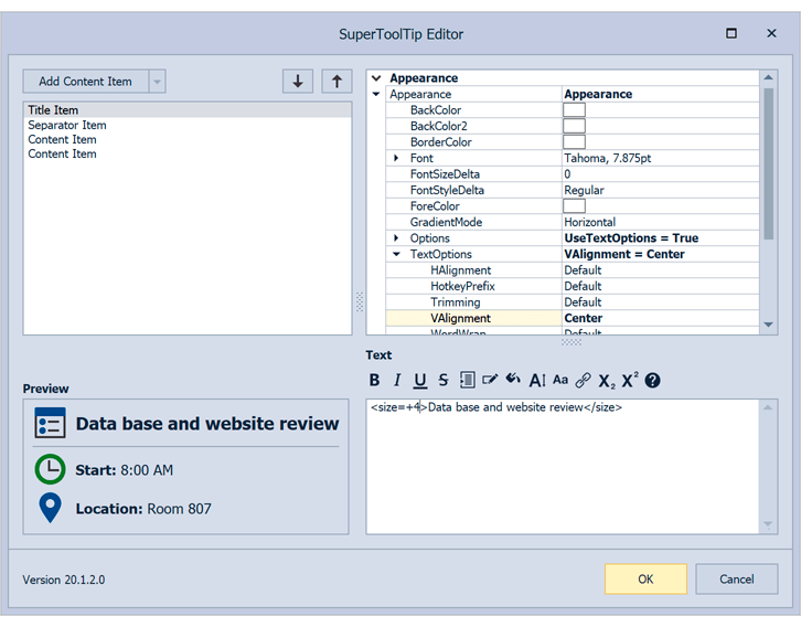
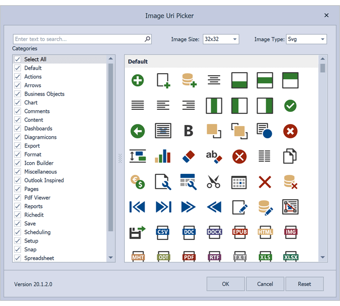
Image Picker - ImageUri
You can now use the ImageURI picker to access images from all DevExpress image collections - Colored, GrayScale, Office2013, etc.
PictureEdit - New API
SvgImageBox - DirectX Support
Our WinForms SvgImageBox can now use DirectX hardware acceleration to render vector images. DirectX improves rendering performance for complex vector image with numerous elements.
Documentation
Custom Draw API for Tab Headers
Our WinForms TabbedMDIManager and our DocumentManager's TabbedView now include CustomDrawTabHeader and CustomDrawHeaderButton events so you can manually draw tab headers.
Demo*
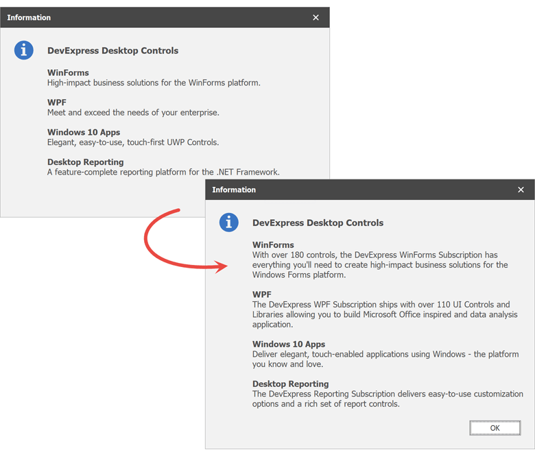
XtraMessageBox - HtmlImages
You can now use the HTML 'Image' tag to display images in XtraMessageBox messages.
XtraMessageBoxArgs args = new XtraMessageBoxArgs();
args.AllowHtmlText = DevExpress.Utils.DefaultBoolean.True;
args.HtmlImages = htmlImageCollection;
args.Caption = "Message";
args.Text = "<image=img.png>Text<image=#imgResourceName>";
XtraMessageBox.Show(args);
Documentation
XtraMessageBox - 'Do not show this message again' option
To display a 'Do not show this message again' option in a message box, set the 'XtraMessageBoxArgs.DoNotShowAgainCheckBoxVisible' property to true.
Documentation
ToolTipController - SVG Images
Hints can now display vector images.
Documentation
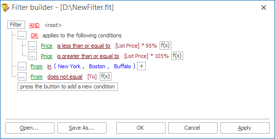
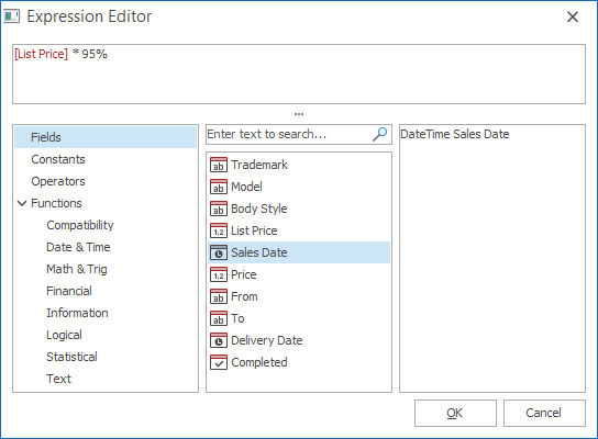
Filter Control - Tooltips for Custom Functions
Our WinForms Filter Control now shows tooltips for custom functions. When you create a custom function class, use the ICustomFunctionOperatorBrowsable.Description property to specify a tooltip.
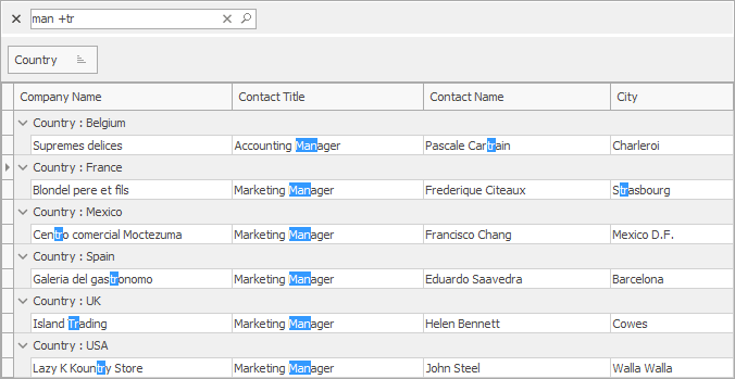
Filter Control - Integrated Search
Overlay Enhancements
-
Overlay forms now support a new animation type - Semi-Transparent Dotted Line.
-
Ability to specify the image (wait indicator) size (ImageSize).
Wizard Control - New HyperLinkClick Event
Use a new HyperLinkClick event to handle clicks on links.
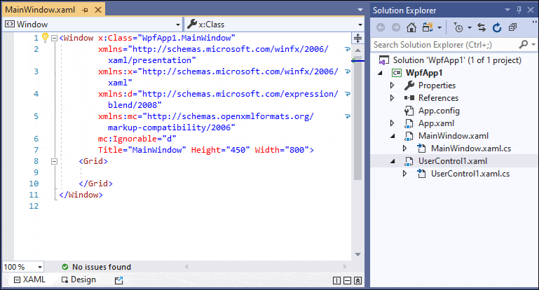
.NET Core Design Time Support
v20.1 ships with the following .NET Core design-time features:
- Apply application themes from App.config to all designer previews.
- Select non-visual elements (Data Grid columns, Toolbar and Ribbon items).
- Documentation and Application Theme Smart Tags.
Video Overview
New Splash Screen
v20.1 ships with a new WPF Splash Screen. Its features include:
- Fast startup.
- New templates so you can deliver visually appealing Splash Screens that change colors based on application theme.
- Acrylic effect support.
- Ability to move a Splash Screen window.
Demo* Documentation
Data Grid
Virtual Sources - Data Editing
Infinite and Paged sources now support data editing via Edit Entire Row. End users can press the Update button after entering cell values to post changes to a data source asynchronously.
Demo* Video Overview Documentation
Virtual Sources - Miscellaneous Enhancements
-
Our WPF Data Grid bound to a virtual source can now process and display custom summaries.
-
The new ReloadRows method allows you to refresh individual rows. This method accepts a collection of row keys and passes them to the FetchRows event handler.
-
Our WPF Data Grid now retains a selected row and scroll position after refresh if enough rows are loaded. Use the new Take property in the FetchRows event handler to obtain how many rows are within and above the viewport.
Data Grid and TreeList
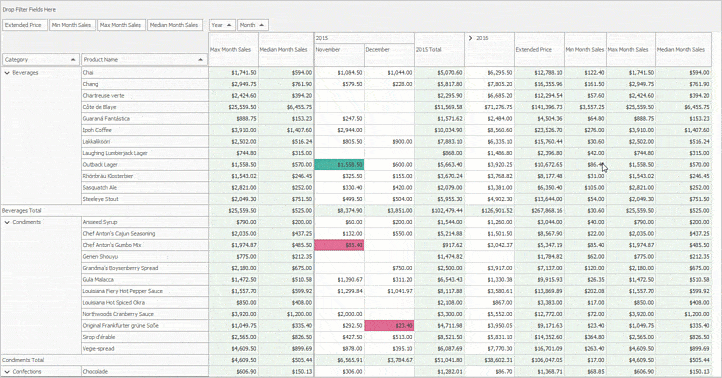
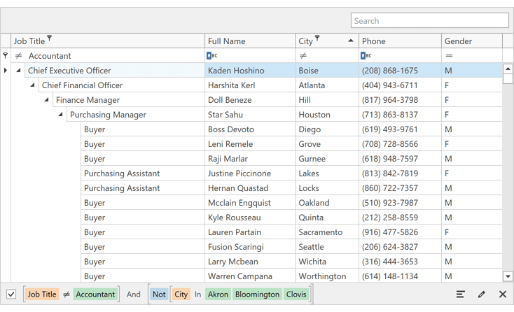
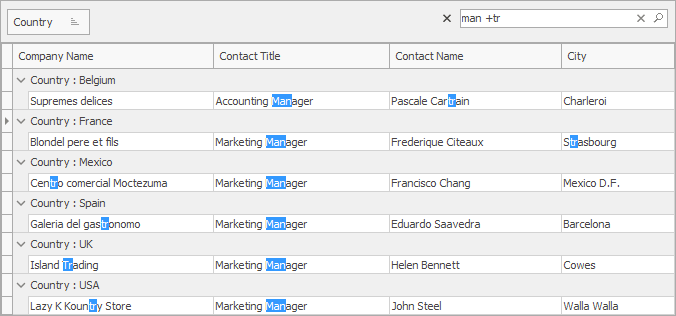
New Filter Panel
The new Filter Panel displays separate tokens with filters for each column.
Demo* Video Overview Documentation
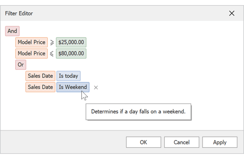
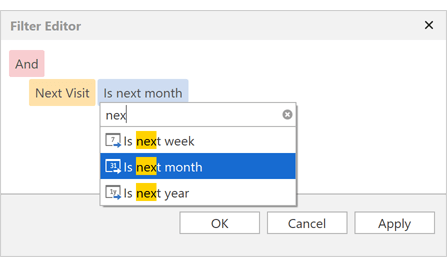
Filter Editor Enhancements
We extended operand types in the Filter Editor. Your end users can now select fields and date-time functions as needed.
Demo* Documentation
Automatic Column Best Fit
The Data Grid and TreeList can automatically (and dynamically) resize columns to fit cell values during scroll operations.
To enable this option, set a column's Width property to Auto. As you can see in the animation below, our WPF Data Grid / TreeList controls automatically recalculate optimal cell width for the target column (and dynamically recalculate cell width as records are scrolled).
Video Overview Documentation
Miscellaneous Enhancements
Accordion Control
Restrict Item Selection
New API allows you to prevent accordion item selection.
-
The CanSelect property specifies whether an accordion item can be selected.
-
The CanSelectItem event allows you to prevent item selection based on a condition.
Show Popup on Hover
Use the new ShowPopupOnHover property to display a popup on mouse hover.
When the mouse pointer leaves a popup, the Accordion control hides the popup with a delay. The delay is specified by the PopupHideDelay property.
Charting
Large Data Source Processing (CTP)
v20.1 introduces a new data processing option (XYSeries2D.AllowResample) to minimize memory footprint when processing extremely large datasets. This option is automatically enabled for 2D Charts with sorted numeric arguments and numeric values.
Demo* Documentation Blog Post
Calculated Fields
This release includes calculated field support. Calculated fields allow you to apply an expression to data source fields.
<dxc:ChartControl.CalculatedFields>
    <dxc:ChartCalculatedField
        FieldName="CalculatedPopulation"
        DisplayName="Calculated Population"
        FieldType="Double"
        Expression="IIF ([Gender] == 'Male', [Population] * -1, [Population])"/>
</dxc:ChartControl.CalculatedFields>
Demo* Documentation Blog Post
Side Margin Enhancements
Blog Post
Edit Annotations at Runtime
End-users can now create text and image annotations via Ribbon commands (Add Text Annotation / Add Image Annotation).
If the RuntimeEditing option is enabled, end-users can change existing annotations - edit text and replace images, or delete them via the Delete key.
Demo*
Chart Toolbar
The WPF Chart Toolbar allows you to quickly customize chart elements. End-users can print a chart, invoke the Chart Designer, change on-screen data range and much more. Toolbar content is customizable - you can add your own items (commands) and hide items you consider unnecessary.
You can use a Ribbon or traditional toolbar for Charts.
Demo* Documentation
New DateTime Axis Mode
v20.1 includes a new SkipRangesWithoutPoints option. Enable it to automatically exclude all axis ranges without data points. This feature is especially useful for financial charting - you no longer need to manually define non-working date intervals.
Documentation
Constant Lines - Runtime Editing
End-users can now add constant lines via Ribbon commands (Add Vertical Constant Line / Add Horizontal Constant Line).
End-users can move a constant line, edit its title, or delete the line (via the Delete key).
Demo*
Side Points
v20.1 includes our new Side Points chart element. You can configure markers and labels for the first and last series points independent of other series points.
Demo*
Data Editors
Track Bar Enhancements
Our WPF TrackBar Editor can now draw labels alongside ticks and display a tooltip with the current value when a user drags a thumb.
You can customize tick label / tooltip content and appearance settings.
Demo* Video Overview Documentation
DateNavigator - CalendarControl API Enhancements
-
You can specify cell appearance for each cell state (today, disabled, mouse over, etc.). You must set all Date Navigator Appearance Options to use this feature. Please refer to the following support ticket for more information: T885556
- You can define the DateNavigator's visible range.
- Ability to choose which date format an end-user can select (months, years, range of years, etc.).
Video Overview Documentation
ItemsSourceChanged Event
ListBox, ComboBox, and Lookup editors include an ItemsSourceChanged event.
Select All on a Triple-Click
End-users can triple-click to select all text in our WPF Text Editors (TextEdit, ButtonEdit, and their descendants).
Video Overview
Mask - Improved Text Selection
We've improved text selection for editors that support masked input. End-users can now select the desired portion of a given mask.
To allow selection of the entire mask or any portion thereof, set the new UpdateSelectionOnMouseUp property to true.
Video Overview
DateEdit - Operation Mode Glyphs
The drop-down button displays different icons based on the Date Editor's operation mode.
Demo* Video Overview Documentation
Diagram
Text Tool
Our new Text Tool allows you and your users to add text labels to a diagram.
Video Overview
Properties Panel Localization API
We have extended the 'DevExpress.Diagram.Core.Localization.DiagramControlStringId' class. You can now localize the Properties Panel.
Filtering UI
Filter Behavior
You can now associate our stand-alone Filter Panel control with a data-bound control (Chart, Grid, TreeList, etc.)
Demo* Documentation
Gantt Control
Resources
You can assign resources to tasks and specify the percentage of time a resource spends on a task.
Demo* Video Overview Documentation
Backward Scheduling
Backward Scheduling allows you to manage projects that have a specific deadline. You can plan backwards - scheduling each task from a deadline to the beginning of the project.
Demo* Documentation
Map Control
MapEllipse - Geodesic Shape Layout
MapEllipse now supports Geodesic shape layout.
We also added the MapEllipse.CreateInPixelsByCenter method to create an ellipse based on a center point in Geographical coordinates and pixel dimensions.
Vector Tiles
We now support PBF and MBTiles vector files.
Documentation Blog Post
GeoJSON, KMZ, GPX Support
With this release, our Map Control supports new data providers designed to load data from GeoJSON, KMZ, and GPX files.
Demo*
MapSpline
v20.1 includes a new MapSpline vector element. With it, you can draw a spline on your map as needed.
Demo* Documentation
Pivot Grid
Customization Form Search
The Pivot Grid's Customization Form displays a search box that allows users to filter the list of available fields.
Documentation
New Filter Panel
The new Filter Panel displays separate tokens with filters for each field.
Demo* Documentation
Filter by Summary
The WPF Pivot Grid can now filter data by summary. Users can configure summary filters with a range selector in a pop-up window.
Documentation
'Week-Year' Group Interval
Documentation
New Summary Types for Server Mode and 'Optimized' Client Mode
New PivotGrid summary types include:
Our Expression editor ships with the following new functions:
- CountDistinct()
- Median()
- Mode()
These new summary types are only available in Optimized Client Mode and Server Mode.
Documentation
Ribbon and Toolbars
Backstage View Enhancements
You can now display a glyph for Backstage tab item headers in our WPF Ribbon control. You can also display items at the bottom of the BackstageView.
Demo* Documentation
BarItem - Trigger API
You can now use triggers based on custom conditions, mouse input, and visual states to control a BarItem's appearance.
Documentation
Rich Text Editor
Wrap Text Around a Table
The Rich Text Editor now allows you to change text wrapping around tables, table alignment and offset in code and via its UI.
Documentation
Footnotes and Endnotes
The WPF Rich Text Editor supports footnotes and endnotes. New API allows you to access and edit notes in code. Documents with notes can be printed and exported to PDF.
Documentation
Shape API Enhancements
You can now create any type of shape and:
Character Properties Enhancements
We included the following character spacing options:
- Spacing
- Horizontal Scale
- Position
- Kerning
These properties are available in code and via the control’s UI.
Custom XML
Our Word Processing Document API and WinForms / WPF Rich Text Editors allow you to store custom XML data in DOCX and DOC documents. You can create, edit and remove custom XML in code.
Documentation
Scheduler
Appointment and Time Region Filtering
You can now dynamically hide appointments and time regions. With our WPF Scheduler, you can define filter criteria in XAML or code-behind by using our criteria syntax. FilterAppointment and FilterTimeRegion events allow you to describe custom filtering logic.
You can also bind the Scheduler to the Filter Editor or Filter Elements to incorporate our filtering UI in your WPF application.
Demo* Video Overview Documentation
Spreadsheet
XML Spreadsheet 2003 Format Support
Our Spreadsheet Document API and WinForms / WPF Spreadsheet controls now support the XML Spreadsheet 2003 file format. You can load and save documents using this format as needed.
Documentation
Calculation Accuracy
We significantly improved calculation accuracy for comparison operators and the following built-in functions:
- ROUND, ROUNDUP, ROUNDDOWN, FLOOR (number rounding now replicates Microsoft Excel)
- Date and time functions (WEEKNUM, YEARFRAC, DATEDIF, NETWORKDAYS.INTL)
- Mathematical functions (SUM and AVERAGE)
- Financial functions (EFFECT)
The impact of regular floating point operations on calculation accuracy can be significant. In addition to standard floating point operations, we used math algorithms to match Microsoft Excel as much as possible. Feel free to compare our Spreadsheet control to the competition and tell us where we stand.
Themes
Visual Studio 2019 Themes
This release includes three new themes inspired by Microsoft Visual Studio 2019:
- Visual Studio 2019 Blue
- Visual Studio 2019 Dark
- Visual Studio 2019 Light
New Default Theme
In this release, we changed our default theme to Office2019Colorful. This theme supports palettes, lightweight templates, and standard WPF control customization options (Background, BorderBrush, and BorderThickness).
For backward compatibility, use the CompatibilitySettings.LegacyDefaultTheme property.
Appearance Properties Support
Our most recent themes (Office 2016 SE, Office 2019, VS 2017, VS 2019) now offer enhanced templates for the following controls:
- Ribbon items, pages, categories, and groups.
- Toolbars and Toolbar items.
- Context menu and Context menu items.
- SimpleButton, DropDownButton, and SplitButton.
These templates simplify appearance customization via the following appearance properties:
- Background / Foreground;
- BorderBrush;
- BorderThickness;
- CornerRadius;
- Margin / Padding.
Standard Control Support
With this release, you can apply DevExpress WPF Office 2019/2016SE and Visual Studio 2017/2019 themes to PasswordBox, Menu, and ContextMenu controls.
Documentation
Miscellaneous
Simplified SVG Declaration
You can now specify SVG icons as shown below:
<dxb:BarContainerControl>
    <dxb:MainMenuControl>
        <dxb:BarButtonItem Glyph="i/new.svg"/>
    </dxb:MainMenuControl>
</dxb:BarContainerControl>
Documentation
Common Enhancements
This release includes the following enhancements to our data-aware controls and field editors:
- Accessibility
- Adaptivity
- Data Filtering
- Data Editing (including Batch Editing)
- Touch Support
- Data Export
- Validation
New Diagram
The Diagram control for ASP.NET Web Forms and MVC was first introduced in October 2019 as a community technology preview (CTP). This update marks its official release.
Its features include:
- 40+ Customizable and Scalable Shapes (including OrgChart shapes)
- Collapsible Shape Containers
- Custom Shapes
- Straight and Right-Angle Diagram Connectors
- Bind to any External Data Source
- Load / Save Diagram in JSON
- Export to SVG, PNG and JPEG
- Auto Layout
- Templates
- Full Screen Mode and Simple View
- Read-Only Mode
- Configurable Page Settings
- Customizable UI
- Support for Mobile Devices
- DevExpress Themes
- Localization
Demo: Web Forms Demo: MVC Documentation: Web Forms Documentation: MVC
New Gantt
The ASP.NET Gantt control for Web Forms and MVC was first introduced in May 2019 as a community technology preview (CTP). This update marks its official release.
Its features include:
- Data Binding
- Task, Dependency and Resource Management
- Change History
- Column Management
- Data Sorting
- Task Dependency and Parent/Child Relationship Validation
- Time Highlighting
- Context Menu and Toolbar
- Scroll and Zoom
- Work Time and Holidays
- Configurable Task Appearance
- Localization
Web Forms: Demo Documentation
MVC: Demo Documentation
Performance Improvements
As a part of continuous commitment to component performance, we have optimized our data processing and rendering engine. Changes include:
- Our controls are now much faster within the Visual Studio designer.
- Page can be edited approximately 2-5 times faster.
- First page load speed has been improved by more than 25% for websites and more than doubled for Web Applications (based on page complexity).
- ListBox/Combobox can now manage thousands of items on the client-side up to 10 times faster.
- Controls that rely on SVG images are now rendered faster.
- GridView requires fewer database queries when filtering DateTime columns and exporting data in server mode (especially selected rows).
- We've decreased the number MVC GridView deadlocks.
Data Grid (GridView) Enhancements
New context menu commands allow you to generate summaries on the fly:
- COUNT, MIN and MAX summaries for Enum / DateTime / String columns;
- COUNT, MIN, MAX, SUM and AVG summaries for numeric columns.
Our ASP.NET GridView's toolbar now offers batch editing commands.
Charting
Calculated Fields
This release includes calculated field support. Calculated fields allow you to apply an expression to data source fields.
Blog Post
New DateTime Axis Mode
v20.1 includes a new SkipRangesWithoutPoints option. Enable it to automatically exclude all axis ranges without data points. This feature is especially useful for financial charting - you no longer need to manually define non-working date intervals.
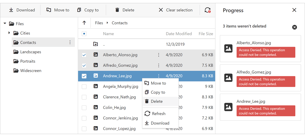
File Manager and Upload Control
Support for SharePoint Cloud Provider
With this release, our ASP.NET File Manager control allows end-users to manage files stored on SharePoint's cloud service.
Demo Documentation
Pivot Grid
New Filter Panel Mode
DevExpress ASP.NET Pivot Grid includes a new filter panel mode called Filter. In this mode, a filter applied in the Filter Editor is synchronized with field filters.
To enable this new filter mode, set the PivotGridWebOptionsFilter.FilterPanelMode property to 'Filter'.
Demo Documentation
'Week-Year' Group Interval
Documentation
New Summary Types for Server Mode and 'Optimized' Client Mode
New PivotGrid summary types include:
Our Expression editor ships with the following new functions:
- CountDistinct()
- Median()
- Mode()
These new summary types are only available in Optimized Client Mode and Server Mode.
Documentation
Rich Text Editor
Client-Side WYSIWYG Export to PDF
Our Rich Text Editor can now export a document to PDF directly on the client. When a document is exported to PDF on the client, PDF layout mirrors the layout displayed within the browser.
Documentation
Font Management API
We improved our Rich Text Editor's font management API. You can now specify font information for both the Ribbon and all associated dialog windows in a single code location.
Documentation: Web Forms Documentation: MVC
New API
New Diagram
The Diagram control was first introduced in May 2019 as a community technology preview (CTP). This update marks its official release. Its features include:
- 40+ Predefined Shapes (including collapsible shape containers and OrgChart shapes)
- Custom Shapes
- Bind to External Data
- Load / Save Diagram in the JSON Format
- Export to SVG, PNG and JPEG
- Auto Layout
- Templates
- Full Screen and Simple View Modes
- Read-Only Mode
- Configurable Page Settings
- UI Customization
- Support for Mobile Devices
- Localization
Demo Documentation
New File Manager
The File Manager was first introduced in May 2019 as a community technology preview (CTP). This update marks its official release.
Its features include:
- Configurable and Modular File System Providers
- File and Folder Editing
- Upload / Download Files
- Thumbnail and Details view modes
- Selection
- Progress and Status UI
- Toolbar and Context Menu
- File Upload Validation
- Responsive UI
- Touch Support
- Localization
Demo Documentation
New Gantt
The Gantt control was first introduced in October 2019 as a community technology preview (CTP). This update marks its official release.
Its features include:
- Data Binding
- Task, Dependency and Resource Management
- Change History
- Task Dependency and Parent/Child Relationship Validation
- Time Highlighting
- Context Menu and Toolbar
- Scroll and Zoom
- Configurable Task Appearance
- Localization
Demo Documentation
Charting
Custom Position of Chart Axes
You can now specify the X/Y offset for axes origin.
Polar Chart Annotations
Our Polar Chart now includes annotation support.
Data Grid
New Export to Excel API
This update marks the official release of our new Export to Excel API (based on the ExcelJS library). Features include:
- Customize Individual Cells via customizeCell Callback
- Column Band Export
- Cell Text Alignment, Wrapping and Font Settings
- DataGrid's Column Format Support
- Cell Image Export
- Excel-Inspired Column Filter
- Export Status Panel
Data Grid and Tree List
Remote Validation Support
We have extended Asynchronous Validation Rule support in DataGrid/TreeList cells when using row and batch edit modes.
Rich Text Editor
Client-Side WYSIWYG Export to PDF
The Rich Text Editor can now export a document to PDF directly on the client. When a document is exported to PDF on the client, PDF layout mirrors the layout displayed within the browser.
Documentation
Font Management API
We improved our Rich Text Editor's font management API. You can now specify font information for both the Ribbon and all associated dialog windows in a single code location.
Documentation
Scheduler
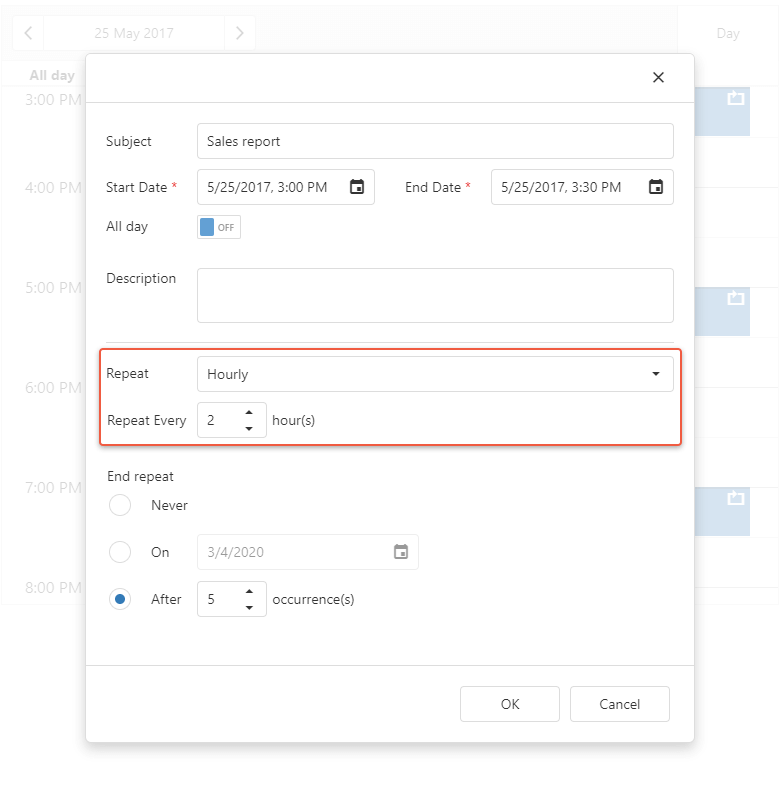
Hourly Repeating Events
Our Scheduler can now use hours to specify repeat intervals for an event (such as an event that repeats every 4 hours).
Adaptivity Enhancements
The DevExtreme Scheduler's Appointment Form was redesigned to better match screen size.
API Enhancements
This release includes a new 'allowEditingTimeZones' option. You no longer need to implement a custom 'onAppointmentFormOpening' event handler.
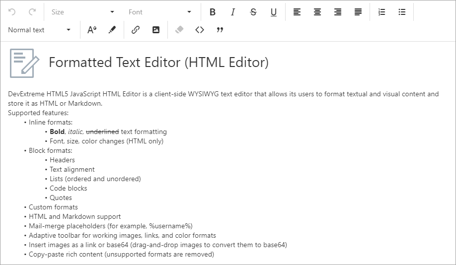
HTML/Markdown Editor
Multi-line Toolbar
You can now display HTMLEditor toolbar items across multiple lines. Turn-off the 'toolbar.multiline' option to disable this new option.
Demo Documentation
UI Widgets
TreeView - Selection API Enhancements
- GetSelectedNodes - gets selected nodes.
- GetSelectedNodeKeys - gets selected node keys.
TreeView - Scrolling API Enhancements
The new 'scrollToItem' method allows you to scroll to a specified TreeView node.
Visual Studio Integration
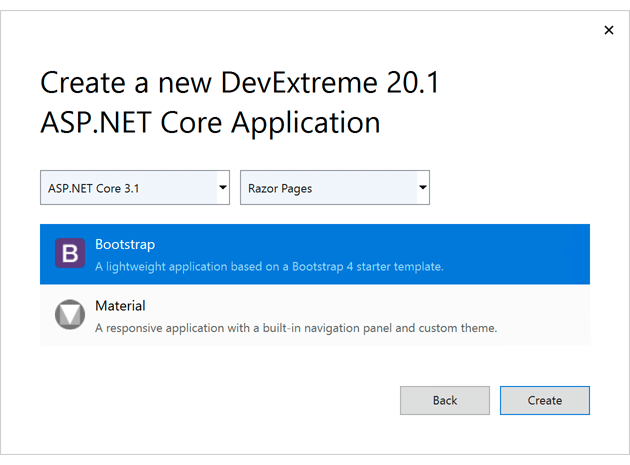
New DevExtreme-based ASP.NET Core Project Wizard
v20.1 ships with a fully reworked project wizard. We combined multiple ASP.NET Core project templates into a single new item.
Once you create a project, the wizard will ask you to choose between:
- Two .NET Core LTS versions - 2.1 and 3.1. Note that 3.1 is only available in Visual Studio 2019.
- Razor Pages or MVC Views
- Bootstrap or Material application layout
Documentation
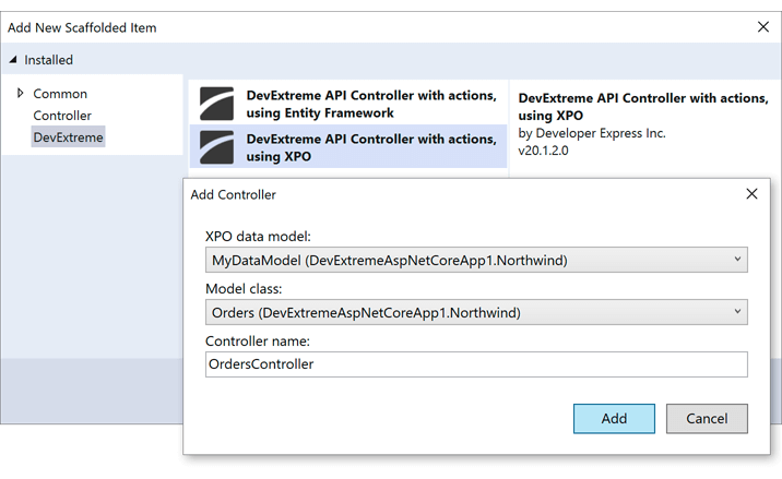
New Scaffold API Controller Wizard (XPO Data Model)
Our new wizard allows you to create an API controller that uses an eXpress Persistent Objects (XPO) data model.
Documentation
This release includes the following enhancements to our data-aware controls and field editors:
- Adaptivity
- Data Filtering
- Data Editing (including Batch Editing)
- Touch Support
- Data Export
- Validation
Accordion
Group Appearance Options
New properties allow you to customize a group's appearance:
Demo
GridView
Edit Form Customization API
New server-side and client-side API allows you to customize the Edit Form. You can now specify item caption and toggle item visibility as needed.
Demo
Charting
Custom Position of Chart Axes
You can now specify the X/Y offset for axes origin. Use the BootstrapChartCommonAxisSettings.CustomPosition and BootstrapChartCommonAxisSettings.Offset properties as necessary.
Demo
Editors
List Box / ComboBox - Multi-Column Mode
Our Bootstrap List Box and ComboBox controls can now display data across multiple columns. Set the BootstrapListBox.EnableMultiColum / BootstrapComboBox.EnableMultiColum property to 'true' to enable multi-column mode.
New field settings allow you to customize a column's caption, width and tooltip (SettingsMultiColumn).
Demo: List Box Demo: ComboBox
FileManager
Support for SharePoint Cloud Provider
With this release, our ASP.NET File Manager control allows end-users to manage files stored on SharePoint's cloud service.
Demo Documentation
As a part of continuous commitment to component performance, we have optimized the following:
- ListBox/Combobox can now manage thousands of items on the client-side up 10 times faster.
- GridView requires fewer database queries when filtering DateTime columns and exporting data in server mode (especially selected rows).
New Diagram
The Diagram control was first introduced in May 2019 as a community technology preview (CTP). This update marks its official release. Its features include:
- 40+ Customizable and Scalable Shapes (including OrgChart shapes)
- Collapsible Shape Containers
- Custom Shapes
- Bind to External Data
- Straight and Right-Angle Diagram Connectors
- Load / Save Diagram in the JSON Format
- Export to SVG, PNG and JPEG
- Auto Layout
- Templates
- Full Screen and Simple View Modes
- Read-Only Mode
- Configurable Page Settings
- UI Customization
- Support for Mobile Devices
- DevExpress Themes
- Localization
Demo Documentation
New File Manager
The File Manager was first introduced in May 2019 as a community technology preview (CTP). This update marks its official release.
Its features include:
- Configurable and Modular File System Providers
- File and Folder Editing
- Upload / Download Files
- Thumbnail and Details view modes
- Selection
- Progress and Status UI
- Toolbar and Context Menu
- File Upload Validation
- Responsive UI
- Touch Support
- Localization
Demo Documentation
New Gantt
The Gantt control was first introduced in October 2019 as a community technology preview (CTP). This update marks its official release.
Its features include:
- Data Binding
- Task, Dependency and Resource Management
- Change History
- Task Dependency and Parent/Child Relationship Validation
- Time Highlighting
- Context Menu and Toolbar
- Scroll and Zoom
- Configurable Task Appearance
- Localization
Demo Documentation
Data Grid
New Export to Excel API
This update marks the official release of our new Export to Excel API (based on the ExcelJS library). Features include:
- Customize Individual Cells via customizeCell Callback
- Column Band Export
- Cell Text Alignment, Wrapping and Font Settings
- DataGrid's Column Format Support
- Cell Image Export
- Excel-Inspired Column Filter
- Export Status Panel
Demo Video Overview Documentation
Data Grid and Tree List
Remote Validation Support
We have extended Asynchronous Validation Rule support in DataGrid/TreeList cells when using row and batch edit modes.
Demo Documentation
Data Visualization
Custom Position of Chart Axes
You can now specify the X/Y offset for axes origin.
Demo Documentation
Polar Chart Annotations
Our Polar Chart now includes annotation support.
Demo Documentation
Scheduler
Hourly Repeating Events
DevExtreme Scheduler can now use hours to specify repeat intervals for an event (such as an event that repeats every 4 hours).
Adaptivity Enhancements
The DevExtreme Scheduler's Appointment Form was redesigned to better match screen size.
API Enhancements
This release includes a new 'allowEditingTimeZones' option. You no longer need to implement a custom 'onAppointmentFormOpening' event handler.
Demo Documentation
HTML/Markdown Editor
Multi-line Toolbar
You can now display HTMLEditor toolbar items across multiple lines. Turn-off the 'toolbar.multiline' option to disable this new option.
Demo Documentation
UI Widgets
TreeView - Selection API Enhancements
Demo
TreeView - Scrolling API Enhancements
The new 'scrollToItem' method allows you to scroll to a specified TreeView node.
Documentation
React Components
Authentication UI Template
We've extended our Login Form template with a new Sign Up, Reset/Change Password form template. We've also implemented corresponding client-side API so you can integrate our forms with your backend authentication API.
Demo
Native React Scheduler - Resources and Grouping
We added resource support to our DevExtreme React Scheduler. Assign resources to appointments and visualize appointments grouped by resources or by dates.
Documentation Video Overview
Native React Grid - Export to Excel
You can now export the contents of the DevExtreme React Grid to Excel (including options to configure formatting).
Demo and Documentation
Native React Grid - Scroll To Row
We introduced a new API that allows you to scroll DevExtreme React Grid content to a specific row.
Our Blazor UI component library includes a comprehensive set of user interface controls for both Blazor server-side and Blazor client-side platforms.
Since we update our Blazor UI controls on a monthly basis, please refer to the following webpages for general product information or our blogs for up-to-the-minute information on new features.
Blog Post: February Update Blog Post: January Update Blog Post: December Update
Blazor UI Components Online Demos
Download
DevExpress Blazor UI Components is available on the
DevExpress NuGet server. Find your personal NuGet feed URL in the
Download Manager and set up Visual Studio's NuGet Package Manager to proceed with installation.
Source Code
Source code is available only for active DXperience and Universal subscribers.
Licensing
The DevExpress UI for Blazor will be part of the
DevExpress ASP.NET Subscription. If you own an active ASP.NET, DXperience, or Universal Subscription, all DevExpress Blazor products will be made available to you automatically.
All Platforms
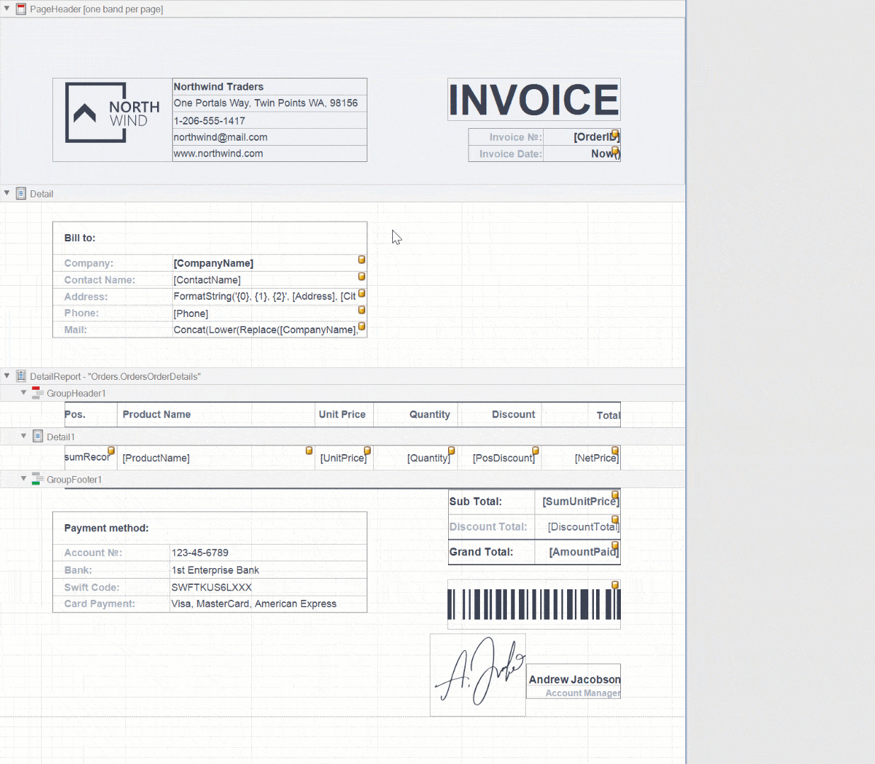
Report Designer - Report Localization
With this release, you can localize a report so that it incorporates design and text variations for different languages and cultures. Localized values are stored in REPX files.
Our Localization Editor was designed to expedite the report translation process.
Feature Tour Video Overview Documentation
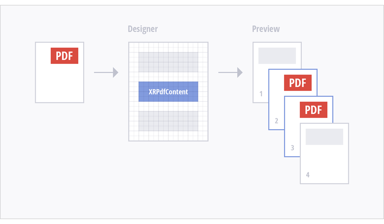
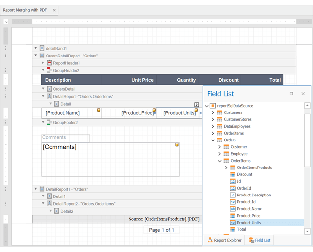
Report Designer - Merge Reports with PDF Documents
We added a new XRPdfContent report control to our Report Designer. This control allows you to embed pages from an external PDF file into a report document. PDF content is rendered on separate pages and uses its own page size.
Video Overview Documentation
Expression Bindings - Use Dots in Data Field Names
We enhanced our criteria language parser. You can now use dots in query and field names.
Excel Export – Html-inspired and RTF Content Support
XRLabel (with the AllowMarkupText property enabled) and XRRichText controls (bound to RTF and/or HTML data) now preserve content formatting when exporting a report to Excel.
How to Export To XLS How to Export To XLSX
PDF Export - Export Image Editable Fields to PDF Form Fields
Documentation
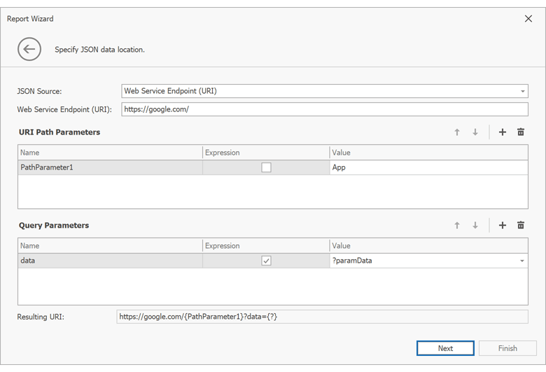
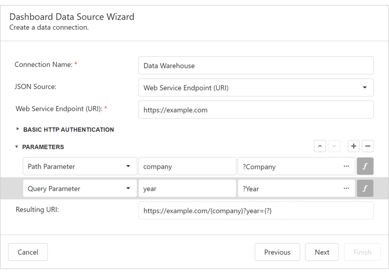
JSON Data Source Parameters - Wizard and Expression Support
We updated the JSON Data Source Wizard. You can now add path, query and header parameters to JSON web service endpoints. We also added support for expressions in JSON parameter values so you can pass report parameter values to resulting requests.
Demo Video Overview
How to Bind a Report to JSON Data
JSON Data Source - Schema Discovery Enhancements
We enhanced the JSON Data Source schema discovery. The JsonDataSource class has a SchemaDiscoveryMaxItemCount property that specifies how many records to analyze in order to build the data source schema (on each level, so you don't need to worry about nested records). The default value is 100. You can modify this value to find the best balance between performance and the schema accuracy.
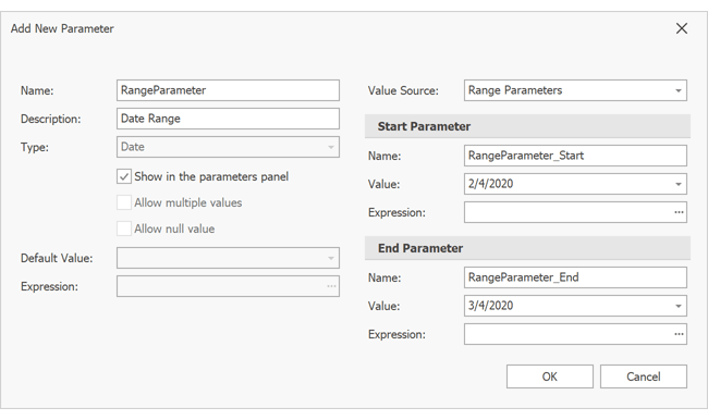
Parameters - Select All Values for Multi-Value Parameters
Use the Parameter.SelectAllValues property to pre-select all values for a multi-value lookup parameter.
Documentation
ASP.NET Core Reporting
Document Rendering Enhancements for Linux and MacOS
Use the DevExpress.CrossPlatform.Printing.DrawingEngine NuGet package to enhance document rendering quality on Linux or macOS.
In this development cycle we focused on parity in terms of document rendering quality and PDF export regardless of target platform (be it .NET Core or .NET Framework) or operating system used to host Reporting apps.
We've used Cairo and Pango to implement this drawing engine. The following table summarizes differences between the two.
Documentation
Azure Web Apps
Export to PDF Enhancements
We've enhanced our PDF export engine for those using Azure Web App hosting. New features include:
- Font Embedding (including CJK fonts)
- Bidirectional Text Support
- Complex Text Layout Support
Azure Support for .NET Standard
We published our DevExpress.AspNetCore.Reporting.Azure NuGet package - .NET Standard-specific analog of the DevExpress.Web.Reporting.Azure package. It allows you to store temporary document data within Azure Storage.
Microsoft Azure Reporting
WinForms Reporting
Report Designer - New Add Parameter Dialog
Documentation
WinForms / WPF Reporting
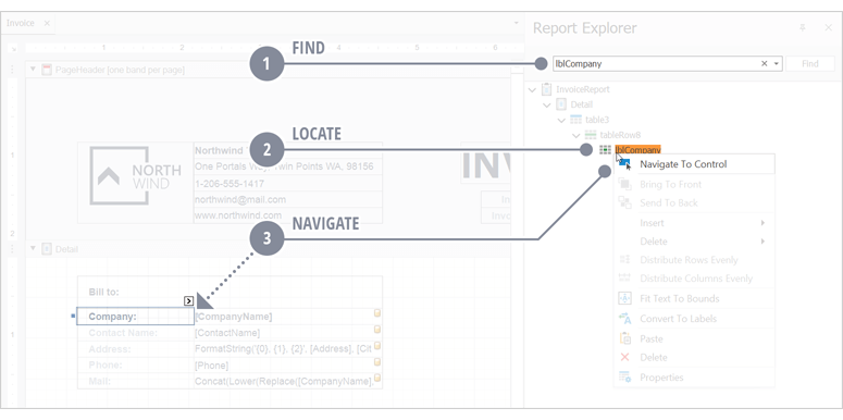
Report Designer - Easier Navigation
The desktop designer offers a new "Navigate To Control" option that will navigate you to the target component. This will help you find a specific control within a complex report layout. Any necessary scrolling / expansion will be performed automatically.
Documentation
Report Designer - Easier Alignment
The Report Designer now allows you to convert multiple labels into a single table. This will help you to create a better aligned Excel file.
Documentation
Report Designer - Expand / Collapse All Bands
You can now quickly expand and collapse all report bands using context menu and Ribbon commands:
Documentation
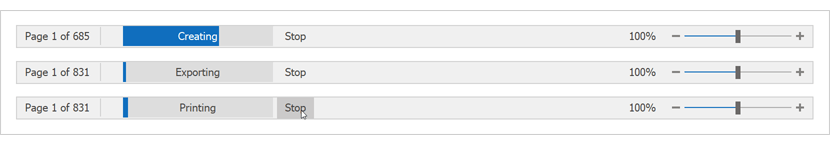
Asynchronous Document Generation and Export API
Our Document Viewer components can now create, print, and export report documents in a separate thread. This feature is enabled by default for the DevExpress Visual Studio Report Designer and WinForms End-User Report Designer preview tab. Enable the following properties before you assign a report to Document Viewer (this will enable the feature for your application):
WinForms
-
The 'DocumentViewer.UseAsyncDocumentCreation' property
-
To create a ReportPrintTool class instance, use the new ReportPrintTool(XtraReport report, bool useAsyncDocumentCreation) constructor
WPF
-
The 'DocumentPreviewControl.UseAsyncDocumentCreation' dependency property
-
Or use the following style:
<Style TargetType="{x:Type dxp:DocumentPreviewControl}">
    <Setter Property="UseAsyncDocumentCreation" Value="True" />
</Style>
The desktop application's main thread remains intact when these operations run in the background thread. This allows users to interact with the user interface. The progress bar displayed in the Document Viewer's status bar now reflects the current operation and allows users to cancel it.
The document generation engine is now independent of the Application.Idle event call sequence. This makes the component interface more responsive and is also helpful if you develop add-ins for external applications like Microsoft Office.
This enhancement also offers a way to create, print, and export report documents in an asynchronous manner via the following new API:
-
the 'CreateDocumentAsync' method;
-
the 'PrintAsync' method.
We also implemented asynchronous counterparts for export methods (e.g. ExportToPdfAsync, ExportToXlsxAsync, etc).
SqlDataSource Filtering - Compare a Multi-Value Report Parameter with Null Value
You can now use the following filter string for 'SelectQuery' either to display the entire set of data source records or only those selected in a multi-value parameter drop-down editor:
?catID Is Null Or CategoryID In (?catID)Documentation
Web Reporting
Web Report Designer - Field List Performance Enhancements
We introduced the following enhancements to the Field List engine:
- The Report Designer now sends a single request to a web-server at initial rendering (to discover Field List nesting levels).
- The Field List now loads its elements on demand. This reduces possible delays when searching through field list items and helps avoid browser lock-up for extremely large and complex data sources.
Documentation
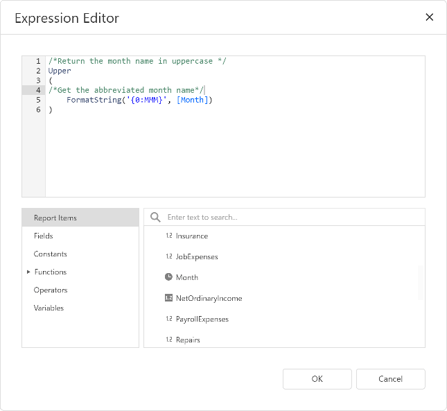
Expression Editor - Comments and Line Breaks
Expression text can now contain comments, newline and space characters to improve readability for complex expressions.
Documentation
Miscellaneous Enhancements
-
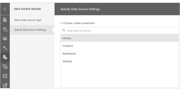
The Web Report Designer's Data Source Wizard allows you to search through the list of available connections.
Documentation
- We updated CSS styles used in Document Viewer and Report Designer to address conflicts with Bootstrap CSS styles. As a result, both components will now appear and render correctly when used in a Bootstrap-based application.
Report and Dashboard Server
Scheduled Job - Repeat Hourly
You can now specify repeat intervals for scheduled jobs in hours.
Extending DevExpress Dashboard's Lifecycle API
New API allows you to effectively customize the Dashboard throughout its entire lifecycle.
v20.1 includes the following lifecycle-related API enhancements:
Web Dashboard
.NET Dashboard Model
WinForms Dashboard Designer
Export Customization API
Blog Post
Data Processing and Performance Enhancements
'Week-Year' Group Interval
Documentation
Extended AGGR Function
v20.1 introduces a new function (joinRule) that extends the Aggr syntax. Use the joinRule function to analyse data shifted to the specified time period. You can now compare metric values between the current and the shifted time period (Parallel Period).
Example: aggr(X, Category, joinRule(Year, Year - 1))
Documentation
Tab Item – Performance Optimization Mode
We added new options for WinForms and WPF platforms so you can configure how Dashboard Items within Inactive Tabs are loaded during the first data load – always or on demand. Please note the documented restrictions on the Dashboard Items load order. We must always load data for Master Filter Item, even when it's placed on the Inactive Tab.
In Web, we permanently changed the Dashboard Item's loading order to make sure the visible items are always loaded and rendered first.
WinForms Documentation WPF Documentation
Data Export
Export Customization API
v20.1 includes our new Export Customization API. Now, you can maintain maximum customization of XRControls. For this release, we chose to extend support for our most popular UI controls - Charts and Gauges. One of the entry points to the new API is the GetPrintableControl method. We updated the CustomerSupport demo to demonstrate this new approach. You can find it in the Dashboard Demo Center.
Data Visualization
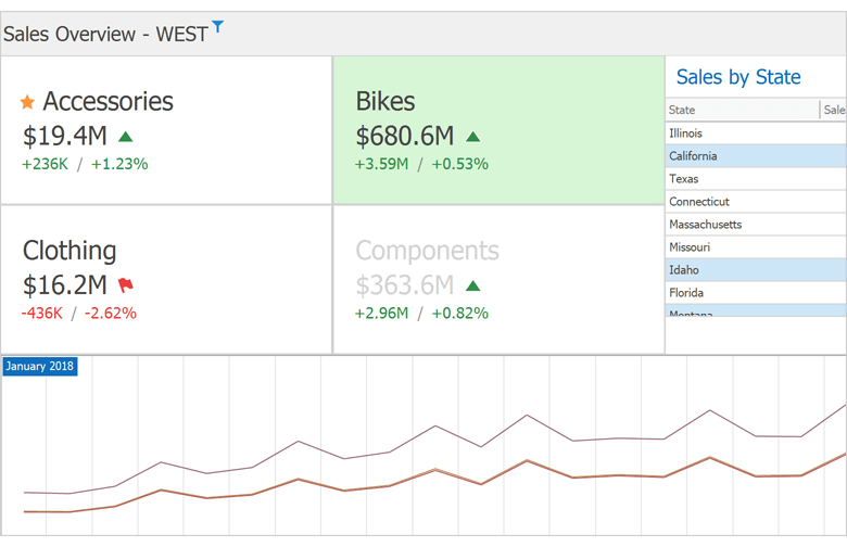
Card Item - Conditional Formatting
You are now able to create conditional formatting for Card Item based on the Measure (Actual or Target Values), Series Dimension, or on the delta between Actual / Target.
You can use Formatting Styles similar to those used for Grid / Pivot Grid conditional formatting. You can change selected Card element Font, add an Icon or apply the background color to the entire Card.
WinForms Documentation WPF Documentation
Web Dashboard
JSON Data Source - Parameters Support
You can now bind Dashboard Parameters to JSON Path Parameters and Query Parameters.
Documentation
Measure Filter
You can now set up a Filter expression for a single Measure bound to a Dashboard Item (i.e. you can filter a single Measure to be calculated only for a specific time period or for a single Product Category, etc).
Rich Text Editor for TextBox Item
Web Dashboard now allows you to use the DevExpress Rich Text Editor to modify rich text directly within its Text Box item.
You can enable this functionality within your Web Dashboard by installing the appropriate Rich Text Editor scripts.
Documentation
WinForms Dashboard
JSON Data Source - Parameters Support
You can now bind Dashboard Parameters to JSON Path Parameters and Query Parameters.
Documentation
Measure Filter
You can now set up a Filter expression for a single Measure bound to a Dashboard Item (i.e. you can filter a single Measure to be calculated only for a specific time period or for a single Product Category, etc).
Documentation
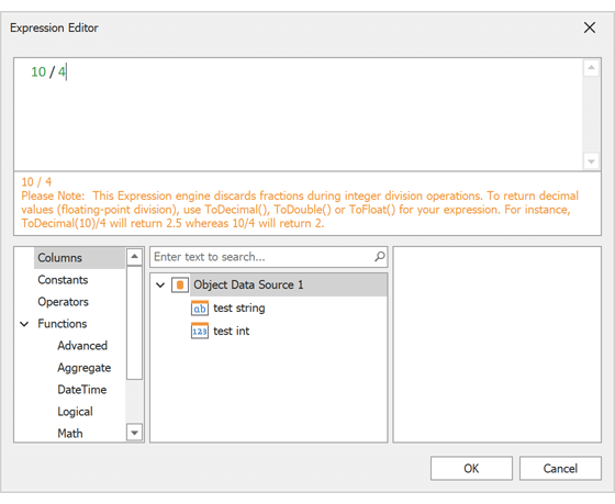
Visual Warning in Expression Editor
We added a visual indicator – a warning – to our WinForms Expression Editor. This indicator warns users that wish to execute [int] / [int] division – an action that can produce unexpected results. Some users may expect Excel-like behavior [int] / [int] = [double] (i.e. 10 / 4 = 2.5) in this scenario.
As you may know, we historically stick to the .NET C# [int] / [int] = [int] approach in this situation (i.e. 10 / 4 = 2). This difference can obviously lead to data loss and as such, we decided to add a warning when [int] to [int] division is created in an Expression.
WinForms State Management – Lifecycle
We implemented a new DashboardStateChanged event. The Dashboard Viewer and Dashboar Designer fire this event each time a dashboard state changes.
PDF Document API
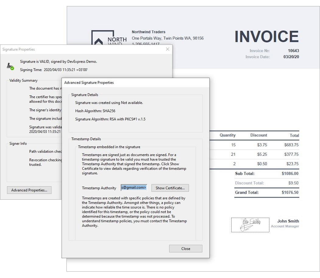
Multiple Document Signatures
The PDF Document API allows you to apply multiple signatures to a document.
Documentation
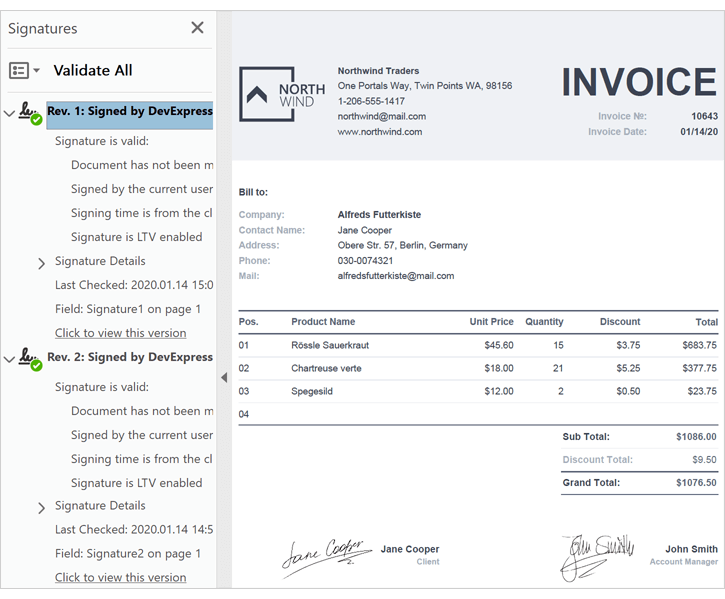
Signature Timestamps
With this release, you can now add a timestamp to a signature.
Documentation
Spreadsheet Document API
XML Spreadsheet 2003 Format Support
Our Spreadsheet Document API and WinForms / WPF Spreadsheet controls now support the XML Spreadsheet 2003 file format. You can load and save documents using this format as needed.
Documentation
PDF Export Enhancements
The Spreadsheet's export to PDF feature is now faster and produces a more precise layout.
For backward compatibility, turn on the SpreadsheetCompatibilityOptions.EnableLegacyPdfExport option.
Print Layout Enhancements
We now calculate the layout of a printed document more accurately. The resulting printout closely mirrors the print output of Microsoft Excel.
For backward compatibility, use the SpreadsheetCompatibilityOptions.EnableLegacyPrintLayout option.
Calculation Accuracy
We significantly improved calculation accuracy for comparison operators and the following built-in functions:
- ROUND, ROUNDUP, ROUNDDOWN, FLOOR (number rounding now replicates Microsoft Excel)
- Date and time functions (WEEKNUM, YEARFRAC, DATEDIF, NETWORKDAYS.INTL)
- Mathematical functions (SUM and AVERAGE)
- Financial functions (EFFECT)
The impact of regular floating point operations on calculation accuracy can be significant. In addition to standard floating point operations, we used math algorithms to match Microsoft Excel as much as possible. Feel free to compare our new Spreadsheet File API to the competition and tell us where we stand.
Word Processing Document API
Wrap Text Around a Table
The Word Processing Document API now allows you to change text wrapping around tables, table alignment and offset in code.
Documentation
Footnotes and Endnotes
The Word Processing Document API supports footnotes and endnotes. New API allows you to access and edit notes in code. Documents with notes can be printed and exported to PDF.
Documentation
Shape API Enhancements
You can now create any type of shape and:
Character Properties Enhancements
We now offer the following character spacing options:
- Spacing
- Horizontal Scale
- Position
- Kerning
Custom XML
Our Word Processing Document API and WinForms / WPF Rich Text Editors allow you to store custom XML data in DOCX and DOC documents. You can create, edit and remove custom XML in code.
Documentation
Blazor
Blazor Server UI (CTP)
ASP.NET Core Blazor Server UI (CTP) supports XPO ORM classes for data access and helps you create fast and mobile-friendly Web apps. This preview ships the following functionality for desktop and mobile browsers:
- Multiple UI themes and a runtime theme chooser;
- Navigation control with a hierarchical tree structure;
- Menus with all standard XAF command types (buttons, popups, input/search boxes, drop-down menus);
- Grid List Editor with sorting, grouping and paging;
- Detail form layout with group and tab controls;
- Property Editors for all data types (no advanced editors for criteria, RTF, etc.);
- Simple Forms Authentication with a login and password, role-based authorization and basic user, role and permission management in the UI.
- A separate 'DevExpress v20.1 XAF.Blazor Solution Wizard' template to help you create and test new projects in Visual Studio 2019 (v16.4 or later).
We do not recommend use of our new Blazor UI for production code. We've made it available to gather feedback and engage those of you considering it for future use.
Online Demo 2020 Roadmap Development Blog FAQ
Core Enhancements
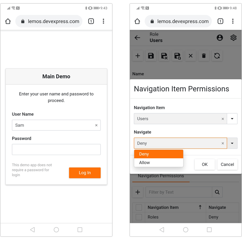
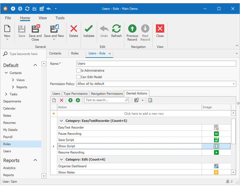
Security Permissions for Actions
Security Permissions allow users to prohibit execution of both custom and XAF system Actions in WinForms and ASP.NET applications. This feature ships with the following options:
- Security permissions hide or deactivate UI Actions unconditionally.
- Users can quickly locate required Actions via search and grouping (for instance, to filter out system Actions like Logon and Refresh).
- Users can group data by display text, category, module and other context information.
Video Overview Documentation
Security System for Entity Framework Core
Our goal is to help DevExpress and non-DevExpress customers benefit from XAF's Security System and Entity Framework Core. In v20.1, we've added a secured Object Space for EF Core 3.1+ and demonstrated its use for basic CRUD operations in Console and WinForms applications.
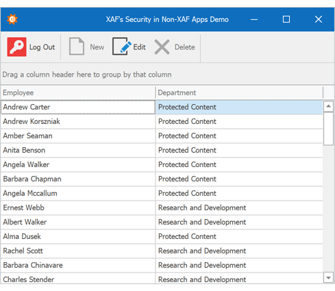
For more information on XAF's user authentication and group authorization APIs for .NET Core and .NET Framework apps, please refer to this GitHub repo.
Video Overview | FAQ
Simplified .NET Core 3.1 WinForms Assemblies and NuGet Packages
We eliminated .NET Core 3 versions of platform-agnostic XAF assemblies in favor of corresponding .NET Standard assemblies (except EF6 and Scheduler assemblies). We've done this for easier project maintenance, clearer dependencies, and future code extension of .NET Core apps and corresponding NuGet packages.
This release makes it easier to complete common development tasks like sharing Class Libraries with DevExpress Data or XPO dependencies for different Target Frameworks.
Documentation
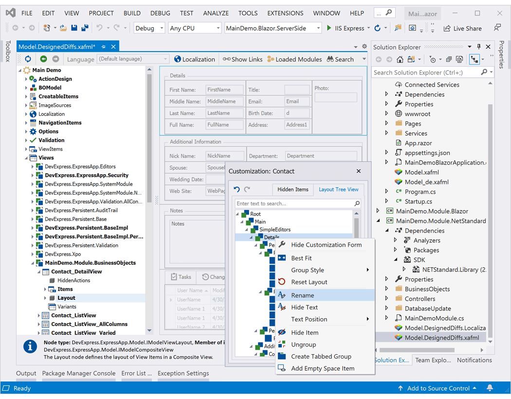
Model Editor for .NET Core and .NET Standard Projects (CTP)*
XAF includes a preview of the Model Editor for .NET Core 3+ (WinForms) and .NET Standard 2.0+ (Blazor) projects. Technically, it is a standalone Model Editor tool that runs as a separate process and draws itself inside the Visual Studio frame.
We took this approach so we could limit the impact of issues related to Component designer support in .NET Core projects and to have full control over designer performance, stability, etc.
Documentation
Performance Enhancements
Asynchronous Data Loading in WinForms List and Detail Views (CTP)
GridListEditor in Client DataAccessMode and DetailView can now load data asynchronously in XPO-based apps. The UI continues responding to user actions as data is being retrieved. You can cancel the load operation by closing the View or navigate to another View (in MDI mode).
Documentation
New ServerView and InstantFeedbackView Data Access Modes for WinForms List View (XPO Apps)
With this release, XAF GridListEditor uses read-only server mode components (XPServerModeView and XPInstantFeedbackView) in ServerView and InstantFeedbackView modes.
New data access modes handle large data sources with lower memory usage because they don't load entire instance of the persistent object.
Documentation
UX Improvements
Enhanced Filter Editors for WinForms
XAF Grid, Tree and Pivot List Editors, Report and Dashboard designers now use an enhanced Filter Editor with a new display style, functions and skin support by default.
Documentation
Non-Persistent/Proxy Object Enhancements
- The IsNewObject function criteria operator supports non-persistent and Entity Framework objects.
- NonPersistentObjectSpace tracks changes for non-persistent objects and supports filter and sort operations in List View.
-
Parent NonPersistentObjectSpace reloads and disposes its inner Object Spaces.
Documentation
NullText Property in the Platform-Agnostic PropertyEditor Class and Model Editor
We implemented a NullText property in our platform-agnostic PropertyEditor class and Model Editor. Use this property to specify the hint displayed when the editor's value is null or empty.
Documentation
Simplified Access to Detail View Editors
With this release, you don't need to handle 'ViewItem.ControlCreated' and other event handlers for many common usage scenarios. Use our 'DetailView.CustomizeViewItemControl' method to customize View Item controls. You no longer need to unsubscribe from events or check whether controls are created.
Documentation
XPO - ORM Library
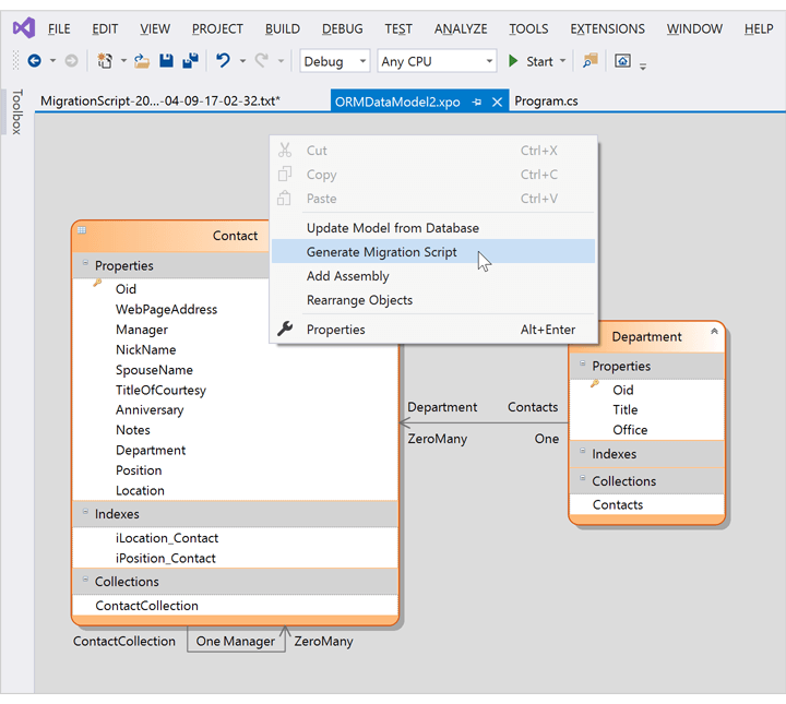
Database Schema Migration (CTP)
With this release, you can incrementally update database schema and preserve existing data after changes are made to an XPO data model. You can generate diffs (the SQL script) between the latest data model and existing database schema in the ORM Data Model Designer or in code. Database schema migration is available as a community technology preview.
Documentation
SQL Server and Always Encrypted Support
In this release, XPO adds support for Always Encrypted for SQL Server 2016+. You can now read, update, sort and filter encrypted column data (the last two operations are driven by encryption mode).
Documentation
Microsoft.Data.SqlClient Support
XPO now supports the Microsoft.Data.SqlClient driver. Microsoft recommends this driver instead of System.Data.SqlClient for new .NET Framework and .NET Core projects. Going forward, Microsoft will also only support new SQL Server features in Microsoft.Data.SqlClient.
Documentation
RushNav for VS Code
RushNav is a free extension for VS Code built by the DevExpress IDE Tools team, adding CodeRush navigation and selection features to the VS Code editor.
Install
Selection Expand/Reduce in TypeScript/JavaScript
You can expand or reduce code selections by logical blocks using the Expand Selection and Reduce Selection commands. Expand Selection will also select the parenting code block if there is no selection.
CodeRush Server
CodeRush Server is an Azure DevOps extension that analyzes code, coverage, and test runs, providing insight into the health of the code base.
Install Free Preview
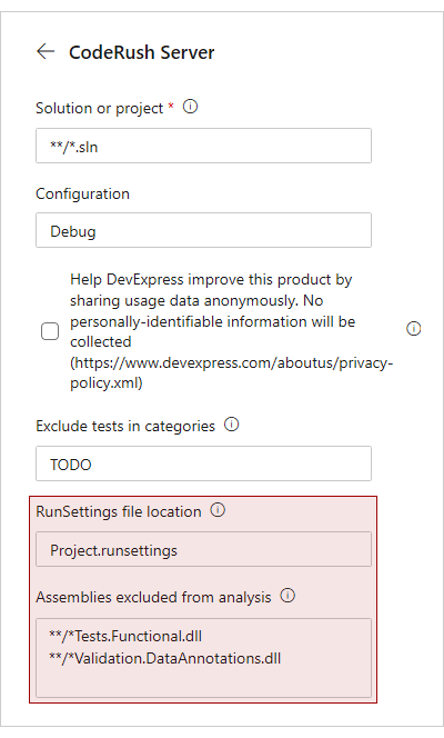
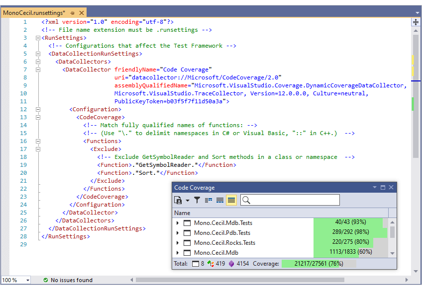
Code Coverage Analysis Options
We added options to let you exclude projects, functions and/or assemblies from Code Coverage analysis:
- RunSettings file location – allows you to specify the relative path to a .runsettings file. Wildcards may be used. CodeRush Server excludes projects and functions from code coverage analysis if you add them to the corresponding Exclude section of the '.runsettings' file.
- Assemblies excluded from analysis – allows you to specify the relative paths to assemblies or assembly names which you want to exclude from testing and analysis. Wildcards may be used.
Documentation
Miscellaneous Enhancements
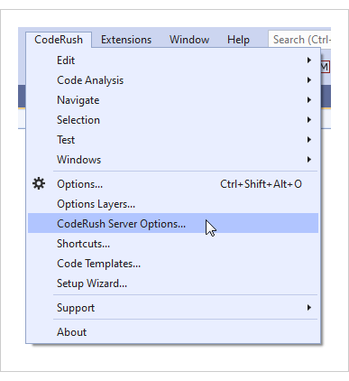
CodeRush Server configuration settings are now stored in a separate options layer inside CodeRush for Visual Studio. If you have CodeRush for Visual Studio installed, you can select CodeRush | CodeRush Server Options... to configure CodeRush Server for your solution.
Documentation
Blazor Support
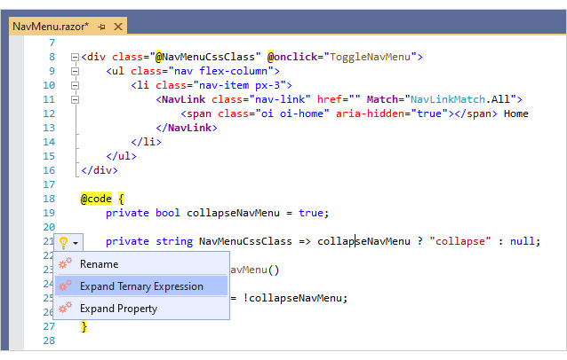
Refactorings and Code Providers
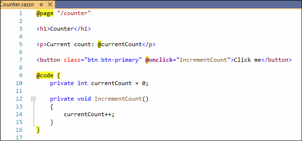
Over 30 refactorings and code providers are now available inside @code sections in .razor files:
- Add/Remove Block Delimiters
- Break Apart Parameters/Arguments
- Collapse/Expand Method / Property
- Convert to Initializer/Decompose Initializer
- Convert to String Interpolation
- Introduce Using Statement
- Make Implicit/Explicit
- Use Expression Body, and many more...
Documentation
Note: These refactorings are unable to update references in closed .razor files, so make sure all files that may be impacted by a particular refactoring are open in Visual Studio before applying it.
Navigation
The following navigation features are now available in Blazor code:
Tab to Next Reference highlights all references and lets you quickly navigate among them just by pressing Tab and Shift+Tab.
The References window finds references to a selected type or identifier at the caret. The references window also lets you filter results by access, letting you quickly find all assignments to a particular identifier, for example.
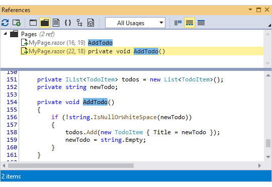
The Jump to window makes it easy to quickly jump to a location of interest. Instanly jump to declarations, members, references, assignments or files with just a few keystrokes.
Code Templates
You can now expand C# templates from inside @code sections in .razor files. For example, type in 'ps' and press Tab or Space to create a property of type string.
Coding Assistance
The following tools are now available in Blazor code:
Code Analysis
Duplicate Code Detection
Now you can detect structurally similar blocks of С# code, in a solution or an active project, making it easier to identify improve the quality of your code bases.
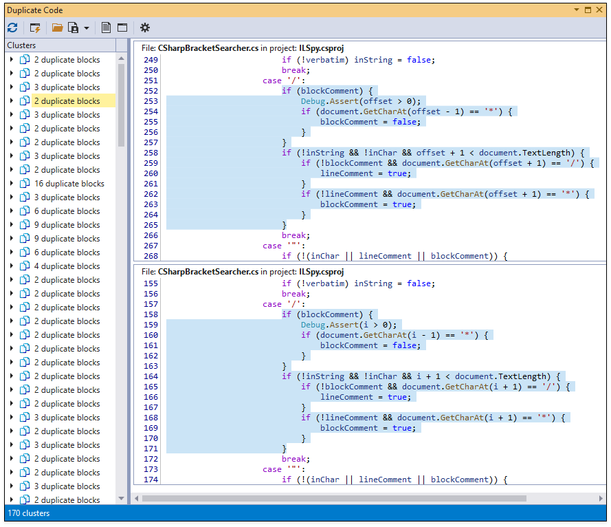
To find duplicate code in a C# solution, open the solution, from the Visual Studio main menu select 'CodeRush | Windows | Duplicate Code', and then click Refresh in the Duplicate Code tool window to run duplicate code analysis.
Documentation
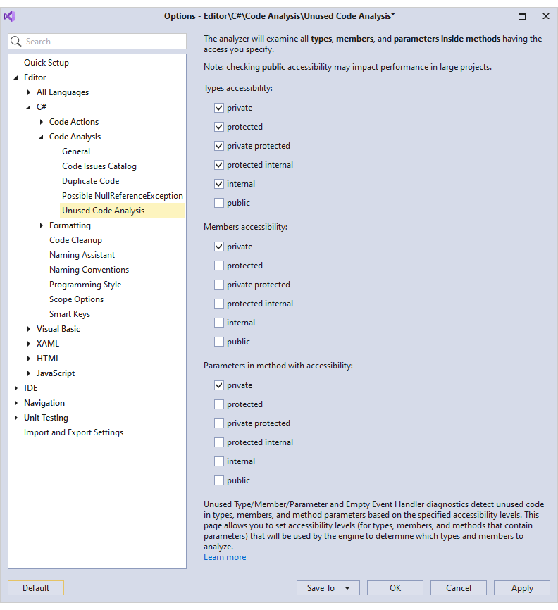
Unused Code Analysis Enhancements
Unused Type, Unused Member, Unused Parameter, and Empty Event Handler diagnostics can now detect unused code in types, members, and method parameters, as determined by a specified member/type accessibility.
Documentation
Refactoring Enhancements
The 'Promote to Generic Parameter' refactoring takes a class reference inside a method block, turns that into a generic type parameter to the method, and updates all calling code to match the new generic method declaration.
The 'Remove Redundant Type Qualifier' refactoring for XAML allows you to remove unneeded type qualifiers when the target type is already defined (for example, on a style setter), which can improve code readability.
You can now apply the Move Type to Namespace refactoring inside XAML code.
Rename Namespace to Match Folder Structure now supports changes in XAML code.
Performance Enhancements
Code formatting and unused code analysis are faster and use less memory.
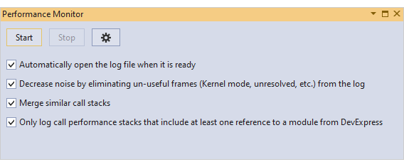
Performance Monitoring
The Performance Monitor continuously analyzes CodeRush performance while you work and records any issues, if found, into a log file.
Documentation
Unit Testing
Run Settings File Support
CodeRush lets you exclude specific functions from Code Coverage analysis with a *.runsettings file.
For more details, see the Customizing Code Coverage Analysis article at the Microsoft web site.
Test Discovery Enhancements
The CodeRush Unit Test Runner can now discover tests in source code and assemblies when you open a solution. This background discovery process aborts when tests are run or when the code is built. Once a project is built successfully, the Unit Test Runner will discover tests located inside these project assemblies.
Organize Members
New Rules
You can create the following new rules to group and sort members:
Blog Post
Dynamic Regions
If you want to wrap sorted interface implementations in dynamic regions, specify the {InterfaceName} built-in variable in the region name and enable the Wrap distinct groups in regions option.
Miscellaneous
Smart Dot
This release introduces 'Smart Dot' to help you write function call chains faster with fewer keystrokes.
When the caret is in a parameterless function call and you want to access a member of the return value, you can now type the dot within parentheses (instead of moving the caret out and to the right). CodeRush will place the dot to the right of the closing parentheses allowing you to call another method in a call chain.
Documentation
HTML Support
Color Swatches and the CodeRush Color Picker are now available in HTML.
DirectX Hardware Acceleration
With this release, our VCL Tile, Tile Bar, and Gallery controls support DirectX hardware acceleration. With DirectX, they will perform at their very best on high-DPI devices (4K+). Depending on the number of visual elements, hardware configuration, OS and driver versions, DirectX rendering is up to 3 times faster than GDI.
You activate the desired render mode via a new option in a skin (or look&feel) controller or a control's look&feel settings. The cxDefaultLookAndFeelRenderMode global constant in the source code allows you to select the render mode used by default.
Our DirectX support requires the Windows 7 Platform Update (with DirectX 11), Windows 8, or newer. A control that fails to create a DirectX-specific context uses GDI instead.
Fluent Design Form
v20.1 ships with a new Fluent Design Form that is inspired by Microsoft's Fluent Design System. Its features include:
- Hamburger Menu/Accordion View Integration.
- Adaptive Layout.
- Acrylic Material (a semi-transparent texture).
- Reveal Highlight (a lighting effect that brings focus to interactive elements).
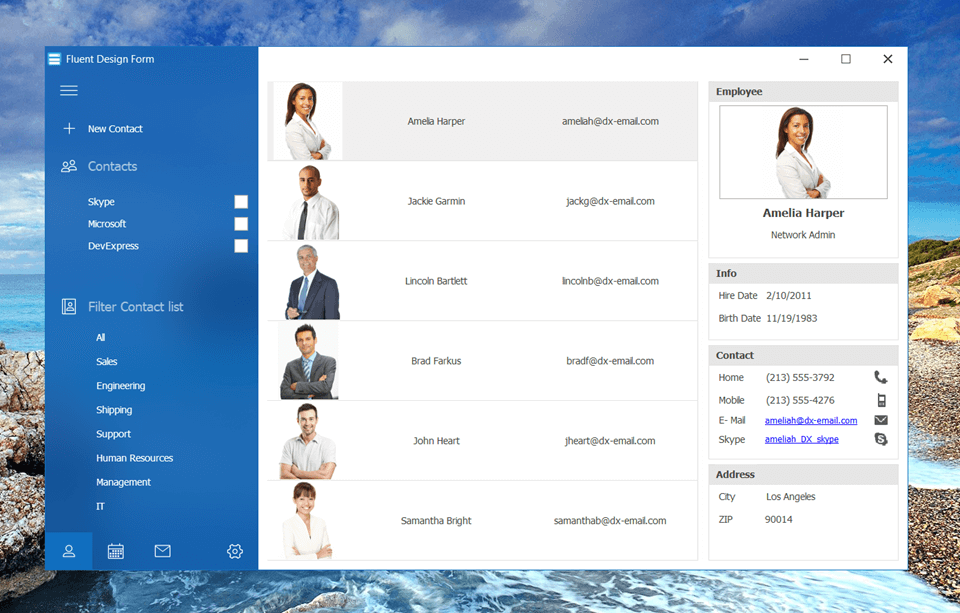
Acrylic Material and Reveal Highlight effects are available on systems with Windows 10 Fall Creators Update (OS Build 17064 or later).
Our Ribbon Form now derives from the Fluent Design Form and inherits its base features. We also added IDE templates to make it easy to create Fluent Design style applications and forms from scratch.
Expression-Based Filters
The VCL Grid, TreeList, and Vertical Grid controls now allow users to calculate filter operands using formulas written as string expressions.
As with the calculated fields introduced in v19.2, you and your users can utilize our Expression Editor (with auto-complete support) to customize formulas.
The new feature is available within all grid Views, except for Chart Views, Server Mode Views, and the EMF Table View.
Find Panel Enhancements
Compact Layout
Our VCL Grid, TreeList, and Vertical Grid controls now offer a new layout option for their Find Panel. In this layout, the panel shrinks its elements and arranges control buttons inside the Find box.
Group By Box Integration
In addition, the Grid control allows you to integrate the Find Panel with the Group By box.
Find Box Enhancements
- We added an option to display the Clear button in Search mode.
- An empty MRU list automatically hides its button.
Grid Control
Modal Edit Forms
Any built-in Edit Form can now be displayed as a modal window. You and your users can customize its layout as needed.
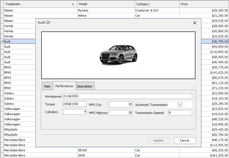
ORM-Based Table View
The Table View was first introduced in December 2019 as a beta. This update marks its official release.
Our ExpressEntityMapping Framework (ORM) now ships with six new attributes for your entity models. These attributes help you define display and edit properties for View columns or dataset fields that are mapped to an entity.
Performance Enhancements
Our optimized text measurement mechanism for single-line cells in Table and Banded Table Views makes the UI more responsive and accelerates Best Fit calculations – they are up to four times faster than in previous versions.
Skins Library
New Office 2019 Skins
This release introduces three new Office 2019 vector skins - White, Dark Gray, and Black.
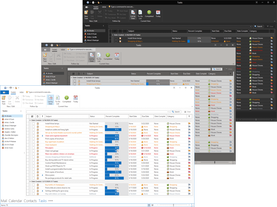
New Basic Skin
v20.1 includes the Basic skin first introduced in our WinForms product line. This skin ships with six color palettes.
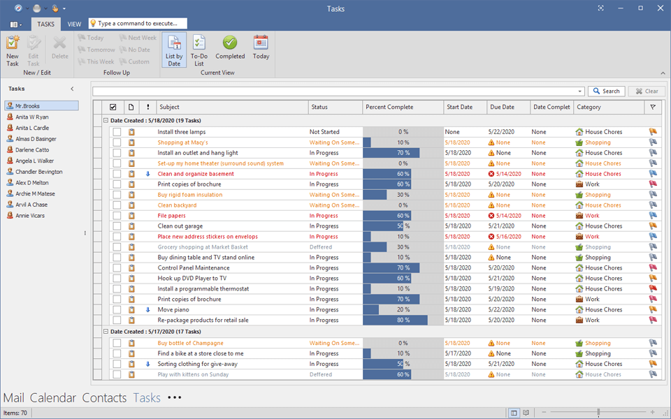
Spreadsheet
This release adds the following enhancements:
- Ability to replace all built-in dialogs with custom equivalents.
- The following new events allow you to customize built-in popup menus or replace them with custom menus: OnPageControlContextPopup and OnTableViewContextPopup.
- You can handle the following new events to respond to drag-and-drop operations with worksheet tabs: OnPageControlTabStartDrag, OnPageControlTabDragAndDrop, and OnPageControlTabEndDrag.
- Our Formula Bar component's Name box now allows users to rename containers and navigate between them.
- Users can press Ctrl+Arrow key to navigate between data blocks. The Ctrl+Shift+Arrow key combination selects their cells.
- The "Insert Function" dialog includes a search box that allows users to filter out functions and display only those whose name or description contains a given search string.
Pivot Grid
Our Pivot Grid ships with the following enhancements:
- End-users can select a summary function from a data field header's context menu.
- New CountDistinct summary function.
- New group intervals for date-time fields, including: "Half Year, Year", "Quarter, Year", and "Month, Year".
- New repository allows you to store custom group intervals.
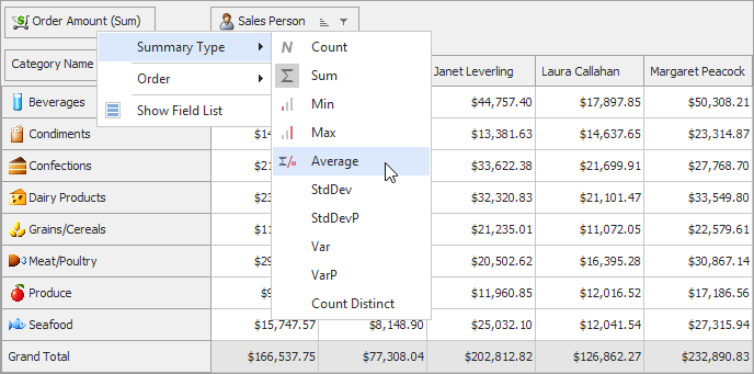
PDF Viewer
Performance Enhancements
- Page content is rendered up to three times faster due to optimized clip operations.
- Images are rendered faster by one-third, while consuming half the memory.
Miscellaneous Enhancements
- We enhanced the render quality of zoomed text.
- New options allow you to restrict user interaction with text, images, and/or markup annotations.
- A new Single Page Continuous layout mode arranges pages in a column.
Layout Control
- A layout group can now display a check box next to its caption. The check box toggles the enabled state of child elements in the group. You can handle a new event to override the default behavior.
- Layout item captions can include text formatted via the BBCode-inspired markup tags introduced in v19.2.
PDF Export Enhancements
Digital Signature Support
With this release, you and your users can digitally sign exported PDF documents. The "PDF Export Options" dialog now allows end-users to select an X.509 certificate and specify signature information.
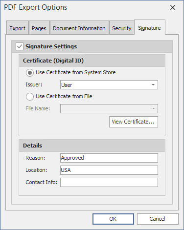
This digital signature support comes with a new API to allow you to obtain certificates from files or system stores, and to view certificate details.
Miscellaneous
- You can sort TdxMemData records by multiple fields.
- Editor controls configured for password input can now display a "password reveal" button. The editor control displays the entered password while a user presses and holds the button.
Charts
New Range Bar
v20.1 ships with a new RangeBar chart type. Range bars can help visualize the difference between minimum and maximum values at each corresponding point.
Documentation
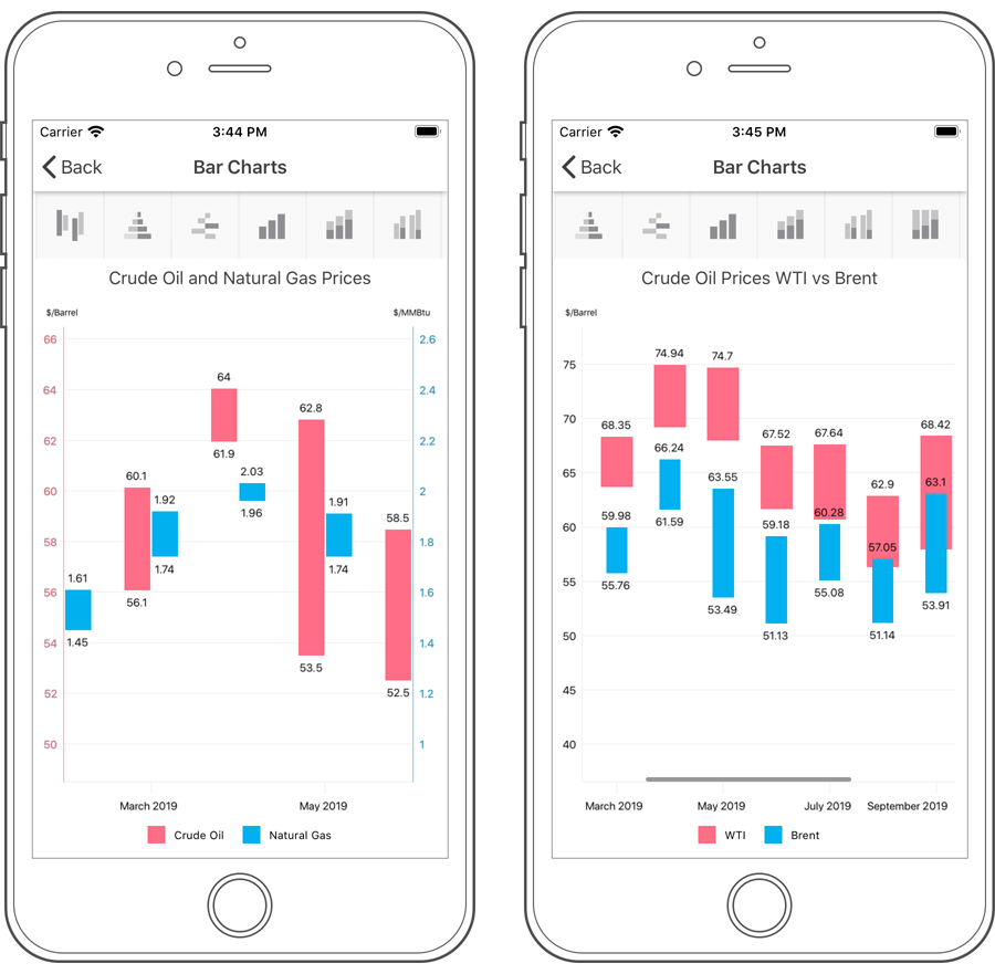
New Range Area
Our new Xamarin Range Area Series chart type displays series as filled areas on a diagram, with two data points that define minimum and maximum limits. This chart view can help illustrate the difference between start and end values.
Documentation
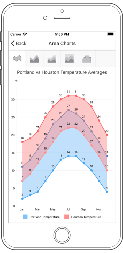
Anchor an Axis
You can anchor an axis to a specific point within the chart diagram or to a specific value on the perpendicular axis.
Documentation
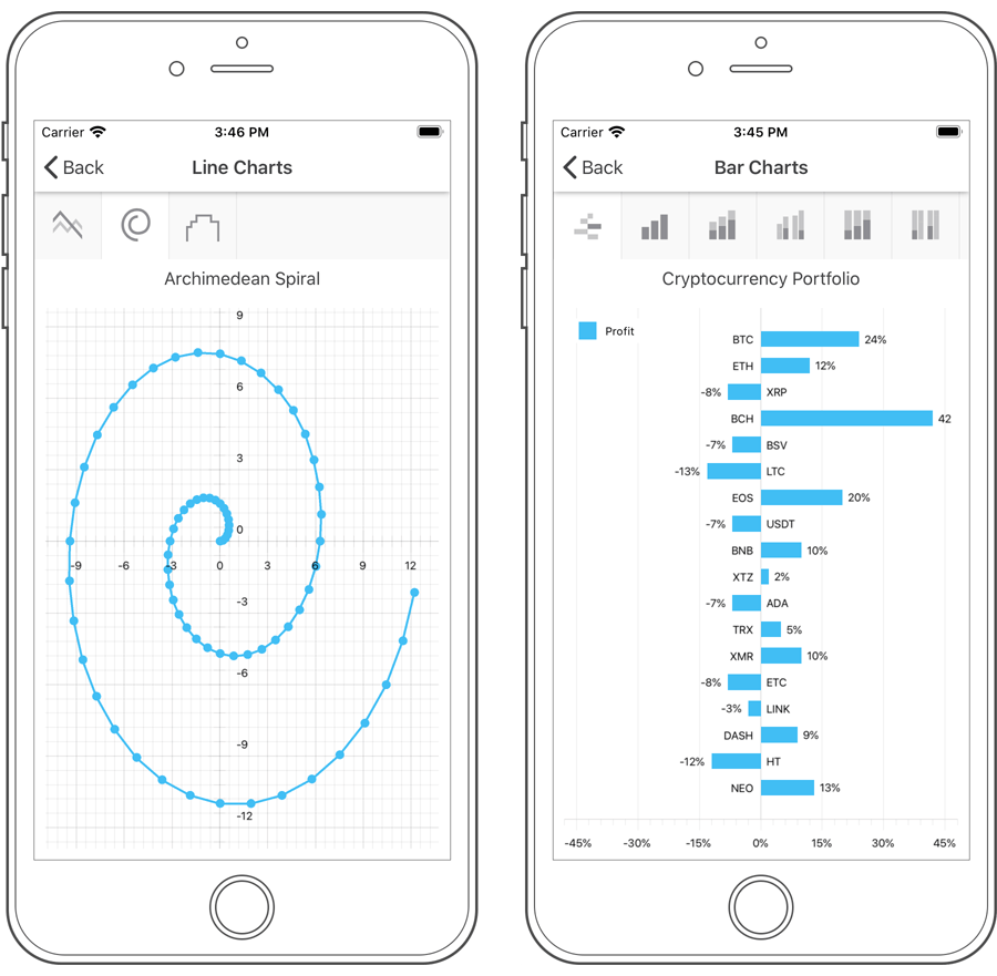
Logarithmic Scale
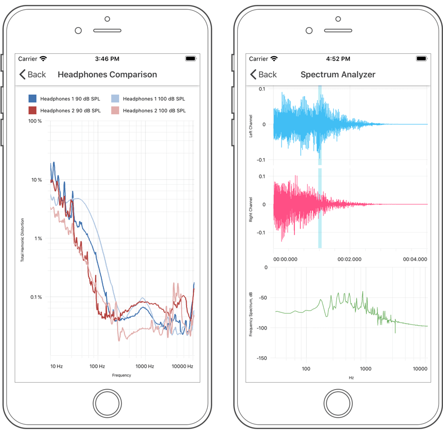
Documentation
Data Grid
Row Drag and Drop
End-users can now drag and drop data rows. New properties and events allow you to enable and control drag-and-drop operations as needed.
Documentation
Multi-Row Cell Layout
Our Xamarin Data Grid View ships with new cell layout options. You can now arrange column headers and corresponding data cells across multiple rows.
Documentation
Cell Appearance Customization
A new CustomCellStyle event allows you to customize the appearance of individual data cells.
New Data Form
Our new Xamarin Data Form control allows you to quickly generate edit forms for any data object. Features include:
- Built-in custom editors
- Commit modes
- Validation
- Grouping
- Layout customization
Documentation
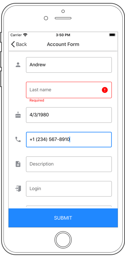
New Text Editor
Our new Xamarin Text Editor ships with the following features:
- Masked Input
- Prefix and Suffix
- Animated Label
- Placeholder
- Help text at the bottom of the editor
- Input Error Indication
- Leading and Trailing Icons
- Clear and Error Icons
- Character Counter
- Filled and Outlined Editor Box Types
- Appearance Options (color, font, border thickness and corners)
Documentation
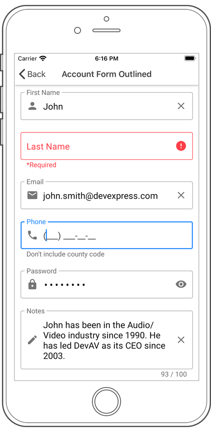
New Password Editor
The DevExpress Xamarin Password Editor allows a user to securely enter a password. It is based on our TextEdit and inherits its base features.
Documentation
New Multi-Line Editor
The DevExpress Xamarin MultiLine Edit component allows a user to enter large chunks of text within it. When the cursor reaches the right edge of the editor, the editor's height increases and text wraps onto a new line. Use the MinLineCount and MaxLineCount properties to specify the minimum and maximum number of text lines used.
Documentation
New ComboBox
Our new Xamarin ComboBox control ships with the following features:
- Custom drop-down and drop-up icons.
- Drop-down list item filtering.
- Configurable box border color, thickness and corner radius.
- Help text and error message at the bottom of the editor box.
- Configurable font family, size and style.
Documentation
New Button Control
Our new Xamarin Button control ships with the following features:
- Ability to display a custom icon, specify icon alignment and indent.
- Custom font family for button text.
- Modify the appearance of button border, text, icon and background used for different button states.
- Custom appearance.
Documentation

New Range Area
Our new Range Area Series chart type displays series as filled areas on a diagram, with two data points that define minimum and maximum limits. This chart view can help illustrate the difference between start and end values.
New Range Bar
v20.1 ships with a new RangeBar chart type. Range bars can help visualize the difference between minimum and maximum values at each corresponding point.
Anchor an Axis
You can anchor an axis to a specific point within the chart diagram or to a specific value on the perpendicular axis.
Logarithmic Scale