Chart Control
Custom Units of Measurement. Custom Aggregate Functions
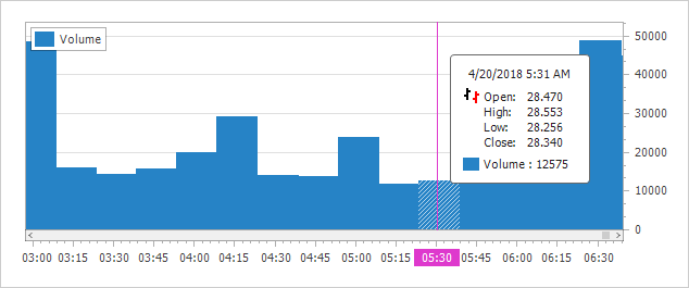
You can now aggregate data by a custom unit of measurement (e.g. 15 minutes, 4 hours, etc.) You can also define a custom function that aggregates values using custom rules without modifying the source collection.
Blog Post Demo Documentation
Custom Colors for Automatically Generated Series
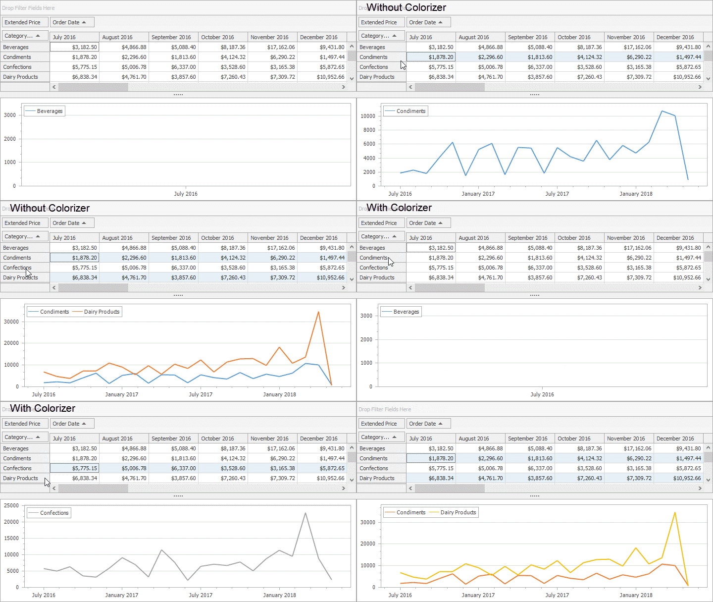
Our Chart Control can now provide custom colors to auto-generated series using one of the following colorizers:
- Key-Color Colorizer assigns colors from a palette to series by series data member values.
- Data Source Colorizer binds colors that the extra data source stores to a series via series data member values.
Demo Documentation
Crosshair Cursor Enhancements
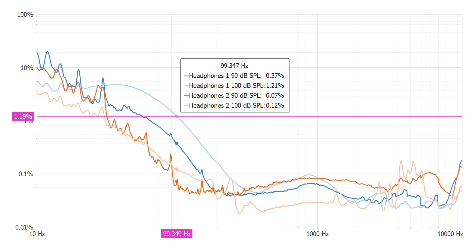
This release extends the capabilities of our Crosshair Cursor. New features include:
- Display values of series points that are selected by the Crosshair Cursor in a legend
- Crosshair Cursor Lines (argument and value) follow the mouse cursor simultaneously
- The ability to display the Crosshair Cursor in the exported/printed chart
- The ability to display any data source field value within the Crosshair Cursor's Label.
Blog Post Demo
DirectX Rendering (2D Charts)
2D WinForms Charts now support DirectX rendering.
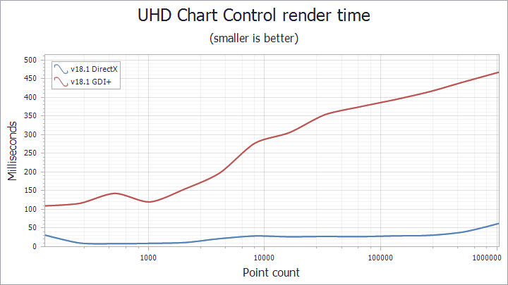
Demo
Multi-Select Enhancements
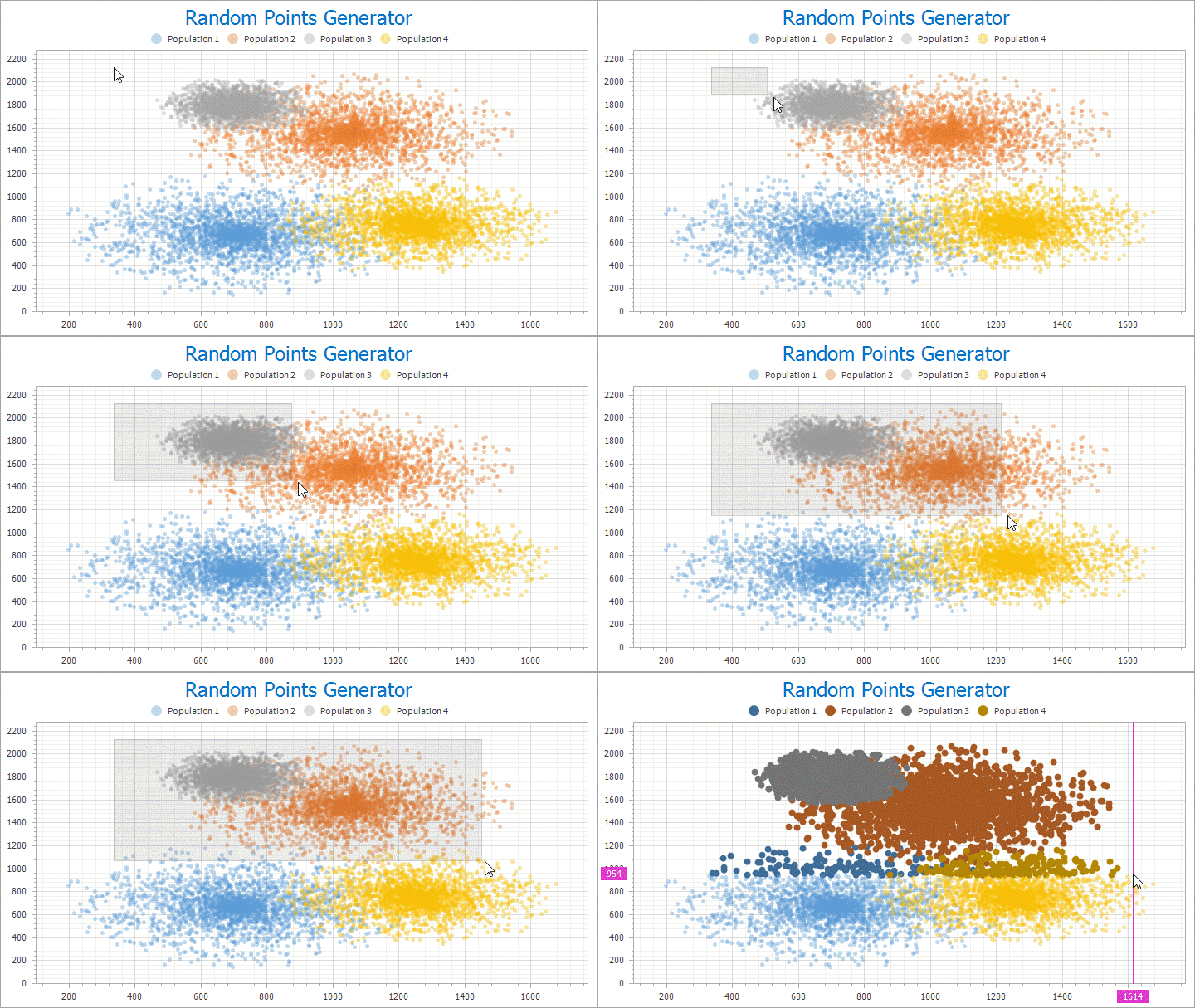
You can select multiple items by drawing a rectangular region with the CTRL key pressed.
You now have the ability to cancel selection in code. To cancel selection, set the Cancel property to 'True' within the SelectionChanging event handler.
Data Grid Control
Infinite Scrolling
Our WinForms Grid ships with an 'Infinite Scrolling' mode – allowing you to more efficiently display data from very large data sources. Once incorporated into your app, you will be able to load (and display) only a small portion of your data source at start up. New records will load and appear on screen as users scroll the Grid vertically. A new data binding mode will help you connect our WinForms Data Grid control to your data source, even when the entire record count is unknown or infinite by nature (like a web service).
Demo Documentation
Binding Selection to Data Source
In multiple row selection mode, you can sync row selected states with a Boolean field in the bound data source. The selection binding mode ensures that row selection persists whenever you filter or group grid data.
Selection binding mode was designed to be used in conjunction with the Web-Style Row Selector (the built-in Selection column). You can, however, use it when the built-in Selection column is hidden.
We've also added support for data filtering against the built-in Selection column via the Auto-Filter row (you can display only selected, deselected or all rows).
Demo Documentation
Data Editors
Calendar - ClassicNew View
The DevExpress WinForms Calendar Control and Date Edit ship with a ClassicNew view (inspired by Outlook 2016).
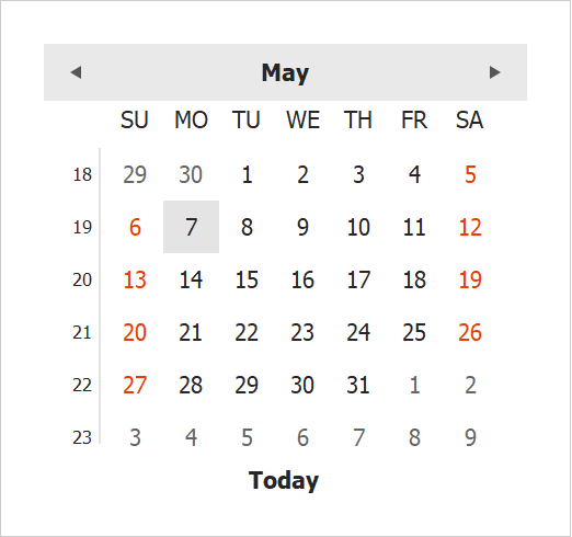
Demo
Open File, Save File and Folder Browser Dialogs
The DevExpress WinForms Open File, Save File and Folder Browser Dialogs were first released as a community technology preview in v17.2. This update marks their official release.
New enhancements include:
- The Folder Browser Dialog includes Compact and Wide display modes.
- Ability to select legacy or skinable dialogs when using the Open File/Folder Behaviors and MVVM services.
Demo Documentation
PictureEdit - DirectX Support
Our WinForms PictureEdit control now supports DirectX rendering.
Documentation
Toast Notification Manager Enhancements
With this release, the DevExpress WinForms ToastNotificationManager gives you the ability to create Windows 10-inspired toast notifications. You can create multiple types of toast notifications by adding the following elements to regular text and image blocks:
- Custom App Logo with optional image cropping
- Hero Image
- Attribution Text
- Custom Timestamp
New event handlers allow you to customize notifications dynamically (e.g., add interactive elements), and handle toast notifications that failed to show.
To test your WinForms apps on a developer machine, use a new smart tag action that creates the application shortcut in the Windows Start Menu at design time.

Demo Documentation
Splash Screens - Overlay Wait Form
v18.1 introduces an Overlay Wait form. The Overlay Form is a semi-transparent splash screen that runs in a background thread and prevents access to a control or form by displaying an overlay.
- The Overlay wait form never locks up the main and operation threads when functioning in a separate thread.
- You can bind the Overlay form to any control, not just the main UI form.
- The transparent Overlay wait form overlaps the owner control in its entirety, and prevents an end-user from interacting with the underlying control.
- You can resize and move the main form while the Overlay form is visible (if you bind the Overlay wait form to a control and perform a lengthy operation asynchronously).
- Multiple animation options.
- Its custom painting mechanism allows you to draw the Overlay wait form manually.
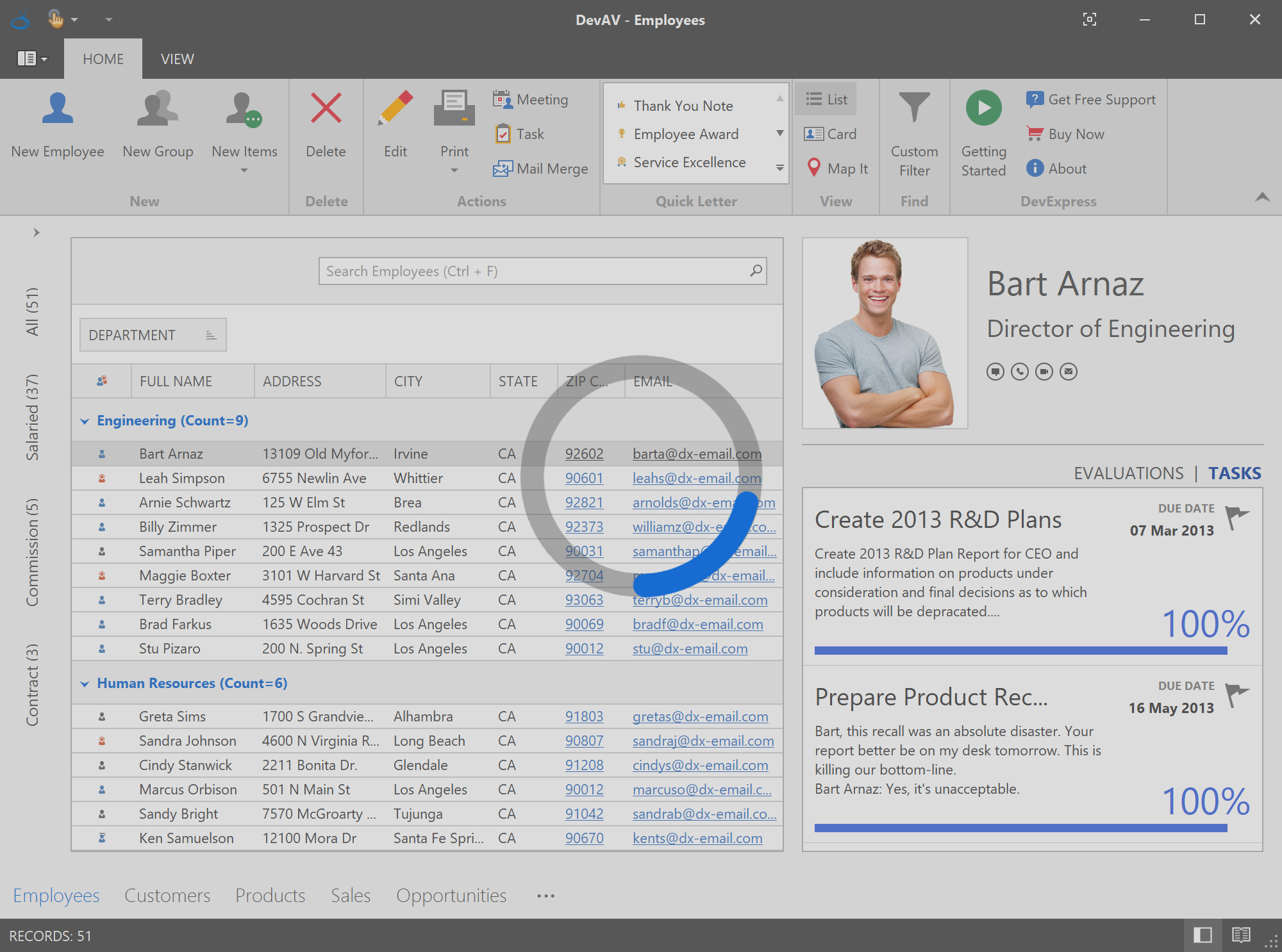
Demo Blog Post Documentation
Group Control - New Group Styles
We've enhanced our WinForms Group Control with new rendering styles:
These group styles are also available for groups embedded in our WinForms Layout Control.
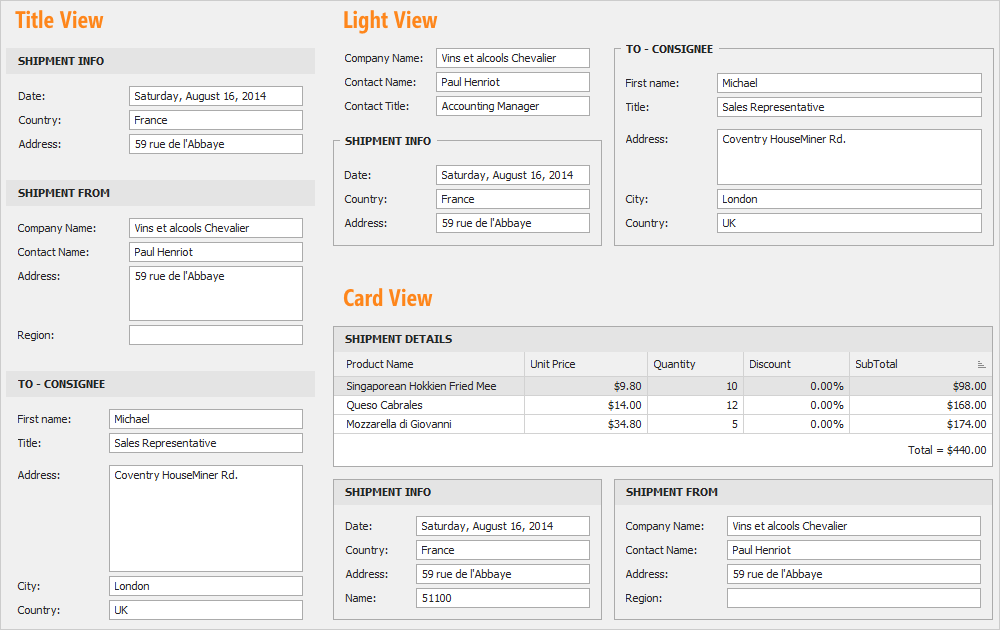
Demo Documentation
Color Pick Editors - Magnifier Dialog enhancements
Our Magnifier Dialogs have been updated with the following enhancements:
- When zooming, the Magnifier Dialog displays a pixel grid allowing you to distinguish individual pixels easily;
- Avoid pixel hunting by switching to precise cursor positioning (press CTRL).
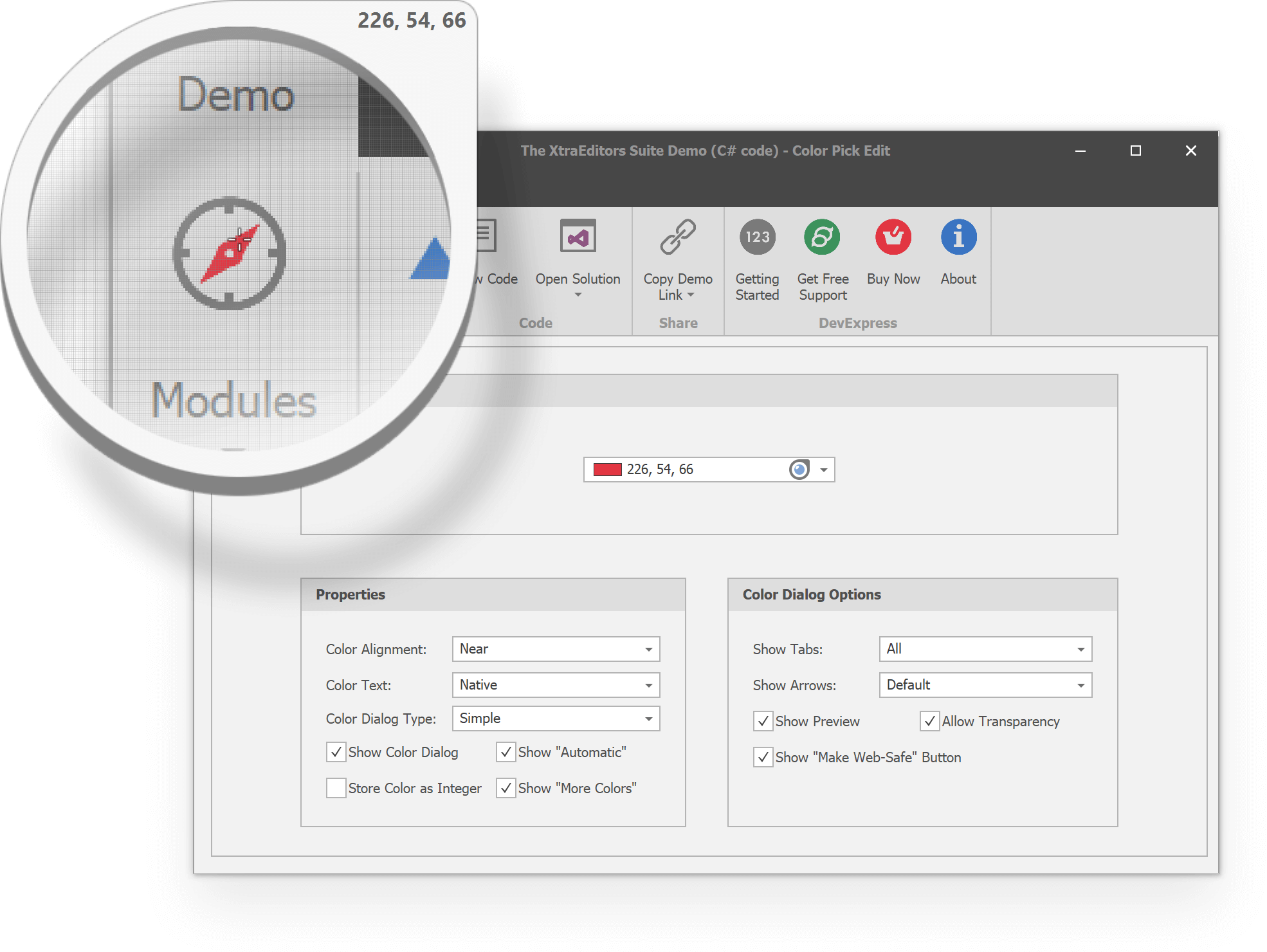
Demo Documentation
ListBox - Highlight Search Results
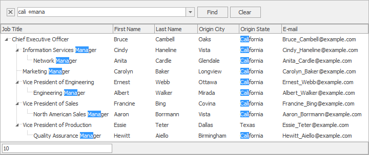
Our WinForms ListBox control now highlights strings that match the search text.
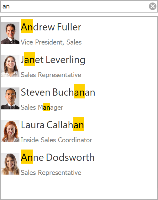
Demo Documentation
High DPI Support
Enhanced High DPI Drawing for all Windows Forms Controls
With this release, we've enhanced DirectX rendering support, and improved the scaling of control elements, borders, indents and images across our WinForms product line.
Documentation
Image to DPIAware Image Conversion
We've added a new action to the ImageCollection's smart tag, which converts the ImageCollection to DPIAwareImageCollection.
Documentation
SVG Icons in New Controls
We now use SVG icons by default in the following controls:
- Scheduler
- Filter Editor
- LayoutView
- PDF Viewer
To revert to previous behavior and use raster graphics instead, disable the 'WindowsFormsSettings.AllowDefaultSvgImages' option.
Map Control
Circular Scrolling
The DevExpress WinForms Map Control allows you to scroll image and vector maps "circularly."
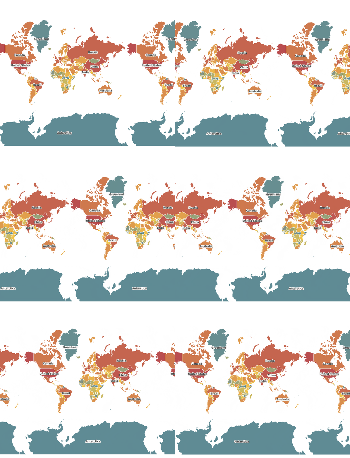
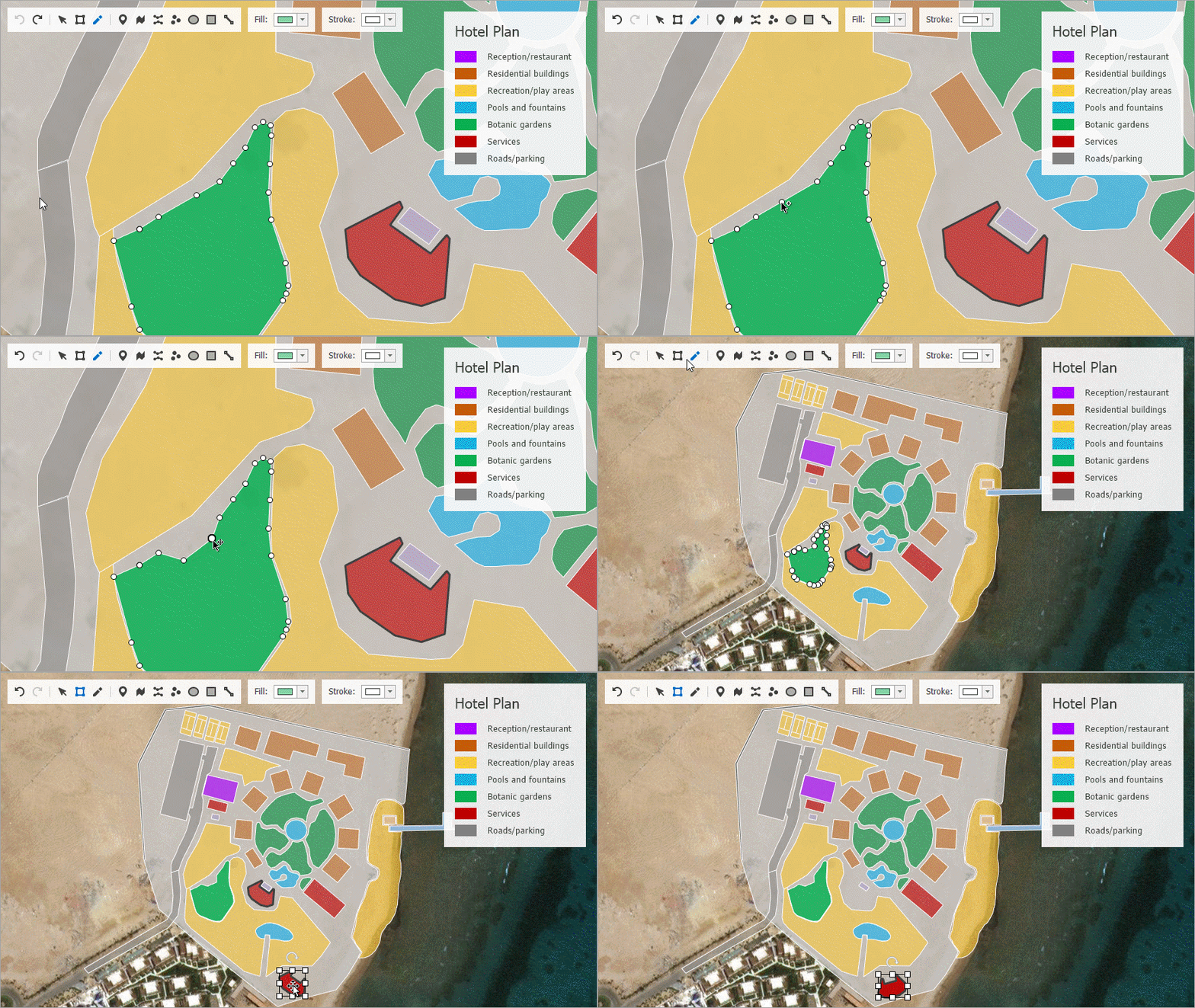
Runtime Vector Item Editor
With this release, you can edit vector items at runtime. We've developed a special toolbar panel to provide quick access to the most common editor functions.
- Add new vector elements (Pushpin, Path, Polyline, Dot, Ellipse, Rectangle, Line)
- Select/Edit/Transform (add, remove and move points)
- Undo/Redo
An end user can switch to Edit mode, draw new elements and edit or delete vertices. Modified vector layer data can be persisted to a file using a supported format (Shapefile, SVG and KML).
This feature is compatible with both Geographical and Cartesian coordinate systems, as well as our newly introduced Circular Scrolling functionality.
Blog Post
Navigation UI
Pager Navigation
The Radio Group and Windows UI Button Panel can be used as a pager for the following: Tile Control, Tile Bar, Navigation Frame and Image Slider.
The pager automatically splits the target control's contents into individual pages.
Demo
Tile Control - DirectX Hardware Acceleration
The DevExpress WinForms Tile Control now supports DirectX rendering so you can create high performance solutions for use on High DPI devices.
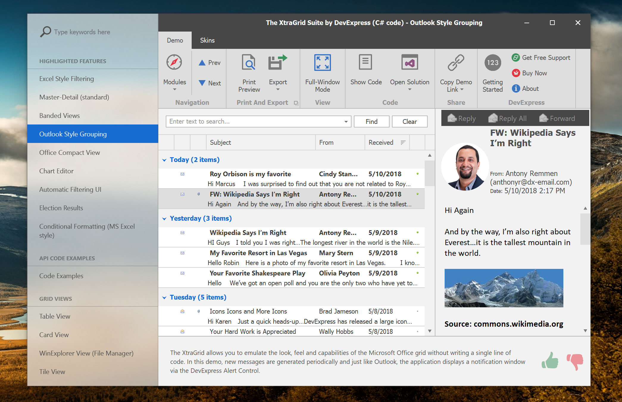
Fluent Design Form
This release includes our new Fluent Design Form. Inspired by the brand new Microsoft Fluent Design System, its features include:
- Integrated Hamburger Menu
- Adaptive Layout
- Acrylic Material (a partially transparent texture)
- Reveal Highlight
Acrylic Material and Reveal Highlight effects are available on systems with Windows 10 Spring Creators Update.
Demo Documentation Blog Post
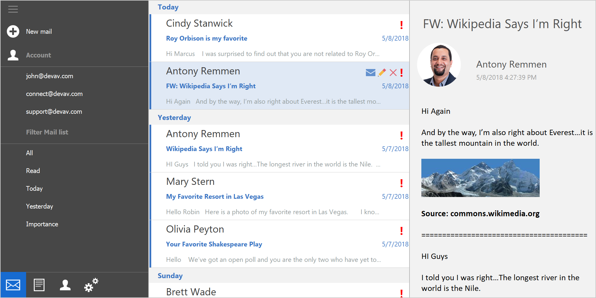
Hamburger Menu
We've integrated the Hamburger Menu with our Accordion Control: Set the ViewType property to HamburgerMenu and the Accordion Control will support a collapsed state designed to mimic the behavior of Windows 10 apps (displays a narrow strip of icons when collapsed).
Used together with our new Fluent Design Form, the Hamburger Menu automatically adapts its state when you resize the form. It also supports Acrylic Material and Reveal Highlight effects (available on systems with Windows 10 Spring Creators Update).
Blog Post Documentation
Accordion Control – Navigation Pane layout
Our WinForms Accordion Control supports a new Navigation Pane option - one that mimics the latest styles used by Microsoft UWP applications. To enable it, set the EnablePaneFooter property to true.
The control also supports DirectX Hardware acceleration - an option designed to improve rendering performance on High DPI screens.
Blog Post Demo
PDF Viewer
DirectX Rendering (Beta)
With this release, both our PDF Viewer for WinForms and PDF Document API support DirectX rendering:
To use DirectX rendering, activate one of the following options:
- PDF Document API: enable the 'PdfDocumentProcessor.RenderPageContentWithDirectX' option.
- WinForms PDF Viewer: enable the 'PdfViewer.RenderPageContentWithDirectX' option.
Blog Post Documentation
Pivot Grid Control
Performance Enhancements
We continue to improve the Pivot Grid's in-memory data processing. The following features are now processed by the pivot grid in Optimized Mode:
- Drill-Down
- Unbound Expressions
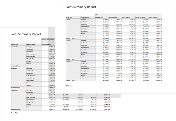
Print Row Headings on Every Page
You can now set a new option and print row headings on every page.
Documentation
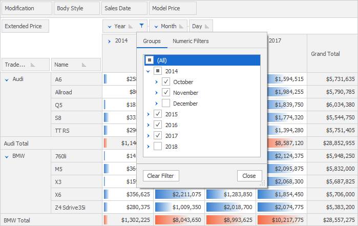
Excel Inspired Filter
We've improved the Pivot Grid's Filter Popup. End-users can now filter grouped data using Excel inspired filter.
Documentation
Ribbon, Bars and Dock UI
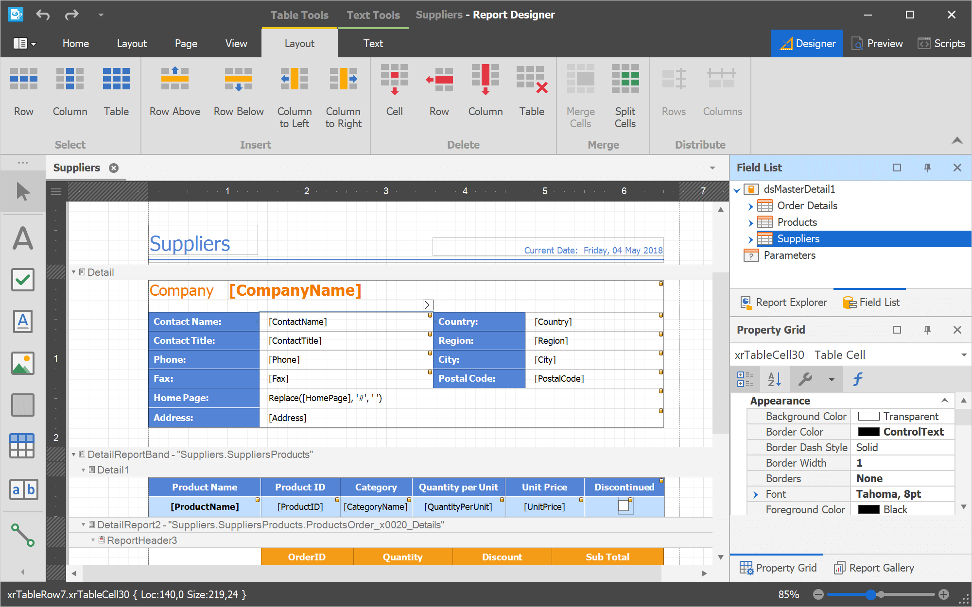
Dock Windows - Light View
This release includes a new "Light" mode. When used, all Dock Windows are drawn using 1-pixel borders.
Demo Documentation
Design-Time Enhancements
WinForms Bar Manager
The designer's 'Toolbars' page allows you to manage toolbars, create different bar item types, add bar items to toolbars and populate hierarchical sub-menus. The Customization Form is now resizable, and provides on-form actions to manipulate bar items and categories.
WinForms Ribbon
The designer's 'Ribbon Items' page allows you to customize ribbon item hierarchy (categories, pages, page groups, buttons and sub-menus).
WinForms Popup Menus
A new editor integrated into the Bar Manager/Ribbon Designer allows you to customize popup menus. The menu editor allows you to create a popup menu, populate the menu with items, and modify menu/item settings.
Ribbon Memory Usage and Performance Enhancements
We have optimized our WinForms Ribbon Control. Depending upon your usage scenario, the Ribbon's startup time is up to 10% faster than previous versions. As you might expect, memory consumption has also been reduced.
Rich Text Editor
Microsoft Word Inspired Formatting and Layout
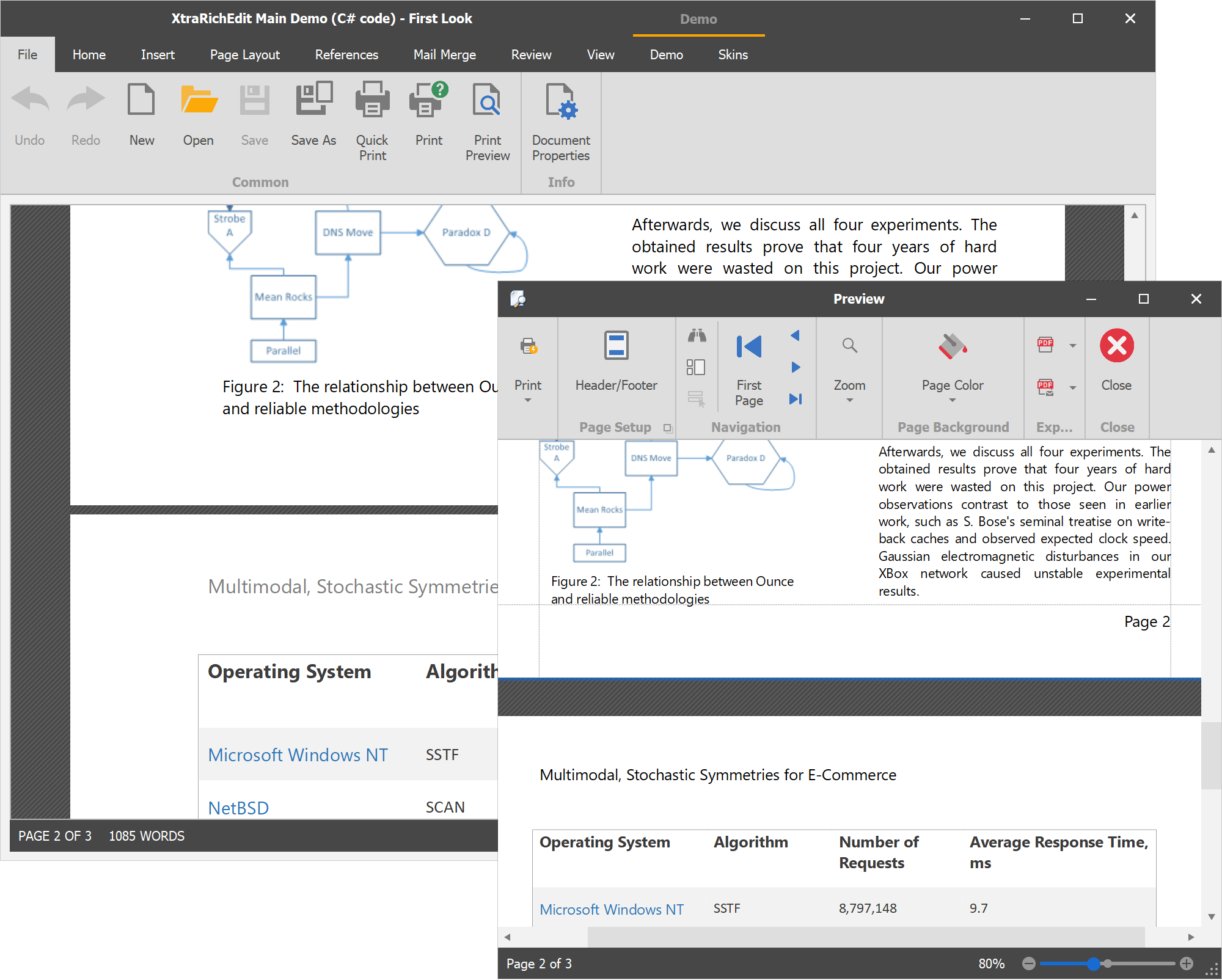
We've invested significant resources to improve the manner in which our DevExpress Rich Edit control for WinForms, WPF, and our Word Processing File API renders documents. We've enhanced layout and formatting accuracy when displaying, printing and exporting documents. DPI settings are also no longer an issue.
Blog Post Documentation
Checkbox Form Fields
With this release, our WinForms and WPF Rich Text Editors can load documents with checkboxes. End-users can toggle checkbox state, save, print or export the result.
Documentation Blog Post
Miscellaneous Enhancements
Automatic Document Format Identification
With this release, if a document is loaded from a file or stream programmatically, the DevExpress RichEditControl automatically identifies the document's format based on its content. Documentation
Print API
Our WinForms RichEditControl now includes the 'Print' method that allows you to print documents using default or custom printer settings. Documentation
Scheduler Control
New Storage Mechanism
We've replaced our existing SchedulerStorage with SchedulerDataStorage. Its features include:
- Labels and statuses can have their own data sources out-of-the-box.
- Storage data isn't reloaded after each change in the underlying data source.
- Previously, any data change fired the same 'CollectionLoaded' event, and it was impossible to identify what kind of operation was performed. The new storage provides various events for different action types.
- Enclosing data operations with the BeginUpdate\EndUpdate methods is no longer required.
- The new storage correctly recognizes any data modifications performed at the data source level.
SchedulerStorage will continue to be supported (for backward compatibility purposes).
Documentation
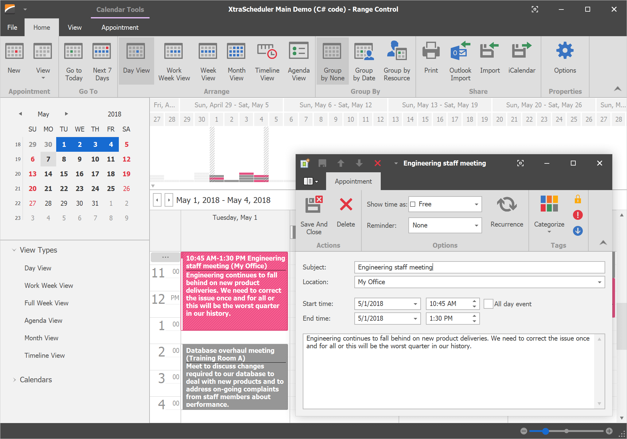
SVG Icons
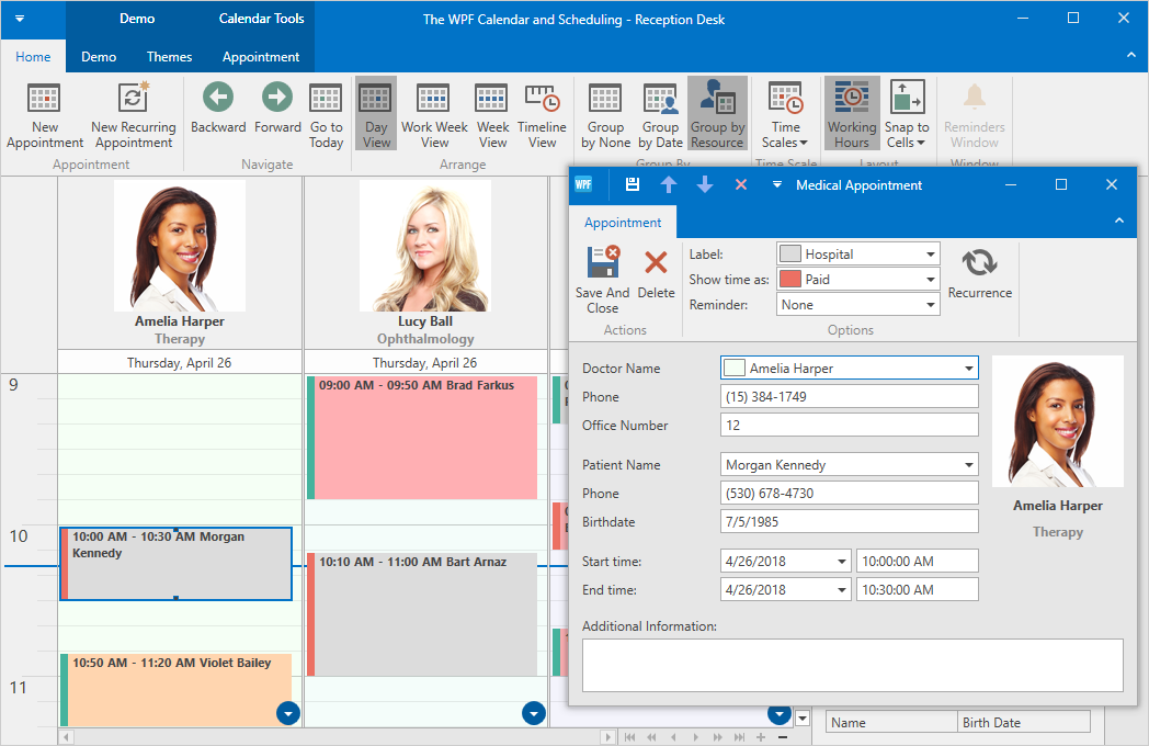
With this release, the DevExpress WinForms Scheduler uses SVG icons by default. To revert to previous behavior and use raster graphics instead, disable the 'WindowsFormsSettings.AllowDefaultSvgImages' option.
Demo
DirectX Rendering
The DevExpress WinForms Scheduler Control now supports DirectX rendering so you can create high performance solutions for use on High DPI devices.
Demo
Skins and Vector Icons
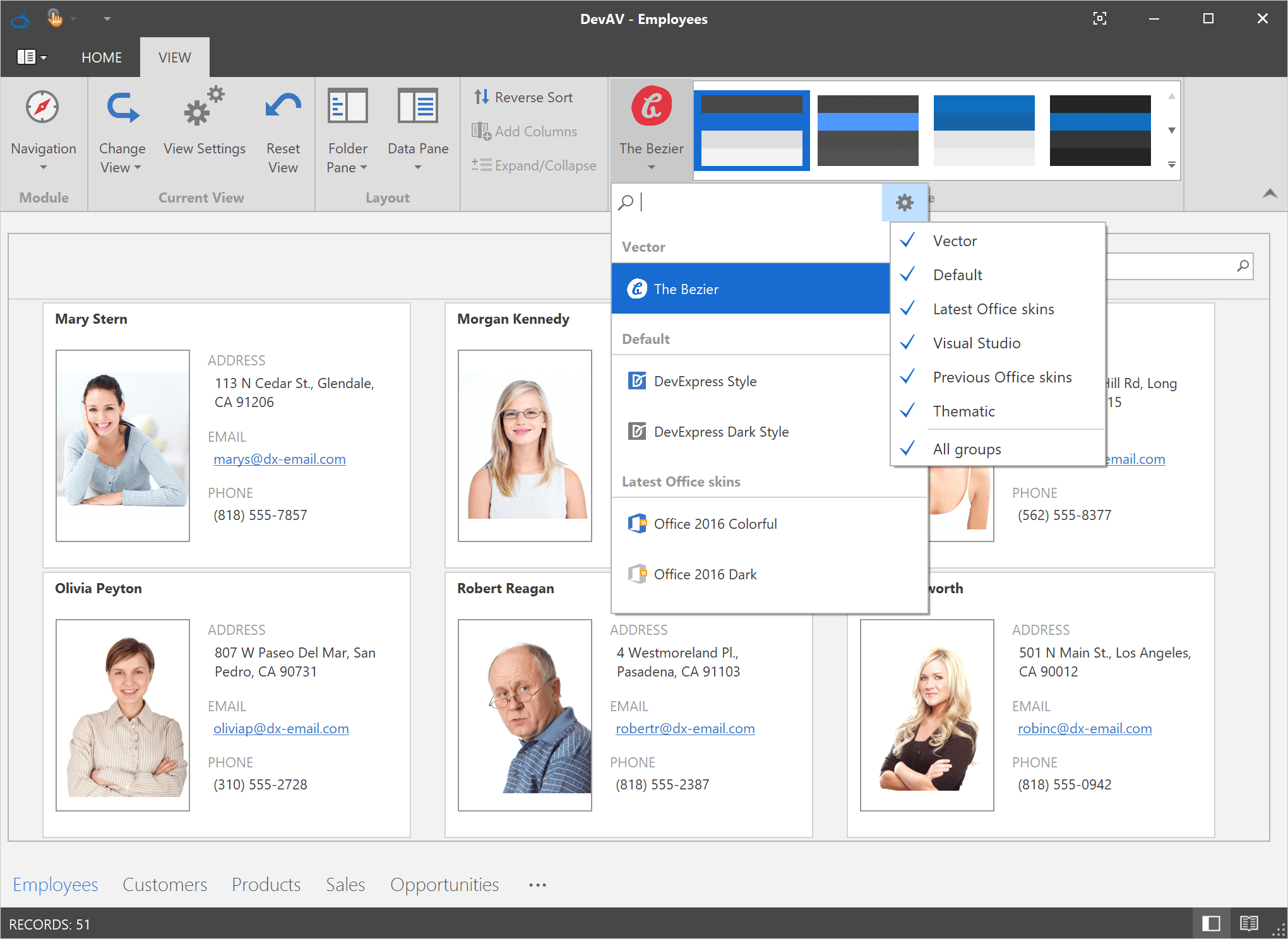
New Skin Selector
With the release of our Bezier vector-based skin (which provides dozens of unique skin presets or swatches), a traditional skin gallery may “feel” overcrowded. Our new skin/swatch selector is designed to address this issue and provide users a more intuitive way to apply the desired appearance to their application.
Documentation
Office Palettes for Vector Skins
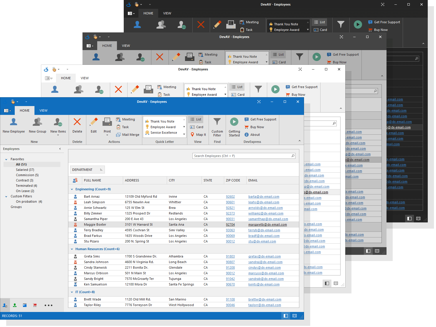
In v18.1, we've added four vector skin palettes inspired by MS Office.
SVG Icon Builder in MS Windows Store
The DevExpress SVG Icon Builder is a productivity tool designed to simplify the creation of custom SVG icons by combining existing graphical elements. You can install it directly from the Microsoft Windows Store.
Download from MS Windows Store Blog Post Documentation
Spreadsheet Control
Spreadsheet Shapes
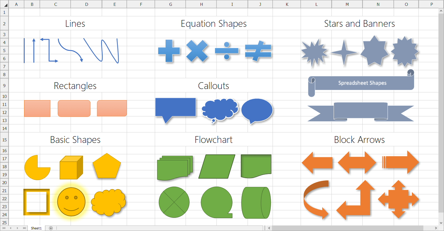
From simple lines and rectangles, to banners and callouts, our WinForms and WPF Spreadsheet controls now support all shape types. You can move, resize and remove shapes. Worksheets with shapes can also be printed and exported to PDF. Refer to the following blog post for more information and limitations associated with this specific feature.
Blog Post Documentation
Custom Colors for Individual Chart Series Points
With this release, our WinForms and WPF Spreadsheet controls can display, print and export worksheets with charts that contain series points with custom colors.
Blog Post
Formula AutoComplete
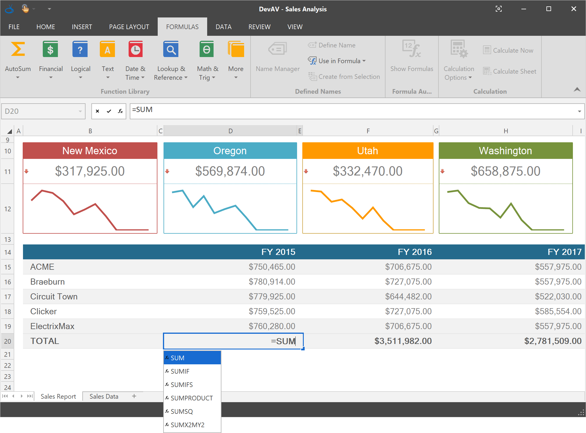
With this release, we've simplified formula construction. Our WinForms and WPF Spreadsheet controls now support Formula AutoComplete. This feature can help prevent spelling or syntax errors by providing a list of function names, defined names and table names that match the characters you enter into a formula.
Blog Post Documentation
Miscellaneous Enhancements
Automatic Document Format Identification: With this release, if a document is loaded from a file without specifying its format, the Spreadsheet control automatically identifies the document's format based on its content (regardless of filename extension).
A new 'Print' method allows you to print an entire document or an individual sheet using default or custom printer settings.
Blog Post Documentation
TreeList Control
Excel-Inspired Group Filter
Excel-inspired filter dropdowns can now group filter items from two or more columns, and present the result as a hierarchical checked list. For instance, instead of a linear task list, you can show tasks grouped by employees:
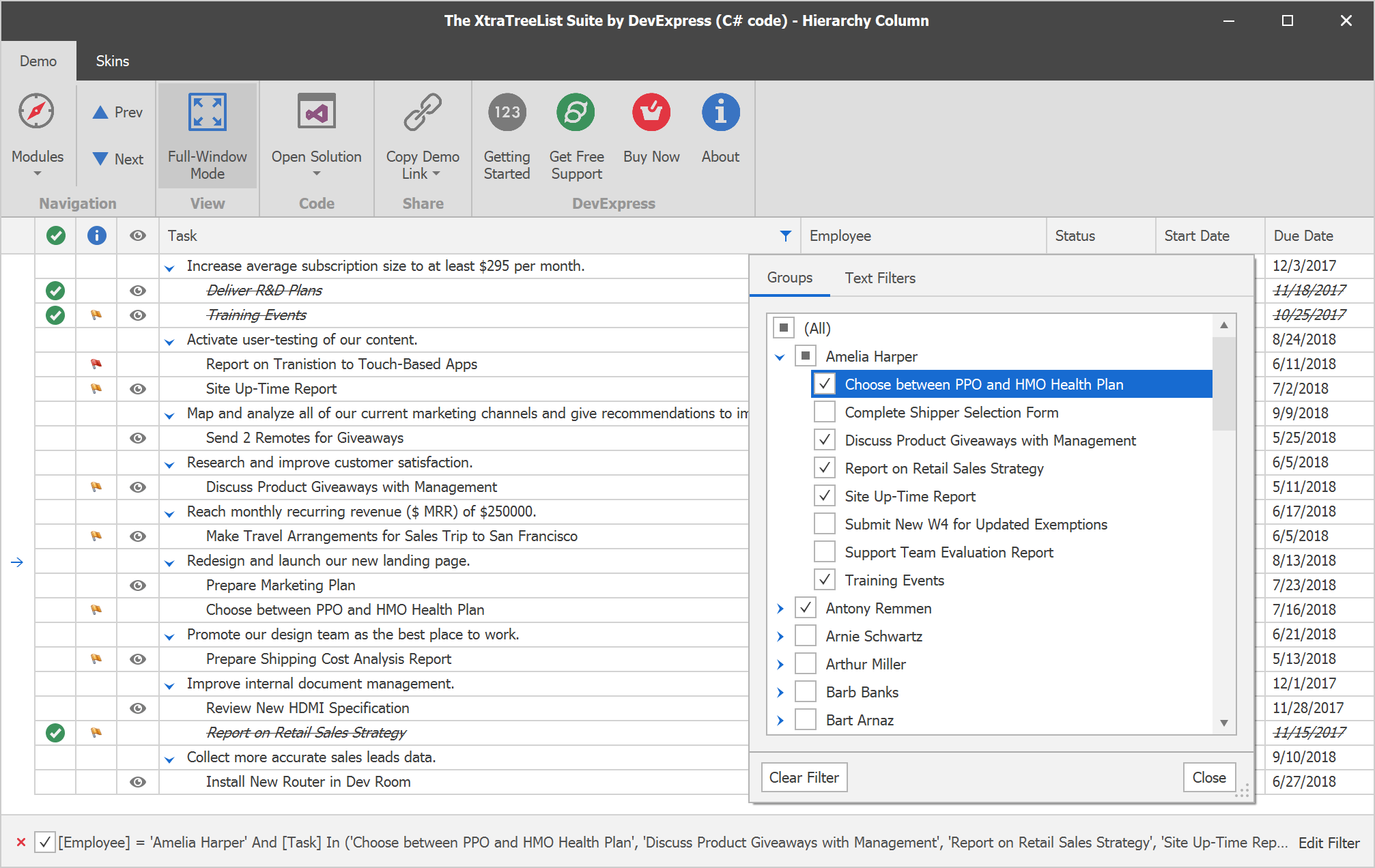
Demo Documentation
DirectX Hardware Acceleration
Enable the 'WindowsFormsSettings.ForceDirectXPaint' option and leverage the power of DirectX hardware acceleration to boost TreeList rendering on High DPI devices.
Demo
Display Node Images within Data Cells
By default, our WinForms TreeList control reserves space for both Select and State images if either are displayed within a node. With this new option, you can save space by moving Select/State images from the indent region to node cells.
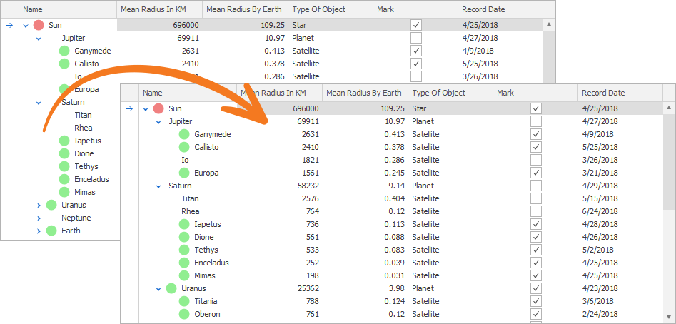
Demo Documentation
Band and Column Separators
You can now highlight individual columns and bands by changing the width and appearance settings of their separators.
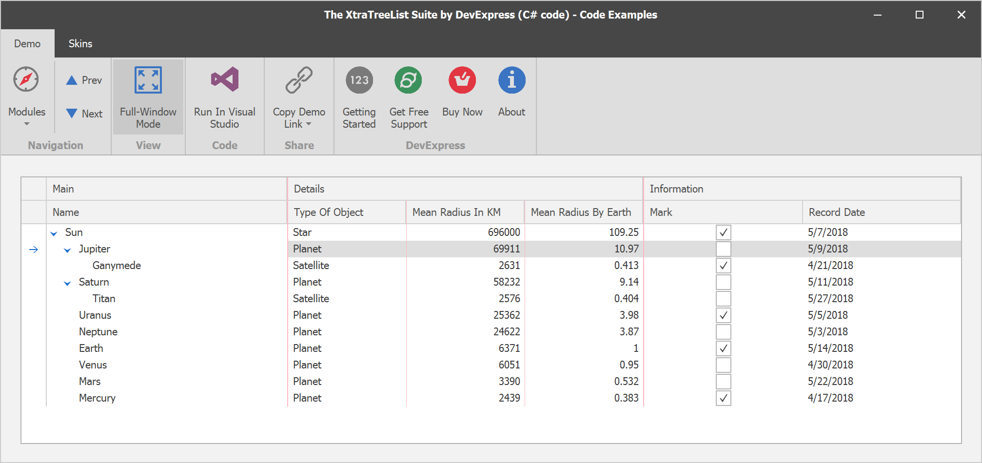
Demo Documentation
Tree Line Visibility
By default, tree lines are displayed or hidden based upon the currently applied skin. v18.1 introduces the new 'ShowTreeLines' option allowing you to explicitly specify whether to display tree lines. If this option is enabled, you can specify node hierarchy line styles using the TreeLineStyle property.
Demo Documentation
Miscellaneous Enhancements
We've added a few popular Data Grid API members (RowClick, RowCellClick, MakeColumnVisible, etc.) to the TreeList control and added expand/collapse node animation effects.
Vertical Grid Control
Office 2016 Inspired View
Our WinForms Property Grid ships with a new "flat" view inspired by Office 2016. Its features include:
- Ability to organize categories into separate groups
- Advanced value editing for numeric properties
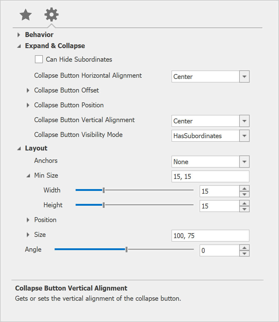
Demo Blog Post Documentation
Miscellaneous Enhancements
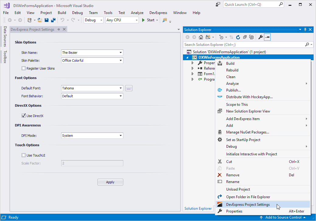
Design-Time Access to all DevExpress Project Settings
When you start a new project, you can right-click the Visual Studio Solution Explorer and select DevExpress Project Settings to activate a page that exposes major DevExpress project settings.
Blog Post Documentation
Filter Editor Enhancements
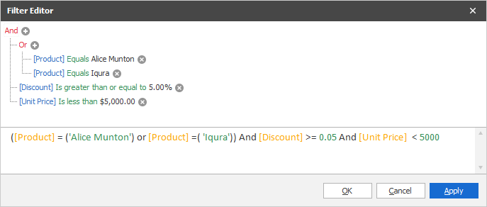
With this release, we've improved our WinForms Filter Editor. New enhancements include:
- Tabbed UI
- Syntax Highlighting
- Auto-Complete
- Expression Validation and Error Indication
The Filter Editor now uses SVG icons by default. To revert to previous behavior and use raster graphics instead, disable the 'WindowsFormsSettings.AllowDefaultSvgImages' option.
Demo Documentation
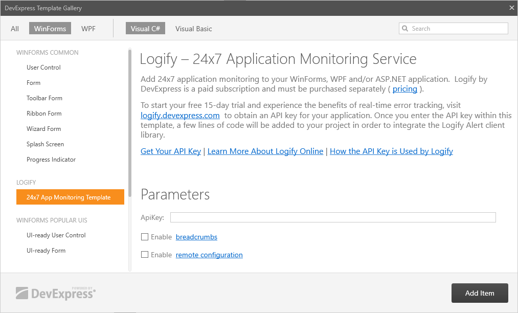
Template Gallery - Logify Client Template (Windows Forms, WPF and ASP.NET)
Logify is a 24/7 application monitoring tool (helps you track errors and log app crash events). The DevExpress WinForms Team has extended our Template Gallery with a new template designed to add a Logify client to your project with one click.
Adorner UI Manager - Tab Badges
The DevExpress WinForms Adorner UI Manager can now display tab badges.
Demo
MVVM: DialogService UICommands
The DevExpress MVVM DialogService can now display dialog windows with custom buttons.
Documentation
Accordion Control
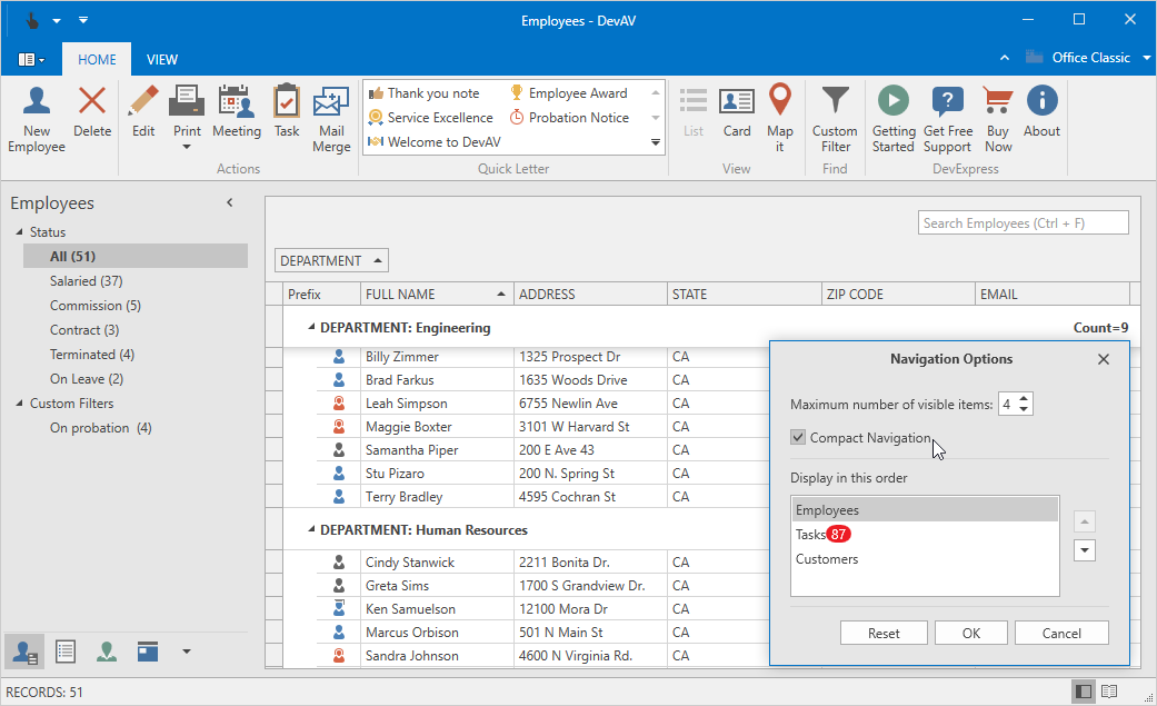
Navigation Pane Mode
A new Navigation Pane mode allows you to create an Outlook-inspired side bar panel and integrate it with our WPF Office Navigation Bar control. In this mode, the Accordion control only displays selected group content and shows other groups as buttons at the bottom.
Blog Post
Chart Control
Custom Units of Measurement. Custom Aggregate Functions
You can now aggregate data by a custom unit of measurement (e.g. 15 minutes, 4 hours, etc.) You can also define a custom function that aggregates values using custom rules without modifying the source collection.
Blog Post

Crosshair Cursor Enhancements
This release extends the capabilities of our Crosshair Cursor. New features include:
- Display values of series points that are selected by the Crosshair Cursor in a legend
- Crosshair Cursor Lines (argument and value) follow the mouse cursor simultaneously
- The ability to display the Crosshair Cursor in the exported/printed chart
- The ability to display any data source field value within the Crosshair Cursor's Label.
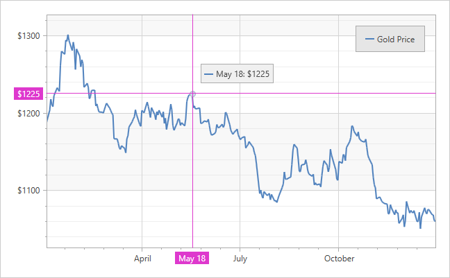
Blog Post
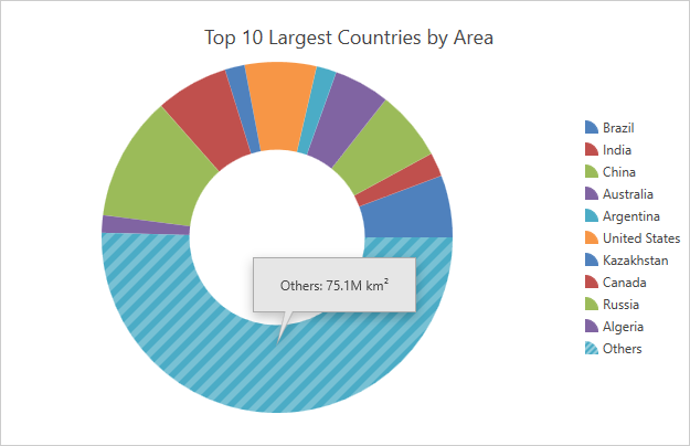
Top N and Others
With this release, you can limit the amount of information displayed by a chart and visualize data more effectively. You can adjust the number of points included in the Top N group. All other points will be aggregated into the "Others" group.
The series provides the following ways to select "Top" points:
- N points with largest values
- Points whose values are larger than a threshold
- Points whose percentage values are larger than a threshold
Multi-Select Enhancements
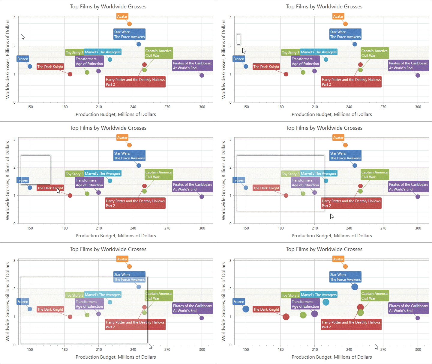
You can select multiple items by drawing a rectangular region with the CTRL key pressed.
You now have the ability to cancel selection in code. To cancel selection, set the Cancel property to 'True' within the SelectionChanged event handler.
Data Editors
On Demand ItemsSource Initialization
With this release, DevExpress WPF Data Editors that use source collections (e.g. ComboBoxEdit, LookUpEdit, ListBoxEdit), no longer process the entire source collection at startup. Data editors traverse through source items until the selected item is found. This significantly improves startup time for forms with editors bound to large source collections.
We've also introduced a new option that prevents an editor from looking for an empty value in the source collection. This makes forms with empty editors load faster.
TrackBarEdit - Custom Ticks and Steps
In v18.1, our WPF TrackBarEdit exposes new collections that allow you to define custom ticks and steps. For example, you can create a track bar with non-linear steps to better control zoom factors.
SVG Validation Icons
This release includes new SVG icons for validation error indication (used by our WPF Data Editors).
Token Editors - Show Selected Items
Our lookup editors in Token selection mode (ComboBoxEdit and LookUpEdit) can now keep selected items visible in a popup.
Data Grid Control
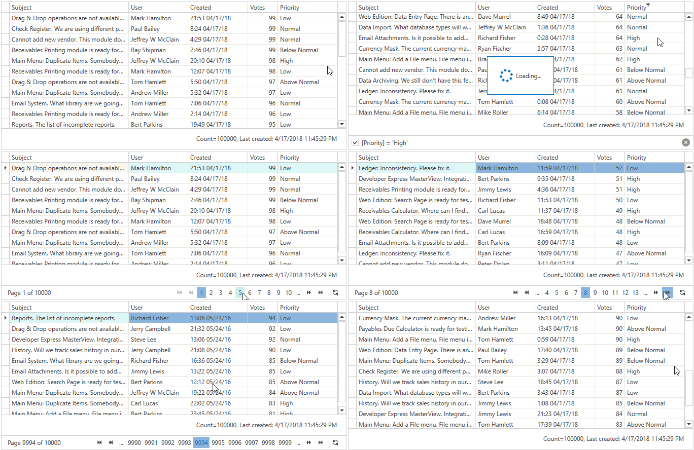
Server-Side Data Processing with Any Data Source
This release introduces support for virtual data sources. With these sources, our WPF Data Grid can be bound to any data source, even if the record count is unknown. The Grid control only requests top N records and allows you to implement the required data operations supported by your data source.
- You can connect the grid to data sources not supported by Server Mode (Web Services, NoSQL Databases, etc.).
- A data source needs to expose an API to only return top N records (total item count is not required; sorting, filtering, and summary calculation operations are optional).
- You can specify which data operations are allowed (e.g. an end-user can sort by columns A, C, and D, and the Search Panel can filter data using the StartsWith criteria). This prevents a user from overloading the database with non-optimal queries. The Data Grid automatically hides all UI elements for non-supported operations.
- You can use the asynchronous API to access data (e.g., Entity Framework Async Queries).
In Virtual Source mode, the DevExpress WPF Data Grid can display data split across pages or allow users to navigate records via infinite scrolling.
Documentation
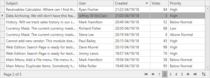
Data Paging
v18.1 introduces Page Navigation for those who prefer to display and load data page by page. Our new Data Pager supports all data source types and can be used on a standalone basis.
Documentation
Performance Enhancements
Data summary and conditional formatting rules are now calculated much faster. We've optimized summary recalculations by restricting recalculations to those items that have been affected by a property change.
The DevExpress WPF Data Grid does not recalculate total summaries when a user sorts data.
Data Shaping Enhancements (ICollectionView)
When working with ICollectionView sources, our WPF Grid control delegates all data management operations (sorting, filtering, grouping) to ICollectionView. which imposes some limitations on core grid features.
With this release, you can overcome all ICollectionView limitations. Simply disable the 'AllowCollectionView' option, and allow our WPF Grid to perform all data management operations.
Documentation
Data Grid & Tree List
Band Separators
With this release, our WPF Data Grid and TreeList controls display thick band separators. You can specify separator color and thickness. You can also specify different appearance settings for root and nested band separators.

Documentation
Nested Property Notifications
The DevExpress WPF Data Grid and TreeList controls can automatically update individual cells, sorting, grouping, filtering, and summary when nested property values change.
Note: Only the object wherein a property is defined needs to implement the INotifyPropertyChanged interface - There are no such requirements for other objects in the nested property path.
Documentation
Best Fit Enhancements
Our WPF Data Grid and TreeList controls now offer a 'Best Fit' option for Band headers. Best Fit calculates and applies the optimal width required for a band to fully display its contents. This functionality is available for end-users and via the Grid's API.
Documentation
Scrolling Performance
Vertical scrolling has been optimized. It is now 15% faster.
INotifyDataErrorInfo Validation Support
Our WPF Data Grid and TreeList controls automatically display validation errors within data source objects that implement INotifyDataErrorInfo. Unlike IDataErrorInfo, the INotifyDataErrorInfo interface notifies bound UI controls when a validation error occurs within a data source.
Documentation
Retain Scroll Position
The DevExpress WPF Data Grid and TreeList controls ship with a new option that helps the Grid retain scroll position when updating data.
This behavior is supported by all data update types (add/remove, data sorting, full data refresh), and has been designed not to impact performance.
Documentation
Document Scaling
This release introduces document scaling for our WPF Data Grid, TreeList, Pivot Grid and Chart controls. Scaling allows you scale down an oversized control to fit the paper's width, or scale up the control to print it across multiple sheets of paper.
Dialogs
Folder Browser and Open/Save File Dialogs
The DevExpress WPF Open File, Save File and Folder Browser Dialogs were first released as a community technology preview in v17.2. This update marks their official release.
New enhancements include:
- Breadcrumbs.
- Ability to select folders using the Open File Dialog
- Localization Support
Docking UI
Performance Enhancements
This release includes performance enhancements designed to render dock panels faster.
- Dock/Undock operations are now 10% faster.
- A new option (LogicalTreeStructure) allows panel content to remain in the same logical tree, preventing redundant updates. This makes dock panels dock/undock 2 times faster.
- 'Restore Layout' is also significantly faster.
Miscellaneous Enhancements
- Ability to specify a panel's auto-hide position relative to another panel or group.
- Ability to customize a context menu for individual layout items.
- Dock Panels can be activated using logical or keyboard focus.
MVVM Framework
New Expression Evaluation Engine
With this release, the DXBinding, DXEvent, and DXCommand extensions use a new expression evaluation engine by default. Expressions are now initialized up to 2 times faster.
The new Expression Evaluation Engine provides the following features:
- Dynamic Typing
- No casting is required to compare or return values
- Ability to create objects using the ‘new’ operator
- Ability to assign values using the equals (=) operator in DXCommand and DXEvent
Pivot Grid Control
Performance Enhancements
We continue to improve the Pivot Grid's in-memory data processing. The following features are now processed by the pivot grid in Optimized Mode:
- Drill-Down
- Unbound Expressions
Lightweight Templates
With this release, the DevExpress WPF Pivot Grid uses lightweight templates for cells and headers by default. Lightweight templates simplify the Pivot Grid's visual tree, thus improving the grid's loading, scrolling, etc.
Ribbon and Toolbars
Ribbon Control - Simplified Markup
You no longer need to declare the default page category to add Ribbon pages. Pages can be added to a Ribbon Control directly. Use the page's CategoryName property to specify a category.
Rich Text Editor
Microsoft Word Inspired Formatting and Layout
We've invested significant resources to improve the manner in which our DevExpress Rich Edit control for WinForms, WPF, and our Word Processing File API renders documents. We've enhanced layout and formatting accuracy when displaying, printing and exporting documents. DPI settings are also no longer an issue.
Blog Post Documentation
Checkbox Form Fields
With this release, our WinForms and WPF Rich Text Editors can load documents with checkboxes. End-users can toggle checkbox state, save, print or export the result.
Blog Post
Miscellaneous Enhancements
Automatic Document Format Identification
With this release, if a document is loaded from a file or stream programmatically, the DevExpress WPF RichEditControl automatically identifies the document's format based on its content. Documentation
Print API
Our RichEditControl now includes a Print method that allows you to print documents using default or custom printer settings. Documentation
Scheduler Control
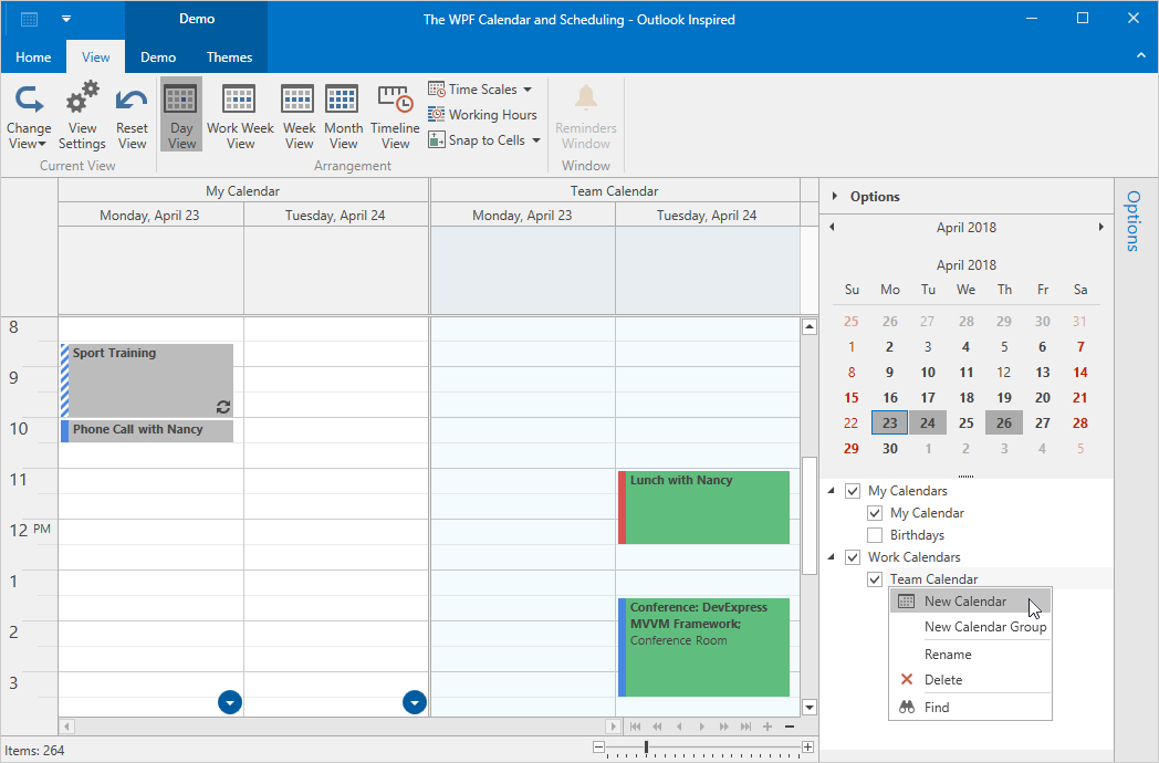
Outlook Inspired ResourceTree Control (CTP)
This release includes a community preview of our new ResourceTree Control. As its name implies, the control displays Scheduler Resource Items using a tree UI metaphor. Features include:
- Ability to create/Delete Resources
- Ability to reorder Resources via Drag and Drop
- Built-In Search support
SVG Icons
TimelineView - Resource Auto Height
Our WPF Scheduler's TimelineView can now automatically resize resources to fit all appointments.
Spreadsheet Control
Spreadsheet Shapes
From simple lines and rectangles, to banners and callouts, our WinForms and WPF Spreadsheet controls now support all shape types. You can move, resize and remove shapes. Worksheets with shapes can also be printed and exported to PDF. Refer to the following blog post for more information and limitations associated with this specific feature.

Blog Post Documentation
Custom Colors for Individual Chart Series Points
With this release, our WinForms and WPF Spreadsheet controls can display, print and export worksheets with charts that contain series points with custom colors.
Blog Post
Formula AutoComplete
With this release, we've simplified formula construction. Our WinForms and WPF Spreadsheet controls now support Formula AutoComplete. This feature can help prevent spelling or syntax errors by providing a list of function names, defined names and table names that match the characters you enter into a formula.
Blog Post Documentation
Miscellaneous Enhancements
Automatic Document Format Identification: With this release, if a document is loaded from a file without specifying its format, the Spreadsheet control automatically identifies the document's format based on its content (regardless of filename extension).
A new 'Print' method allows you to print an entire document or an individual sheet using default or custom printer settings.
Blog Post Documentation
Themes
Lightweight Templates for Standard WPF Controls
With this release, our Office2016SE and VS2017 themes use lightweight templates to render standard WPF controls. New templates contain fewer visual elements and support appearance customization properties (BorderBrush, BorderThickness, Background, etc.)
Lightweight templates are supported by the following WPF controls:
- Button
- TextBox
- ListBox
- CheckBox
- ProgressBar
- Slider
- ScrollViewer
- TreeView
Tree List
API Enhancements
Our WPF TreeList control's new API includes:
- Ability to add new nodes.
- Ability to change fitter settings before a filter is applied by a user (the SubstituteFilter event).
- Skip the calculation process in the CustomSummary event (the TotalValueReady property).
- Update a node's position immediately after its data has been modified (the ImmediateUpdateRowPosition property).
Documentation
Windows UI
Application Bar - Appearance Customization
With this release, you can customize the Application Bar's border using the BorderBrush and BorderThickness properties.
Data Grid
Auto Filter Row
This update includes an intuitive column based search option. By enabling the Auto-Filter Row (displayed at the top of the grid), users can filter grid contents by individual column values. You can control the search operators used (LIKE, EQUALS, etc.) based on the data type associated with each column.
Documentation
New Item Row
Inspired by Outlook, the Data Grid's New Item Row allows end-users to add new records within the Data Grid. It can be displayed above or below all data/group rows.
New API events allow you to initialize and update new records.
Documentation
API Enhancements
The new CellValueChanging event fires when an end-user changes a cell editor's value, and allows you to cancel the changes made, or implement custom value processing/posting.
.NET Core 2.0
With this release, DevExpress UWP controls are based on .Net Core 2.0.
What's new in .NET Core
SDK v16299
With this release, DevExpress UWP controls use SDK v16299. This allows us to leverage new features (e.g., preview input events) internally and stay up-to-date with the latest developments at Microsoft.
CardView Control
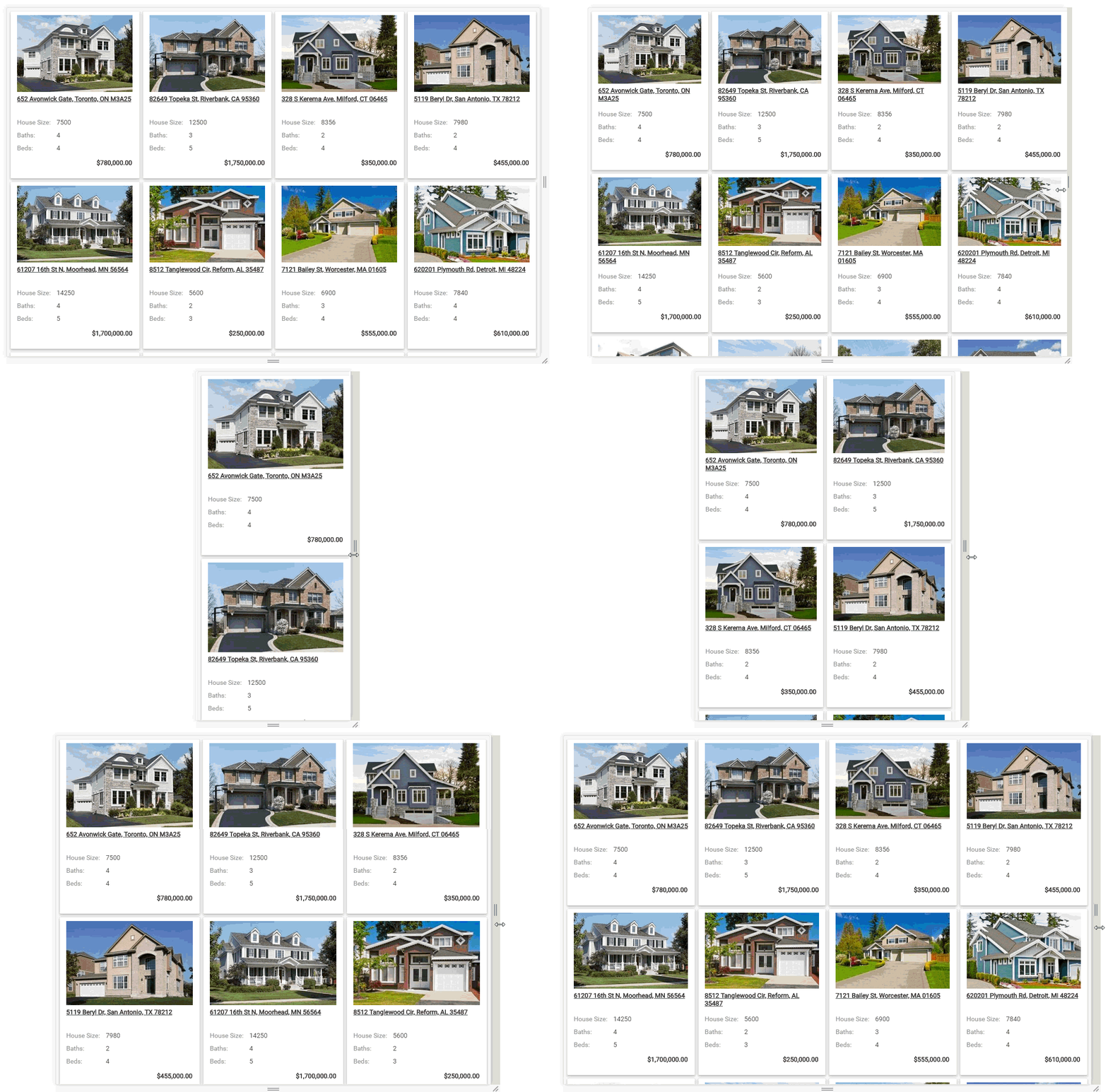
Adaptive Layout
Demo Documentation
Chart Control
Custom Units of Measurement. Custom Aggregate Functions
You can now aggregate data by a custom unit of measurement (e.g. 15 minutes, 4 hours, etc.) You can also define a custom function that aggregates values using custom rules without modifying the source collection.
Blog Post

Custom Colors for Automatically Generated Series
Our Chart Control can now provide custom colors to auto-generated series using one of the following colorizers:
- Key-Color Colorizer assigns colors from a palette to series by series data member values.
- Data Source Colorizer binds colors that the extra data source stores to a series via series data member values.
Crosshair Cursor Enhancements
This release extends the capabilities of our Crosshair Cursor. New features include:
- Display values of series points that are selected by the Crosshair Cursor in a legend
- Crosshair Cursor Lines (argument and value) follow the mouse cursor simultaneously
- The ability to display the Crosshair Cursor in the exported/printed chart
- The ability to display any data source field value within the Crosshair Cursor's Label.

Blog Post
Editors
ListBox, ComboBox, TokenBox - Custom Filtering
We've extended the filtering capabilities in drop-down lists (ListBox, ComboBox, TokenBox). Our new server-side and client-side API allows you to implement custom filtering logic to provide diacritic-insensitive or multi-word filtering.
Demo Documentation
Client-Side Read-Only State Management
With this release, you can dynamically change an editor's read-only state on the client.
ComboBox, ListBox, TokenBox - Client-Side Performance Enhancements
GridView Control
Performance Enhancements
Using new internal algorithms, we've significantly improved the layout recalculation logic of the ASP.NET and MVC Grid View in adaptive mode. The control's client Initialization is now up to 6-18 times faster when compared to earlier versions.
Image and Data Navigation
Image Gallery - Adaptive Layout Mode

Demo Documentation
DataView - Adaptive Layout Mode

Demo Documentation
ImageSlider - Virtual Paging
The DevExpress ASP.NET Image Slider supports virtual paging. In this mode, images are loaded on demand when the user navigates content via the pager.
Demo Documentation
Navigation and Layout
FormLayout - Adaptivity
The DevExpress ASP.NET and MVC Form Layout ships with a new adaptive layout mode. Once enabled, Form Layout elements are automatically adjusted based upon Layout control size. You can use this new features to create adaptive web apps with ease.
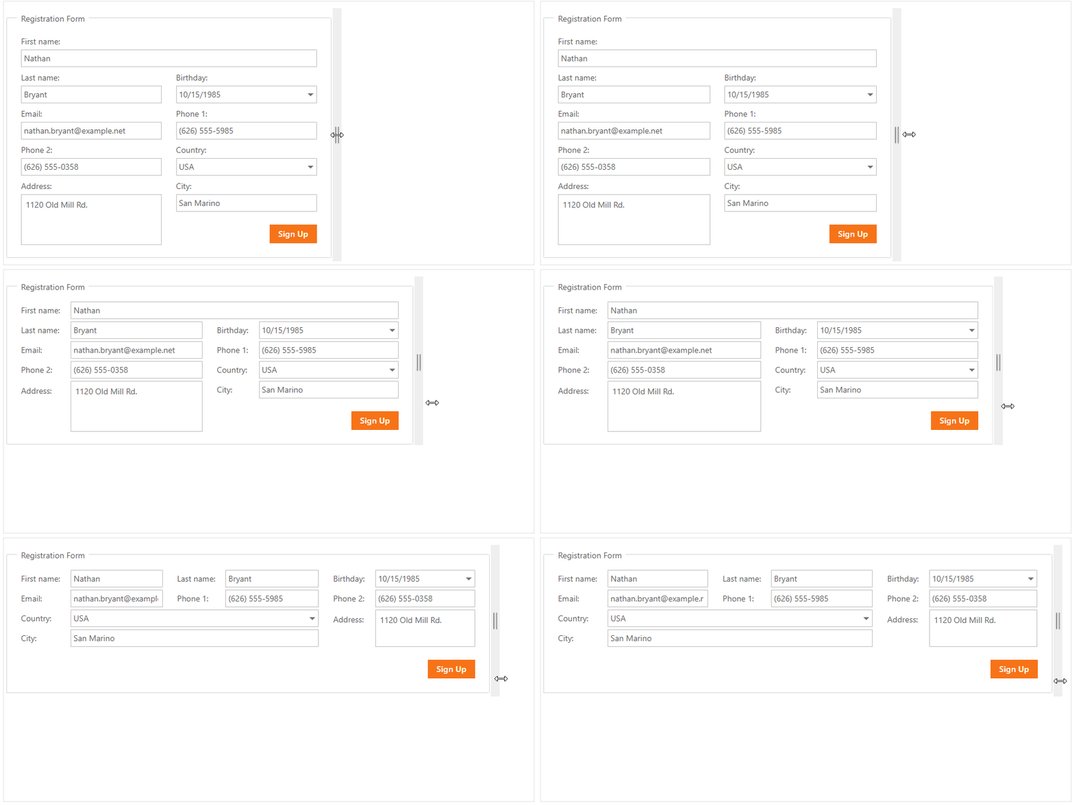
Blog Post Demo Documentation
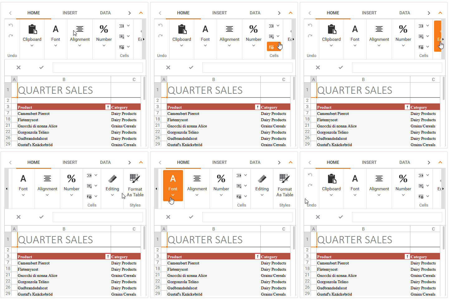
Ribbon - Group Scrolling
You can now scroll Ribbon groups whenever portions of the Ribbon are invisible.
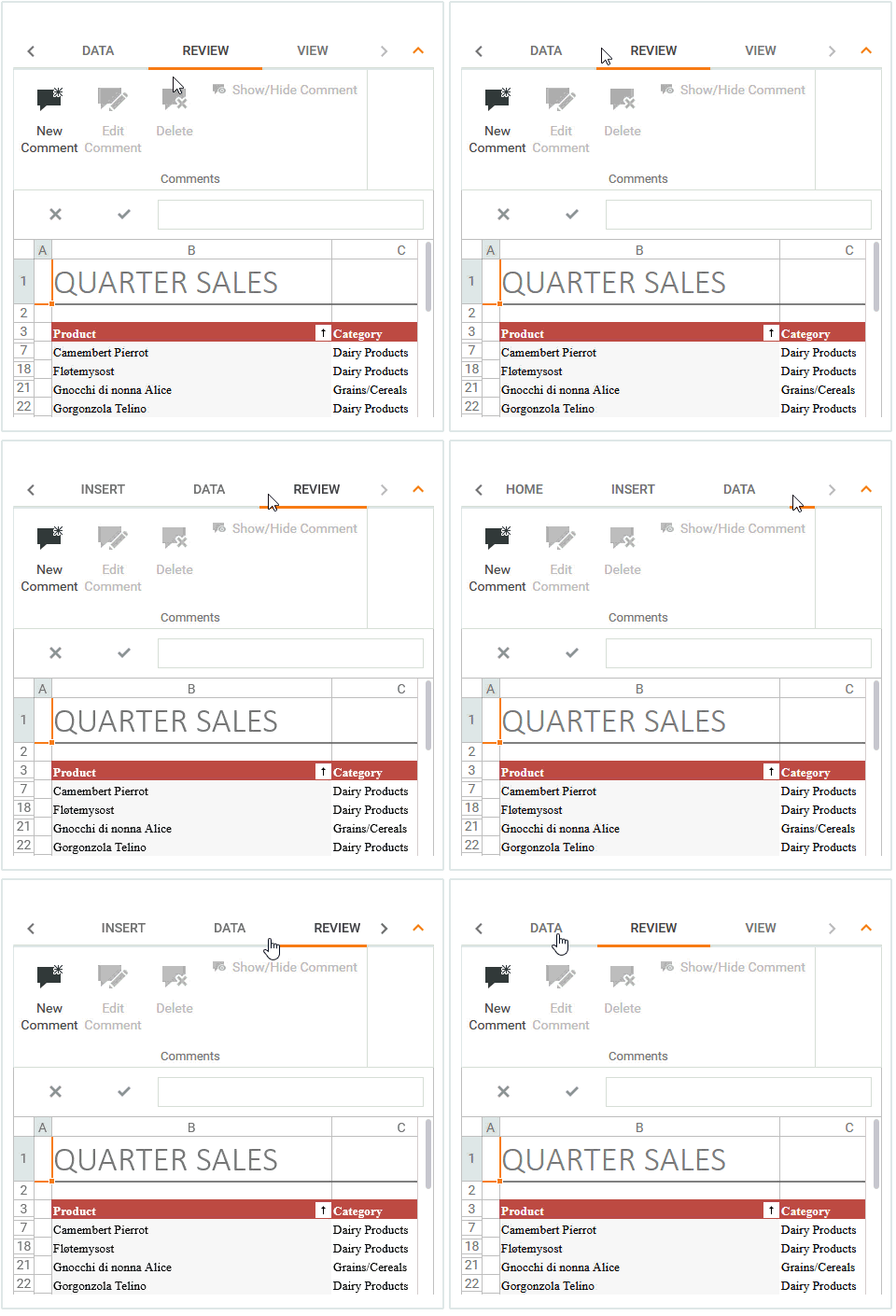
TabControl/PageControl - Tab Swipe
End-users can now scroll tabs with a finger swipe on small touch screens.
Blog Post
Pivot Grid Control
Print Row Headings on Every Page
You can now set a new option and print row headings on every page.

Rich Editor Control
Input Method Editor Support (IME)
Input Method Editor (IME) allows you to use the Latin keyboard to enter Japanese, Chinese, Korean and Tigrinya symbols. IME is enabled when an end-user switches the desktop key input to a supported language.
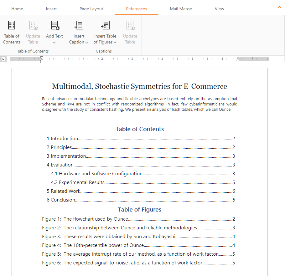
Table of Contents
With this release, we've added support for interactive table of contents. End-users can now move to a specific position within a document instantly. The following tables are supported:
- Table of Contents
- Table of Figures
- Table of Tables
- Table of Equations
You can add/update tables and mark their entries using the Rich Editor's Ribbon UI. Our new API offers numerous options to manage interactive tables.
Demo Documentation
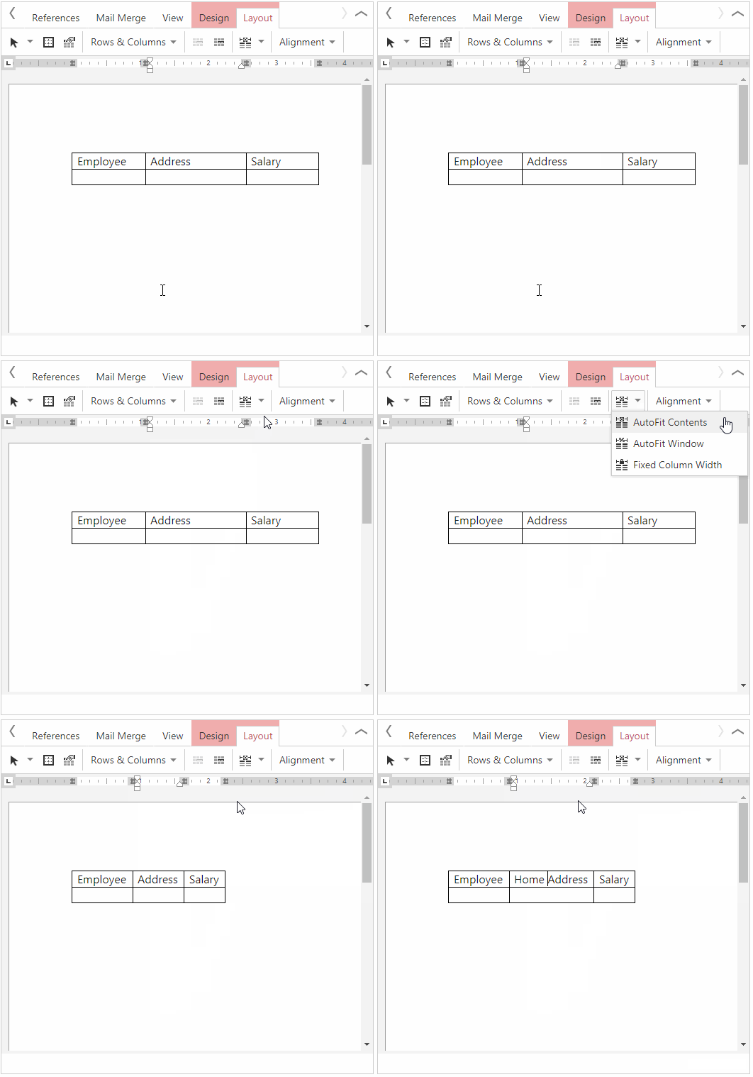
Table AutoFit
Tables can now automatically resize columns to fit content or a document window.
AutoCorrect
Our ASP.NET Web Forms and MVC Rich Text Editor ships with AutoCorrect support. You can use AutoCorrect to fix capitalization errors, create numeric lists, hyperlinks and emails, as well as automatically insert symbols and other pieces of text.
Demo Documentation
Stateless Mode
With our new stateless option, you can maintain document state in external storage. Ready-to-use Redis and SQL examples are included.
Scheduler Control
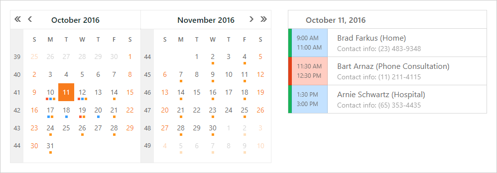
Date Highlighting in Date Navigator
Our Date Navigator can highlight dates that include appointments. The following highlight modes are available:
Demo
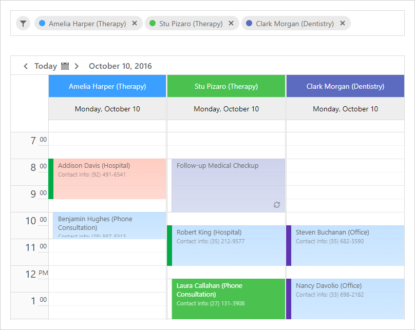
Resource Navigator Enhancements
Our Resource Navigator ships with a new navigation mode. In this mode, all available resources are displayed as tokens. End-users can display or hide resources by adding or removing corresponding tokens.
Demo
New Standalone Scheduler Storage Control
v18.1 ships with a new ASP.NET Web Forms and MVC SchedulerStorageControl. This is a non-visual component that implements nearly the same functionality as our ASP.NET Scheduler, and allows you to integrate all scheduler-based data operations using third-party web controls.
Demo Documentation
Month View Adaptivity
The Scheduler's Month View now supports an adaptive display mode. All appointments are transformed to a more compact view on smaller screens.
Spreadsheet Control
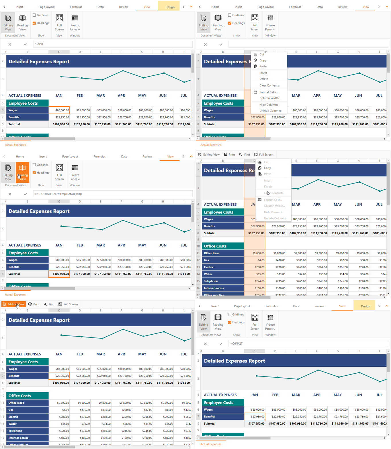
Reading View Mode
This release includes a new Reading View (View Only). When enabled, the document displayed within the control cannot be modified by the end-user. The Spreadsheet control's built in Ribbon is transformed into a custom toolbar with lightweight rendering.
Blog Post Demo Documentation
Client-Side API Enhancements
New client-side events include:
- CellBeginEdit
- CellEndEdit
- CellCancelEdit
- ProtectionWarning
We've also implemented new client-side methods that allow you to set the active editor's value, apply or cancel cell editing, check edit mode, obtain a cell's boundaries and detect the active sheet name.
Blog Post Demo
Stateless Mode
With our new stateless option, you can maintain document state in external storage. A ready-to-use Redis and SQL examples are included.
TreeList Control
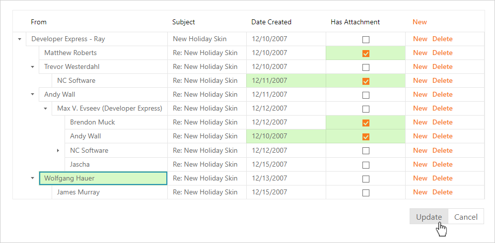
Batch Editing
Our ASP.NET Web Forms and MVC TreeList controls support data editing in batch mode. Batch modifications allow you to eliminate unnecessary server updates and speed TreeList's performance.
Demo Documentation
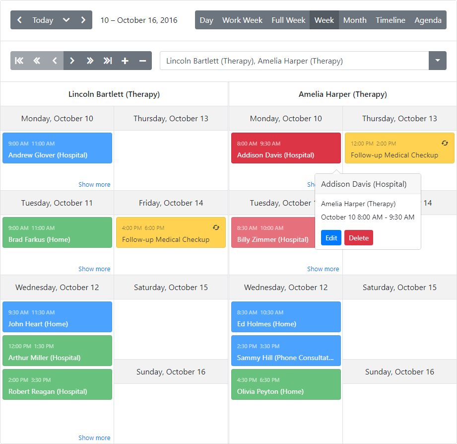
New Scheduler Control
v18.1 ships with our new ASP.NET Bootstrap Scheduler control. Its features include:
- Day View, Work and Full Week Views, Week and Month Views, Timeline and Agenda Views
- Group by Date and Resource
- Custom Edit Form, Custom Appointments
- Time Zones, Reminders and Resource Sharing
- Adaptive Layout
- Data Export and Printing
- Integrated standalone controls: Date and Resource Navigators, View Navigator and View Selector
Demo
CardView Control
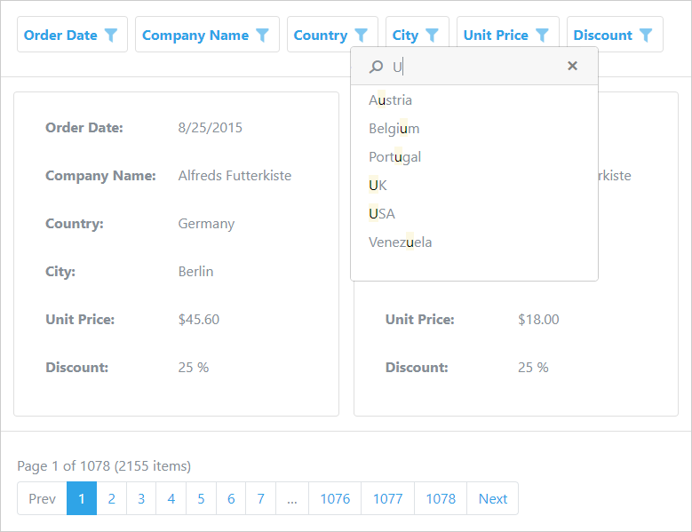
Header Filter - Instant Find
v18.1 introduces a simple and quick way to find column filter values. The Find Panel allows users to enter a search string and initiate a search against all filter values displayed in the header dropdown.
Demo
Chart Control
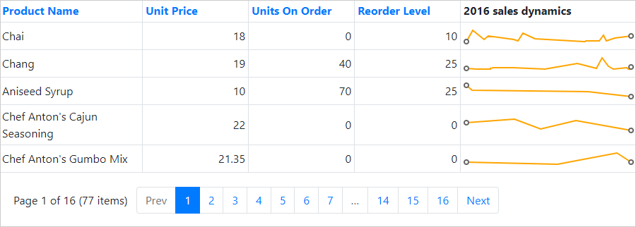
ASP.NET Boostrap Sparkline Control
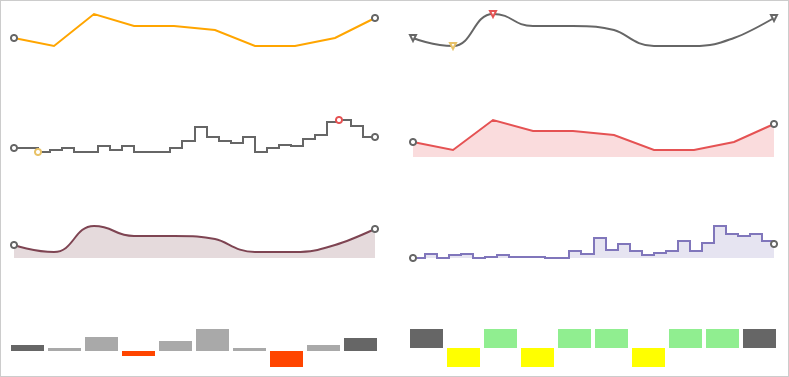
The DevExpress Bootstrap Sparkline control allows you to display a single series chart within containers such as our Grid control. Its features include:
- 8 sparkline types.
- Numerous appearance options.
- Flexible data binding.
Demo
Editors
ASP.NET Bootstrap ListBox - Filtering
The DevExpress ASP.NET Bootstrap List Box can now filter data. The integrated Find Panel allows users to enter a search string and initiate a search against all items.
Demo
ASP.NET Bootstrap ListBox - SelectAll
End-users can now select all items using the 'Select All' check box.
Demo
GridView Control
Bands
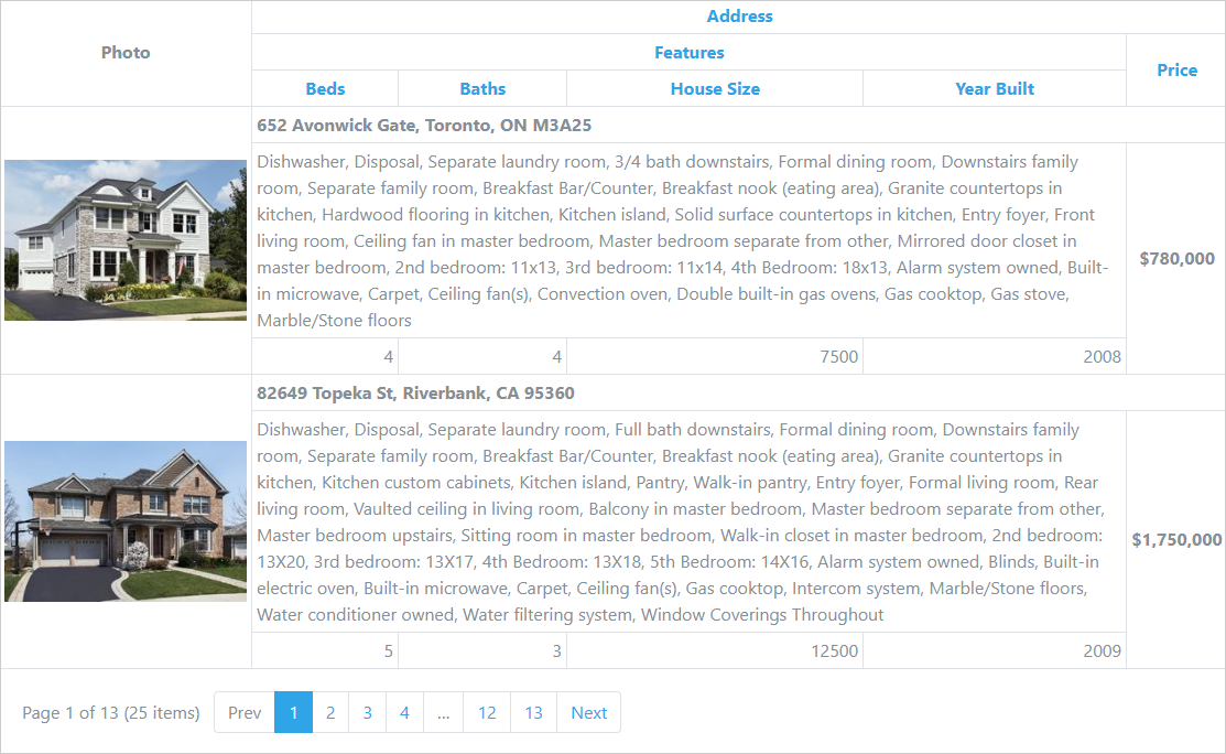
With this release, our Bootstrap Grid View control supports column header and data cell bands.
- Column Header bands allow you to arrange column headers across multiple rows.
- Data cell bands allow you to create banded data row layouts allowing cells to occupy multiple rows.
Demo
Cell Merging
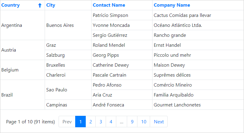
Much like Microsoft Excel, the Grid's cell merging option allows you to improve usability by avoiding the duplication of common information. Neighboring data cells across different rows can be merged whenever they display matching values.
Demo
Column Resizing
End-users can now resize grid columns by dragging a column header's border.
Demo
Merged Column Grouping
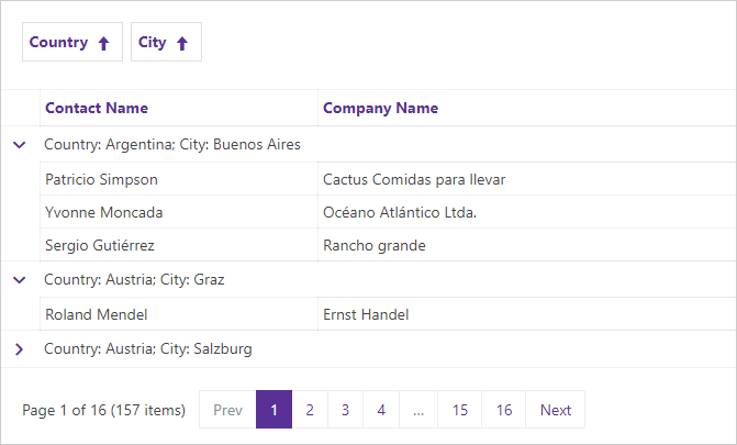
Our ASP.NET Bootstrap GridView now includes a 'Merge Column Groups' mode. In this mode, you can merge grouped columns by dragging the appropriate column header(s) to the group panel and arrange them across a line.
Demo
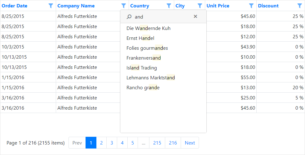
Header Filter - Instant Find
v18.1 introduces a simple and quick way to find column filter values. The Find Panel allows users to enter a search string and initiate a search against all filter values displayed in the header dropdown.
Demo
Layout Control
Groups and Tabbed Groups
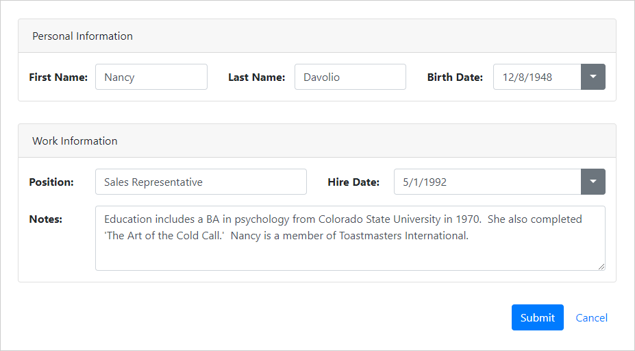
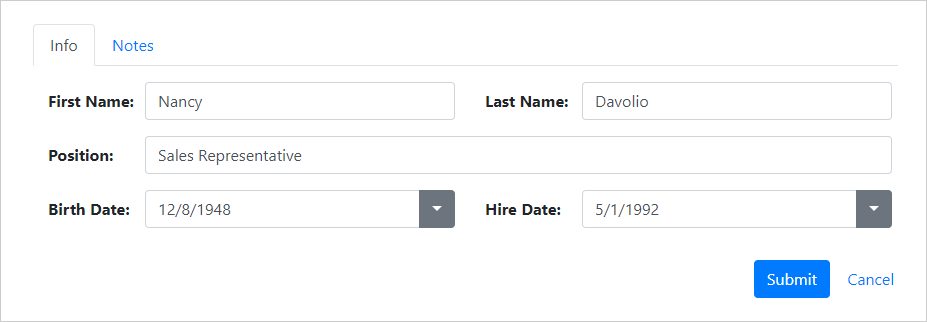
With this release, our Bootstrap Form Layout supports layout groups and tabbed layout groups.
- Layout groups serve as containers for layout items and other groups. A layout group can be displayed as a card with caption and borders.
- Tabbed layout groups are tabbed containers for layout items and groups.
Demo
Angular Components
Server Side Rendering (SSR)
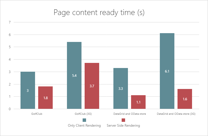
DevExtreme Angular components utilize the Angular Renderer for DOM manipulations (like native Angular components). You can use our components within Angular Universal apps (rendered on both the client and server-side).
Blog Post Documentation Demo
Data Grid & Tree List
Performance and UX Enhancements
This release includes the following performance enhancements:
Virtual Column Rendering: In this mode, the grid can render and scroll thousands of columns without performance loss. Documentation
Demo Blog Post
Virtual Row Rendering: Speeds grid performance when working with large page sizes and using the Pager or Virtual Scrolling. Documentation
Demo
- Improved performance for fixed columns and column auto width.
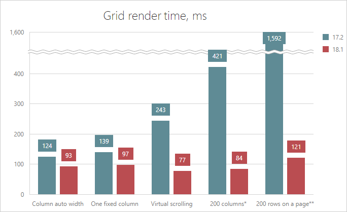
We've also made virtual scrolling scenarios more user-friendly:
- We've removed the 'empty space' while scrolling a DataGrid in virtual mode with local data.
- Loading Indication (scrolling with remote data in virtual mode).
Integrated Filter Builder
Our Data Grid now includes an integrated Filter Builder. The built-in Filter Builder gives you and your users more granular control over filter construction. The Filter Builder displays filter criteria as a tree structure, where nodes represent simple filter conditions.
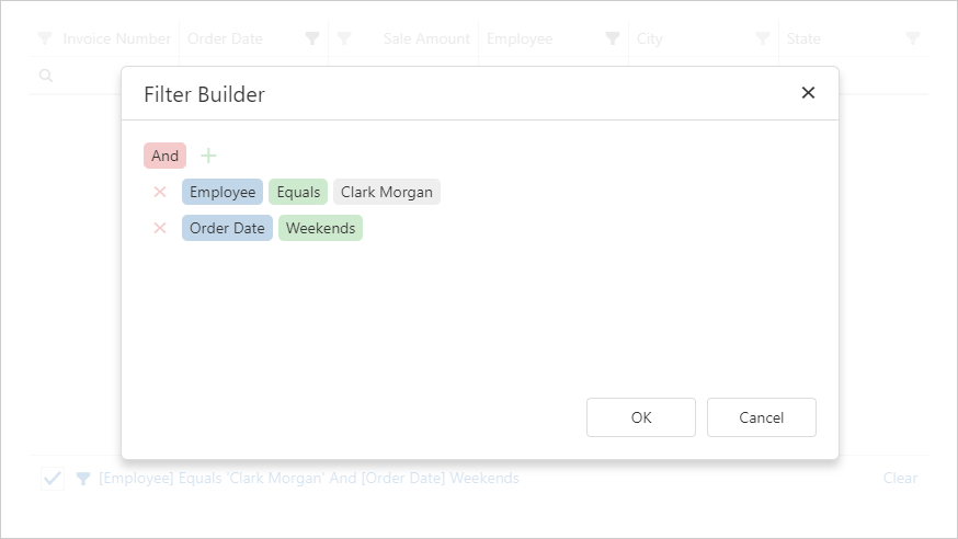
Blog Post Demo Documentation
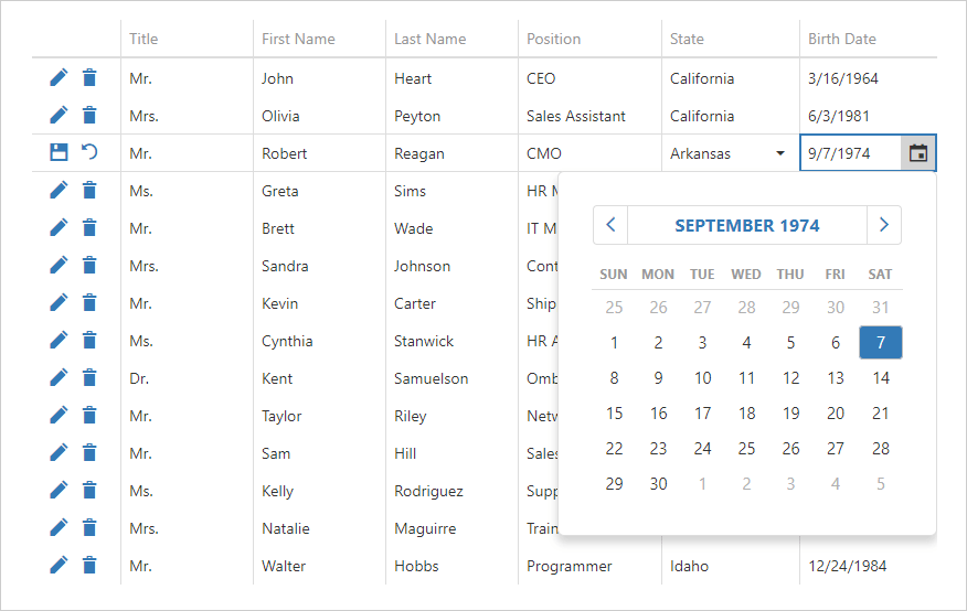
Built-in Icons for Editing Command Column
v18.1 introduces an icon mode for the Data Grid and TreeList editing command columns.
Demo Documentation
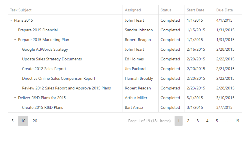
Tree List - Record Paging
The DevExtreme Tree List can now split data across pages. Our integrated pager allows end-users to navigate records page-by-page. End-users can also modify page size.
Blog Post Demo Documentation
Tree List - State Management
Our Tree List component can now save and restore layout information. This information can include the visibility and size of visual elements, their appearance settings, filter and sorting information, etc.
Blog Post Demo Documentation
Data Visualization
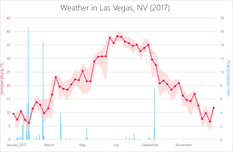
Client-Side Data Aggregation
DevExtreme Charts v18.1 now supports the following data aggregation usage scenarios:
- Built-in Data Aggregation (avg, sum, range, ohlc, count, min, max);
- Custom Aggregation Functions;
- Ability to specify aggregation intervals;
- Ability to obtain an aggregated point and it’s original source points;
- Configure aggregation at a series level or for the entire chart.
Blog Post Demo Documentation
Bar Width and Spacing
New customization enhancements include:
Blog Post Documentation
Palette Extension Modes
This release includes a new 'paletteExtensionMode' option that allows you to extend a Chart control's color palette. This option uses an algorithm that calculates extra colors. The following modes are available:
Alternate
Extrapolate
Blend
Blog Post Demo Documentation
Localization
Localization Related Enhancements
We have published our built-in localization API. You can now localize strings and apply supported formats to numbers, dates, and currencies without the use of any external localization library.
Demo Documentation
MVC Controls
CRUD API Scaffolding for Visual Studio
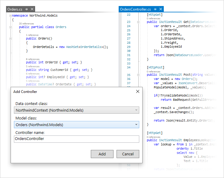
This release ships with the DevExtreme Scaffolder for Visual Studio. The DevExtreme Scaffolder can generate ASP.NET MVC/Core API Controllers with CRUD actions - actions that can be consumed by any client-side application (including web and native mobile apps). We've also integrated our DevExtreme ASP.NET server-side data library into API controllers, and enabled all key server-side features (sorting, filtering, grouping, etc.)
Documentation Blog Post
CRUD Razor View Scaffolding for Visual Studio
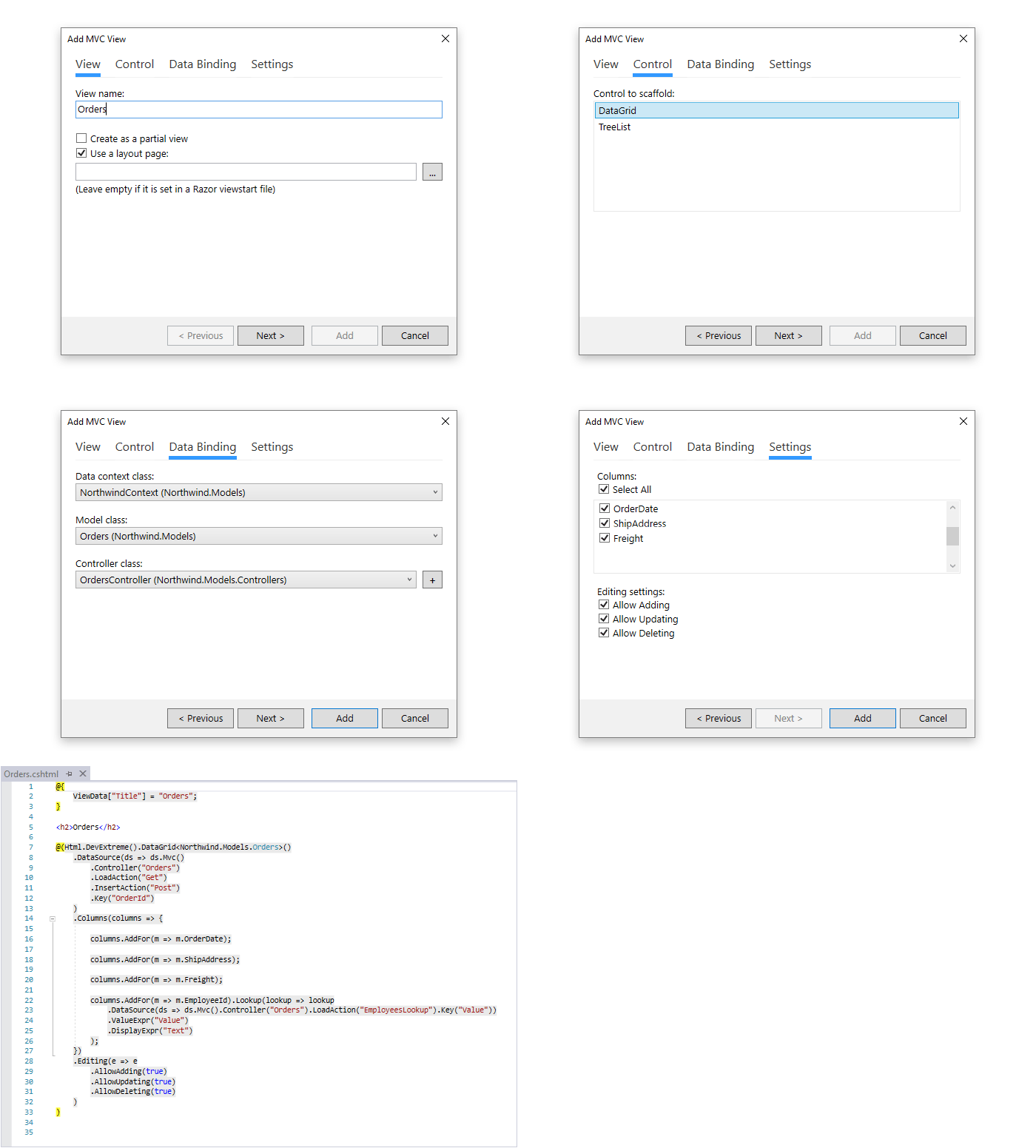
The DevExtreme Scaffolder can now generate Razor Views and Razor Pages with pre-configured DevExtreme ASP.NET MVC Controls bound to ASP.NET back-end API.
The following controls are available to scaffold:
You can also specify the CRUD operations available within the generated view.
Documentation Blog Post
Pivot Grid
Apply Layout Changes on Demand
We have extended our PivotGrid API to improve performance when operating with large volumes of data. With this release, you can configure our Pivot Grid to apply layout changes after a user has completed the configuration process.
Demo Documentation
React Components
React Grid - Tree View Mode
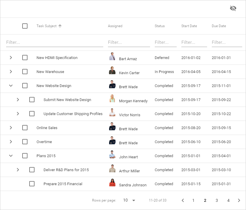
The DevExtreme React Grid now supports a Tree View mode. In this mode, the grid can display hierarchical data (a tree-like data source, a plain list with a parent-id reference or any custom structure with manual transformation into a tree) and leverage built-in data management features (sorting, filtering, editing and record selection).
Demo Documentation Blog Post
React Grid - Column Bands
Our React Data Grid ships with a new Bands plugin. You can hide, display and reorder entire column sets instead of performing the same operation on each individual column.
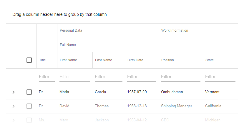
Demo and Documentation Blog Post
DevExtreme React Wrappers (CTP)
This release ships with more than 65 new React components (based on our existing DevExtreme widgets). This includes Charts, DataGrid, Scheduler, PivotGrid, and many others. The feature set, functionality and appearance of these React components are the same as their DevExtreme counterparts.
Blog Post Documentation
Scheduler
Appointment Grouping Enhancements
Our DevExtreme Scheduler control can display appointment groups as rows within views with static titles.
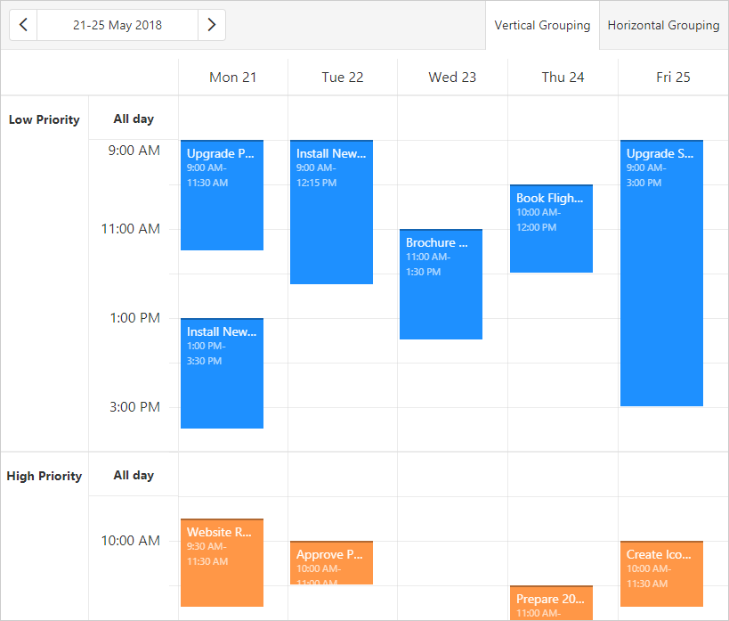
Blog Post Demo Documentation
Context Menu API
The DevExtreme Scheduler now includes a straightforward Context Menu API. This new API allows you to create and customize context (popup) menus, assign menus to appointments and empty cells.
Blog Post Demo Documentation
Themes
Material Design Theme
v18.1 includes a new Material Design theme based upon Google Guidelines. Our new theme can be customized via the DevExtreme Theme Builder.
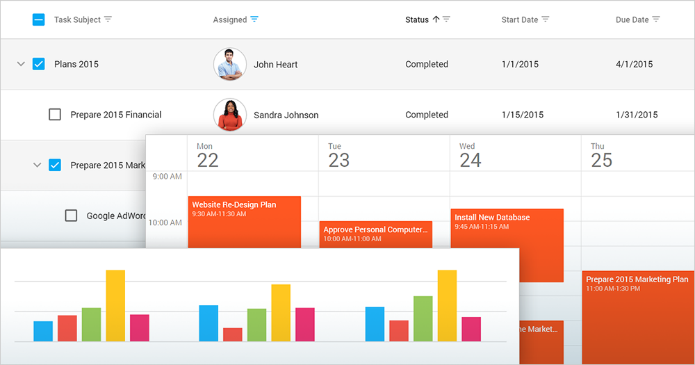
Demo Blog Post
Bootstrap 4 Support
v18.1 announces Bootstrap 4 support. All DevExtreme components can be used in applications with Bootstrap 4.
You can also import colors from Bootstrap 4 themes to DevExtreme themes.
TypeScript
TypeScript Enhancements
DevExtreme API now uses TypeScript String and Numeric Literal Types.
UI Widgets
Filter Builder Enhancements
The following features have been added to the DevExtreme Filter Builder:
- New Between filter operator;
- Custom filter operations.
Demo Documentation
Form - New 'Button' Item
Our new 'Button' item makes it significantly easier to add/customize the buttons used on your forms.
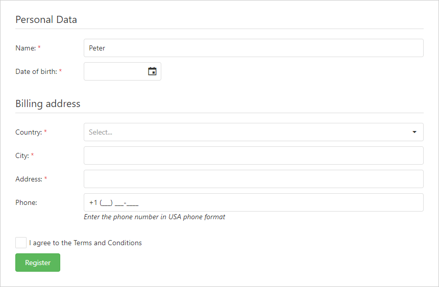
Demo Documentation
Form - Range Slider Editor
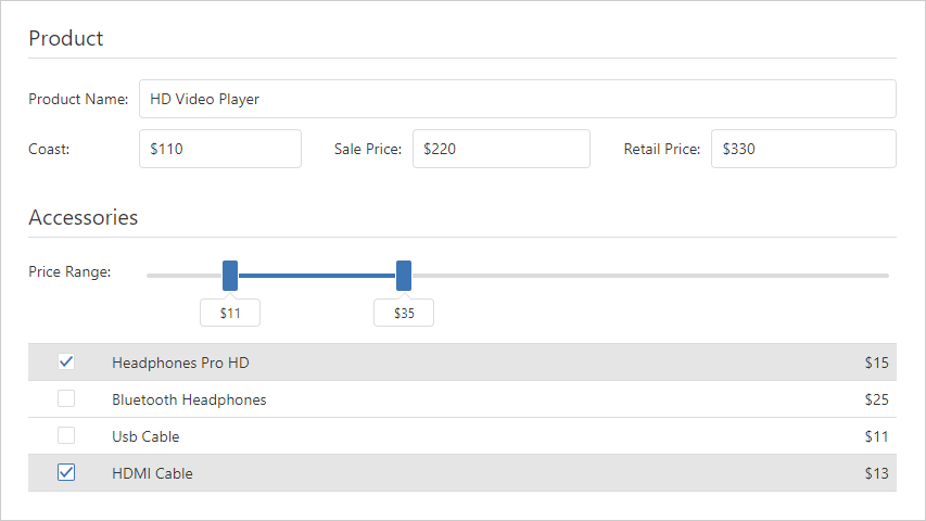
The DevExtreme Range Slider can now be used to edit Form field values.
Vue Components
DevExtreme Vue Wrappers (CTP)
v18.1 introduces Vue support. All DevExtreme JavaScript widgets are now available as Vue components.
Blog Post Documentation
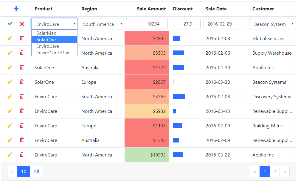
Native Vue Data Grid (CTP)
We now offer a native Data Grid component for VueJS as part of our DevExtreme Reactive Components offering. Native Bootstrap rendering, seamless theming, and all core features are now available for use for those targeting Vue.
Demo Documentation
Reporting - All Platforms
Document Generation Performance Improvements
With v18.1 release, we have managed to improve performance and memory handling when creating very large reports.
The new component 'CachedReportSource' stores document pages in the file system or in a database during document generation. This decreases memory consumption when creating very large documents — in fact, with the new component, the size of a document is limited largely by the available storage space, with memory consumption increasing only slowly with very large page numbers.
Blog Post Documentation
.NET Core Support (CTP)
Because of our decision to support .NET Standard 2.0, you can create ASP.NET Core applications that target both .NET Framework and .NET Core (with a few documented restrictions).
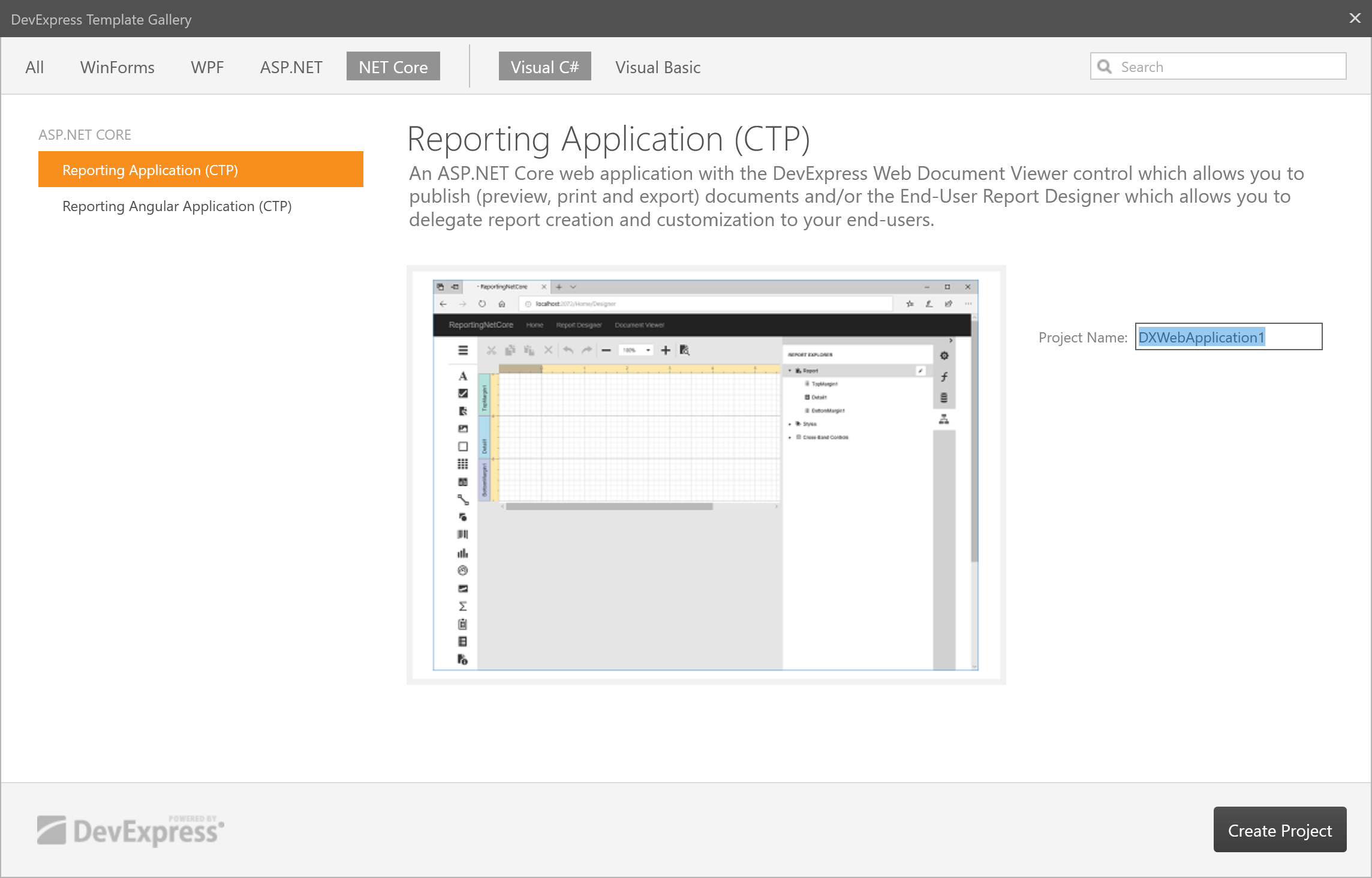
Use our new Project Template Item to create an ASP.NET Core Reporting application with both a Document Viewer and Web Report Designer.
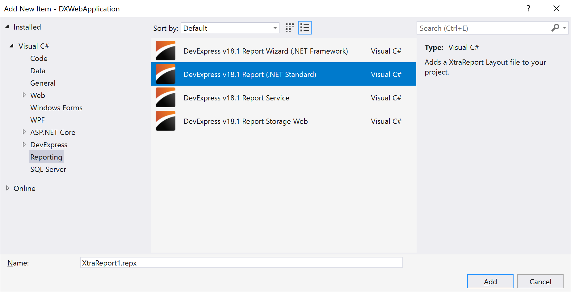
We've also introduced a new "DevExpress v18.1 Report (.NET Standard)" Item Template. This template adds a blank XML report to your project. Once you have added this item to your project, Visual Studio will automatically add a dependency to the DevExpress.Reporting.Core NuGet package. Double-click this report in Visual Studio to invoke a modal window with our Report Designer.
Blog Post Documentation
Cross-Tab Report Enhancements
If a pivot grid spans more than one page horizontally, you can set a new option and print row headings on every page.

Blog Post Documentation
Designer Enhancements
New Report Designer enhancements include:
-
Resizing table columns and rows proportionally: When you include tables in your reports, you can now use new context menu commands to set the same size for multiple rows and columns (much like similar table formatting commands in Microsoft Word). Documentation
- Adjusting label size and label content: Two new context menu commands are available to automatically adjust label size and their content. Documentation
-
Ability to fit an image, rich text or any other control into a parent container (e.g., a table cell) and position the control correctly within the container. Documentation
-
Line Widths are now provided in pixels. The type used for XRLine.LineWidth property has changed (from Int32 to Single). Line width is now considered a pixel value (not a value in report units). Documentation
-
Smart copy/paste operations: When you copy report controls to the clipboard and then paste them to a new container or band, the original positions of the controls are preserved. Documentation
Blog Post
XRTable - Improved Hidden Column Processing
The XRTable control can now recalculate its width whenever a column is hidden instead of leaving an empty space in the final output. You can choose between various redistribution modes to generate the desired table layout.
Blog Post Documentation
Web Reporting
ASP.NET MVC - New Query Builder
Our new ASP.NET MVC Query Builder allows an end-user to visually construct queries using our UI controls. This saves the end-user from learning and writing SQL statements. Once the queries are built, you can apply those queries to existing DevExpress controls like the ASP.NET MVC GridView. This places the power of ad-hoc querying at your user's fingertips.
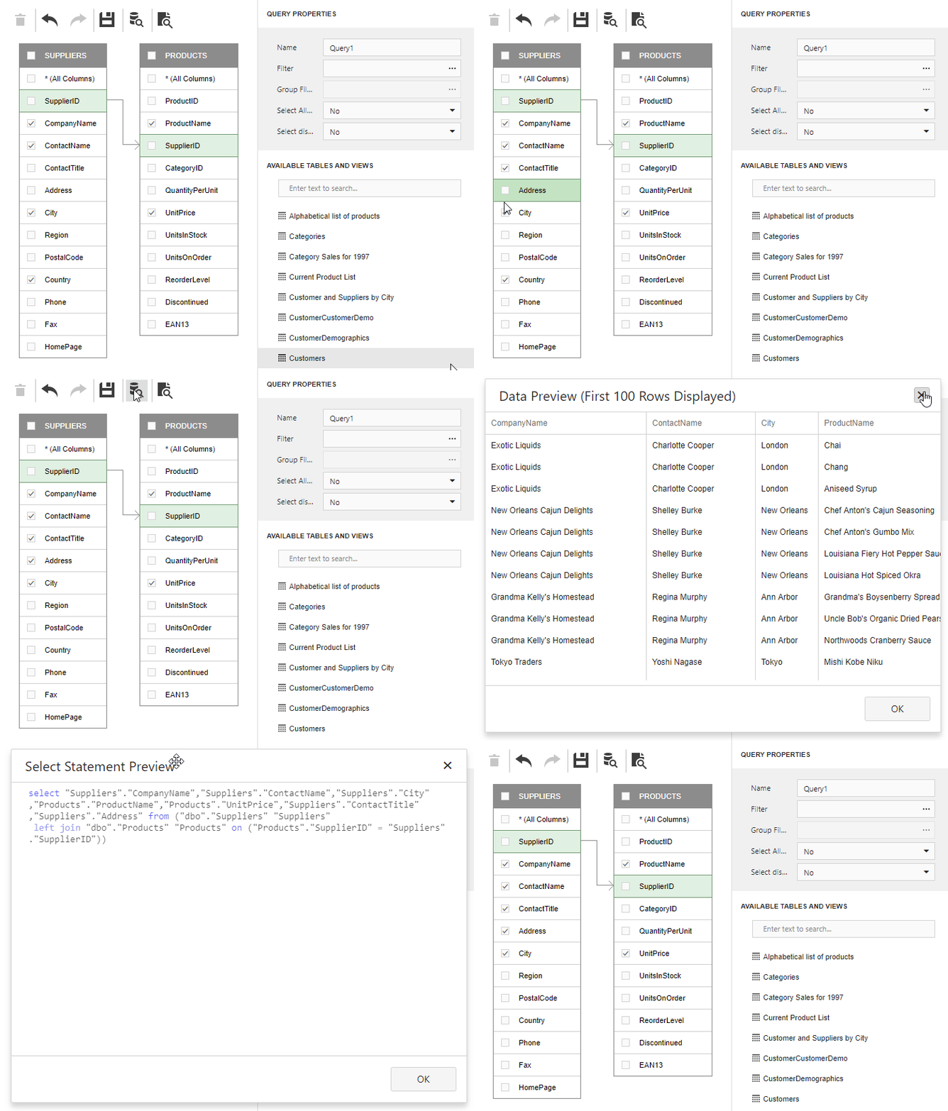
Blog Post Documentation
HTML5 Reporting Controls - Web Farm and Web Garden Support
The DevExpress HTML5 Document Viewer and End-User Report Designer can now work in Web Farm and Web Garden environments.
Documentation
HTML5 Document Viewer - Display Remote Documents
The DevExpress HTML5 Document Viewer can now display documents created with our Report Server (Report Server is an enterprise reporting platform and must be purchased/licensed separately).
Documentation
Miscellaneous Enhancements
Our Web Report Designer can now validate expression/data bindings specified for report controls, and indicate errors.
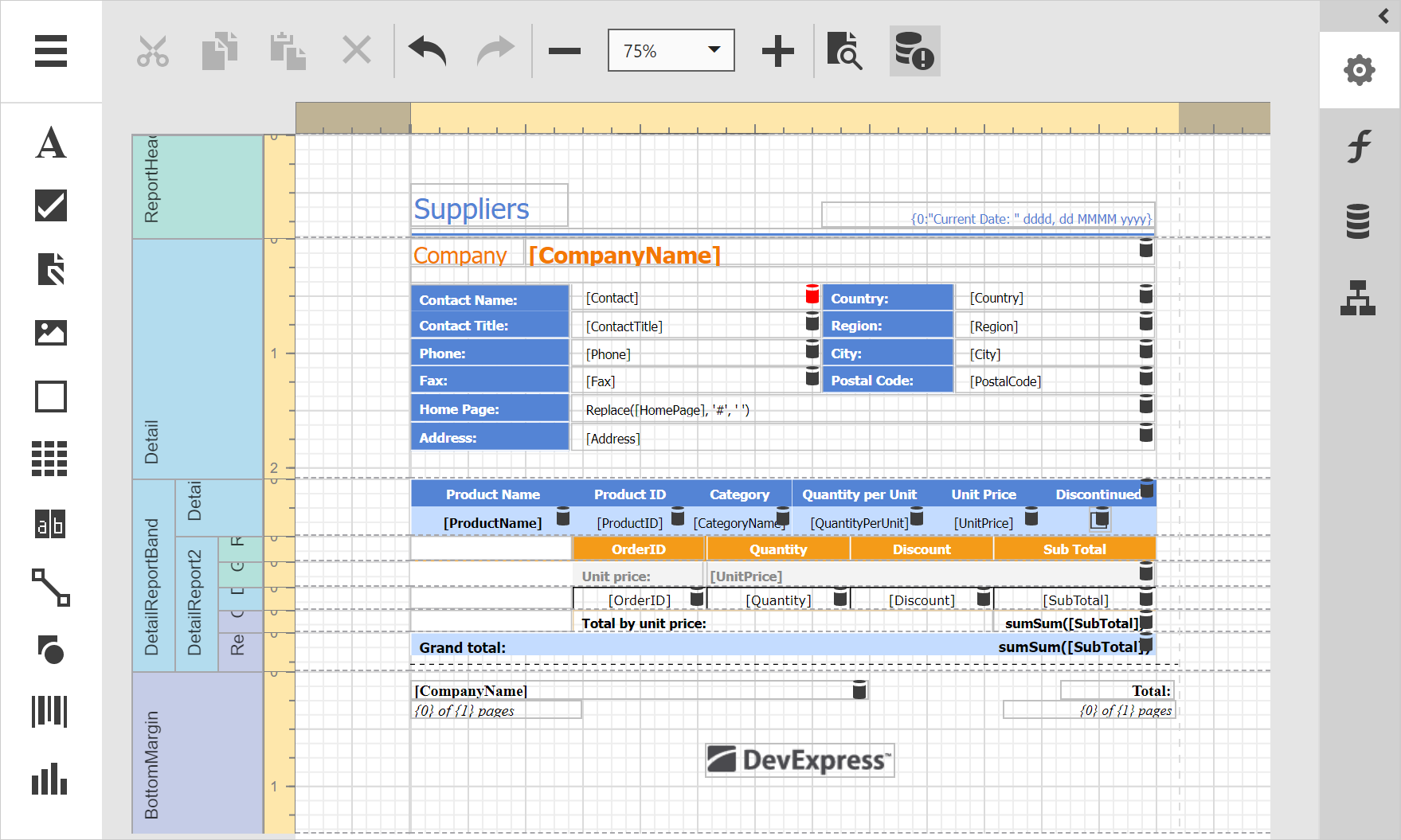
Documentation
Syntax highlighting for SELECT statements.
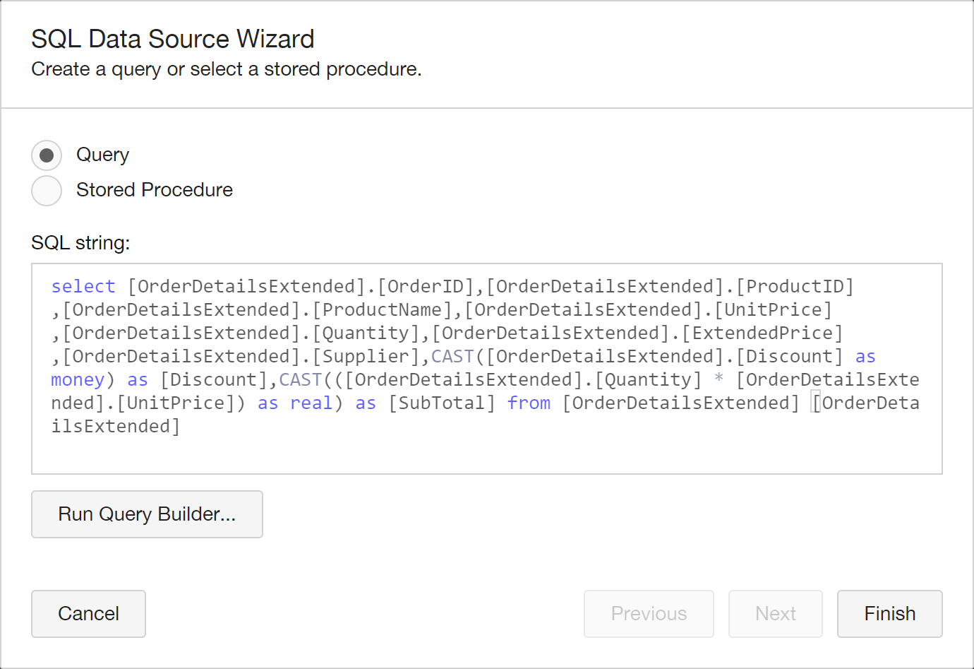
The Expression Editor now supports function descriptions (hints).
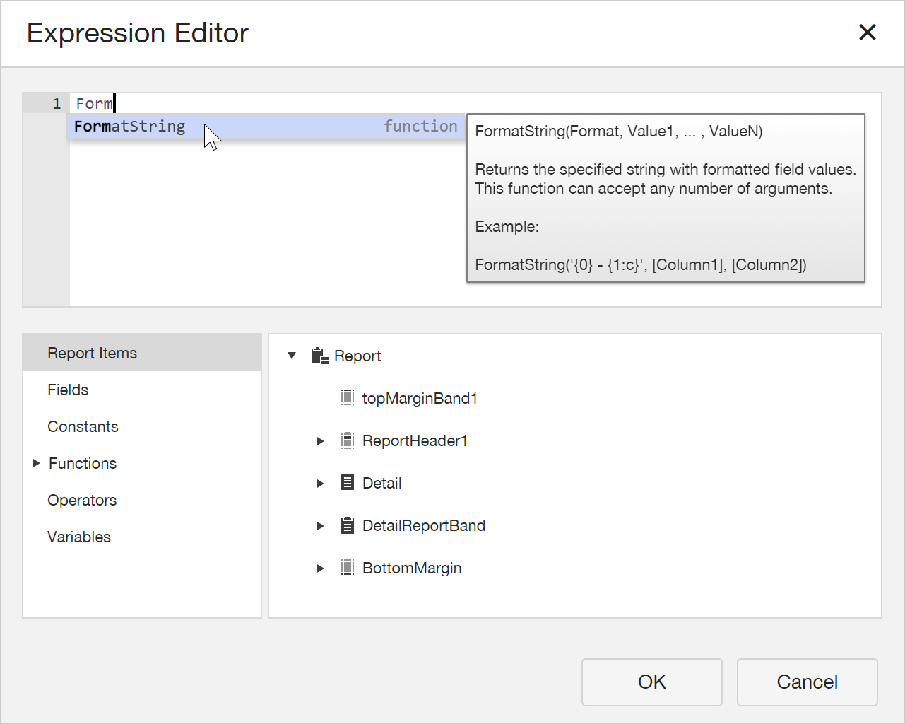
Miscellaneous enhancements include:
- Ability to rename the data source component.
- The XRTable control can span cells across multiple rows.
- HTML5 Document Viewer: Clicking a TOC item automatically selects the corresponding item in the Document Map.
WinForms Reporting
End-User Report Designer UX Enhancements
Contextual Tabs inspired by Microsoft Office: Contextual Tabs often display context specific commands, and as such, they don't need to be on constant display (they are displayed only when a specific object is selected or when an end-user performs a specific action).
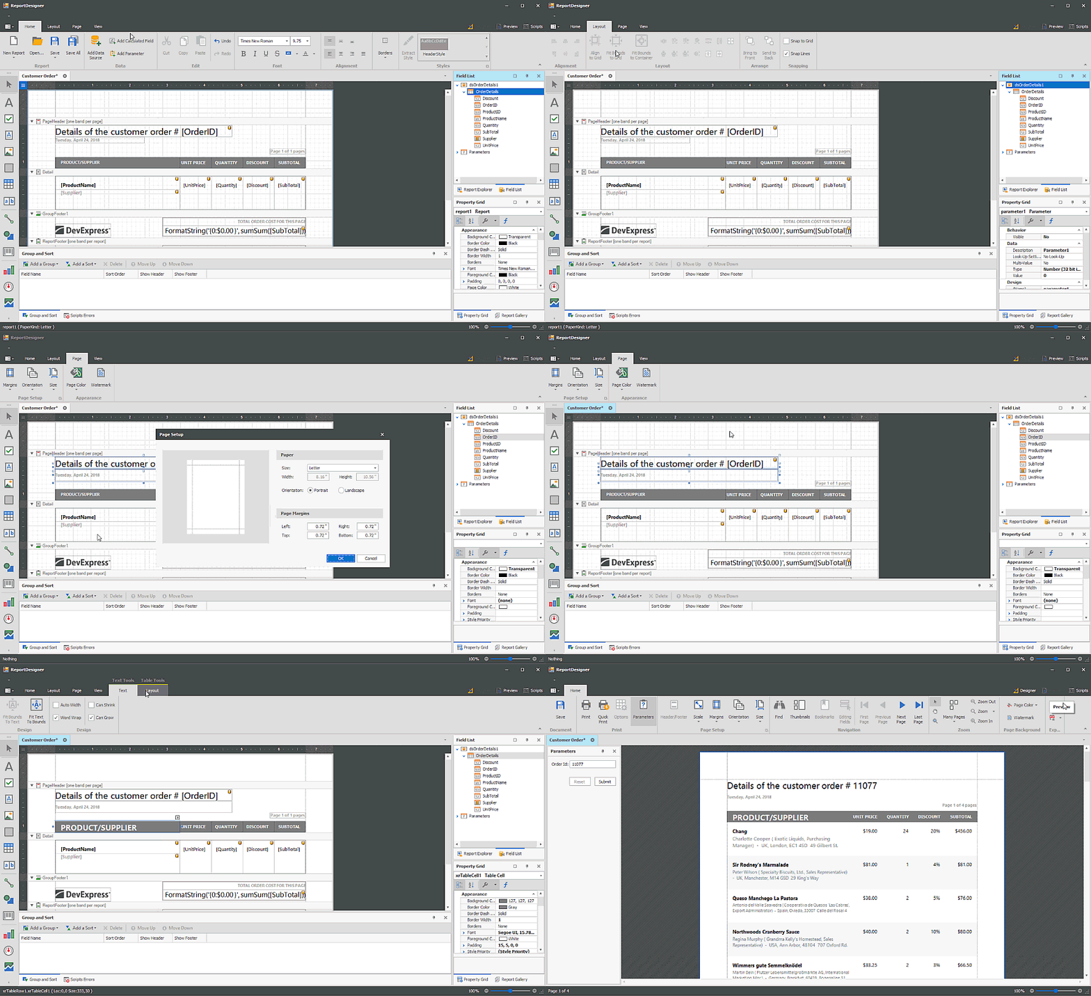
Documentation
Docking Light View
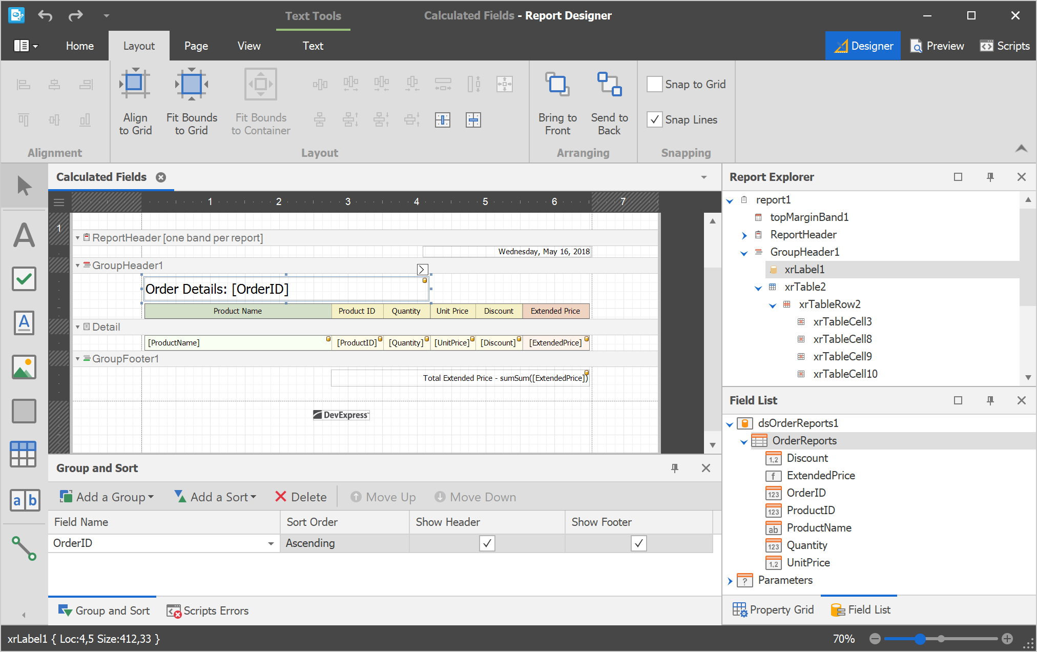
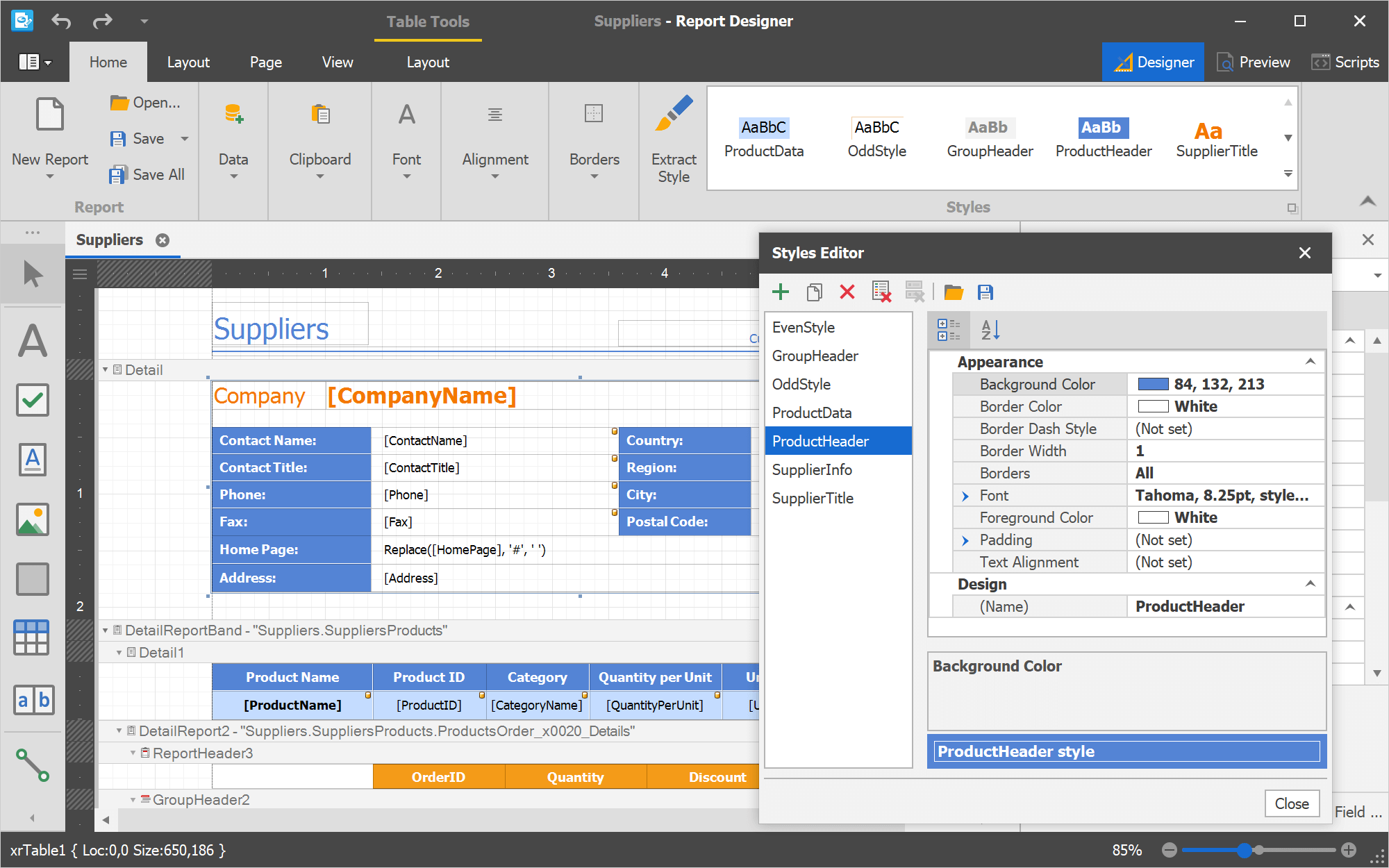
The Ribbon Style Gallery displays available report styles. End-users can assign any style to selected controls.
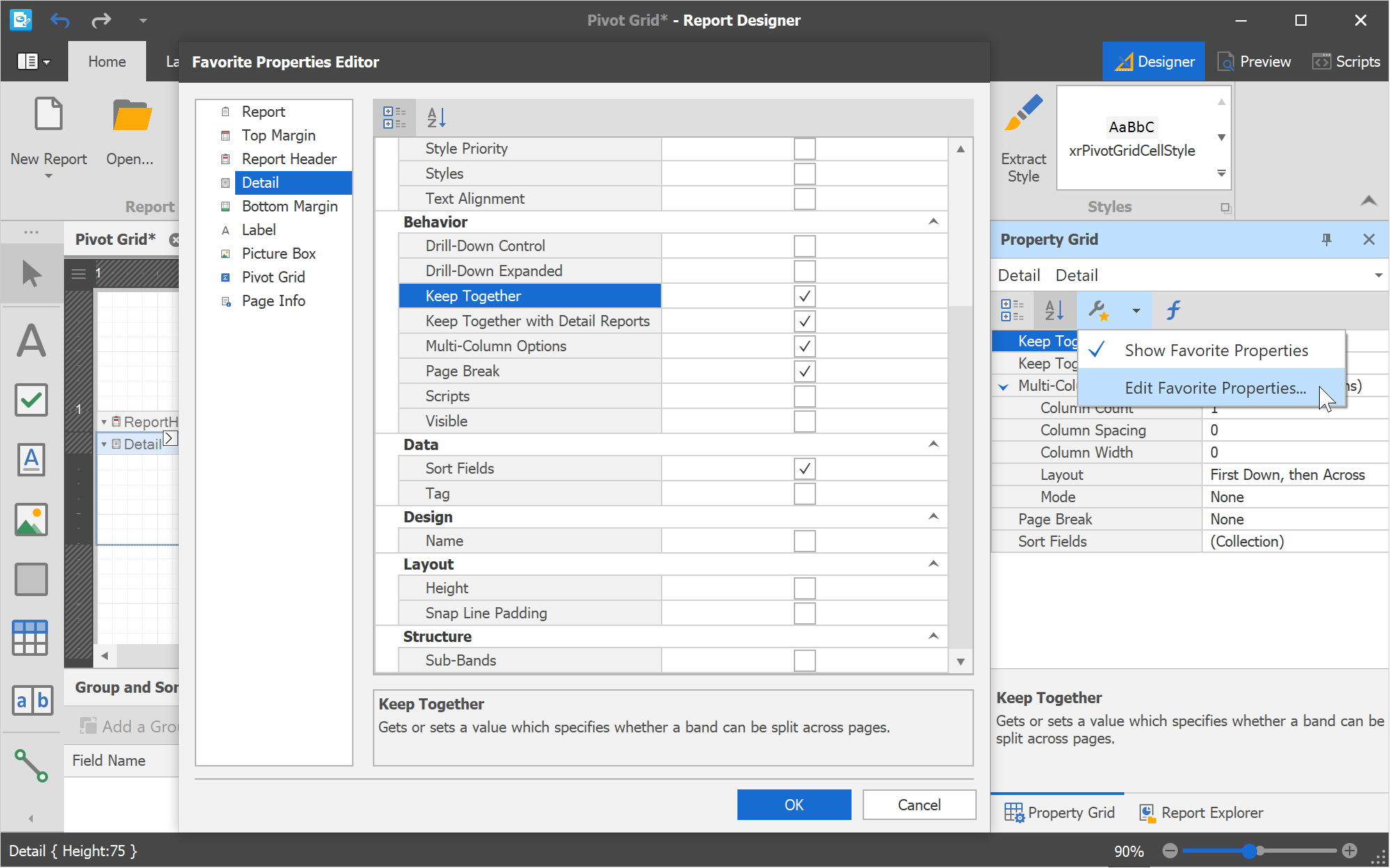
The Property Grid's Favorites Tab allows end-users to specify their favorite or most frequently used properties.
Blog Post Documentation
Page Setup Dialog - Custom Paper Size
With this release, our Page Setup Dialog (Print Preview, Report Designer) allows you to specify custom paper size.
Enhanced Filter Editor
We've improved the usability of our Filter Editor (when building filter criteria in Text Mode). New enhancements include:
- Intelligent Code Completion
- Column and Function Tooltips
- Input Validation and Error Indication
Documentation
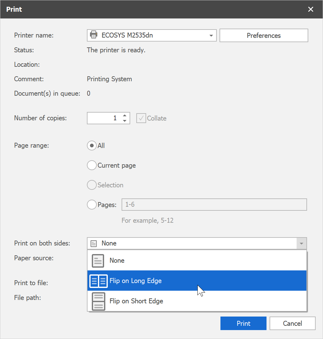
Duplex Printing
You no longer need to write any code for duplex printing. The following built-in modes are now available:
- Flip on Long Edge
- Flip on Short Edge
WPF Reporting
End-User Report Designer UX Enhancements
- Contextual Tabs inspired by Microsoft Office: Contextual Tabs often display context specific commands, and as such, they don't need to be on constant display (they are displayed only when a specific object is selected or when an end-user performs a specific action). Documentation
- The Ribbon Style Gallery displays available report styles. End-users can assign any style to selected controls.
- The Property Grid's Favorites Tab allows end-users to specify their favorite or most frequently used properties. Documentation
Page Setup Dialog - Custom Paper Size
With this release, our Page Setup Dialog (Print Preview, Report Designer) allows you to specify custom paper size.
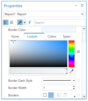
Office-Inspired Property Grid
To improve usability, our WPF Report Designer ships with an Office-inspired Report Properties Panel.
Documentation
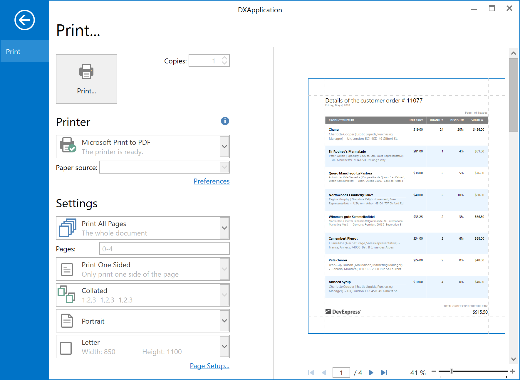
WPF Backstage Print Preview Control
We've implemented a new Print Preview control that replicates the Print screen available in Microsoft Office. This new control can be incorporated into a BackstageView based Ribbon Menu with ease.
Documentation
Duplex Printing
You no longer need to write any code for duplex printing. The following built-in modes are now available:
- Flip on Long Edge
- Flip on Short Edge
Document Scaling
This release introduces document scaling for our WPF Data Grid, TreeList, Pivot Grid and Chart controls. Scaling allows you scale down an oversized control to fit the paper's width, or scale up the control to print it across multiple sheets of paper.
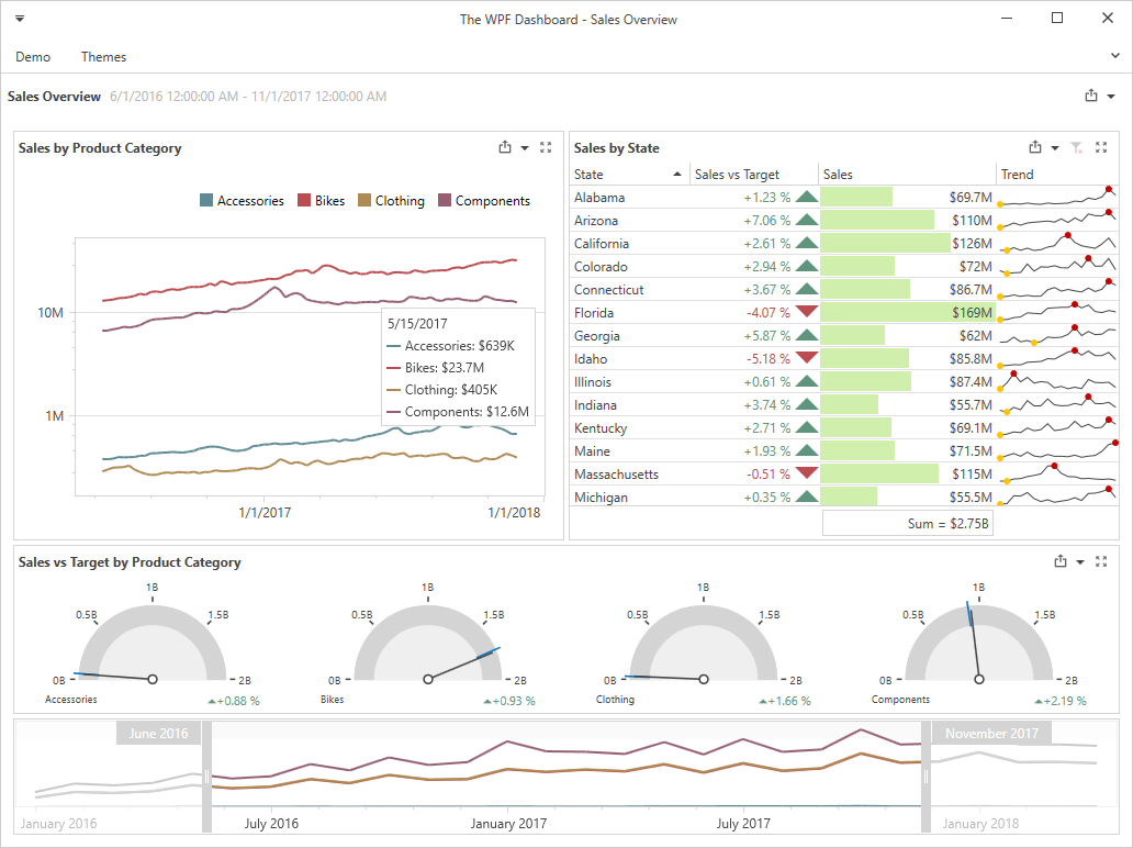
WPF Dashboard Viewer
We are proud to announce our new Dashboard Viewer for WPF. It ships with the same visualization feature as that of its WinForms counterpart. The DevExpress WPF Dashboard Viewer supports asynchronous data loading, templates, and DevExpress Visual Themes.
Blog Post Documentation
Web Dashboard
Mobile Layout
Our Dashboard Mobile Layout was first released as a community preview in December, 2017. The produce is now out of beta and can be used in commercial applications.
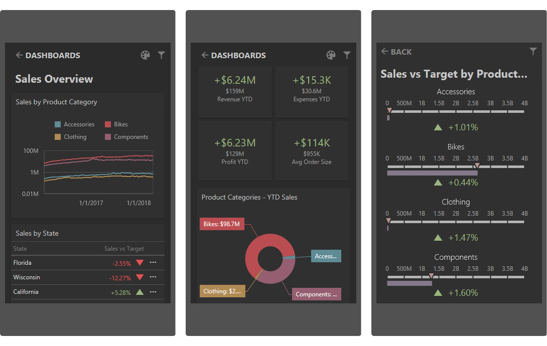
Blog Post Documentation
Create Calculated Fields from Binding Menu
End-users can now create Calculated Fields directly from a Dashboard Item's Binding Menu.
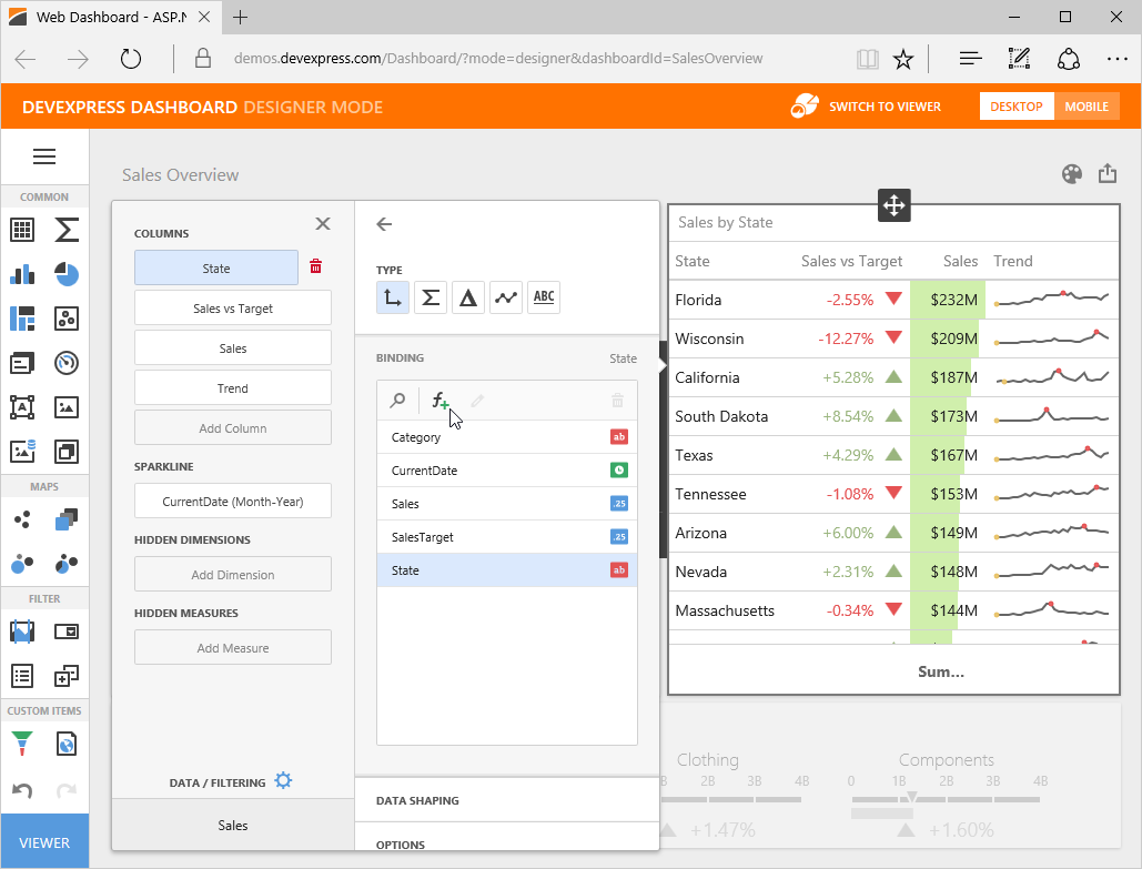
Documentation
.NET Core Support
With this release, the DevExpress Web Dashboard can be used in ASP.NET Core applications. Our Web Dashboard for ASP.NET Core supports full .NET Framework runtime and the modern .NET Core runtime - allowing you to host your applications on both Mac and Linux PCs.
Blog Post Documentation
Web Dashboard Designer - SQL Syntax Highlighting
To simplify usage, we've added SQL syntax highlighting to our Dashboard's Query Viewer and Editor.
WinForms Dashboard
Filter Editor Enhancements
With this release, our WinForms Dashboard Filter Editor has a textual pane with AutoComplete and Syntax Highlighting. This pane displays syntax errors, and allows end-users to use functions when building filter criteria.
Documentation
Dashboard Title and Caption Enhancements
With this release, we have added new customization capabilities. You can now add your own command buttons or dropdown lists to incorporate custom functionality.
Documentation
Dashboard Viewer - SVG Icons
To help improve rendering on High-DPI screens, we've replaced all raster icons with SVG icons within the DevExpress WinForms Dashboard Viewer.
Data Processing
Performance Enhancements
This release includes a number of data processing and calculation related enhancements. The multi-core data processing engine we introduced in our previous release can now be used for the following features/calculations:
- TopN Mode;
- Calculations with AGGR() Function;
- Sorting by Summary.
Visualization
Display a Dashboard Item Full Screen
End-users can now expand dashboard items to populate the entire dashboard. Supported platforms include: WinForms, WPF and Web Dashboard (ASP.NET Web Forms, ASP.NET MVC, ASP.NET Core and Client).
Documentation
A More Modern Administrative Panel and Localization Support (CTP)
The DevExpress Report and Dashboard Server ships with a new Administrative Panel UI, with localization support.
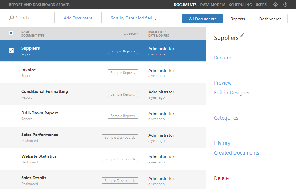
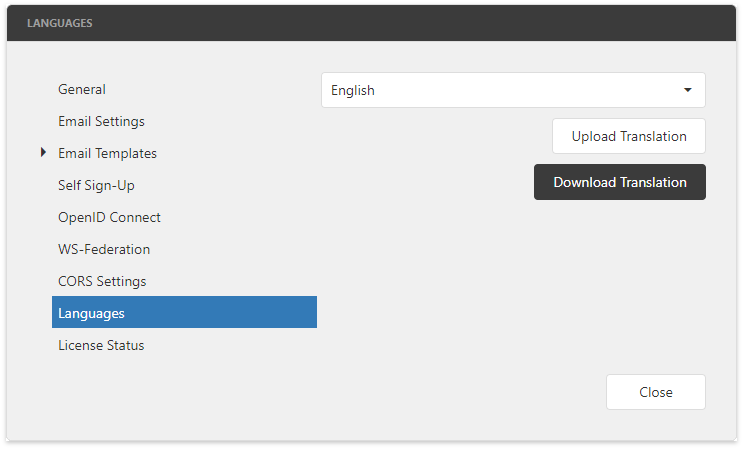
Documentation
PDF Document API
DirectX Rendering (Beta)
With this release, both our PDF Viewer for WinForms and PDF Document API support DirectX rendering:
- Support for all text rendering modes (e.g. using the text as a clip region for a drawing).
To use DirectX rendering, activate one of the following options:
- PDF Document API: enable the 'PdfDocumentProcessor.RenderPageContentWithDirectX' option;
- WinForms PDF Viewer: enable the 'PdfViewer.RenderPageContentWithDirectX' option;
Blog Post Documentation
Spreadsheet Document API
Spreadsheet Shapes
With this release, you can load, print and export to PDF worksheets that contain shapes.
Blog Post
Improved Chart Printing and Data Export
Our Spreadsheet Document API can now print and export (to PDF) worksheets with charts that contain series points with custom colors applied.
Blog Post
Miscellaneous Enhancements
Automatic Document Format Identification: With this release, if a document is loaded from a file without specifying its format, we automatically identify the document format based on its content (regardless of filename extension).
Our Spreadsheet Document API now includes its own Print method and no longer require the DevExpress.XtraPrinting library to print documents. You can print an entire Workbook or individual Sheet using default or custom printer settings.
Blog Post Documentation
Word Processing Document API
Microsoft Word Inspired Formatting and Layout
With this release, we've enhanced both layout and formatting accuracy when printing and exporting documents to PDF.
Blog Post Documentation
Checkbox Form Fields
With this release, our Word (RTF) Document API library supports checkbox form fields. You can create checkbox form fields, change their state and size, print and export to PDF and HTML.
Documentation
Miscellaneous Enhancements
Automatic Document Format Identification: With this release, if a document is loaded from a file or stream, we automatically identify its format based on its content. Documentation
Our Word Document API now includes its own Print method and no longer requires the use of the DevExpress.XtraPrinting library to print documents. You can print documents using default or custom printer settings. Documentation
ASP.NET Enhancements
New Lookup Property Editor (CTP)
With this release, XAF reference properties can be edited using the ASPxGridLookupPropertyEditor. This editor is based on the DevExpress ASP.NET Grid Lookup control. Features include:
- Multiple column support
- Server mode
- Incremental search capabilities
- Data filtering support
- Data sorting, and much more.
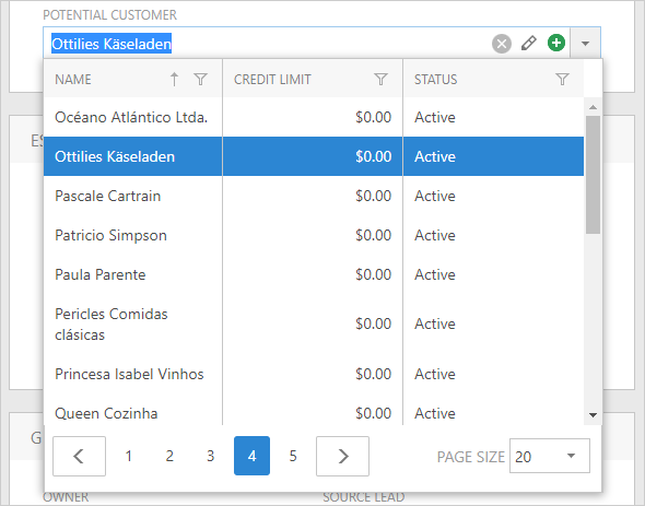
Documentation Blog Post
Concurrent Record Updates Merging
With this release, ASP.NET Web Forms XAF applications can handle concurrent record updates by merging simultaneous changes (by two or more different users).
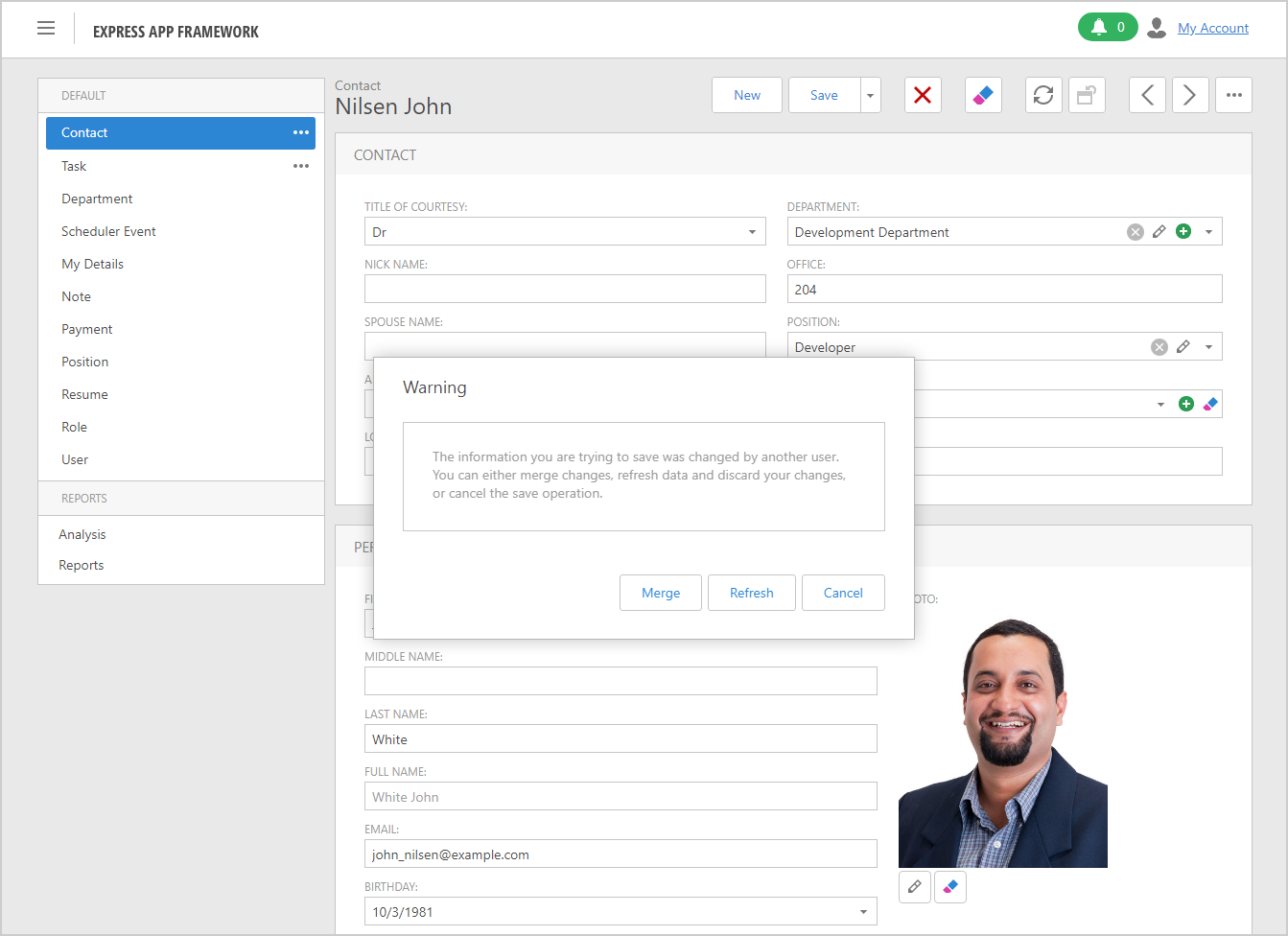
Documentation
Mobile Platform Enhancements
Mobile Report Viewer (CTP)
This release ships with our new Mobile Report Viewer. The Report Viewer allows end users to view (and download) reports on mobile devices.
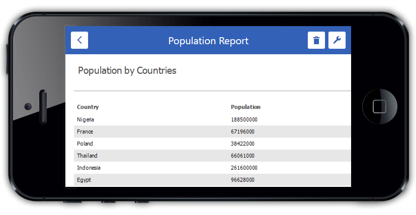
Blog Post
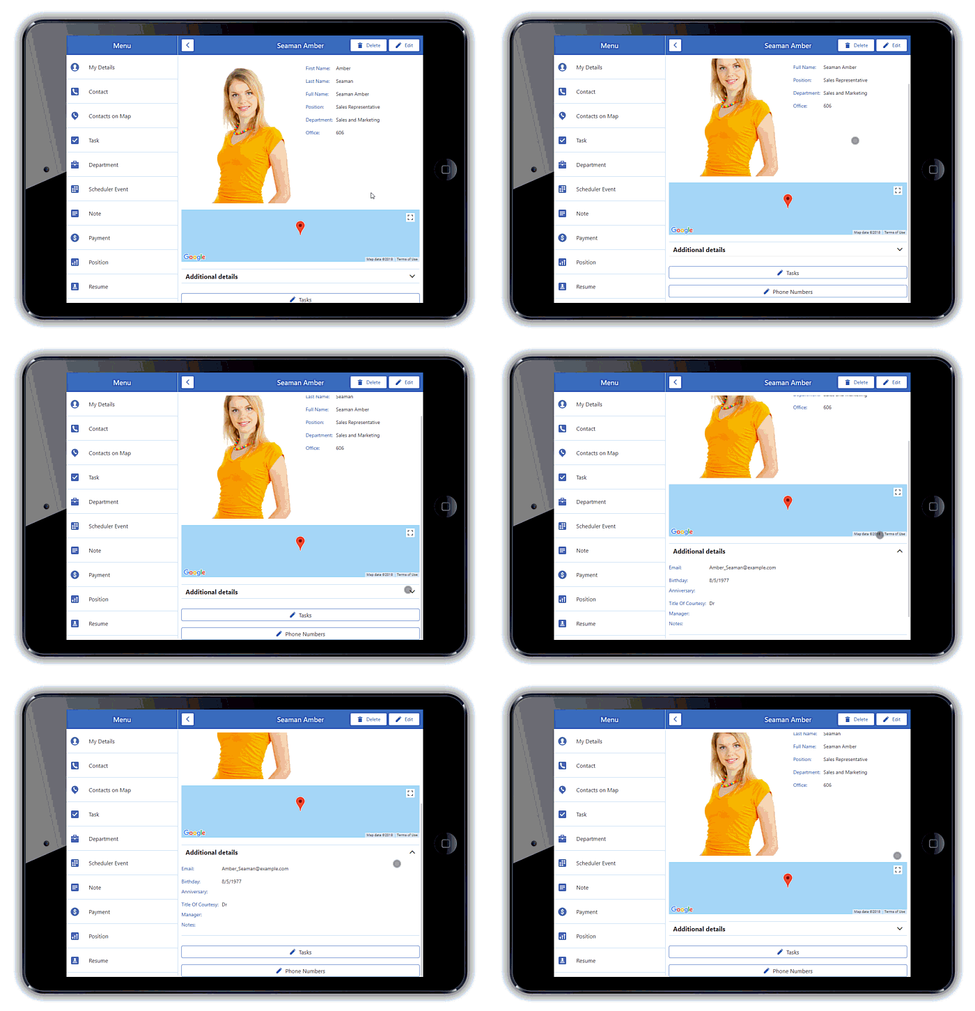
Layout Enhancements
XAF's DetailView layout integrates DevExtreme Form and Accordion widgets - allowing you to configure tabs and collapsible layout groups. As a result, designing forms with complex data layouts and supporting apps for wide screens is now much easier.
Additionally, our MobileImagePropertyEditor allows you to change its image in Edit mode.
Security System Enhancements
Security Diagnostics Tool
Our Security Diagnostic Tool helps you learn more about why access to a specific object and its members was granted or denied.
Documentation Blog Post
WinForms UI Improvements
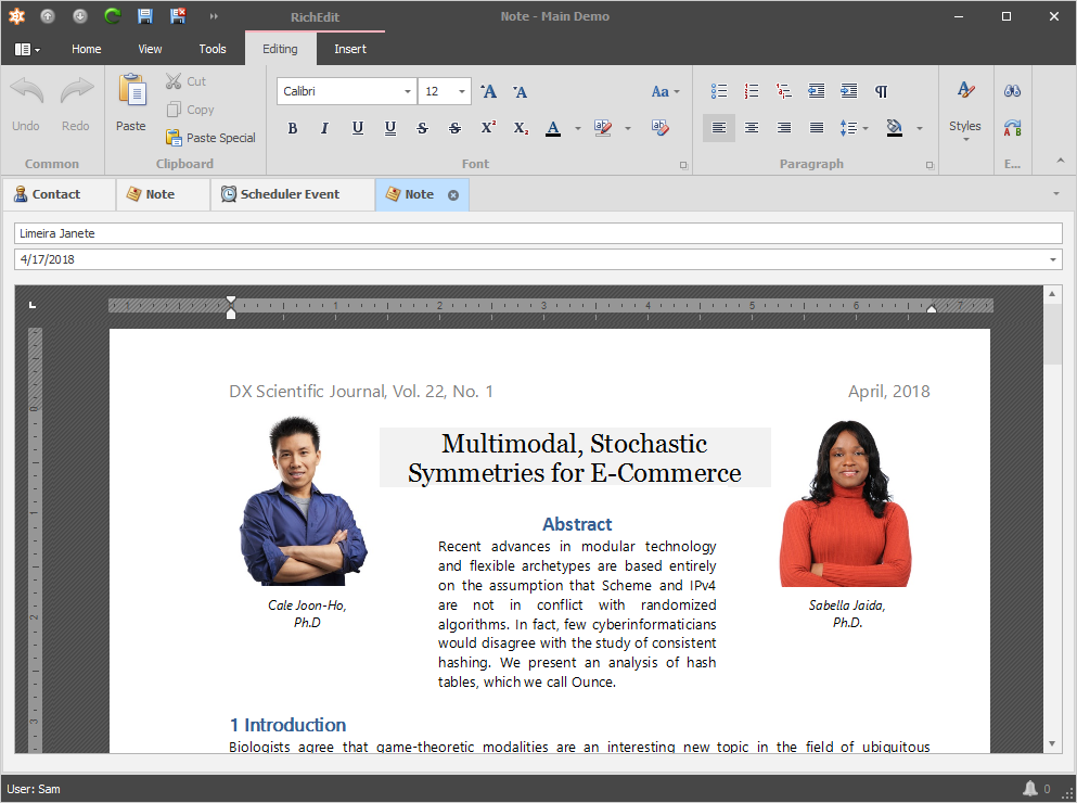
New Office-inspired Word Processing Module (CTP)
XAF v18.1 introduces a new reusable word-processing module. This module integrates the DevExpress WinForms Rich Text Editor - allowing end-users to create, load, change, print, save and convert documents in different formats.
Documentation Blog Post
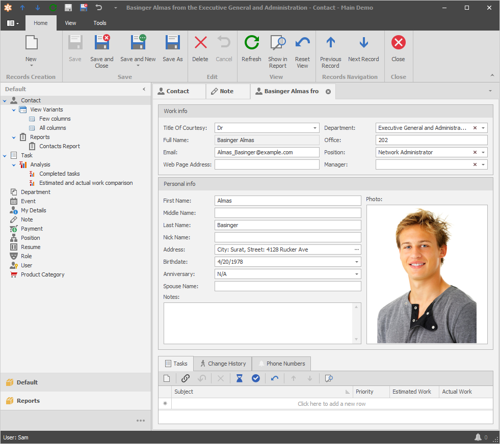
SVG Icons
With this release, the following visual elements support SVG images:
- Main menu and context menus
- Detail View layout groups and tabs
- Built-in property editors
- Form templates, etc
To obtain the entire list of visual elements that support vector images, refer to the following article.
Blog Post
PostgreSQL
PostgreSQL - Display materialized views in the list of tables
SQL Data Source
SQL Data Source Filtering Enhancements
Our updated Filter Editor allows you to use various functions when specifying filter criteria for SqlDataSource. These functions are available in our new text mode and include the following features:
- Intelligent Code Completion
- Column and Function Tooltips
- Input Validation and Error Indication
You can open the extended Filter Editor from both the Query Builder and from the Property Grid (for filter string and group filter string).
XPO - ORM Library
Available Free-of-Charge without Technical Support
With v18.1 release, we're making XPO available free-of-charge. Blog Post
PostgreSql 3.1 Support
XPO now supports Npgsql v3.1. System.Guid properties are mapped to the UUID database column type by default. To revert to previous behavior and map System.Guid properties to CHAR(36), activate the GlobalUseLegacyGuidSupport or UseLegacyGuidSupport options (PostgreSqlConnectionProvider).
Firebird 3.0 Support
FirebirdConnectionProvider now supports:
- Firebird 3.0 Server
- Client ADO.NET data provider (FirebirdSql.Data.FirebirdClient 5.8.0);
- Criteria Functions for Firebird 2.1+ (Substring, AddMonths, AddYears, CharIndex, Round, Remove, Insert, Exp, Power and Replace)
Documentation
Nullable Columns
We've extended our core APIs (e.g. Session, XpoDefault, XPDictionary, ORM Data Model Wizard) with new options that allow columns to accept Null values.
You can also use ColumnDefaultValue, ColumnDbDefaultValue, Nullable, NullableBehavior code attributes and specify the required behavior declaratively.
.NET Core Enhancements
XPO now supports the following:
- ADO.NET provider 5.11+ for Firebird.
- Oracle Data Provider for .NET Core 12.2 Beta 2.
- XPO Profiler supports ASP.NET Core projects. Lean more
- Dependency Injection for ASP.NET Core projects. We've implemented new extension methods for the standard IServiceCollection interface to register XPO services for the ASP.NET Core pipeline.
Blog Post
Miscellaneous Enhancements
- The ORM Data Model Wizard, ORM Persistent Object, ORM OData Service project and item templates are available in the DevExpress Template Gallery.
- Table lists can be fetched from an ASA (SQL Anywhere) database.
- We have optimized our Oracle connection providers. OracleDecimal columns are now processed up to 5 times faster.
- ContainsOperator or 'Any of' Aggregate for the WcfInstantFeedbackSource / WcfServerModeSource and ODataServerModeSource / ODataInstantFeedbackSource components (DevExpress Data Library).
LINQ to XPO improvements include:
- A second Select can be applied to a joined table.
- The 'Equals' operator has been replaced with 'IsNull' operator.
- Expression Injections (e.g. PersistentObject.CollectionProperty.AsQueryable().Any(SomeExpression)).
Code Formatting
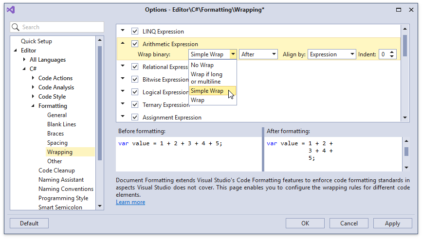
Simple Wrap
The new 'Simple Wrap' formatting option allows you to configure wrapping of only those line parts that exceed the margin, performing a non-greedy wrapping and adding a minimal number of line breaks.
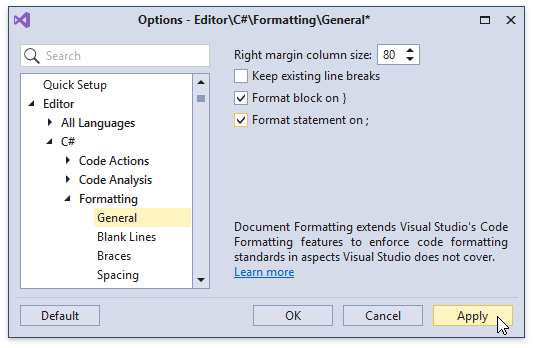
Auto Format Code
We have added new options to Auto Format code as you type (after pressing the } and ; keys).
Extended Formatting Options
We extended code formatting options with the following settings:
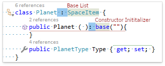
Bitwise operators (&, |, and ^), Relational operators (==, !=, <, >, <=, and >=), null-coalescing operator ("??"), base types list and constructor initializer now have individual wrapping and spacing options.
Removal of Excessive Line Breaks.
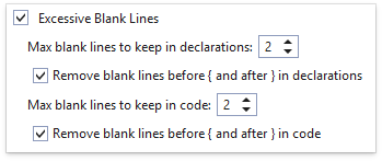
Blank line configuration options for #region directives.
-
Separate Line Break configuration options before "else", "while", "catch" and "finally" keywords.
Documentation
Code Templates
Selection to Template
We have added the ability to create a template right from your code using a context menu. Select the code to become a template, right-click and choose Selection to Template...
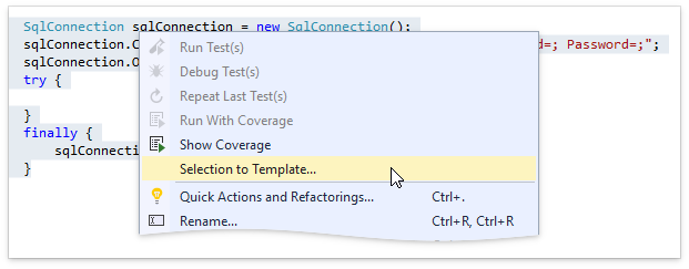
CodeRush automatically creates Links and Fields based on the selected code and opens the new template in the Template Editor.

Blog Post Documentation
Use Type in Templates
You can now easily include any type in the CodeRush templates system as a Template Name Variable. Just right-click the type anywhere it appears in the Visual Studio editor and choose Use Type in Templates....
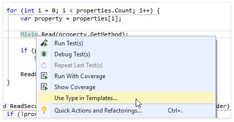
After adding the new type, it will instantly become available in all type-aware templates, including declaration verbs like "m" (for methods), "p" (for properties), "q" for constants, "t" (for types) and "v" (for variables).
Documentation
Template Duplication
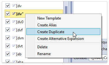
Now you can create new templates based on existing templates. Just right-click the template you want to duplicate (in the Templates options page), and select "Create Duplicate". Enter a new template name, and change the expansion or context as needed.
Documentation
Smart Duplicate Line Improvements
Smart Duplicate Line (SDL) gets even smarter and morphs into Smart Duplicate Selection (SDS). You can now press Shift + Enter to duplicate the selected code block. SDS duplicates the selection, placing text fields around the code - parts likely to change in the duplication.
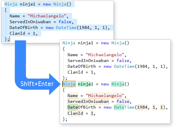
This feature can be used in any language Visual Studio supports. You can use SDS to duplicate CSS styles, HTML controls, parameters in method declarations, binary expressions, arguments, string constants and entire method blocks. Smart Duplicate Selection will also remember changes you make in each file and suggest those same changes in similar duplications you perform in the same file.
Blog Post Documentation
Layered Options
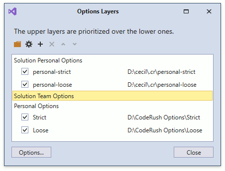
CodeRush now stores your settings in Layers, which allow you to bind settings to a particular solution and team, in addition to personal preferences which can serve as defaults (unless overridden by team/solution settings) or, if needed, personal settings can override team/solution settings.
You can use this feature to create solution-dependent options and share them with your entire team. These options are applied automatically to all team members using CodeRush when the solution is open.
Code Analysis
Code Metrics
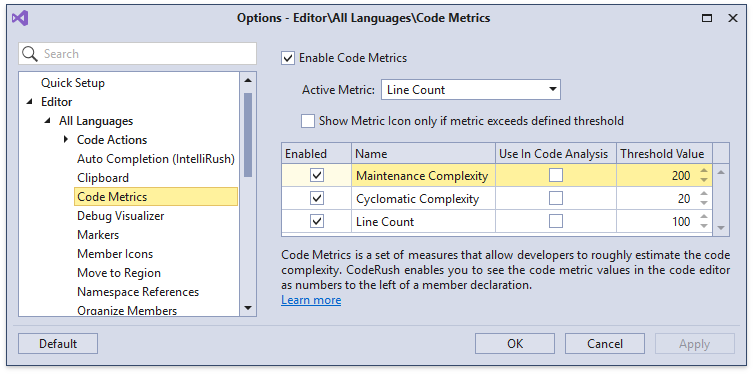
Code Metrics now support a Threshold Value setting that determines when the metric appears and when/if the metric contributes to code analysis. This allows code analysis to report members that exceed your specified complexity thresholds.
Documentation
Code Issues Catalog
CodeRush Analyzers now appear in the Code Issues Catalog. You can use this options page for the following tasks:
- Enable/disable specific Code Issues.
- Add/remove Code Issues to/from Visual Studio's background analysis.
- Specify the severity of each Code Issue.
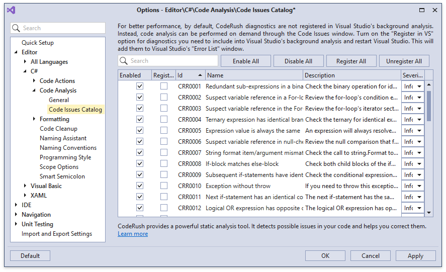
Documentation
Refactorings and Code Providers
Invert Selection
The Invert Selection code provider inverts selected lines of code in a variety of ways:
-
Assignments (a = b → b = a)
-
Boolean literals (true → false)
-
Addition/substraction assignments (a += b → a -= b)
-
Equality operators (== → !=)

Documentation
Remove Unused Assembly References
We have added the ability to remove unused assembly references from your projects, accessible through the project's right-click context menu:
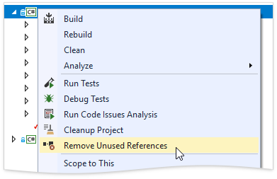
Documentation
Unit Test Runner
.NET Memory Profiler Integration
You can now run unit tests under SciTech Software’s .NET Memory Profiler. If this third-party product is installed, you can use the Run Under Memory Profiler option to run tests designed to identify memory leaks and other memory usage issues.
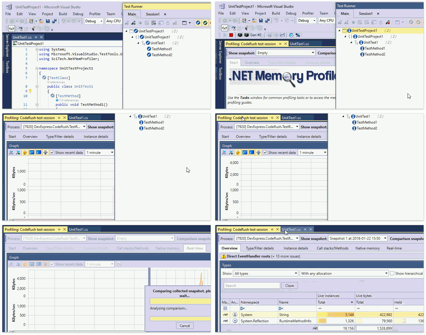
F# Support
CodeRush Test Runner now supports running tests created for the F# language.
Test Runner UX Enhancements
Code Style
Default Visibility Modifier
You can now change the default visibility modifier CodeRush uses for generated members.
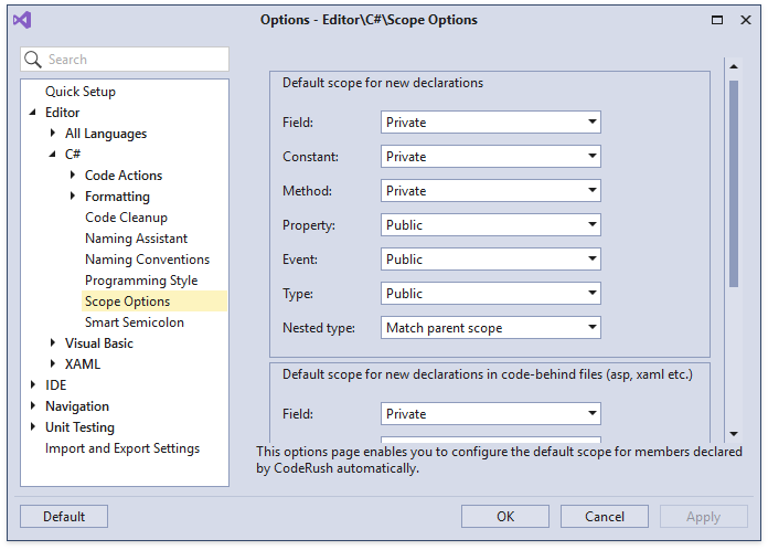
This setting is used by Declaration Providers, Templates and other features that generate new members from scratch.
Documentation
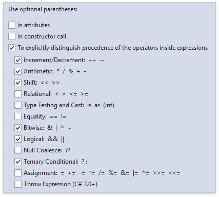
Optional Parentheses
There's a new Code Style option that lets you set preferences for adding clarifying (but optional) parentheses to your code.
Miscellaneous Enhancements
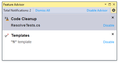
Feature Advisor
The Feature Advisor introduces CodeRush features likely to improve your coding efficiency based on the ways you create and modify code in the editor.
Blog Post
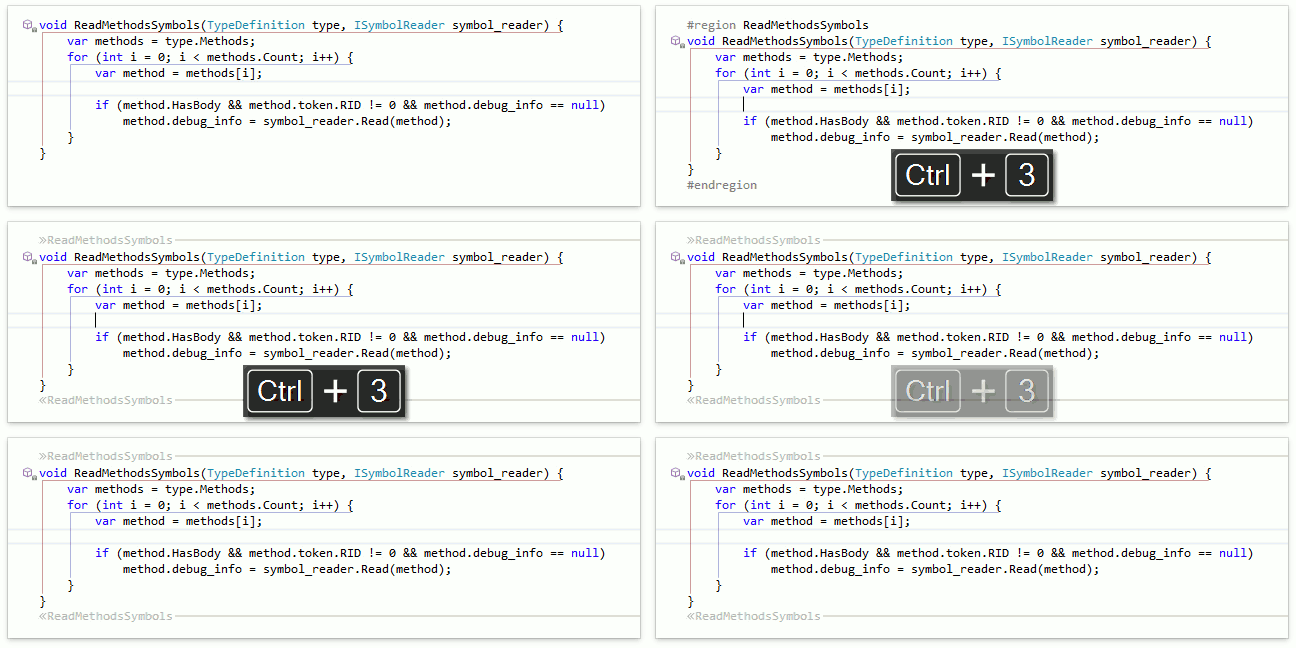
Region Creation
Press Ctrl+3 to automatically create a region around the current member or selection instantly.
Documentation
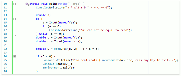
Right Margin Line
The Right Margin Line can help you keep code lines from getting too long or exceeding style guidelines. The margin serves as a visual indicator showing lines that have overrun the specified line length.
Documentation
XML Support
The following features support XML markup language now:
Filtering in Jump To Members
Type, member, and access filtering is now available for the Jump To Members navigation feature.
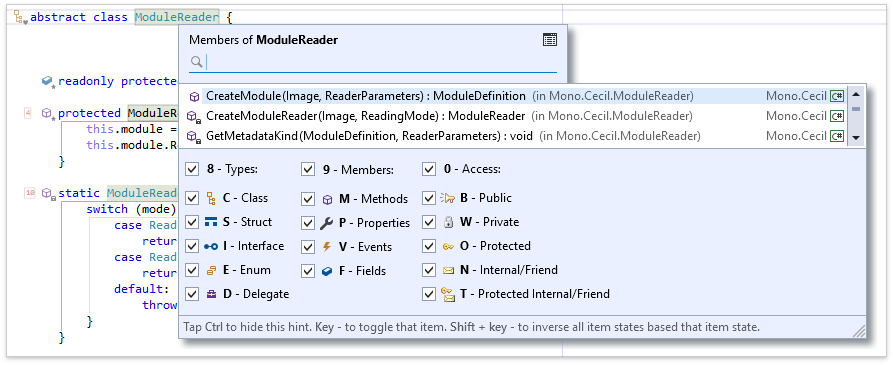
Documentation
New Object-Relational Mapping Tool (Beta)
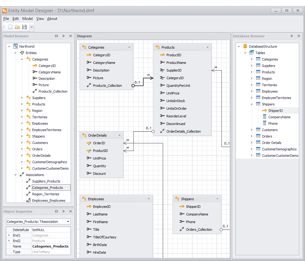
The VCL ExpressEntityMapping Framework is an object-relational mapping (ORM) tool that simplifies data access and management by converting relational data into objects, properties, and collections for use in code. With this tool, you can query data and implement business logic using entity models and an object-oriented approach instead of handling the low-level data access and constructing/executing SQL statements manually.
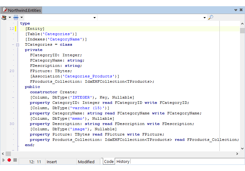
The ExpressEntityMapping Framework ships with the following features:
- Support for the Code-First, Database-First, and Model-First approaches to application development;
- A standalone application that helps you design entity models in a visual fashion, and generate classes based on them;
- Transparent and controllable object-relational mapping via built-in attributes or registration functions;
- Support for Oracle, Microsoft SQL Server, MySQL, Firebird, SQLite, and Microsoft Access database engines;
- Comprehensive database generation, updates, and integrity validation based on definitions of your entity classes;
- Advanced support for existing databases with the capability to prohibit changing their schemas;
- Data access using FireDAC and dbGo ADO connection components – no additional connections are required in your existing applications;
- A dataset component allowing you to bind entity objects to data-aware controls;
- Easy-to-build object queries allowing you to retrieve, sort, and filter data using LINQ expressions, object-based criteria syntax, or plain text, including calculated conditions and a wide set of criteria operators and functions;
- An advanced parser supporting a database-independent criteria string syntax;
- Support for ordinal, real, enumerated, and Nullable types, string fields/properties of unlimited size, and BLOB data serialization;
- Custom object identifiers (keys) allowing you to mark a field/property of any supported data type as a key by a corresponding attribute;
- IEnumerable and IEnumerable<T> object collections and LINQ expression results.
Ribbon and Toolbars
This release adds the following enhancements:
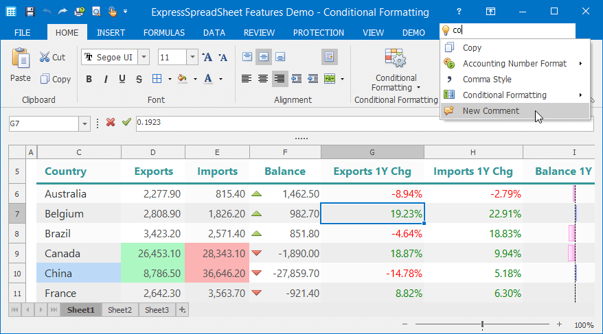
- A new Search Toolbar that follows the ribbon tabs displayed in the tab area;
- A new editor that allows end-users to search toolbar/ribbon commands by their captions and display search results in a drop-down window. This editor is designed for use in two use-case scenarios: either standalone or when embedded in toolbars or ribbon groups. When embedded in the new Search Toolbar, the editor allows you to mimic the 'Tell Me' box available in modern Microsoft Office applications.
Data Export – Improved Performance
With this release, we've improved our data export engine’s performance and optimized memory usage when exporting data.
-
Grid Views without master-detail data presentation are now exported up to 8 times faster and use up to 4 times less memory than in previous releases.
-
The TreeList control’s data export is up to 9 times faster and consumes up to 13 times less memory when compared to previous versions.
-
XLSX export compresses XML files and streams compressed data to the resulting file without storing temporary XML files in memory.
Grid Control
Improved Customization Options
We've improved the quick band/column customization functionality with:
- A three-state check box allowing users to toggle the checked state of all items on the list;
- A check box allowing users to sort items alphabetically;
- Ability to switch the checked state of selected items by pressing the Space key;
- Ability to select multiple items by pressing and holding the left mouse button and moving the mouse pointer over them. In addition, end-users can hold down the Ctrl key to invert the selection and thus select non-contiguous items.
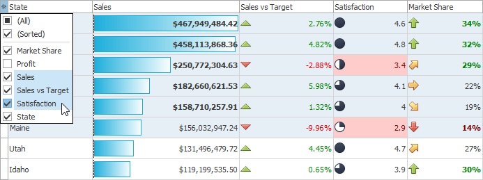
Miscellaneous Enhancements
- We've added the ability to manage and apply conditional formatting rules in the Layout and Data Editor at design time.
- The indicator cell for a row now displays a new icon in response to displaying an in-place Edit Form.
Hybrid Touch-Friendly Scrolling
With this release, we've added a scrollbar mode similar to that found in Universal Windows Platform (UWP) apps that run on Windows 10. This mode is a hybrid of the classic mode and the touch-friendly scrollbar mode introduced in v17.2. In the new mode, the scrollbar thumb appears when an end-user hovers the mouse pointer over a control or scrolls through its content. Hovering the mouse pointer over the scrollbar thumb or its movement path transforms the thumb to a traditional scrollbar.
Moving the mouse pointer away from the scrollbar reduces it back to the thumb. The thumb disappears if the mouse pointer is stationary or the control is not scrolled for some time.
You can enable the new scrollbar mode by switching the corresponding option in a skin (or look&feel) controller.
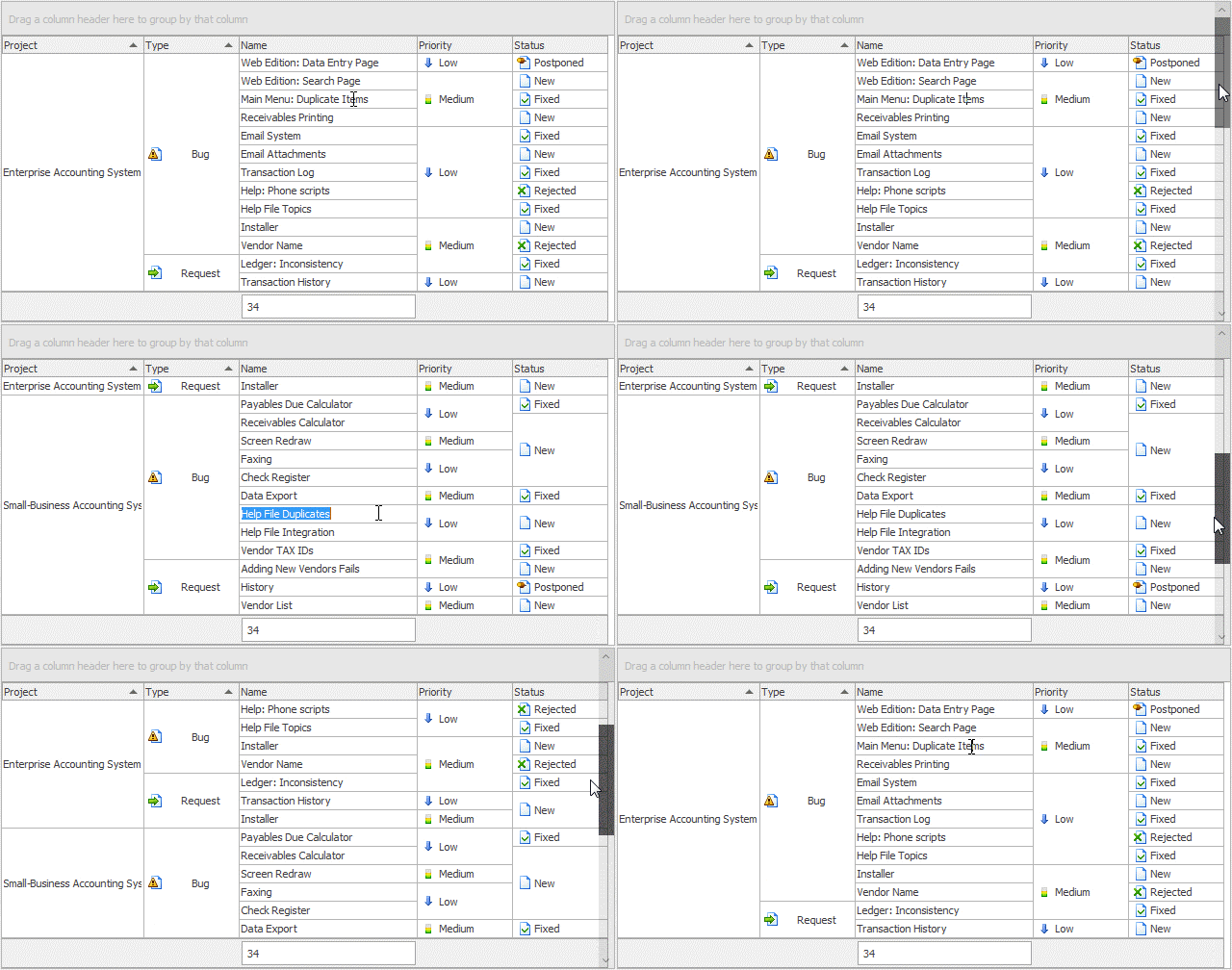
PDF Viewer
Bookmarks and Hyperlinks
The VCL PDF Viewer now allows you to display bookmarks within its Navigation pane for PDF documents that include bookmarked sections. This release also adds support for hyperlinks (both external links and links to specific parts in a loaded document).
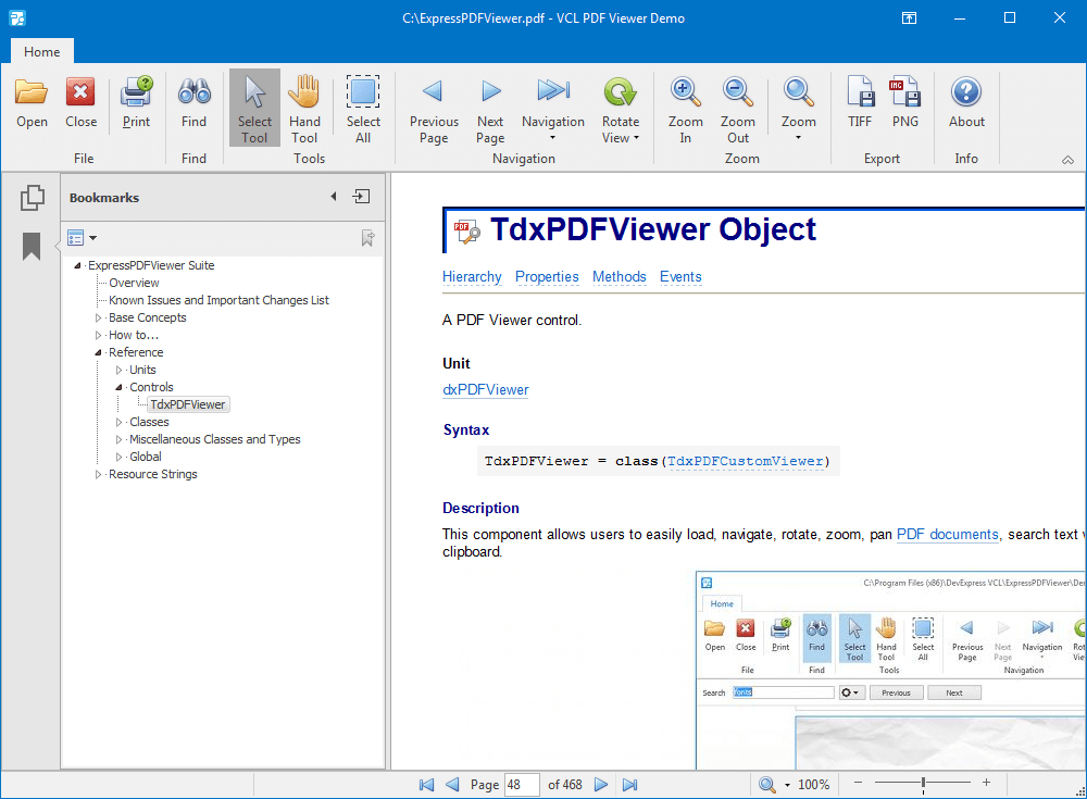
Page Thumbnail Navigation
With v18.1, we've added navigation by page thumbnails. Page thumbnails represent miniature previews of document pages. The Page Thumbnails panel located in the Navigation pane allows end-users to do the following:
-
Navigate through the document by clicking page thumbnails;
-
Enlarge or reduce the thumbnail size;
-
Select thumbnails using mouse clicks combined with the Shift or Ctrl key;
-
Print pages which correspond to selected thumbnails.
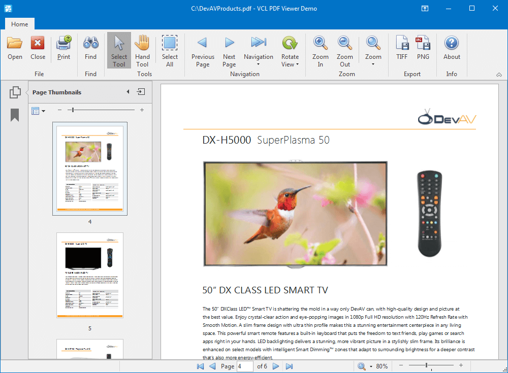
Miscellaneous Enhancements
- Multi-threaded content rendering improves performance when scrolling, zooming, or rotating pages;
- The PDF Viewer can now display a 'Locked View' image when opening a PDF document. This is especially useful for large documents.
Scheduler Control
Google and Microsoft Office Calendars
v18.1 introduces a storage component that allows users to create, display, or modify appointments on Google and Microsoft Office calendars.
Accessing calendar data requires that you obtain OAuth 2.0 credentials for your application and specify them via the new authorization components introduced in this release.
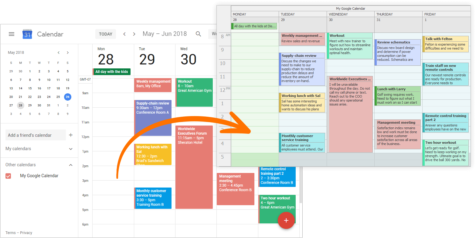
Agenda View
Appointments can now be rearranged using drag and drop.
Skins Library
Vector (SVG) Skins
v18.1 adds full support for SVG (Scalable Vector Graphics) skins. The release ships with a new skin (The Bezier) first introduced in our WinForms product line and which is based entirely on SVG images. This new skin allows our VCL controls to look perfect on any screen with any DPI settings. The Bezier is the first skin that ships with UI elements that allow users to change the skin palette and instantly re-paint the entire skin at runtime. You can choose from dozens of unique palette presets or easily create a custom palette to apply a corporate style to your application.
Skin Editor Enhancements
This release adds the following enhancements:
- The new tabbed MDI UI simplifies the manner in which you switch between skins and their elements.
- The Project Manager and tabs allow you to reorder skins in a project using drag and drop and Move Up/Down buttons.
- A Find Panel allows you to quickly locate skin elements in product groups.
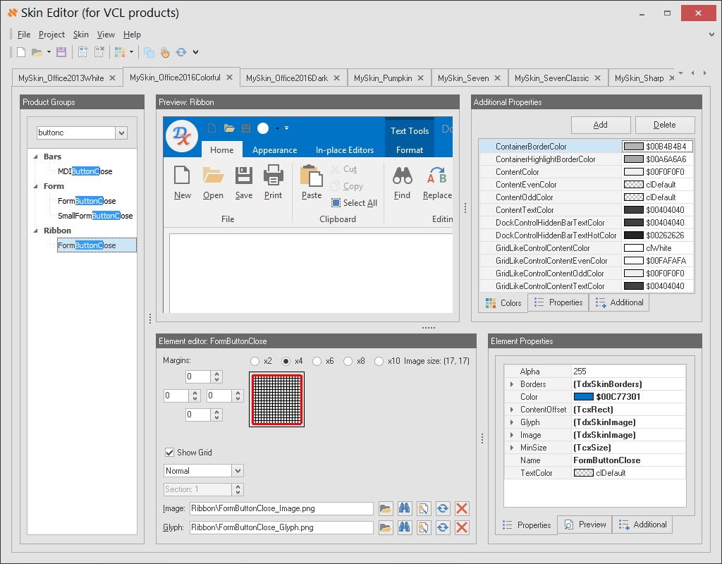
TreeList Control
Node Filtering
The VCL TreeList control now provides the following node filtering options:
- The end-user ability to build filter criteria using the Filter Control component (TcxFilterControl).
- A new Filter property allowing you to programmatically specify filter criteria.
- A new OnFilterNode event enabling you to dynamically filter out individual nodes.
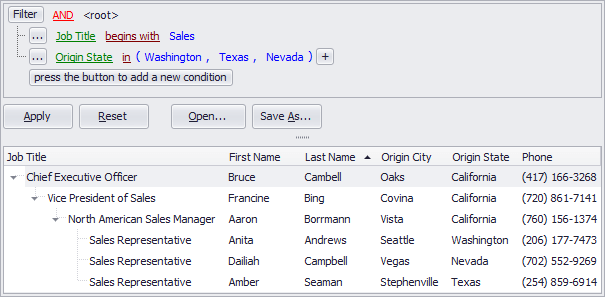
TreeList & Vertical Grid Controls
Find Panel
We've added the Find Panel functionality first seen in our Grid control to the TreeList and Vertical Grid controls. These controls offer numerous options to customize the display and behavior of the Find Panel.
