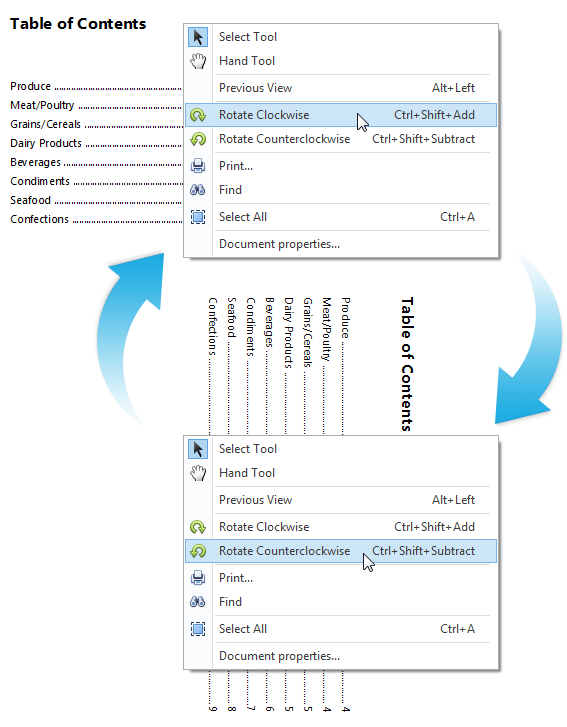
New TileNav Pane
Designed to be positioned at the top of your application window (like a Ribbon), the TileNavPane can be thought of as a touch-friendly version of traditional navigation elements used within Windows desktop or touch-enabled hybrid apps. With the new WinForms TileNav Pane, you and your end-users will be able to:
- Navigate the app's structure much like our Outlook-inspired Navigation Bar.
- Introduce animations within the NavPane using our new Transition Manager Control.
- Quickly determine where the user is within the application's navigation hierarchy.
- Display and activate a drop down menu with sub nodes for each Tile.
- Fully customize individual Tiles and associated drop down menus (from its height and appearance all the way to the group header's look and feel).
- Use custom Tile buttons and custom category buttons.
- Manage navigation processes using the SelectedElementChanging event.
Blog Post
New TileBar Control
The WinForms TileBar displays a set of tiles within its container and allows you to introduce simple/straightforward navigation experiences to your WinForms applications. Its features include:
- Display drop downs for each individual Tile.
- Place any control within the Tile's drop down region.
- Position the TileBar anywhere within your app (Top, Bottom, Left and Right).
- Customize the appearance of individual Tile items.
- Built-in glyph skinning. You provide a monochrome glyph for the Tile and the TileBar will colorize it to a complimentary color.
- The TileBar is shipped with a Visual Studio designer so you can quickly create the user experience most appropriate for your business needs.
Blog Post
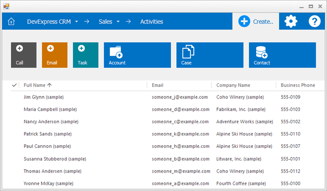
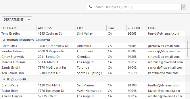
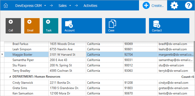
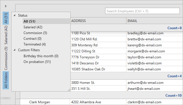
Office Navigation Bar
With this release, we've extended the capabilities of our WinForms Navigation Bar to fully replicate the UX shipping as part of Outlook 2013.
Blog Post
With this release, you can reproduce the folder pane experience of Outlook when a folder pane has been collapsed via a popup.
Blog Post
Editors
Rating Control
In this release, the DevExpress Data Editors Library was extended with a new Rating Control allowing your end-users to rate content.
TimeSpan Editor
A new touch-friendly editor allows you to set a time span with a precision from seconds to days.
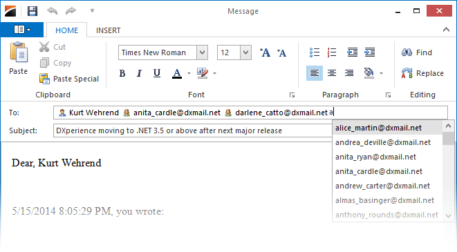
Token Editor
A new advanced text-box inspired by behaviors found in modern mail clients such as Microsoft Outlook and Google GMail.
Blog Post
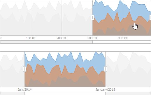
Range Control Clients
New DevExpress WinForms Chart Range Control Clients allow you to visualize DateTime and Numeric ranges within the Range Control.
Blog Post
BreadCrumb Editor
The new DevExpress WinForms BreadCrumb Editor allows you to add breadcrumb navigation to your WinForms apps.
Documentation
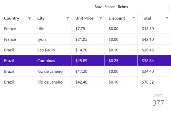
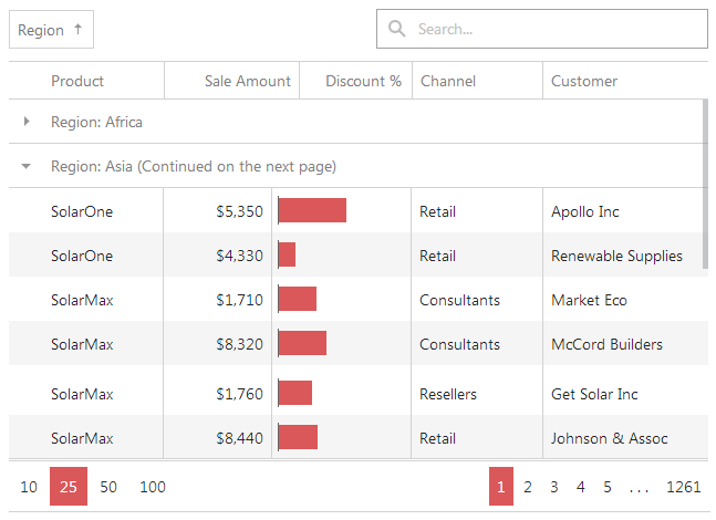
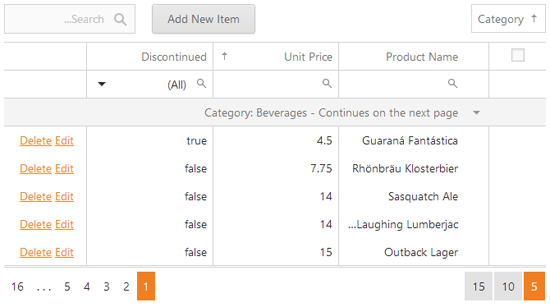
Search Control
The new DevExpress WinForms Search Control allows you to quickly locate and filter records in a bound control.
Documentation
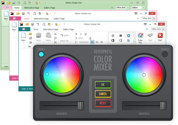
Transition Manager
The new DevExpress Transition Manager allows you to enhance any WinForms application by adding visual effects when changes are made to a form's content. Features include:
- 8 built-in transition types (Push, Shape, Clock, Fade, etc.)
- Support for easing.
- Ability to customize transition parameters (frame count and interval, effect options, background color, etc.)
- Ability to display a wait indicator and customize its settings.
Blog Post

Miscellaneous
- The CheckedListBoxControl's check boxes can be bound to a field in a data source.
- The TreeListLookUpEdit has new search and filtering options.
- The XtraMessageBox now supports HTML text.
- The Range Control has two new chart clients: date-time and numeric.
Toast Notification Manager
The new WinForms Toast Notification Manager allows you to display transient messages based on events within your WinForms app. A toast notification can contain text, an image and play a system-defined sound. You can display standard and long-duration toasts.
Documentation
SQL Data Access
Column Headers Auto-Height
With this new option, long column captions can be wrapped onto the next line.
Documentation
Custom Draw Made Easy
When handling custom draw events, you can invoke the default painting mechanism with a single method call.
Documentation
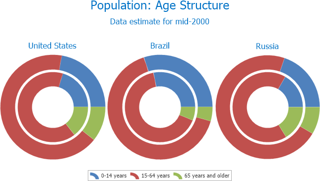
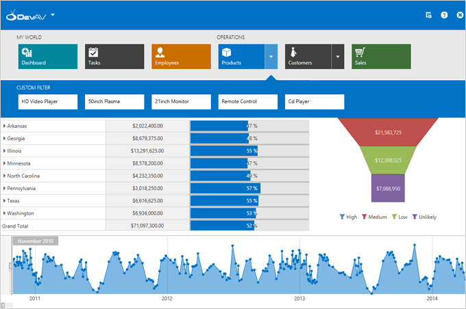
Chart Control
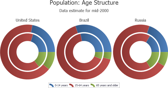
Nested Doughnut Chart
The WinForms Chart Control now includes a Nested Doughnut series view. Similar to the Doughnut series view, Nested Doughnuts compare series by positioning one doughnut inside another.
Blog Post
New Office 2013 Inspired Palettes
New palettes include: Blue Warm, Blue, Blue II, Blue Green, Green, Green Yellow, Yellow, Yellow Orange, Orange, Red, Red Orange, Red, Red Violet, Violet, Violet II, Median, Paper, Marquee, Slipstream.
Documentation
From PointOptions to TextPatterns
With the new TextPattern properties and Pattern Editor, text customization of series labels, axis labels and legend items has been simplified.
Documentation
Miscellaneous
- Automatic scale breaks calculation algorithm.
- Ability to save and load a custom palette via the palette editor.
- Ability to specify the direction in which a Pie series or Doughnut is swept.
- Ability to reset zoom.
- Axis reverse for the range control.
Spreadsheet Control
Password Protection for Worksheet and Workbook Elements
You can protect worksheet data or workbook elements to prevent their modification. You can also specify a password that users must enter to edit protected worksheets, to change the structure of a workbook, and set the size and position of worksheet windows. In addition, you can extend permissions to users in order to edit ranges in a protected worksheet.
Documentation
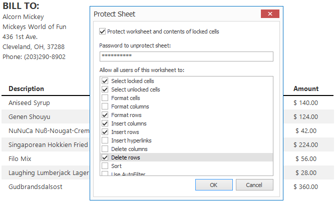
Chart Object Model and API
In this release, the Charting and DrawingML object models are available via a public API. You can create all chart types in code, specify the layout and position of chart elements, customize series markers and labels.
Documentation
Formula Builder
With this release, we've added an Insert Function and Function Arguments dialogs in order to assist end-users when creating formulas containing functions.
Documentation
Text Search
The DevExpress WinForms Spreadsheet Control allows you to find and replace text in a range, worksheet or in the entire document.
Documentation
Name Manager
Names make your formulas much easier to understand and maintain. The Name Manager allows you to add, edit or delete names in a workbook.
Documentation
New Worksheet Functions
- Real-Time Data Function - retrieves real-time data from a COM server. If the server continually updates its data, RTD formulas are automatically recalculated to reflect changes.
- Statistical Functions - LINEST, CHISQ.DIST, CHISQ.DIST.RT, CHISQ.INV, CHISQ.INV.RT, CHISQ.TEST, GAMMA.INV, T.TEST.
- Compatibility Functions - CHIDIST, CHIINV, CHITEST, GAMMAINV, TTEST.
Documentation
Mail Merge
- Field List Panel - displays the structure of a data source.
- Template cells containing mail merge fields are marked with database barrel icons in the Mail Merge Design View.
- Data sorting, grouping and filtering.
- Ability to preview a merged document.
Documentation
Miscellaneous
- Export to HTML.
- Calculation options.
- Formula Engine that provides access to formula elements.
- Ability to programmatically sort data in worksheets.
- Ability to manually draw the line that separates frozen panes on a worksheet.
- Ability to specify the pixel width of row headers and column header height.
Tree List Control
- Per-Pixel Scrolling Support.
- Advanced animation support for in-place data editors.
- With the new filter mode, the Tree List control no longer hides parent nodes if their children match filter criteria.
- When handling custom draw events, you can invoke the default painting mechanism by a single method call.
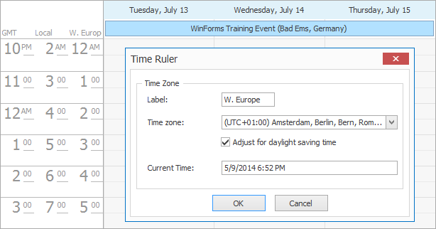
Scheduler Control
In this release, you can schedule all-day events in a floating time zone. An event scheduled for a specific date in a floating time zone will last for the entire day in any time zone.
Documentation
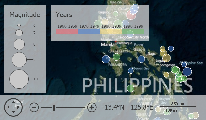
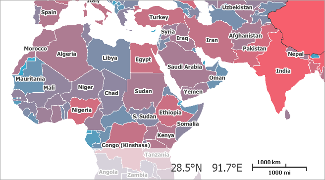
Map Control
New Map Items
With this release, you can display chart items above the Map control. The WinForms Map control can automatically aggregate the underlying data and show chart items at locations which correspond to aggregated values. The following chart types are supported:
Blog Post
New Size Legend
The Size legend visually describes the information displayed within the WinForms Map.
Blog Post
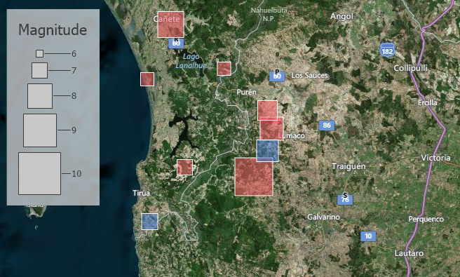
Multiple Legends
With this release, you can display multiple legends within the WinForms Map control. For instance, you can display both color and size legends to make your maps more readable and informative.
Blog Post
Shape Titles
In this release, the WinForms Map control automatically display titles for shape items. Note that these items can be displayed only for specified zoom levels and hidden for other zoom levels – this allows you to control when to display titles for larger elements and when to hide them for smaller ones.
iOS Office Inspired
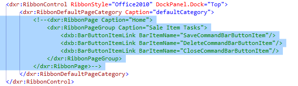
With this release, we've updated our WinForms Ribbon Control to support the look, feel and user-experience of the new Office Ribbon for iOS. The XtraBars Suite will now include a Tablet Ribbon option so you can emulate the UI found in Microsoft Office for iPad. Unlike a traditional Ribbon, it includes only a single row of buttons.
Blog Post
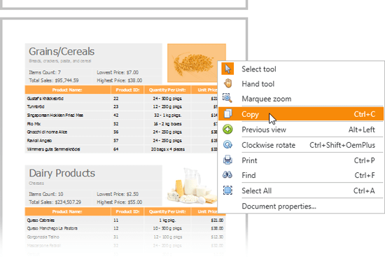
PDF Viewer
- Ability to select and copy text and images to the clipboard.
- Page Rotation.
- Document Navigation History (ability to save and restore navigation positions).
- Ability to save PDF documents.
Documentation
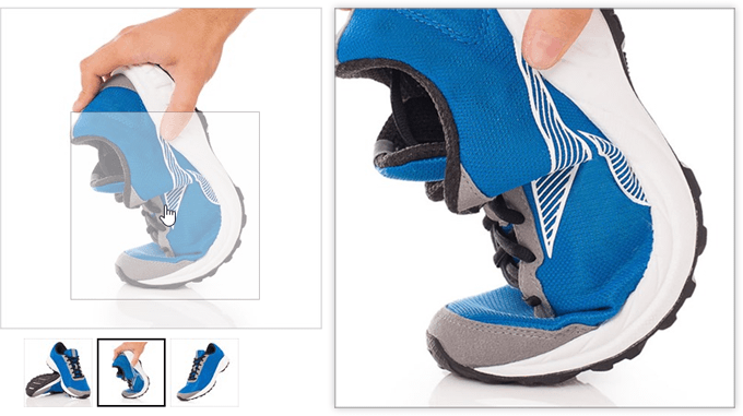
Layout Control
The DevExpress WinForms Layout Control is now optimized for touch devices. End-user layout customization has been extended with touch friendly features. To activate the new customization mode, hold down the left mouse button for a few seconds.
Documentation
Flyout Panel
Outlook 2013 Inspired Peek Panel
With this release, the DevExpress WinForms Flyout Panel control can be used as a popup panel displayed on the side of your application window.
Documentation
Windows 8 Dialog
You can now use the DevExpress WinForms Flyout panel to display Windows 8 UI-style dialogs.
Touch Friendly Scrolling
Blog Post
Application Themes
In this release, DevExpress introduces a quick and easy way for you to modify colors used within an existing theme and make them your very own.
Documentation
Miscellaneous
- Per-Pixel Scrolling Support for Pivot Grid and Vertical Grid controls.
- (Rich Text Editor) Support for third-party document comments (DOC, DOCX, RTF), including export and import. With this release, you can also open RTF documents created by XtraReports.
- (Vertical Grid Control) Ability to search and filter data.
- (Wizard Control) Ability to use HTML formatting for wizard captions.
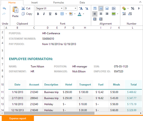
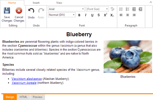
New Spreadsheet Control
The DevExpress ASP.NET Spreadsheet control was first released as a community preview in December, 2013. With this update, we officially release the product and have updated our web-based spreadsheet control with the following new features:
- Built-in file management menu items (create, open and save).
- Ability to use an external ribbon control.
- Built-in mail merge capabilities.
- Touch and Theme support.
- Support for hidden columns and hidden rows.
- Support for the standard ASP.NET localization.
- Dialog window design improvements.
- Optional grid lines.
- Additional client-side events and API.
Demo
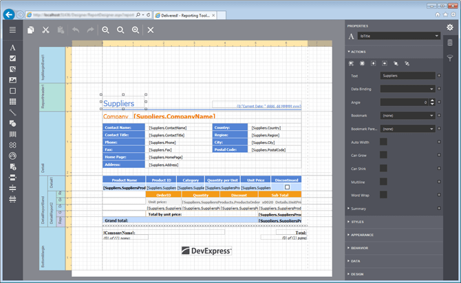
New Report Designer
With this release, we've introduced a full featured Report Designer for the web. The DevExpress ASP.NET Report Designer is a client-side control (based on CSS3, HTML 5 and JavaScript) and targets modern browsers such as IE9+.
Demo
New Image Browsing
The new ASP.NET ImageZoom control ships with the following features:
- Zoom on hover.
- Enlarge an image in a full-screen popup window on click.
- Ability to change a Zoom Window's position and size.
- Ability to zoom inside an image.
- Ability to specify captions for Zoom and Expand windows.
- Hint support.
The ASP.NET ImageZoom control can be used in conjunction with the ASP.NET ImageZoom Navigator. This allows you to navigate through a set of images as necessary. When used together, the following features are available:
- Navigation through a collection of images.
- Binding to an image collection.
- Binding to a folder containing images.
- Ability to automatically generate images and thumbnails in bound mode.
Demo
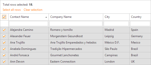
GridView Control
Select All Rows via UI
With this release, we've added a new UI element that allows end-users to select all data rows displayed within the grid or only the current page.
Demo
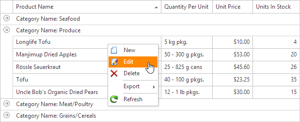
Built-in Context Menu
The ASP.NET Grid View now includes an embedded context menu. Menu items can be customized via properties or by handling server-side and client-side events.
Demo
Batch Edit Mode
- The layout and appearance of grid cells can be customized via templates in Batch Edit mode.
- Ability to specify when validation is performed in Batch Edit mode - on modifying a cell's value or on saving changes made.
Demo
Chart Control
Nested Doughnut Chart
The ASP.NET Chart Control now includes a Nested Doughnut series view. Similar to the Doughnut series view, Nested Doughnuts compare series by positioning one doughnut inside another.
Documentation
New Office 2013 Inspired Palettes
New palettes include: Blue Warm, Blue, Blue II, Blue Green, Green, Green Yellow, Yellow, Yellow Orange, Orange, Red, Red Orange, Red, Red Violet, Violet, Violet II, Median, Paper, Marquee, Slipstream.
Documentation
From PointOptions to TextPatterns
With the new TextPattern properties and Pattern Editor, text customization of series labels, axis labels and legend items has been simplified.
Documentation
Miscellaneous Enhancements
- Automatic scale breaks calculation algorithm.
- Ability to save and load a custom palette via the palette editor.
- Ability to specify the direction in which a Pie series or Doughnut is swept.
- Ability to reset zoom.
HTML Editor
With this release, you can manipulate the ASP.NET HTML Editor control using an external ASP.NET Ribbon Control. If full-screen mode is activated, the external ribbon will be displayed at the top of the page.
We've also added the ability to select a custom color within toolbar color pickers. The collection of custom colors can be maintained in cookies.
Demo: Toolbar Mode
Demo: External Ribbon
Scheduler Control
You can now schedule all-day events in a floating time zone. An event scheduled for a specific date in a floating time zone will last for the entire day in any time zone.
Blog Post
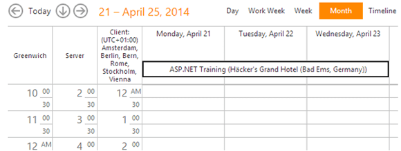
Image Slider
With this release, you can allow end-users to use loop navigation when they reach the leftmost or rightmost slide.
Demo
Round Panel
The DevExpress ASP.NET Round Panel can be expanded/collapsed by clicking its header or header button. It's also possible to load panel content on demand via callbacks.
Demo
Editors
In this release, we've made it easier to define and customize editor captions. The following new features are available:
- Automatic alignment to the base line of the editor's text.
- Ability to customize the caption's position and alignment (horizontal and vertical).
- Ability to display the required (or optional) mark.
In addition, we've made it possible to specify text (null text) to be displayed when the password editor has no value.
Demo
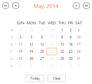
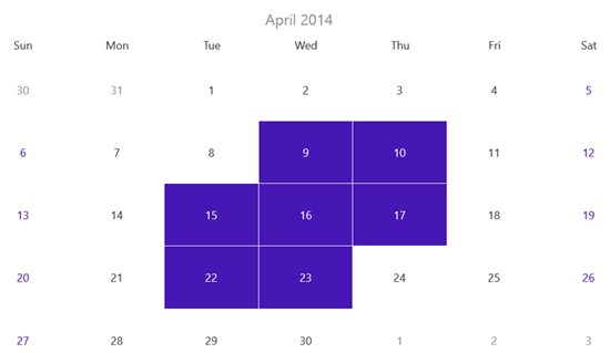
Calendar and Date Editor: Ability to Disable Dates
With this release, you can disable individual dates in the ASP.NET Calendar and Date Editor so that they cannot be selected by end-users. You can maintain disable dates in a collection or provide a rule to disable specific dates dynamically by handling server and/or client events.
Demo
Application Themes
DevExpress introduces a quick and easy way for you to modify colors and fonts for existing DevExpress ASP.NET themes and make them your very own. We've added a new parameters section to the ASPxThemeBuilder tool that allows you to specify the base font set/size and base color.
Blog Post
New TileNav Pane
Designed to be positioned at the top of your application window (like a Ribbon), the TileNavPane can be thought of as a touch-friendly version of traditional navigation elements used within WPF desktop apps. With it, you and your end-users will be able to:
-
Navigate the app's structure much like our Outlook-inspired Navigation Bar.
-
Quickly determine where the user is within the application's navigation hierarchy.
-
Display and activate a drop down menu with sub nodes for each Tile.
-
Fully customize individual Tiles.
-
Use custom Tile buttons and custom category buttons.
Blog Post
New TileBar Control
The WPF TileBar displays a set of tiles within its container and allows you to introduce simple/straightforward navigation experiences to your WPF applications. Its features include the following:
-
Display drop downs for each individual Tile.
-
Place any control within the Tile's drop down region.
-
Position the TileBar anywhere within your app (Top, Bottom, Left and Right).
-
Customize the appearance of individual Tile items.
-
Built-in glyph themes. You provide a monochrome glyph for the Tile and the TileBar will colorize it to a complimentary color.
Blog Post
Office Navigation Bar
With this release, we've extended the capabilities of our WPF Navigation components to fully support the user-experience found in Outlook 2013.
Blog Post
Barcode Control
With this release, you can integrate 1D and 2D barcodes into your WPF applications.

MVVM Services
New Taskbar Services
This release includes 2 new services: TaskbarItemService and ApplicationJumpListService. These services allow you to customize the manner in which your WPF application interacts with the Windows taskbar. You can add tasks to a Jump List and display progress of continuous actions in the taskbar.
New Toast Notification Service
With this new notification service, you can introduce Windows 8 style toast notifications to your WPF desktop applications.
Blog Post

Data Grid Control
Performance Optimization
With this release, we've significantly improved data loading time for the DevExpress WPF Data Grid. By using lightweight templates and editors, the DXGrid is now several times faster than its predecessors.
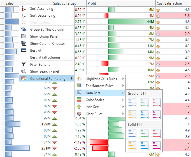
Excel® Inspired Conditional Formatting
Our WPF Grid includes new conditional formatting capabilities:
- Conditional formats for cell background, foreground, font settings (style, weight, size, etc.)
- All format conditions can be applied by the end-user using a column's context menu.
- Ability to apply conditional formatting either to individual data cells or entire row.
- Ability to create complex format conditions using the Condition Editor.
Documentation
Straightforward and Touch Friendly Scrolling
The WPF Data Grid control is optimized for touch devices. Horizontal and vertical touch scrolling has been improved, including support for per-pixel scrolling.
Chart Control
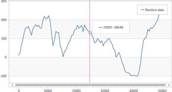
Automatic Data Aggregation
This new feature will improve the performance of your WPF apps when displaying/aggregating large amounts of chart data (e.g., thousands or even millions of data points). Automatic Data Aggregation is available for numeric or date-time X-axis (the argument axis) data.
Blog Post
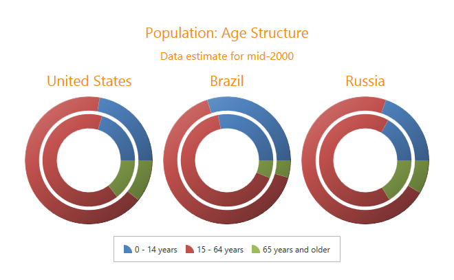
New Charts Series Types
With this release, the WPF Chart Control introduces Nested Donut and Funnel series views.
The WPF Nested Donut is similar to the Donut series view - Nested Donuts compare series by positioning one donut inside another.
The WPF Funnel series offers multiple use-cases. For instance, it can represent stages in the sales process and display the amount of potential revenue across each stage.
Blog Post
Improved Charts Export and Printing
You can now preview and print the contents of the WPF Chart control, export your chart to an image file (multiple file formats are supported), a PDF file, an image embedded in an HTML page or an image embedded in a Microsoft Excel spreadsheet.
Chart Migration Improvements
This release includes TextPattern properties, designed to simplify text customization of series labels, axis labels and legend items (when the ColorEach mode is enabled). In addition, the Pattern Editor can be invoked in the Property grid for these properties in the same manner as that of crosshair pattern properties.
Documentation
The following Office 2013 inspired palettes are now available:
Blue Warm, Blue, Blue II, Blue Green, Green, Green Yellow, Yellow, Yellow Orange, Orange, Red, Red Orange, Red, Red Violet, Violet, Violet II, Median, Paper, Marquee, Slipstream.
Documentation
Map Control
Zoom to Region
You are now able to select a map region and zoom into it.
Select Multiple Items
With this new feature, you can press 'SHIFT' and select any region on a map. This will automatically select all map items located within this region.
Scheduler Control
-
The WPF Scheduler allows you to schedule all-day events in a floating time zone. An event scheduled for a specific date in a floating time zone will last for the entire day in any time zone.
-
MVVM Support.
Documentation
Spreadsheet Control
Password Protection for Worksheet and Workbook Elements
With this release, you can protect worksheet data or workbook elements to prevent their modification. You can also specify a password that users must enter to edit protected worksheets, to change the structure of a workbook, and set the size and position of worksheet windows. In addition, you can extend permissions to users in order to edit ranges in a protected worksheet.
Documentation
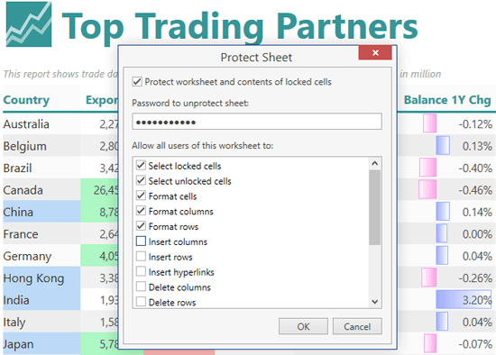
Chart Object Model and API
The Charting and DrawingML object models are now available via a public API. You can create all chart types in code, specify the layout and position of chart elements, customize series markers and labels.
Documentation
Text Search
The WPF Spreadsheet Control allows you to find and replace text in a range, a worksheet or for the entire document.
Documentation
Name Manager
Names make your formulas much easier to understand and maintain. The Name Manager allows you to add, edit or delete names in a workbook.
New Worksheet Functions
- Real-Time Data Function - retrieves real-time data from a COM server. If the server continually updates its data, RTD formulas are automatically recalculated to reflect changes.
- Statistical Functions - LINEST, CHISQ.DIST, CHISQ.DIST.RT, CHISQ.INV, CHISQ.INV.RT, CHISQ.TEST, GAMMA.INV, T.TEST.
- Compatibility Functions - CHIDIST, CHIINV, CHITEST, GAMMAINV, TTEST.
Documentation
Miscellaneous
-
Export to HTML.
-
Calculation options.
-
Formula Engine that provides access to formula elements.
-
Ability to programmatically sort data in worksheets.
-
Ability to manually paint a line that separates frozen panes on a worksheet.
-
Ability to specify the width of row headers and height of column headers, in pixels.
NavBar Control
With this release, you can reproduce the folder pane experience of Outlook when a folder pane has been collapsed via a popup.
Blog Post
PDF Viewer
- Ability to select and copy text and images to the clipboard.
- Navigation history support (save and restore the navigation position).
- Ability to save a document.
- Page rotation.
- Startup screen.
- Marquee zoom and advanced mouse wheel zooming.
Video
Rich Text Editor
With this release, the WPF Rich Text Editor supports third-party document comments (DOC, DOCX, RTF), including export and import.
Design-Time
- Ability to define MVVM components via Smart Tags.
- Improved Scaffolding Wizard.
Documentation
Chart Control
Data Aggregation
This new feature will improve the performance of your Silverlight apps when displaying/aggregating large amounts of chart data (e.g., thousands or even millions of data points). Automatic Data Aggregation is available for numeric or date-time X-axis (the argument axis) data.
Blog Post
New Charts Series Types
With this release, the Silverlight Chart Control introduces Nested Donut and Funnel series views.
The Silverlight Nested Donut is similar to the Donut series view - Nested Donuts compare series by positioning one donut inside another.
The Silverlight Funnel series offers multiple use-cases. For instance, it can represent stages in the sales process and display the amount of potential revenue across each stage.
Improved Charts Export and Printing
You can now preview and print the contents of the Silverlight Chart control, export your chart to an image file (multiple file formats are supported), a PDF file, an image embedded in an HTML page or an image embedded in a Microsoft Excel spreadsheet.
Chart Migration Improvements
This release includes TextPattern properties, designed to simplify text customization of series labels, axis labels and legend items (when the ColorEach mode is enabled). In addition, the Pattern Editor can be invoked in the Property grid for these properties in the same manner as that of crosshair pattern properties.
The following Office 2013 inspired palettes are now available:
The following Office 2013- inspired palettes are now available:
Blue Warm, Blue, Blue II, Blue Green, Green, Green Yellow, Yellow, Yellow Orange, Orange, Red, Red Orange, Red, Red Violet, Violet, Violet II, Median, Paper, Marquee, Slipstream.
Map Control
Zoom to Region
You are now able to select a map region and zoom into it.
Select Multiple Items
With this new feature, you can press 'SHIFT' and select any region on a map. This will automatically select all map items located within this region.
Rich Text Editor
With this release, the Silverlight Rich Text Editor supports third-party document comments (DOC, DOCX, RTF), including export and import.
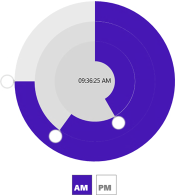
New Radial Time Picker
The new touch-friendly radial time picker allows you to quickly specify hours, minutes and seconds within your XAML 8 apps.
Mosaic Hub Tile
Barcode Control
With this release, you can easily integrate 1D and 2D barcodes into your Windows 8 XAML solutions.

Date Navigator Control
The DevExpress Windows 8 XAML Date Navigator includes the following features:
- Single and multiple selection modes.
- Ability to customize cell appearance.
- Multiple views (Month, Year, Decade, Century).
Data Grid Control
The DevExpress Windows 8 XAML Grid now ships with powerful search and filtering options.
Documentation
HTML 5/JS Widgets
HTML 5 Client-Side Data Grid Widget (optimized for web apps)
An HTML/JS Data Grid, with powerful data-shaping options. Like all DevExtreme widgets, Data Grid provides straightforward configuration options and API so you can deliver your very best in the shortest possible time.
Blog Post
HTML 5 Color Picker (optimized for web apps)
Allows end-users to select a color from a list. Supports alpha channel.
HTML 5 Calendar (optimized for web apps)
A calendar allowing end users to select the required date.
Documentation
HTML 5 Menu (optimized for web apps)
A horizontally or vertically oriented menu that supports as many submenu levels as needed.
Documentation
HTML 5 Context Menu (optimized for web apps)
A popup menu that provides extended options for the end-user in the current context. This menu is invoked by right clicking an associated element, as well as on a long tap or on custom actions.
Documentation
HTML 5 MultiView (optimized for mobile and web apps)
A widget that is used to display contents of the specified container and switch between several containers.
Documentation
HTML 5 Tooltip (optimized for mobile and web apps)
A widget that displays a tooltip for the specified element.
Video
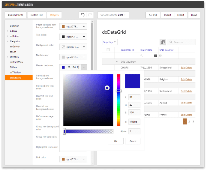
CSS Theme Builder
With this release, the themes supplied with DevExtreme can be customized using an online Theme Builder. Whether you run it on your server or locally the CSS Theme Builder allows you to change colors and the base font in a theme.
Blog Post
Right-To-Left Support
The DevExtreme Mobile Framework, UI and visualization widgets now support right-to-left text direction. Applications built using the DevExtreme Framework and websites based on DevExtreme widgets can incorporate right-to-left reading order, mirroring of UI elements and reversed transition animation.
HTML 5 Widget Enhancements
Device-dependent templates for widgets
We have extended the appearance customization capabilities of our widgets. You can now specify the target platform for the dxTemplate markup option, which allows widgets to incorporate a separate template for each platform.
HTML 5 List
-
With this release, we have added item reordering capabilities to the List widget. End-users can now drag an item and drop it onto the desired position within the list. Moving items programmatically is also available.
- A context menu can be displayed for any list item.
Select Box widget multiselect mode
We have extended Select Box functionality by introducing multi-selection mode. End-user can now select multiple items simultaneously.
Slider and Range Slider tooltip for handles and labels
Slider and Range Slider can display additional information for a handle or label within the corresponding tooltip.
NavBar widget item badge
NavBar can mark out the required item with a vivid badge.
Number Box widget spin buttons
Number Box now incorporates spin buttons, allowing end-user to specify widget value without using a keyboard.
Check Box indeterminate state
This widget now supports an indeterminate state, applied if the widget value is undefined.
Date Box widget
A "calendar" type for Date Box simplifies date selection. End-user can now specify dates using a drop-down calendar.
Performance Enhancements
Widgets have been rethought and reworked internally. As a result, you will experience performance improvements when using DevExtreme UI widgets across your mobile apps and websites.
-
Support for touch gestures (swiping, scrolling, etc.) has been improved as a result of the newly introduced gesture event manager.
-
List widget scrolling is now smoother, especially on Android and Windows Phone devices.
-
List widget rendering and animation in edit mode has been improved.
-
Slider widget animations are now smoother due to CSS3 transitions.
-
The Gallery, SlideOut, Pivot, Panorama widgets slide better due to the caching of required DOM-element dimensions.
HTML 5/JS Application Framework
Performance Enhancements
-
With this release, DevExtreme displays newly rendered views up to 30% faster by disposing views asynchronously.
- Performance across applications with a large number of cached views or very large view DOM size has been significantly improved.
Orientation-Specific Views
You can now define different view HTML templates for portrait and landscape device orientations. A corresponding view template will be applied based upon current device orientation.
Documentation
Split Layout for Tablet Devices
DevExtreme applications can now better adapt to tablet device orientation due to the newly introduced Split layout for iOS, Android and Windows Phone 8. In this layout, there are two panes on-screen: a "master" pane and a "detail" pane. A "master" pane usually presents a list of items. A "detail" pane presents detail information on the item selected in the "master" pane. When defining application views, you just denote the views that is to be displayed in the "detail" pane.
Visual Studio Integration
View Designer Enhancements
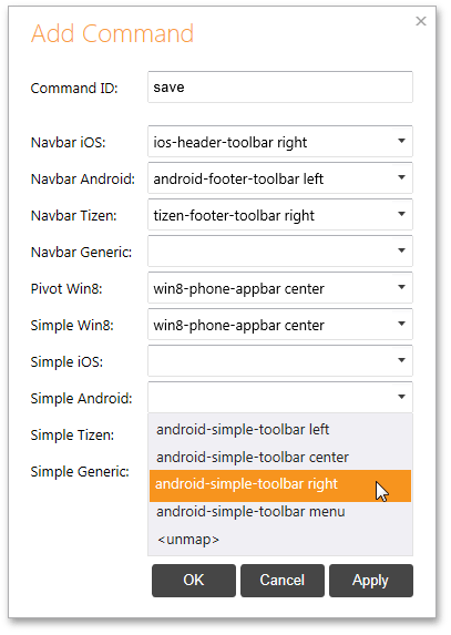
With this release, we've simplified the process of adding commands to views in applications built using the DevExtreme Mobile Framework. You can now use the 'Add Command' dialog within the View Designer. This dialog allows you to add a command specifying an identifier and a command container for it. In addition, you can invoke this dialog repeatedly to edit mapping settings for a command.
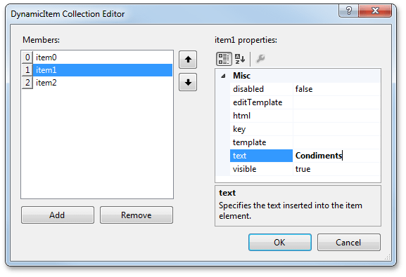
In the Property Grid, object arrays (like "series" in Chart or "items" in List) can now be set using the Collection dialog.
Documentation
Cordova 3.3 Support
Now the Cordova library version 3.3 is integrated into the DevExtreme application template and used to build iOS, Android and Windows Phone 8 packages.
HTML 5 Data Visualization
"Top N" in Pie Charts
The HTML 5 Pie Chart widget is now able to display only Top N values and aggregate the rest into one segment.
Demo
Group Small Pie Values in One Segment
You can now group small values and display their sum as one segment.
Demo
HTML 5 Charts - Adaptive Layout
Both the Chart and Pie Chart widgets now support adaptive layout of their elements. When resizing a page with a chart, elements such as a legend, title, axis labels, etc. may be hidden in order to maintain the maximum possible size of displayed data.
HTML 5 Vector Map
-
The Vector Map widget now supports double touch gesture to zoom a map twice.
- The Vector Map's API has been extended. New methods have been added to manage a map's zoom and centering options.
- Additional marker types are now available.
Demo
HTML 5 Range Selector
Series Templates
When the number of series displayed in a range selector's scale changes during the widget's lifecycle, define a template for the series. All series from the data source will be displayed in the same manner. Individual series customization is supported.
Logarithmic Scale
You can now use a logarithmic scale to help visualize datasets with rapidly-increasing values. You can choose a base for the logarithm so that generated scale ticks provide the most effective display of information.
Demo
Error Messages
ChartJS provides additional information when errors and warnings are encountered. In the browser's console, you will be able to learn the identifier of the error/warning and follow the provided link. This link navigates you to the documentation that describes the error/message and provides appropriate recommendations.
Sub-Bands Reporting
With this release, you can create unlimited copies of any report band type. For instance, you can print different band versions based on the specific condition.
Gauge Control
DevExpress Reporting now supports circular and linear gauge types (XRGauge).
Documentation
Report Data Wizard
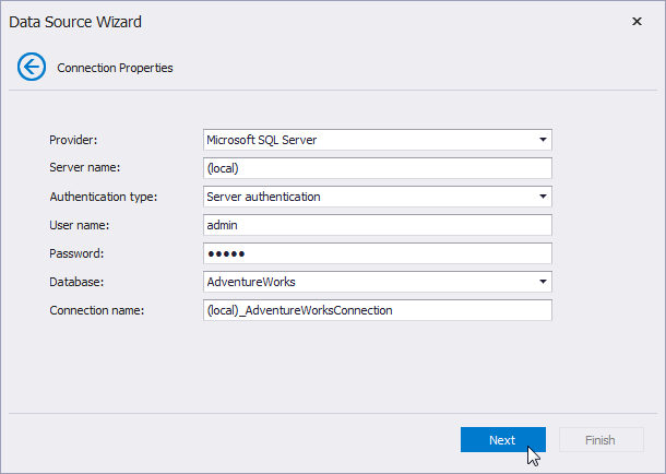
The new Data Wizard is available at both design time and within the WinForms End-User Report Designer. Features include:
- Ability to connect directly to a database or via Entity Framework (version 5 or 6).
- Support for the most common data providers (MS SQL Server, MS Access 97 and 2007, Oracle, MySQL, VistaDB and much more).
- An integrated query builder provides an extended set of data shaping tools.
- Ability to create Master-Detail reports.
- Ability to directly specify a SQL connection string.
- Support for stored procedures and server-side parameters.
Documentation
Miscellaneous
Data Binding
- Support for SQL & Entity Framework data sources.
- Support for stored procedures.
- Server-side parameters.
Export to PDF
- Support for Arabic fonts.
- Support for PDF/A format (PDF/A-2b).
- Vector painting of 2D charts
Export to XLSX
iPhone and iPad support.
Document Viewer - UI and Search Enhancements
- (ASP.NET, WPF, Silverlight) Ability to switch between a standard toolbar or a Ribbon.
- (ASP.NET) A cross-browser Search to locate text in a published report.
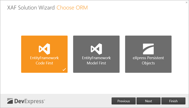
XAF Solution Wizard
XAF now ships with a wizard allowing you to create a new application in a few simple steps. Choose your target platform (desktop, web or both), data model type (Entity Framework Code First, Entity Framework Model First or XPO), user authentication method, and select the extended modules to include into your application.
Documentation
Blog Post
XAF Entity Framework Support
The new DevExpress.Persistent.BaseImpl.EF library contains ready-to-use Code-First entities. These are general-purpose entities (like Person, Task, Address, etc.), and entities that are specially designed to be used with XAF extended modules and security system (Event, FileData, User, Role, etc).
The Key Performance Indicators (KPI) Module now supports the Entity Framework data model.
Blog Post
XAF ListView Performance
The new DataView mode for the ListView helps improve performance in analytics, reporting and other use-case scenarios involving large volumes of data. With this new feature, entire persistent objects will not be loaded, but rather their projections as configured by the developer via the Model Editor.
Blog Post
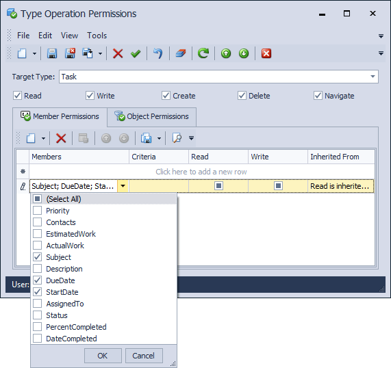
XAF Security System Usability
Application administrators can now assign member-level permissions with the new CheckedListBoxPropertyEditor editor.
Blog Post
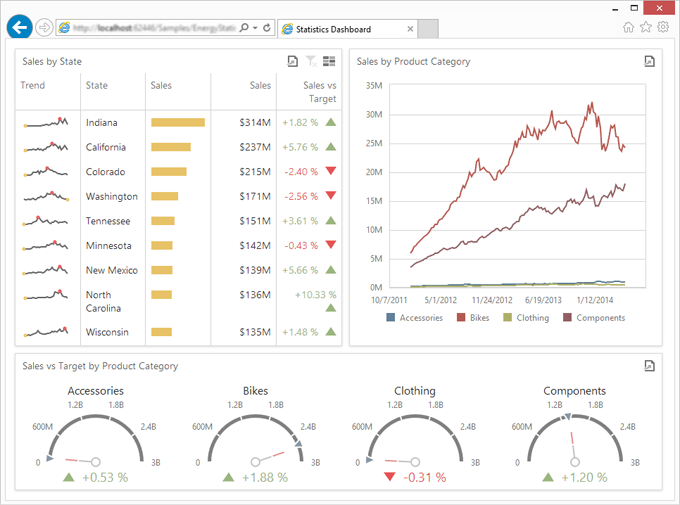
MVC Dashboard Viewer
With this release, we extend web support for the DevExpress .NET Dashboard Viewer and introduce a new extension (Dashboard Viewer) so you can easily integrate Dashboards in your next ASP.NET MVC project. The DevExpress MVC Dashboard Viewer ships with the following features:
- Cross-browser support.
- Dynamic dashboard UI elements and static presentation items.
- Drill-down, data filtering and event handling.
- Built-in support for 14 different database engines.
Documentation
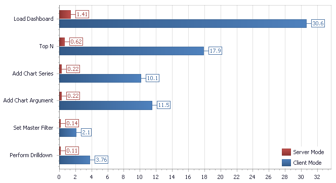
Server Mode for SQL Data Sources
Your customers expect superior performance, regardless of dataset size or information complexity. With this release, the DevExpress Dashboard is powered by our proprietary server-side data processing engine for SQL data sources so that regardless of dataset size, your apps will always remain responsive and allow users to shape and analyze information at lightning speed.
The following screenshot illustrates the high performance of our new server mode. The numbers indicate the amount of time (in seconds) it takes to complete dashboard operations.
Documentation
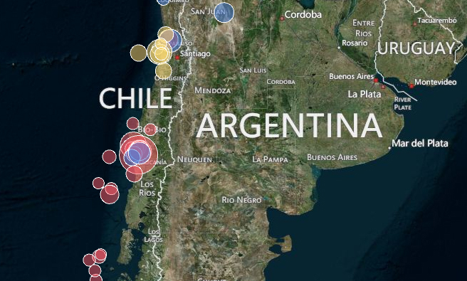
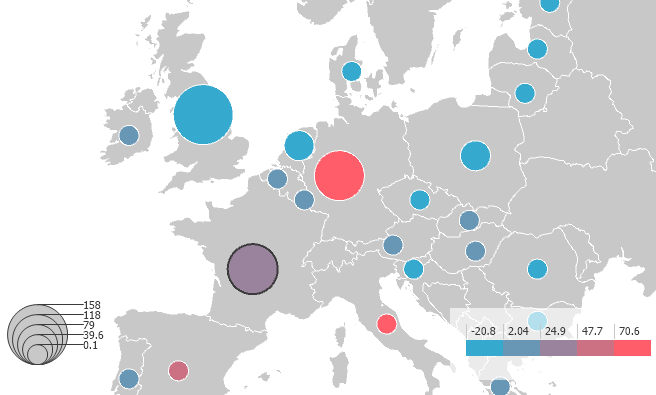
Geo Point Maps - Bubbles and Pies
With this release, you can visualize data related to geographical points using bubbles or pies. These types of maps are available for both platforms - Win and Web.
Video
Geo Point Maps - Clustering
Before the 14.1 version, Geo Point Maps rendered every point in the data set. This would often cause an unattractive display because all the points overlap each other. Starting with 14.1 the Dashboard introduces a "Clustering" capability which automatically groups data points into several clusters and prevents overlapping and loss of information. The clustering algorithm is performed on dashboard side and optimized for working with over 100,000 data points. Also, the clusters are dynamically rearranged when zooming, scrolling or resizing map.
Documentation
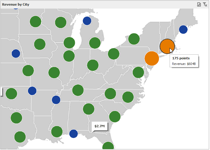
Data Access Client-Side API
Client-Side API for Data Access and User Actions (Win, Web)
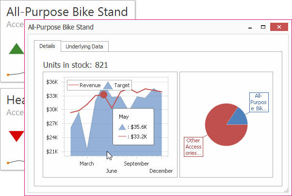
We have added a new Client-Side API for handling events related to both data access as well as user actions. On the data side, you can now trap events related to connections, server side filtering as well as parameter changes. On the user action side, developers can handle any number of mouse click, hover, and wheel events to add an unlimited amount of added interactivity. Included in these events are the underlying data associated with the event. In the case of clicking on a card in a dashboard, for example, you can get access to the underlying axis the bar represents as well as any associated measures, slices of data, and any deltas that might be associated to the bar. These features together with an already powerful dashboard allow for the creation of truly rich interactive data displays that are sure to elucidate the meaning behind your data.
In the case above, clicking on the “All-Purpose Bike Stand” card allows you to create a separate dashboard visualization for just that card.
Documentation
Miscellaneous Enhancements
- The Chart's Series Options dialog allows you to customize various options for each series type.
- The Dashboard Designer now allows you to convert dashboard items to other types (Chart to Grid, Pie to Gauge, etc.), rename data sources, etc.
- In 14.1 the Visual Studio Dashboard Designer automatically generates data for project data sources which can't be populated at design-time. This feature makes design-time actions clearer for customers.
PDF Document Processor
The DevExpress PDF Document Processor ships with the following new features:
- Document Merge.
- Page Rotation.
- Ability to remove individual document pages.
Documentation
New Worksheet Functions
Real-Time Data
A worksheet RTD function retrieves real-time data from a COM server (a program that supports COM automation). If the server continually updates its data, RTD formulas are automatically recalculated to reflect changes.
Statistical
- Linest
- ChisqDotDist
- ChisqDotDistDotRt
- ChisqDotInv
- ChisqDotInvDotRt
- ChisqDotTest
- GammaDotInv
- TDotTest
Compatibility
- ChiDist
- ChiInv
- ChiTest
- GammaInv
- TTest
Worksheet Function Parser
Programming object that provides parsed formula representation, so you can iterate through formula components. You can access a formula as a string or as a group of objects.
API Improvements
-
With this release, the Charting and DrawingML object models are available via a public API. You can create all chart types in code, specify the layout and position of chart elements, adjust series markers and labels.
-
New methods allow you to save a worksheet or cell range to a file in HTML format.
-
Ability to sort data in a range of cells using specified options.
New CodeRush Refactorings
With this release, we have introduced the following new refactorings:
New CodeRush Code Providers
This release adds an Implement IEquatable, Implement ISerializable and Implement IComparer code providers, allowing you to add the appropriate interface members to the class under caret.
The new 'Import Namespace' code provider imports the required library to the current project. The code provider can be called for an undeclared class or namespace reference.
-
With this release we have introduced the Remove potentially redundant assignment and Remove potentially redundant assignment (remove all) code providers, which remove XAML attributes initialized to default values.
Enhanced Refactoring
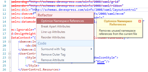
The 'Optimize namespace references' refactoring is now available in XAML. It removes unused namespace references highlighted with the 'Redundant namespace reference' code issue.
Enhanced Code Providers
The Declare XAML Namespace References and Declare All XAML Namespace References code providers are available even if there is no qualifier for the element under caret. When executing these code providers, CodeRush analyzes XmlnPrefix attributes, declares the appropriate namespace reference and adds the required qualifier if it is missing.
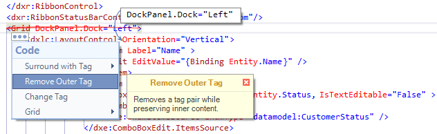
The 'Remove Tag' code provider moves attached properties of a removed tag to a child tag. The 'Surround With Tag' code provider moves these properties from the current tag to the created surrounding tag. The following attached properties can be moved:
- Canvas.Left
- Canvas.Top
- DockPanel.Dock
- Grid.Column
- Grid.ColumnSpan
- Grid.Row
- Grid.RowSpan
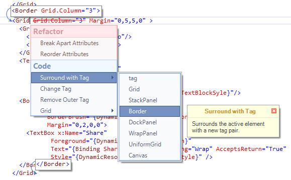
We have added submenu items to the 'Surround With Tag' code provider. These items allow you to surround the selection with any of the following tags with a single click:
- Grid
- StackPanel
- Border
- DockPanel
- WrapPanel
- UniformGrid
- Canvas
Enhanced Issues
We have implemented the Default value may be assigned code issue, which highlights XAML attributes set to default values. In most cases, such attribute declarations can be removed.
CodeRush Comment/Uncomment
The Comment/Uncomment feature is now available in XML like markup. If you press the appropriate shortcut ('/' by default), CodeRush encloses the selected code to a multi-line comment (<!-- . . . -->).
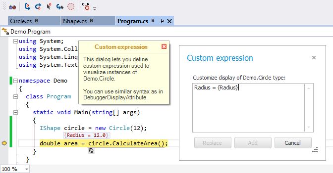
Debug Visualizer
- With this release, the Debug Visualizer is shipped with the toolbar making it easier to access main actions. The new toolbar also includes commands used to step through the code being debugged.
- The ability to use custom expressions to visualize values of specific type instances.
- We have optimized multiple option pages to make color customization simple.
- We have changed the appearance of values displayed for expressions and variables, so that you can easily understand connections between values and expressions.
- With this release, values can be displayed using one of the following modes: always, on demand or when there is enough space.
Miscellaneous CodeRush
We have added a 'Disable CodeRush' button to the visualization toolbar, allowing you to temporarily disable all CodeRush features within the current solution.
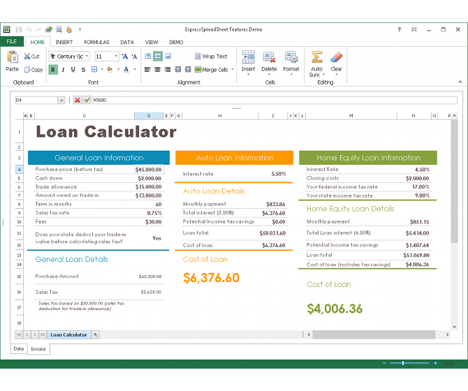
New Spreadsheet Control
The DevExpress VCL Spreadsheet Control allows you to create applications that help your users analyze and process data in a familiar Excel-style environment. Inspired by Microsoft Office, the VCL Spreadsheet Control has been completely redesigned and re-engineered from the ground up in v14.1 to support the following features:
- Support for XLSX, XLS, and binary file formats.
- In-place cell editing.
- Comprehensive worksheet, row, column, and cell management.
- Formula calculations with a wide range of functions, including: Compatibility, Date and time, Financial, Information, Logical, Lookup and reference, Math and trigonometry, Statistical, and Text functions.
- Embedded pictures and shapes support.
- Appearance settings for individual cells, columns, or rows.
-
ExpressSkins and built-in Look & Feel styles support.
- Advanced value formatting with custom format codes support.
- Frozen panes.
- And so much more...
Blog Post
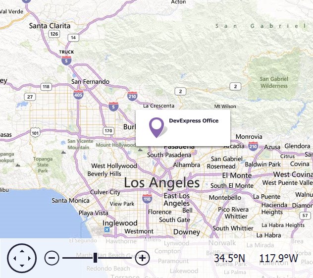
New Map Control
The new VCL Map Control allows you to embed popular map services into your VCL applications. The VCL Map Control ships with the following features:
- Support for the Bing Maps and OpenStreetMap online map providers.
- Ability to simultaneously display an unlimited number of layers rendered with image tiles, vector items and shapes, and/or geographic data stored in KML (Keyhole Markup Language) files.
- A set of UI elements that allow your users to scroll, zoom in and out, as well as visualize information about the current view.
Blog Post
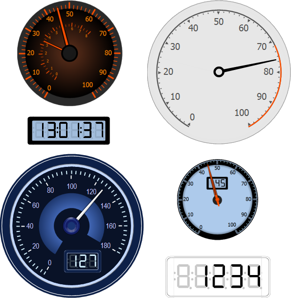
New Gauge Control (CTP)
Designed to clearly convey information at a glance, gauges are a significant data visualization part of dashboards. Communicate appropriate intelligence with a variety of circular and digital gauges that help depict data varying with time.
This initial version ships with two gauge types:
- Circular (full circular only)
- Digital (7 segment only)
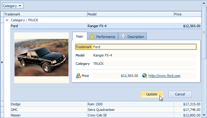
Grid Control
Data Editing with Built-in Edit Forms
The DevExpress VCL Grid now ships with two new edit modes to help simplify data entry and reduce the code you need to write to deliver the UI experience most suited to your application. The first new mode is the In-place Edit Form. Here a panel is inserted into the grid underneath the row being edited, and this panel holds the form for editing the data in the row. The second mode is similar, except that the row being edited is hidden by the panel.
This new option allows you to incorporate an auto-generated layout within the edit form or a custom layout via the DevExpress Layout Control. In addition, you can enable end-user customization of the form's layout.
Blog Post
Ribbon Control
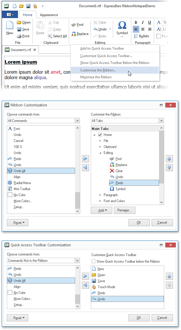
Runtime Ribbon Customization
With this release, your users can customize your application's Ribbon UI in the same manner as they do in Microsoft Office. The Ribbon Control now provides two new customization forms: the Ribbon Customization dialog and the Quick Access Toolbar Customization dialog.
Miscellaneous Enhancements
The rendering of the Ribbon UI has been improved with both low-color and high contrast color schemes.
Layout Control
The VCL Layout Control has been improved in two major areas. First, a new auxiliary layout item has been provided that adds the capability to embed an image. Second, the existing Customization Form has been extended with several drag-and-drop improvements.
Web Based Test Code Editor
With this release, TestCafe ships with a fully integrated test code editor. Simply launch TestCafe's Control Panel in order to view/edit your test code. TestCafe's code editor includes all the functionality you'll need to manage your tests including the ability to locate test code instantly: when you press edit for a given test, the Control Panel automatically opens the file and loads it within the code editor, positioning the cursor at the appropriate position.
Enhanced Configuration
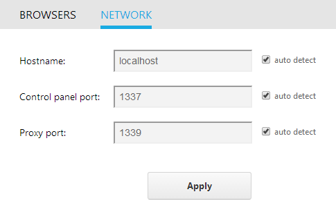
Enhanced Configuration and Setting Options
We have extended TestCafe's Control Panel and improved the way in which you manage test settings for your web applications. New features include the ability to:
- Add, modify or remove locally installed browsers from your test target list. Remember, TestCafe supports all HTML 5 browsers so you can restrict your tests to those used within your enterprise or BYOD world.
- Quickly modify TestCafe settings such as hostname, Control Panel port and Proxy port.
Extended
API Functions
Two new user actions and one dialog handling function have been added to TestCafe's API.
- A new user action that navigates to the specified url (act.navigateTo).
- A new user action that allows you to wait until the specified asynchronous event is complete (act.waitFor).
- A new dialog handling function that closes a dialog shown when a window is about to be unloaded (handleBeforeUnload).

Architecture and Core
Improvement Architecture and Test Core
Our commitment is to constant and never-ending improvement and so TestCafe 14.1 ships with a significantly improved core engine. The updated architecture improves TestCafe's reliability and addresses a number of usability requests from users such as yourself.
Additional Enhancements
14.1 improves the user experience with an improved Control Panel. New options include:
- A new software update indicator whenever a new featuredetail>
- Links to TestCafe's Online documentation so you can get questions answered quickly.
- Direct link to the DevExpress Support Center so we can help whenever you have an issue.

New Installer
for Windows Users
TestCafe v14.1 now ships with a simplified Windows installer for those testing web apps on the Windows operating system.
